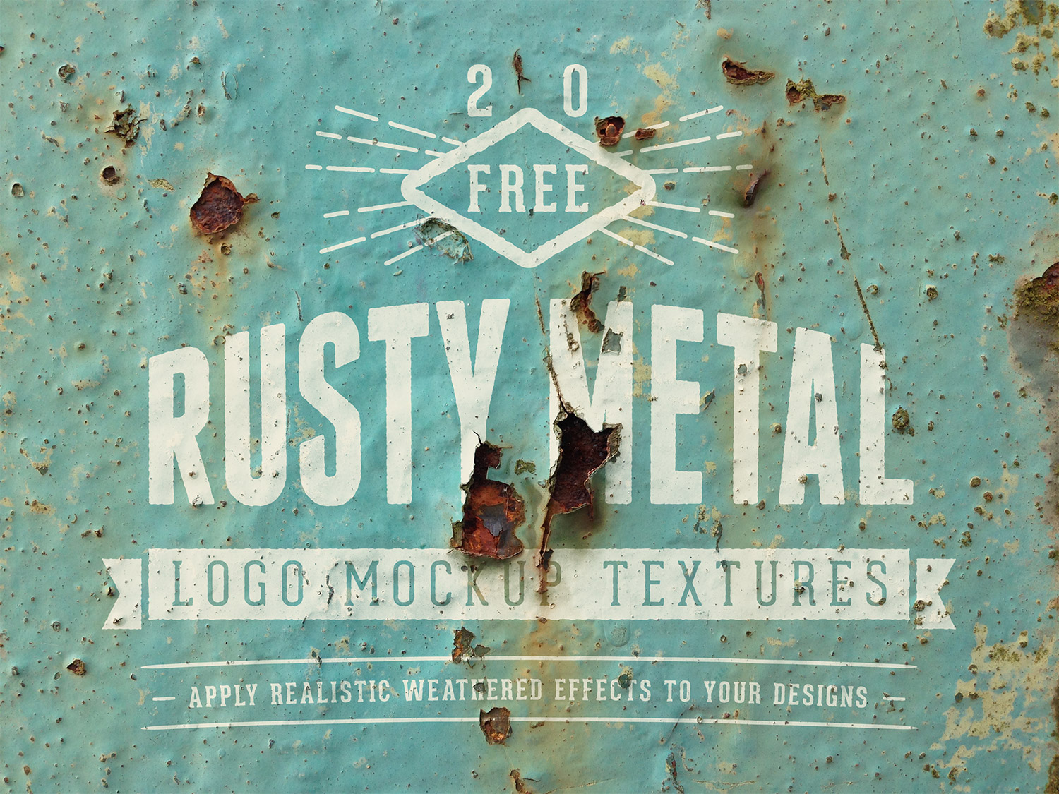
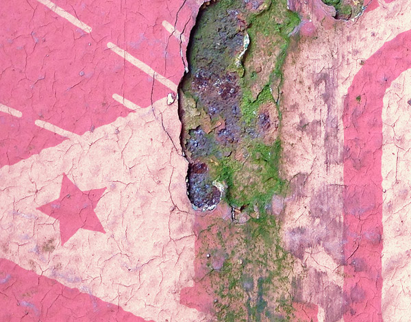
I had to illegally trespass onto an old disused WW2 era Aerodrome in order to bring you my latest pack of free design resources, so this collection of rusty metal logo mockup textures is as authentically vintage as you can get! They’re perfect for mocking up your logos and designs onto worn surfaces to create realistic aged weathered effects. All you have to do is paste your artwork onto the Smart Object layer, then your design will be automatically distorted and distressed to simulate an old painted sign.
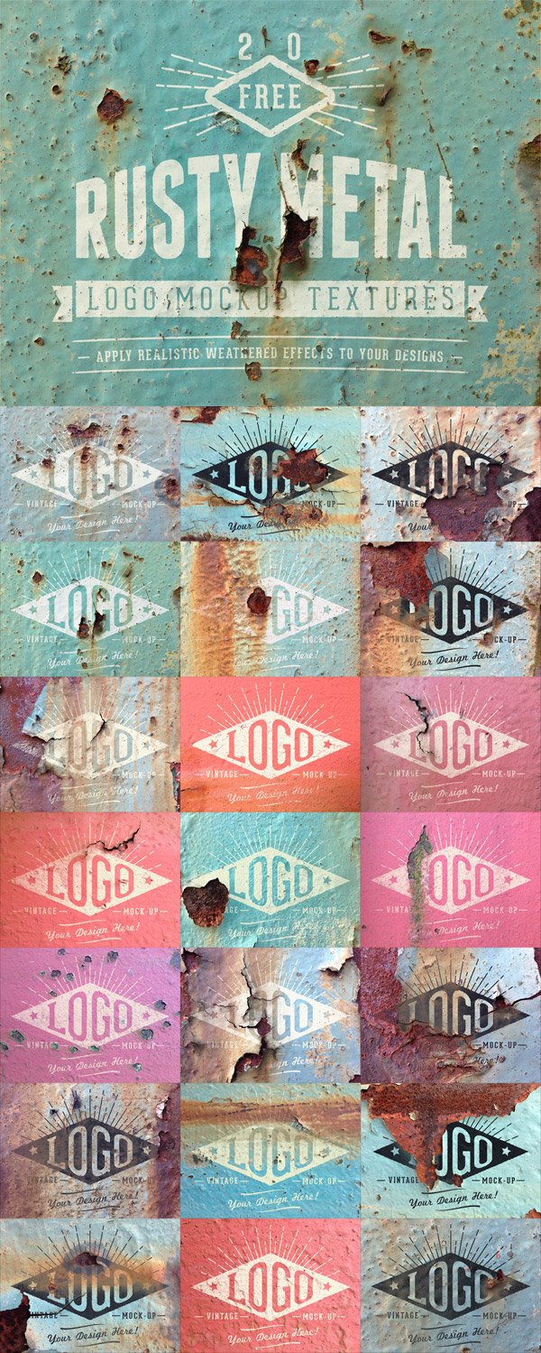
This free pack of logo mockups contains 20 texture files of grungy old painted metal surfaces that have decayed with years of corrosion. Paste in your artwork onto the relevant Smart Object layer, then a series of displacement map and channel manipulations will distort your design to apply the same weathered look, resulting in a realistic aged painted sign appearance. They perfectly complement brand designs based on old vintage industries or nautical inspired artwork which tries to capture the character of ships and docks.
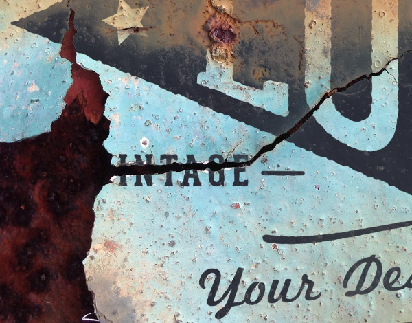
There’s loads variety when it comes to the level of rusty corrosion, from subtle textures to full on rot with flaky paint and large cracks. All these lovely details are applied to your artwork to create realistic simulations of a design that has been eroded over the years.
The files also contain a colour adjustment layer so it’s easy to find the perfect hue to blend your art into the scene.
Authentically vintage WW2 era textures!
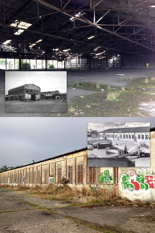
These textures were taken from the site of an old WW2 era Aerodrome. In its prime the site was an RAF balloon barrage during the war, but a couple of buildings and the remains of derelict aircraft hangers remain today, providing the kinds of textures and design resources you just can’t find anywhere else!


The textures look very realistic! Usually designers create just beautiful? ideal textures! But these really look like they are not designed, but taken from life
Only Mother Nature can create the most realistic textures!
How Cool! I love old hangars! Thanks for making these available!
Thanks for sharing, your time and efforts are always highly appreciated.
Great chris, you are really a genius .
Thank you so much Chris for these very attractive textures and for all the resources
you share !!
These are fabulous! Thanks!
Thanks for these, very useful. One question,
I have a two colour logo which appears as only one colour. Any way around this please?
Try turning off the visibility of the Solid Color adjustment layer that is linked to the logo. That replaces the colour of the whole logo so it blends in a little better, but it might be causing problems with your particular design.
Hi Chris:
I was waiting to see these. SO EXCITED!!!
Am getting ready to share with MY community!
THANK YOU SO MUCH for doing this for all of us! YOUR work and YOUR contributions to the Design Community are REALLY AWEsome and inspiring!
Roz Fruchtman
Thanks Roz, I hope your community enjoys them!
Fabulous! Thank you so much :)
Chris, I could hug you right now.
Virtual hugs all round!
You are the best! Thank you!
Not only are the textures really beautiful, it was really cool of you to note where they originated from.
This is awesome! Thanks for sharing Chris!
My pleasure Michelle, I hope you find a good use for them!
Mantap !!!
Terima Kasih Chris….
May I join in the line to give you a hug? Thanks you so much ! ! ! I love these… can’t wait to try them. :)
really nice looking… But can you tell – show me how to use them ? cant get it working :(
Lars ..
Open up one of the files in Adobe Photoshop and make sure your Layers panel is visible.
You’ll see a layer named ‘Double click to edit’, make sure you click the thumbnail of this layer.
The logo file will open, allowing you to replace the placeholder with your design by pasting it in and scaling it to size.
Press Save and close this logo file, then you’ll find your design in place on the texture.
These rusty backgrounds are lovely, I just love rust! I shall look forward to playing with these. Thank you.
Great! Thanks.
Man.. fantastic pack!
How wonderful of you to share these- I love the ‘old’ look for fresh design ideas. So many possibilities. I love you blog- thanks for all that you do!
These are just fantastic! Love every single one of them. again thank You for you work!
I hug you too chris!!!
Thank you so much, Chris. I’ve been searching lately for all kinds of mock-ups and these of artwork-over-destroyed surfaces are my favourite!!!
So kind of you to share such good work.
Incredibly fun and easy to navigate. I’m such a newbie in photoshop and appreciate how straight forward your graphic toys are. Thanks for providing such quality materials!
Thanks for taking the time to put these together Chris!! And even BIGGER thanks for giving them away.
Stay Thirsty My Friend.
Hello Chris,
You are real smart in doing that staffs, I like photoshop and I some time start learning how to do that but when I see things looks like real like yours I feel like I should find another field to compete, I cant compete with designers like you. Good job
Hi Chris
I simply love your skills, the way you create a fantastic design in photoshop. Again great freebie thanks.
Thank you so much :)
good post!
Thanks Chris, really nice textures. Cheers!
Your generosity is inspiring, Chris!
Generosity Is The New Black!
I think you just saved my life
I downloaded both the zip and rar files and they have 0 info in them. :(
Thanks very much, Chris!
THANKS, TIME AND ENERGY IS VERY IMPORTANT THANKS FOR CREATING THIS.
NAME MISSPELLED SORRY! LAST NAME IS RAY.
Heey m8
Thanks for sharing.
Your great Spooner.. :)
Incredibly fun. It was really cute.
You’re the best Chris! thanks!!! :D
Gracias! <3 =:)
heya… thnx chris for all kinds of mockups. good one… keep it up.
Hats OFF man..