Videos
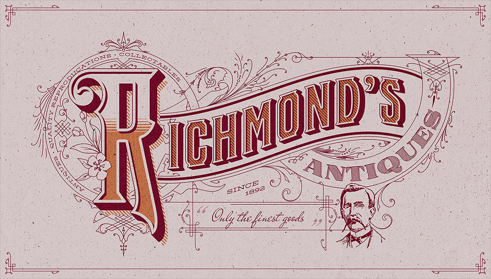
Detailed vintage lettering is one of the coolest text effects you can make! Originally these kinds of embellished titles were drawn by hand as the cover art for old insurance maps from the likes of the Sanborn map company. Painstakingly illustrating artwork like this by hand is a dying art form that would have taken years of training to become a master of penmanship, but we can easily make similar text styles with digital tools. Follow along with this tutorial to create detailed vintage text effects the easy way with the powerful tools available in Kittl.
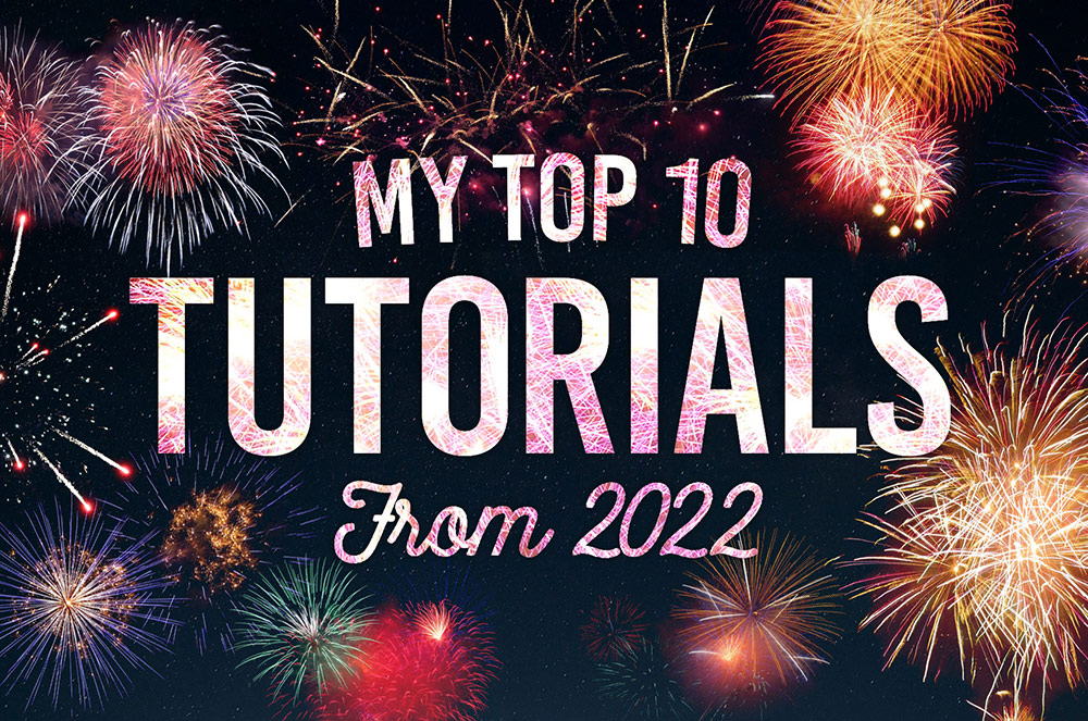
2022 is coming to an end, so let’s take a look back at my tutorial videos from the past year and see which topics proved to be the most popular. Last year I had a big hitter with my Neon Light Effect Photoshop Tutorial, which gained over 1 million views in 2021 and has continued to dominate in my YouTube Analytics dashboard. I haven’t had quite as much success this year, but stick around until the end to see which of my tutorials achieved 1st place spot.
Y2K logos are a hot trend at the moment. They’re reinterpretations of the style of logo design from around the year 2000. Imagine abstract fonts, star graphics and bold outlines. In today’s tutorial I’ll show you how to easily create your own Y2K logos with the help of Kittl.
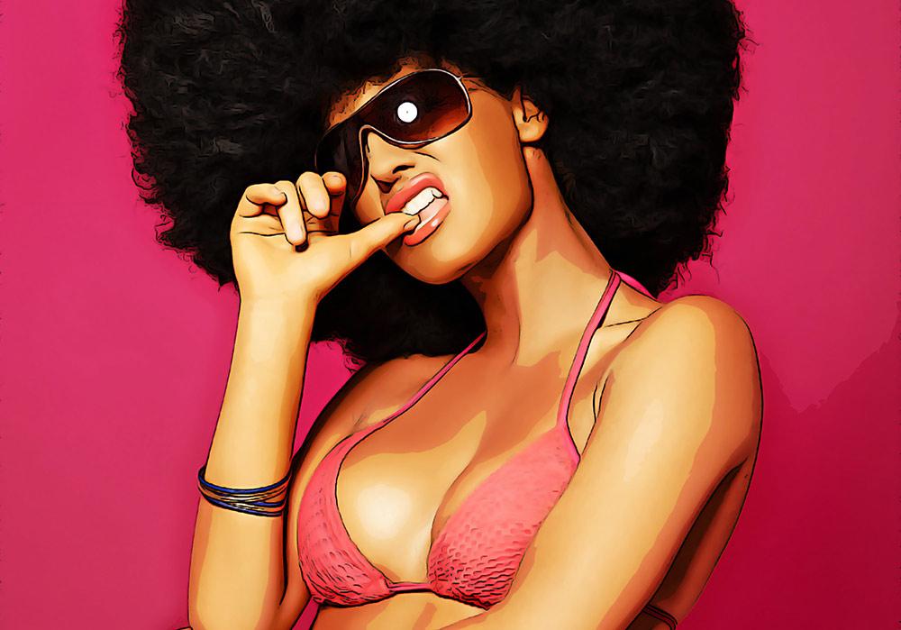
In today’s Photoshop tutorial I’ll show you a cocktail of adjustments that mimic the outlines, colours, and shading of a digitally painted image automatically, without the need to trace, paint or draw by hand. This effect can be applied to any image to transform a real photograph into an illustrated cartoon graphic.
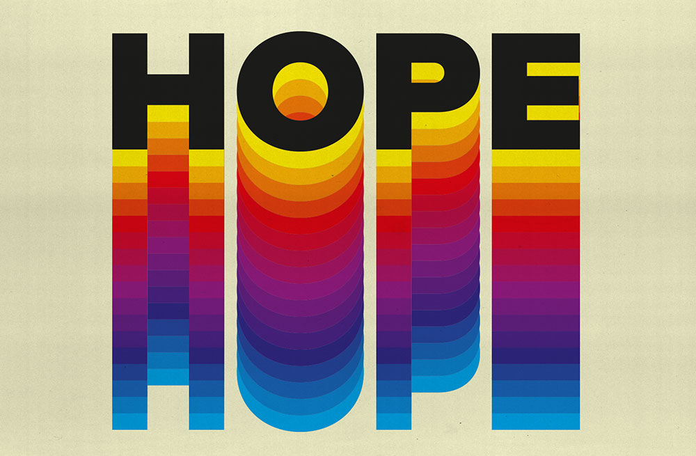
In today’s Illustrator tutorial I’m going to show you how to create a colourful text effect, which comprises of a stack of text elements that transition through the colour spectrum to produce a rainbow effect. Illustrator’s Blend tool will form a core part of the procedure, but I will also share a useful tip that enables you to easily alter the wording of all the text instances at once.
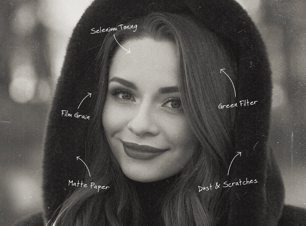
In today’s Photoshop tutorial share 5 tips to add authentic-looking analog film effects to your photos. While modern digital cameras produce vastly superior images with crisp colourful pixels, photographers still love the nostalgia of old film based cameras and the character of the photographs they produce, especially the beautiful mood and tones of black and white film stock. It takes a lot of practise and experience to master analogue photography, plus there’s a lot of messy work with various chemicals involved to develop traditional photographic film, but Photoshop has some great built-in tools that you can use to transform your digital pictures into realistic looking film based shots. It just requires a basic understanding of how analogue pictures are made, so you can then find ways to mimic the appearance with Photoshop adjustments.