Videos
I received a great topic suggestion on Twitter recently from Furquan101, who asked if I could make a guide on creating a folded logo in the style of Android N or the new Medium branding. In this Adobe Illustrator tutorial I’ll show you how to create a design based on the letter M, but this folded style gives you plenty of options for producing various initials, or an abstract ribbon type icon. We’ll create the full colour primary logo graphic, then follow up with flat and mono versions that would be used in specific design scenarios.
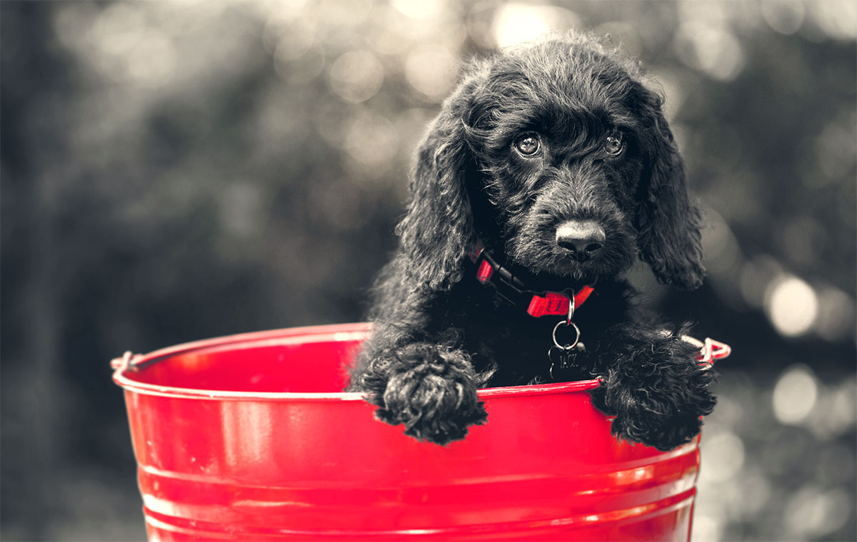
In today’s Adobe Photoshop video tutorial I’m going to show you how to create a popular photo effect that goes by many names, including selective colour photography, spot colour photography, colour isolation photography, partial colour photography, colour splash photography, colour accent photography and many many more! No matter what you want to call it, it’s where a photograph is converted to black and white with a single colour preserved to highlight specific areas.
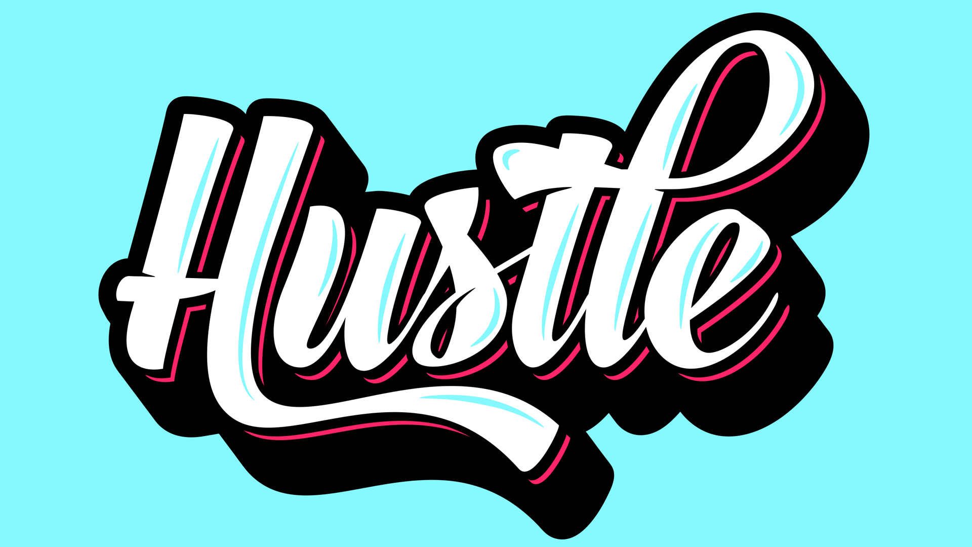
In today’s Adobe Illustrator tutorial I’m going to show you how to create a custom typography design. Usually text styles like this would be lettered by hand, but in this tutorial I’ll share some secrets on how you can still create cool looking typography by customising ready-made fonts with clever OpenType features. The tutorial will then continue with some customisation of the type to add shadows, offset accents and highlights to create a bright and colourful text effect.
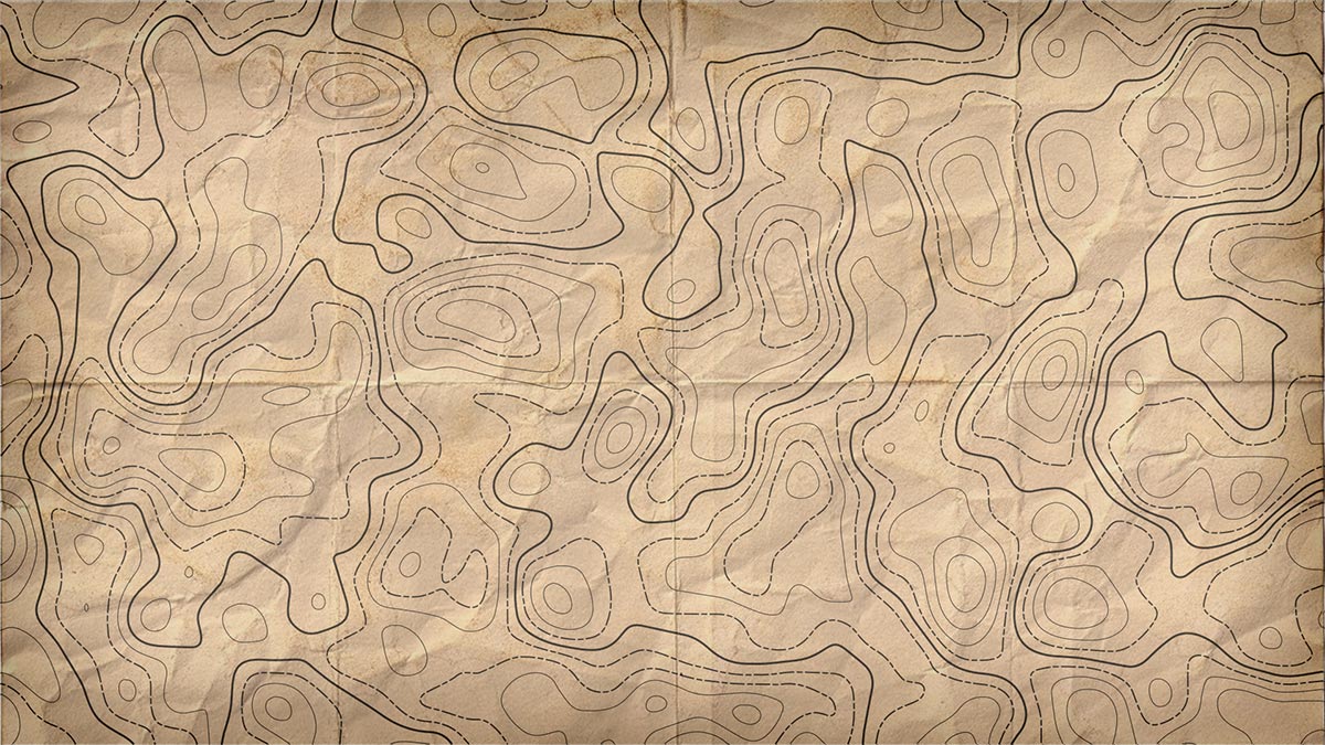
In today’s video tutorial we’re going to combine the powers of Adobe Photoshop and Adobe Illustrator to create a contour map effect, you know, the ones with loads of lines that show the topography of the landscape. We’ll use Photoshop’s filters to produce the basic contour map effect, then we’ll bring it into Illustrator to vectorize it, then customise the paths to add various line weights and styles.
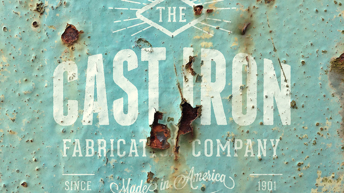
In today’s Photoshop video tutorial we’re going to realistically apply a rust texture to a design. This can be done with any kind of image, it could be a single colour logo like I’ll be using in this example today, or even full colour artwork or photographs. The technique makes use of the the Channels in Photoshop to make a selection of a texture, which is then used to erase the artwork wherever there’s rust. Because we’re using the Channels rather than a manual selection, every single tiny detail is captured, which produces an ultra realistic result.
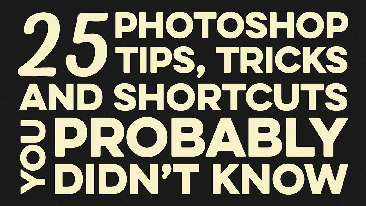
In this week’s video I’m going to run through a bunch of handy tips to help you develop a faster workflow. A lot of us use Adobe Photoshop on a daily basis, but no matter how much of a veteran you are, you can always learn new little tips that will make you think “How did I not know this before!”.