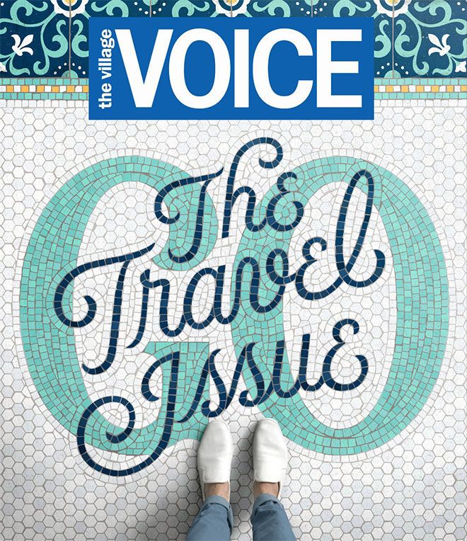
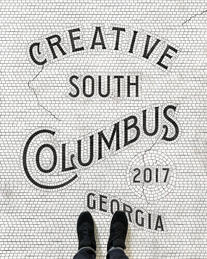
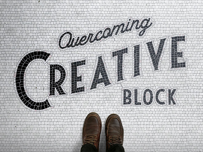
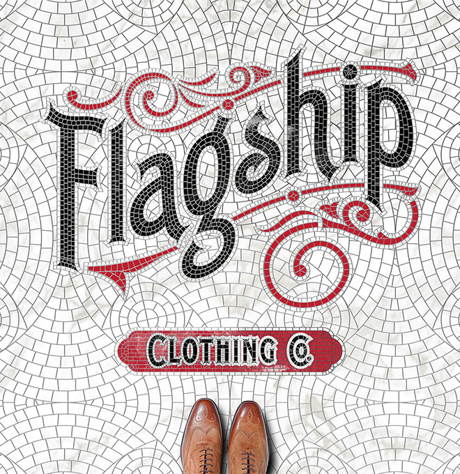
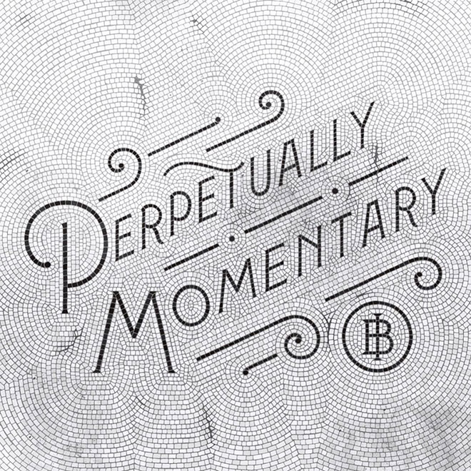
Fauxsaics are a newly emerging illustration style that is inspired by the classic tile mosaics found in hotel foyers, subway stations and public areas of some of the world’s most beautiful cities. Pioneered by the talented artist Nick Misani, these complex typography mosaic illustrations are becoming the next big design trend. Each piece begins in Adobe Illustrator, where the basic type is formed and surrounded by reference gridlines. The design is printed and painstakingly traced by hand to draw each individual tile outline, before being scanned and finished off with with colour fills and a superimposed pair of feet to simulate a real photograph of a tiled floor.

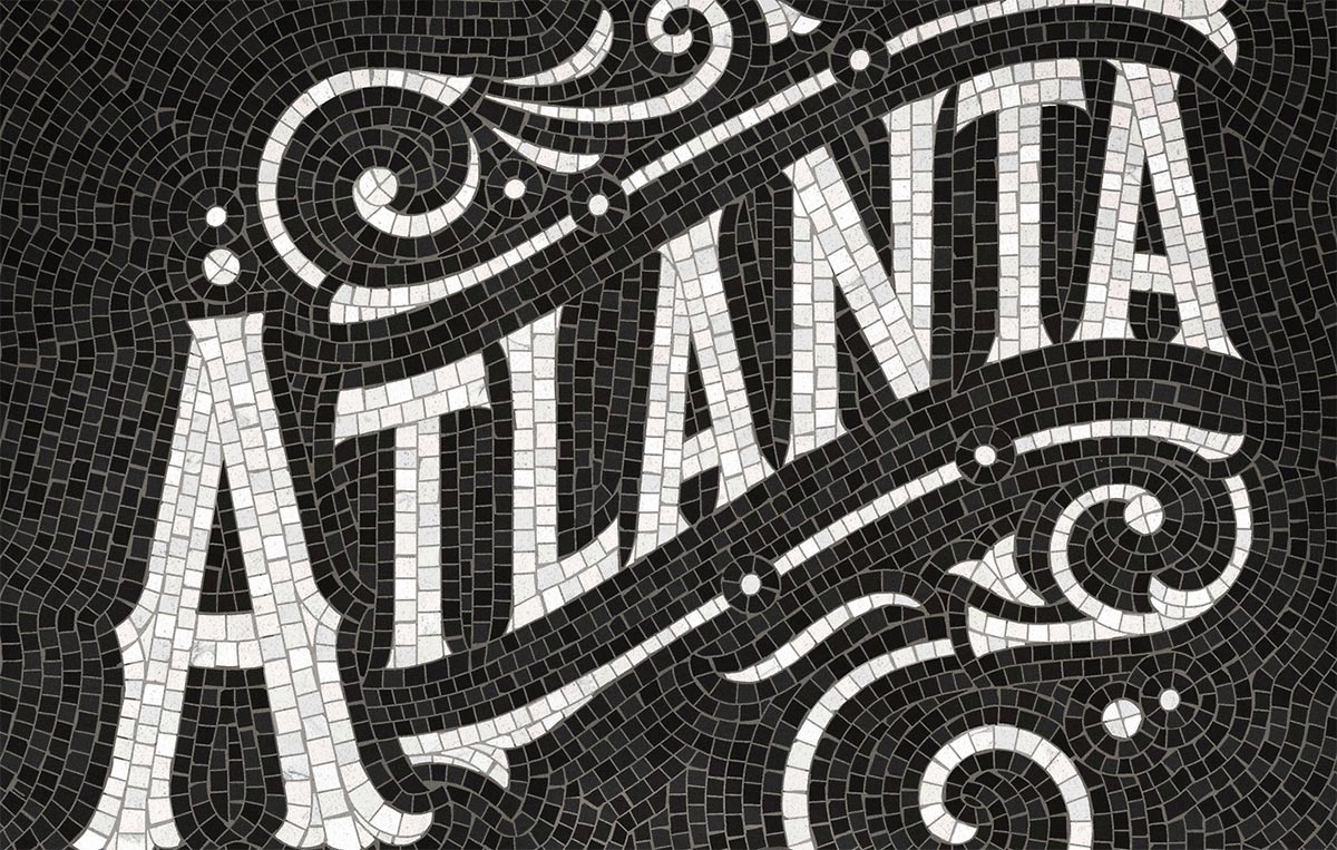
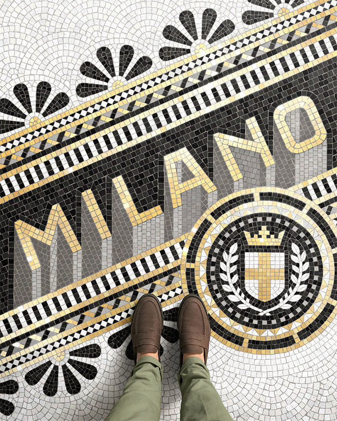
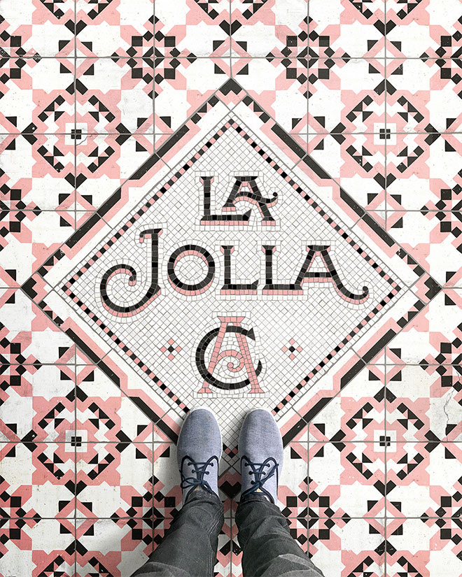
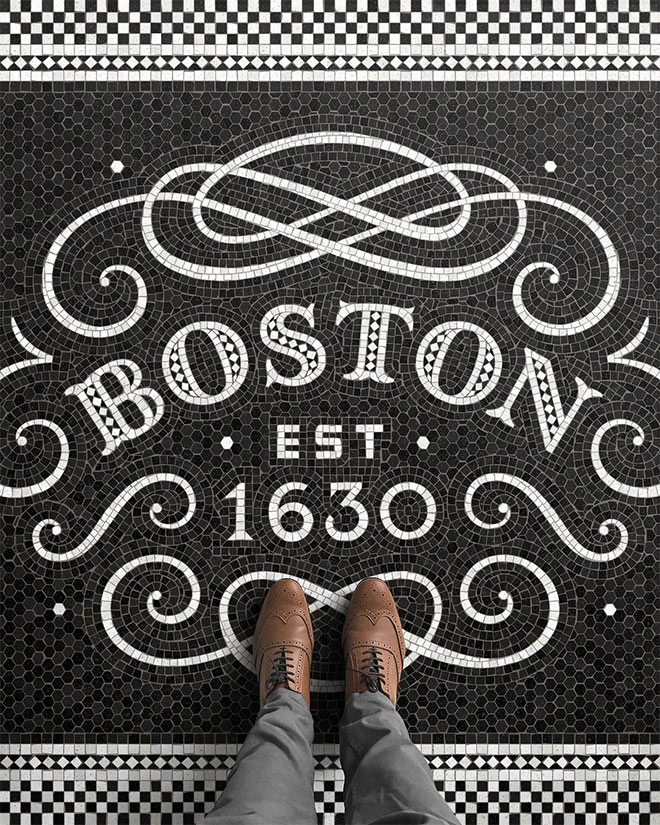
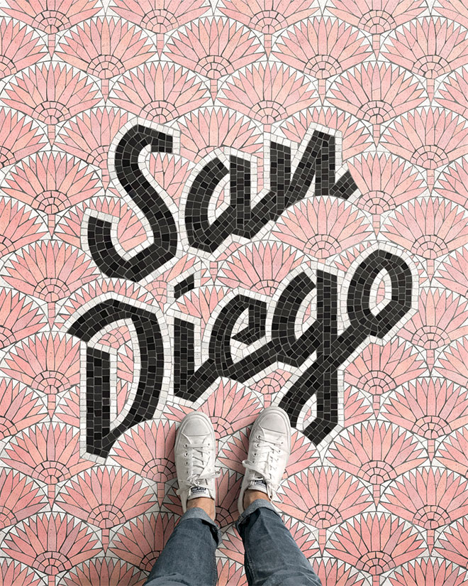
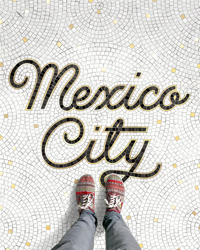
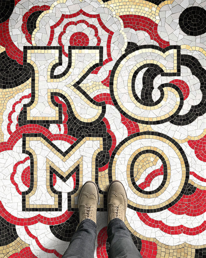
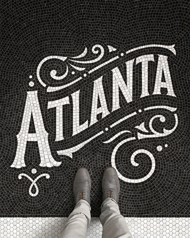
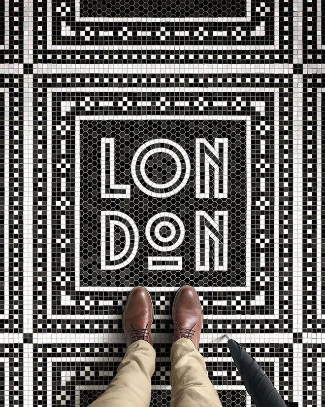
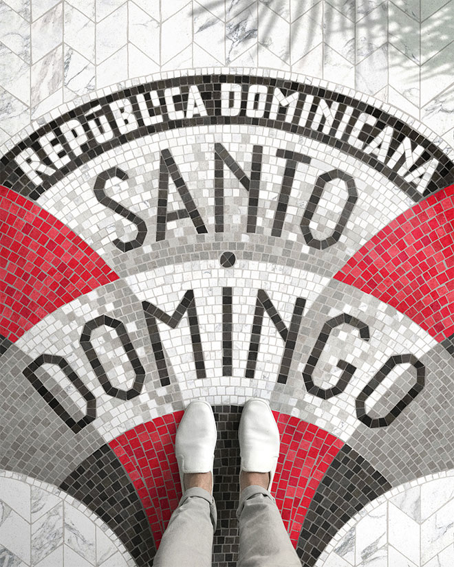


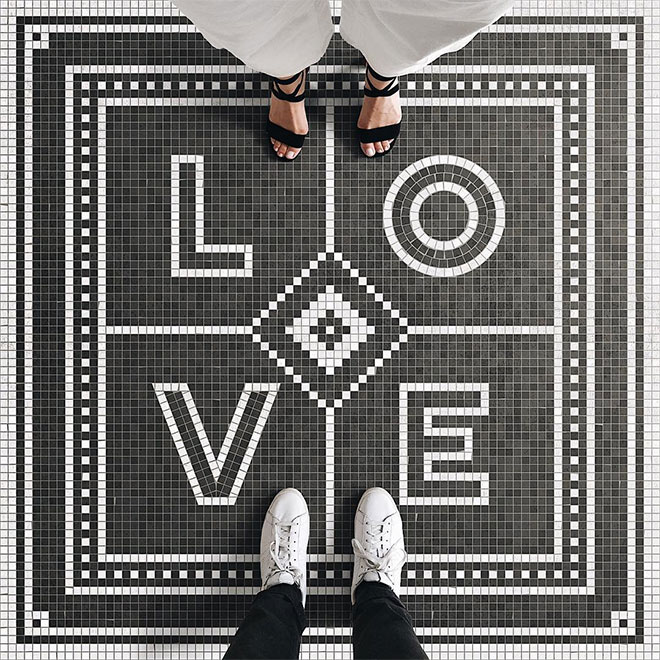

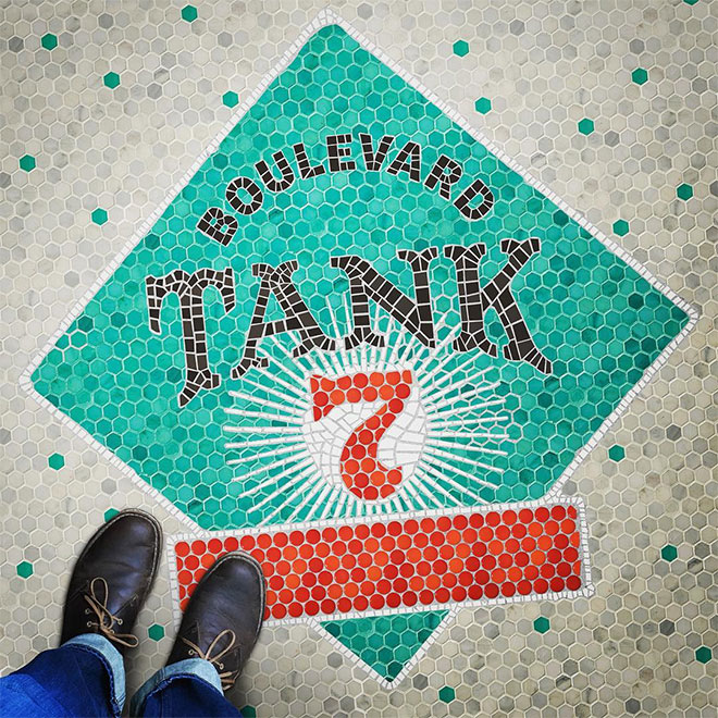

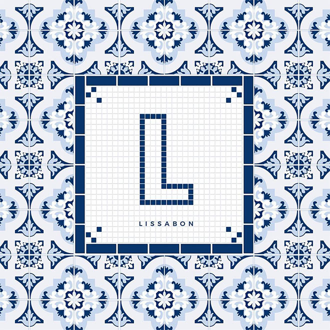
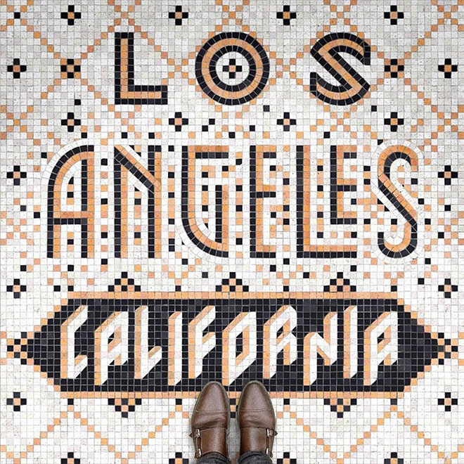
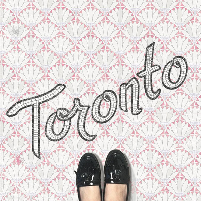
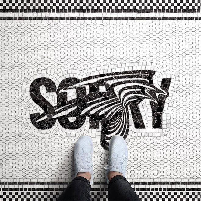
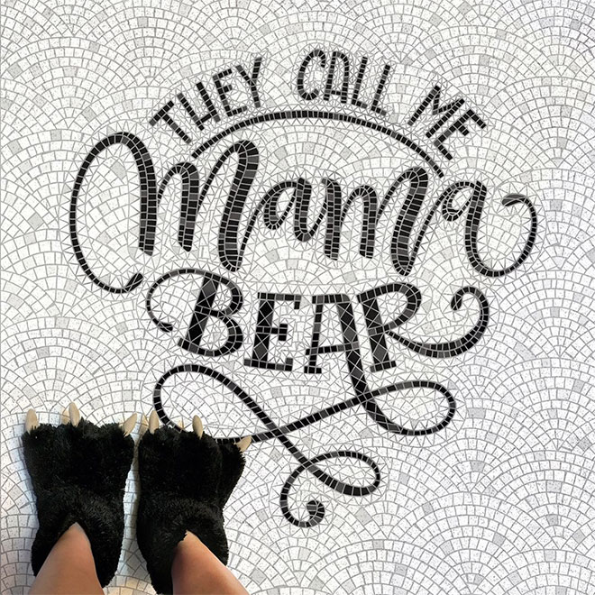

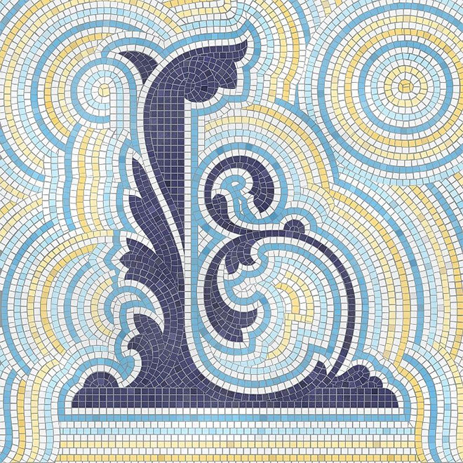

I can’t believe how intricate and detailed these are. Some people have a lot of patience. Milano would have to be my favourite with London a close second.
i need a tutorial! stunning! gorgeous! need to make one! :)
Hi Michelle,
I’ve just seen your comment. In my blog you can find a tiny How-to #fauxsaics Guide. Feel free to have a look. Maybe it helps you a bit. Looking forward to see your fauxsaic. http://www.feth.graphics/fauxsaics-v-for-vienna/
Have a nice evening,
T.
Great post for Great typography. The mag cover is one of my fav. Bravo to Nick Misani and to all the other fine typographers.
Nice work. Funny, though that I like the one without feet the best.
Fantastic ideas, incredible work and tons of time!! Beautiful!
In our downtown district, occasionally, one comes across an old mosaic, cracked and worn, in places one would not expect, like, where a former business once stood, but, is now a parking lot. They left the mosaic! Someone realized the importance!
Thank you for sharing these. I couldn’t help but notice that Nick Misani’s are quite large and colorful, whereas some are mainly the name. There are some near the end that are colorful, too, though, I really like Nick’s!
Thanks for this!
Su
Love it!! Please post tutorial!
There’s another technique where it can all be in illustrator. After the initial text lay out is created, it’s possible to use a collection of ‘primitives’ – square, hexagon, arc and arrange the shapes manually.
The border around London or the background of Atlanta could be built up quit quickly, possibly even Rio. With some detailed variation placed by hand. Even the border around ‘Flagship’ could start as an offset path.
Add some texture and a few graphic styles to the fills and you’re a long way there. Still going to take ages though
Tutorial please, Cheers mate.
Great stuff!
Amazing! Please post tutorial!
Great post guys but the LOS ANGELES CALIFORNIA was created by NICK MISANI not KOT SIFIR as you can see in his instagram >>> https://www.instagram.com/p/BQ3TrttFyCq/
Meraviglioso!!!
Hi Chris,
Thanks for including some of my work here. I’m really proud and appreciate it. I made a tiny ‘How-to #Fauxsaics’ Guide on my Blog, from my last project. I think this could be interesting for some guys here. http://www.feth.graphics/fauxsaics-v-for-vienna/
Love from Vienna,
T.
These are stunning. You can see how much time has gone into them – they look so real! I love this style and really want to have a play with it. Thanks for sharing!
Amazing Styles , I didn’t even knew about typography before reading this but now I know and have seen such amzaing designs , thanks for sharing !!
Nice tutorials and amazing designs
Good post,thanks
very good
Really good, #fausaics – Love the hashtag!
Haven’t really picked up on this trend yet, but will certainly keep an eye out and thanks for sharing the advice and tutorial above!