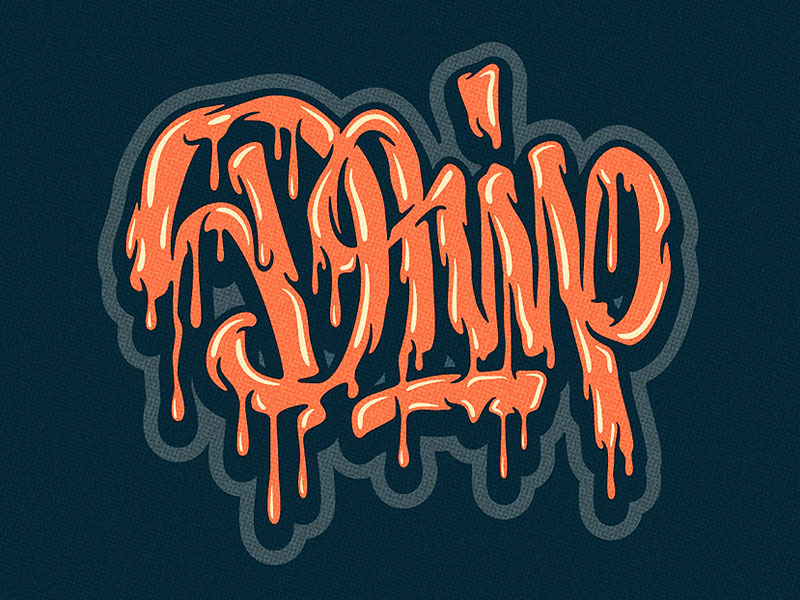
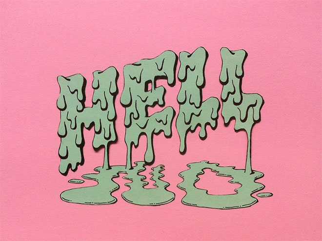
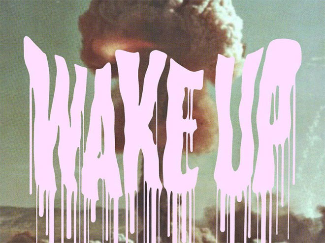
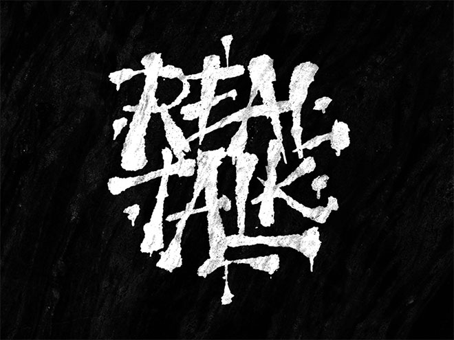
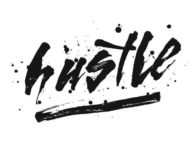
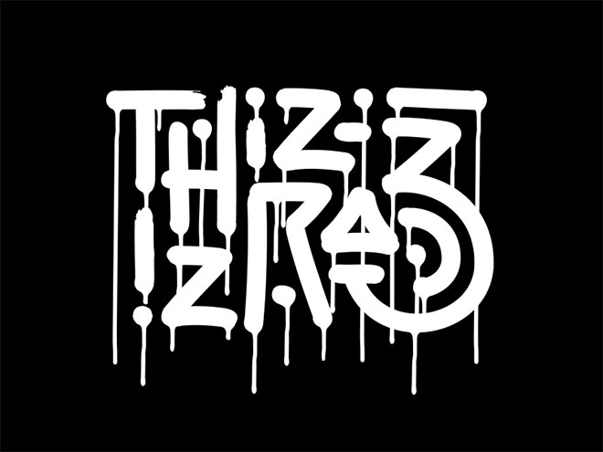
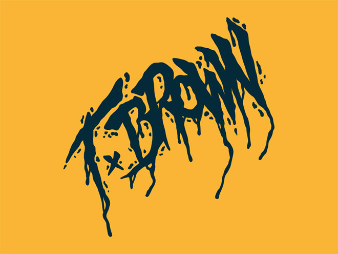
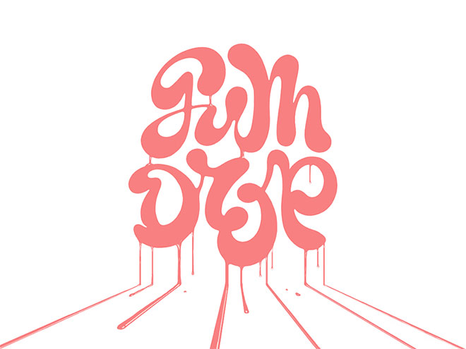
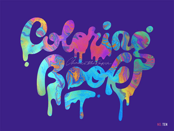
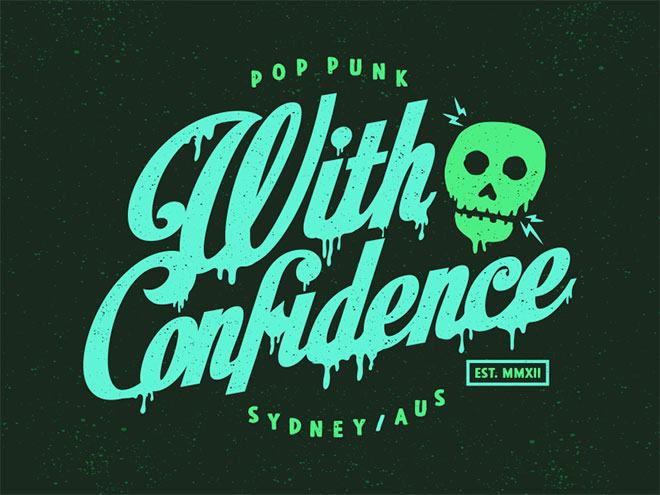
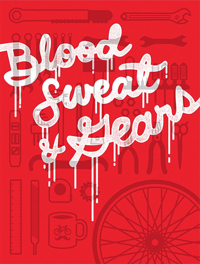
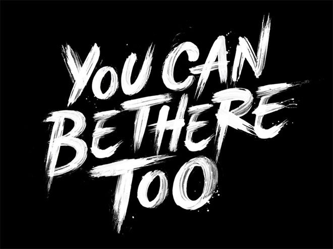
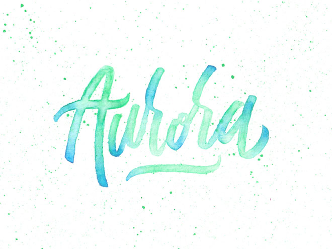
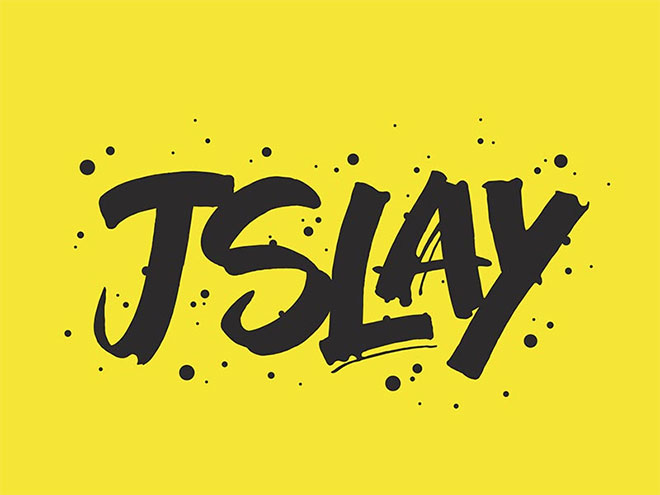
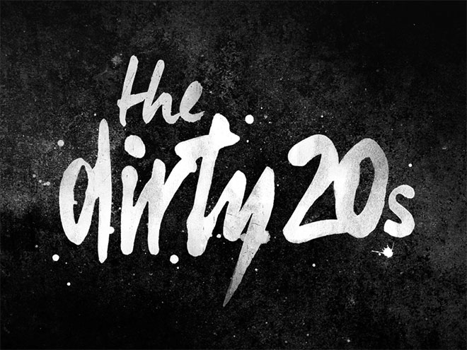
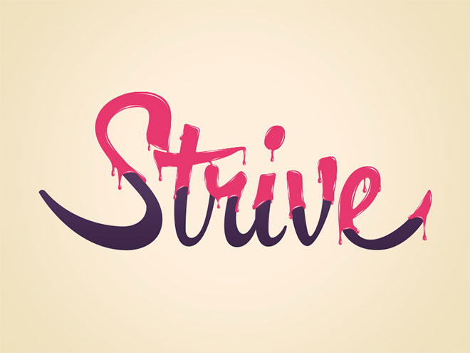
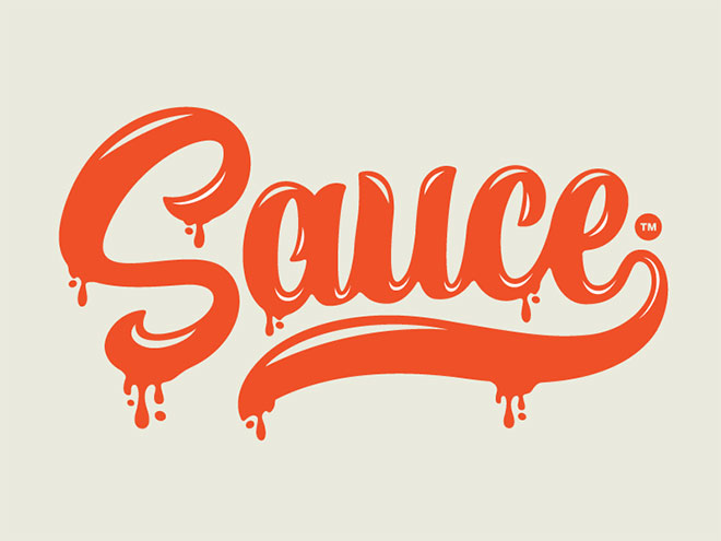
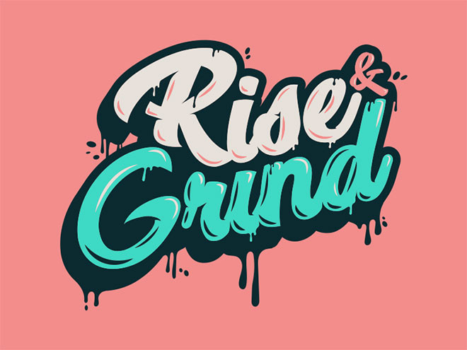
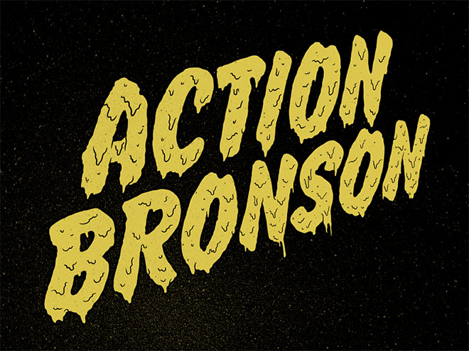
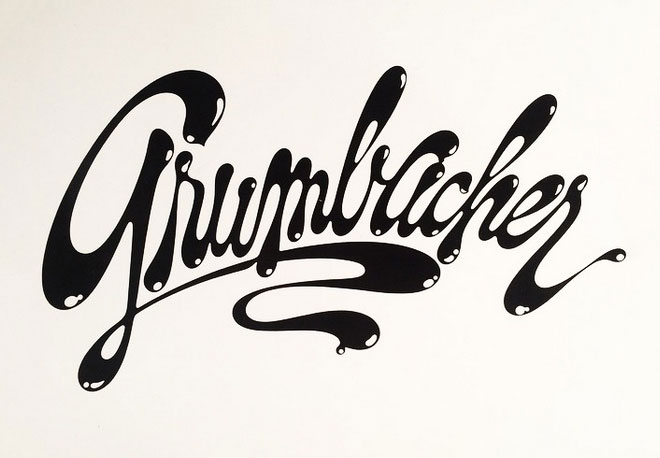
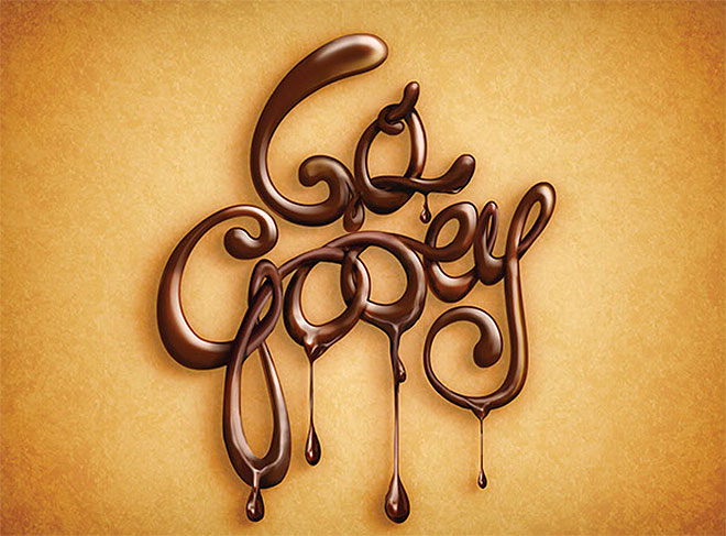
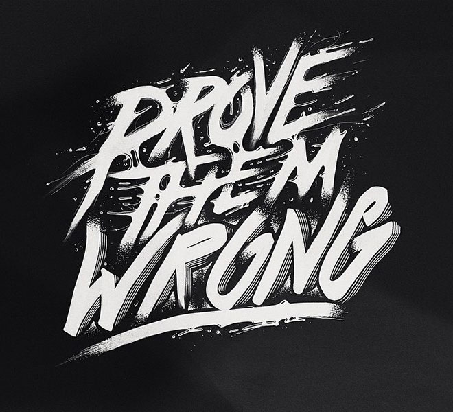
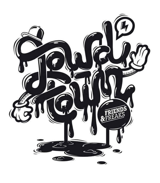
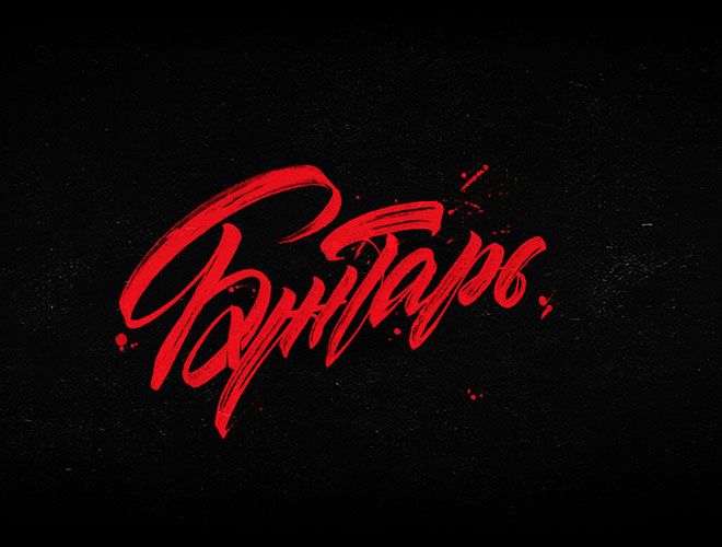
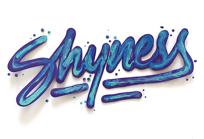
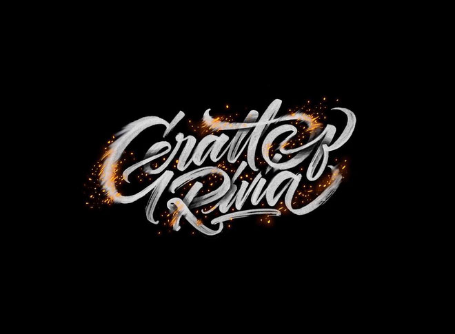
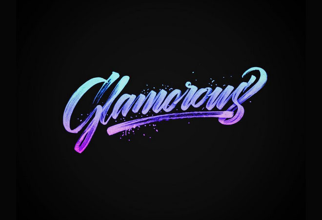
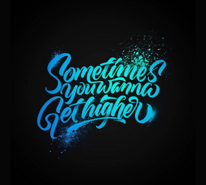
Paint drips and ink splatters are usually the side effects of producing lettering by hand with pens and paintbrushes, but these kinds of aesthetics are also incorporated into digital type designs to retain that popular hand made look. The type styles that result in messy splatters and runs are those that are created with fast and rough strokes, often using script styles where the characters are drawn in one continuous motion. In today’s showcase I present 30 custom lettering designs from a range of artists, each one features some kind of gloopy, graffiti or grungy appearance.




These are all cool! I wish there were how-to’s with some of them!
Thank you!
Su
Real Talk is my favourite
Nice styles, I have to go with “shyness” as my fave. Would love to get some CS tutorials as well, how to create, save – load :)
By the way thanks for featuring some of my works in your Fractal post – I’m pretty sure there is a version for Mac, when it comes to Apophysis >> http://argothar.deviantart.com/journal/Apophysis-on-Mac-Working-Tutorial-214235432
I haven’t been on this blog in faaar too long! Love the style of these designs. I’m working on a brushstroke lettering project at the moment, and these designs are inspirational. Thanks!
Some of the works are outstanding and read my mind to help me a lot. Thanks, Chris!
Some interesting uses of typography, will endeavor to experiment with some in the future :-)
DAAAAAAAAMN, I had this article in my pinned tab for a while and just saw that I was featured, haha. Thank you so much!