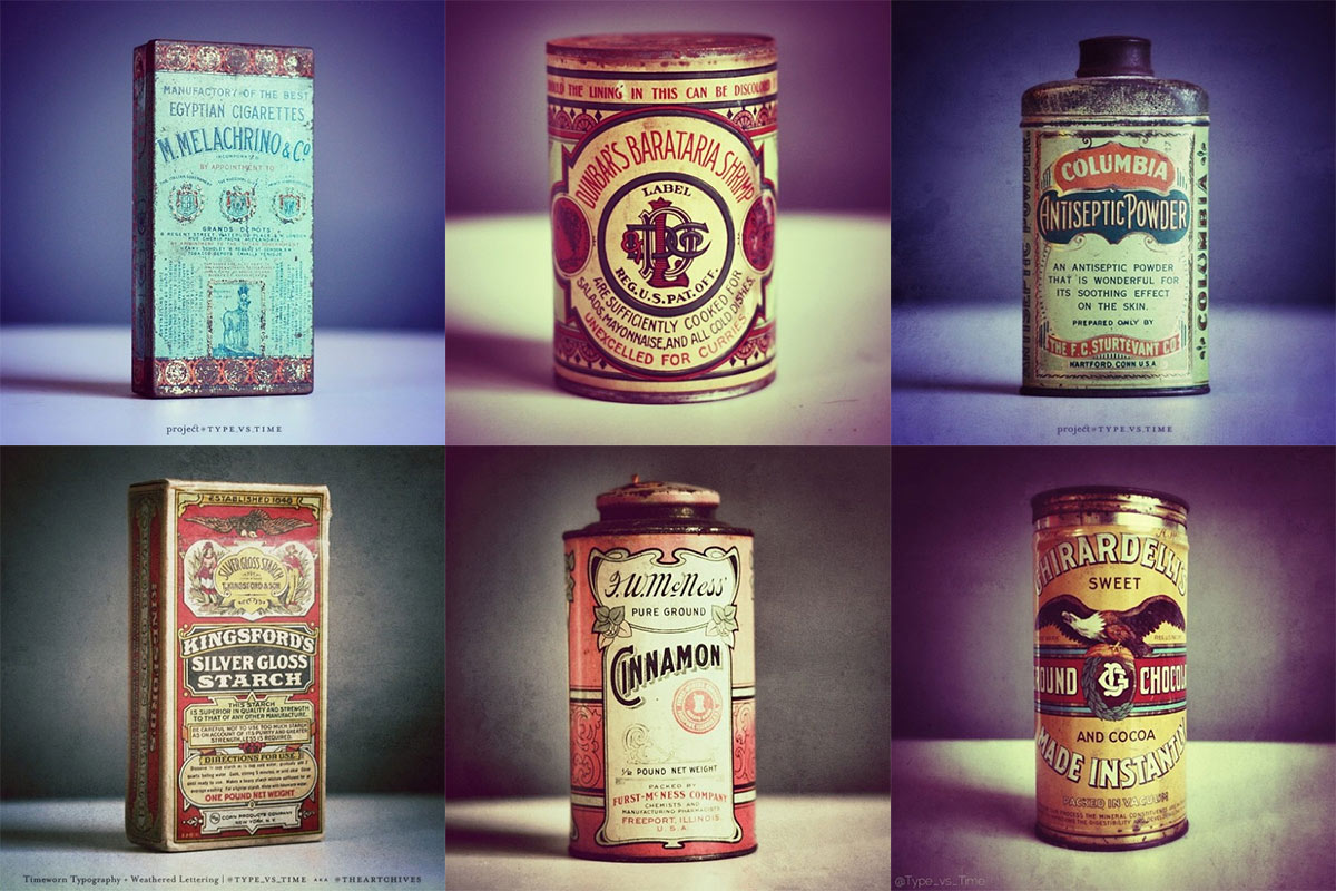
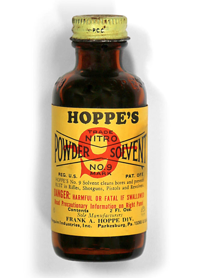
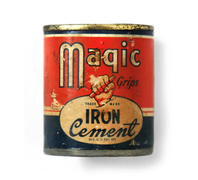
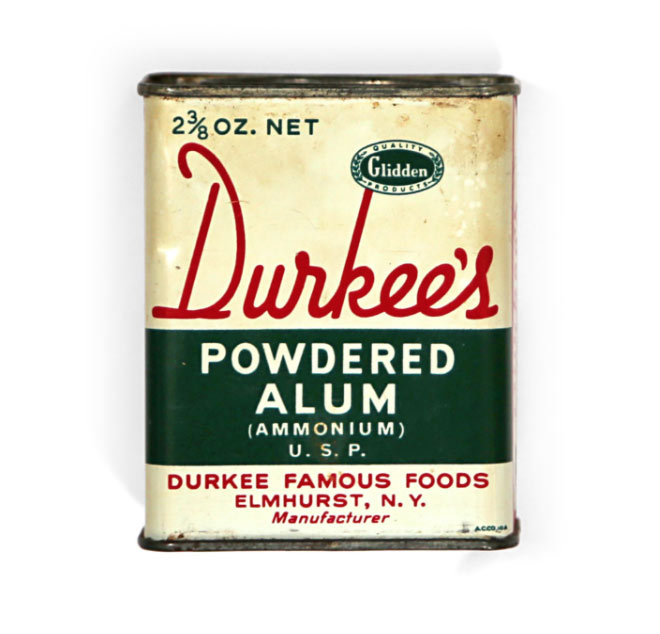
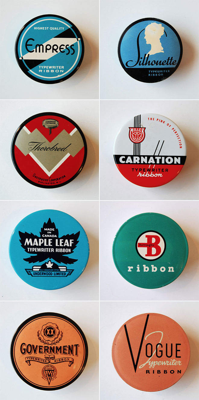
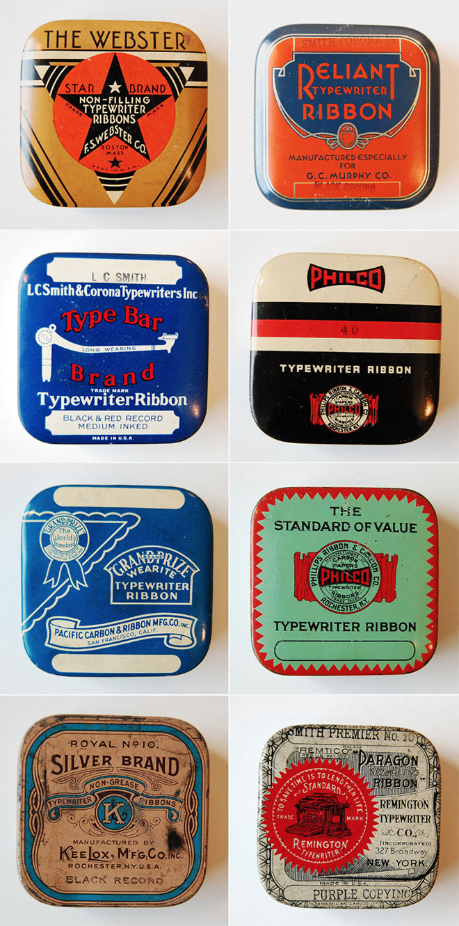
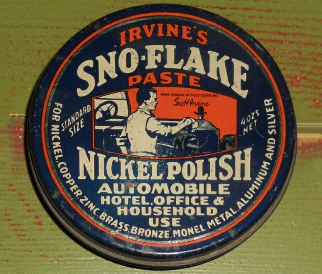
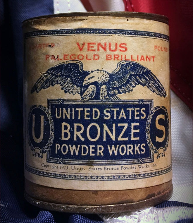
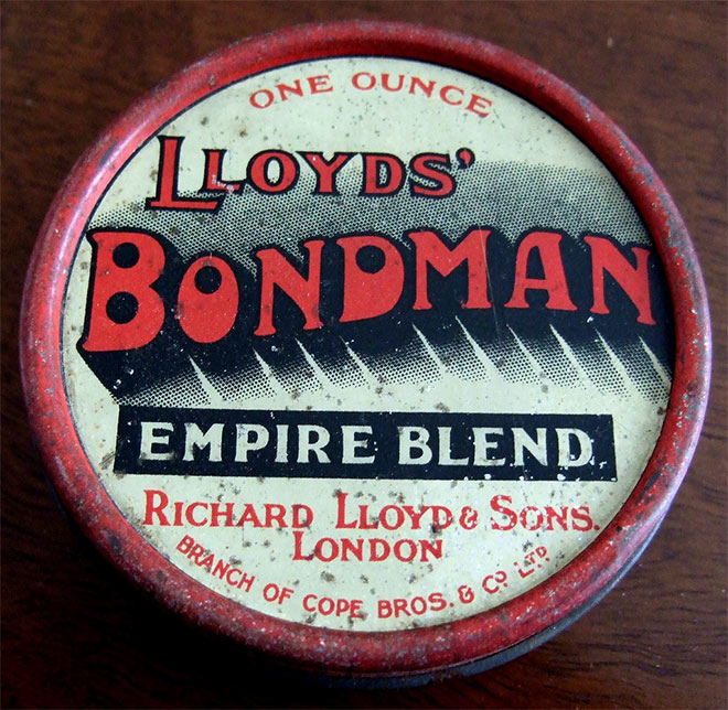
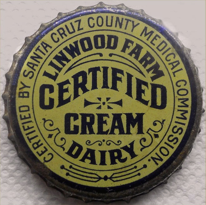
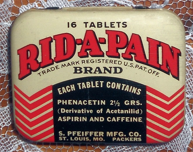
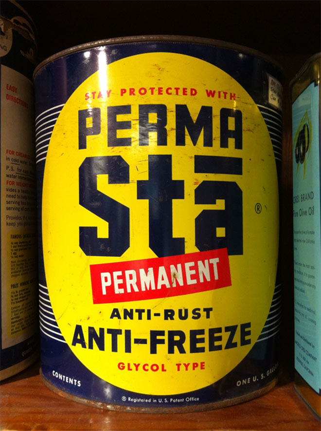
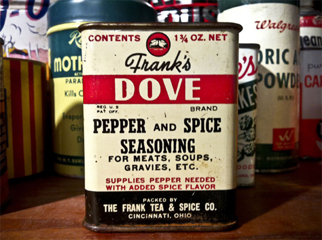
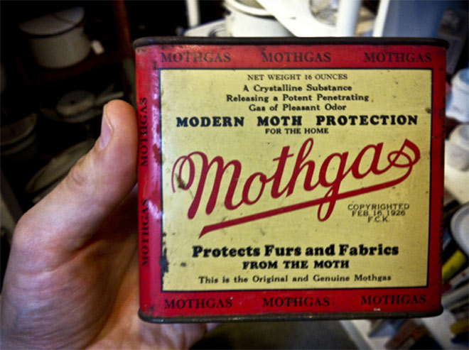
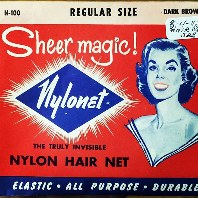
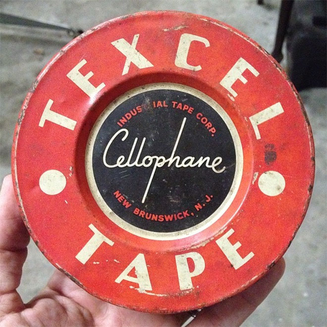
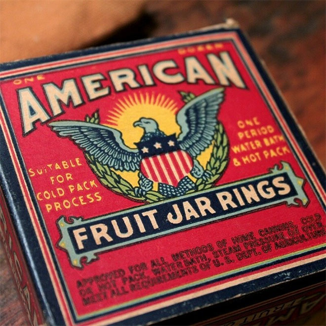
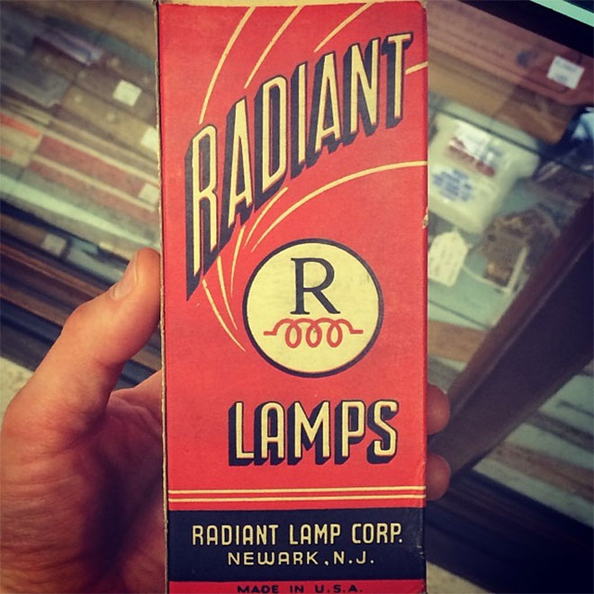
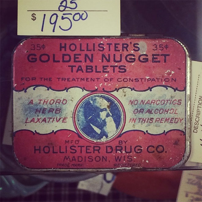
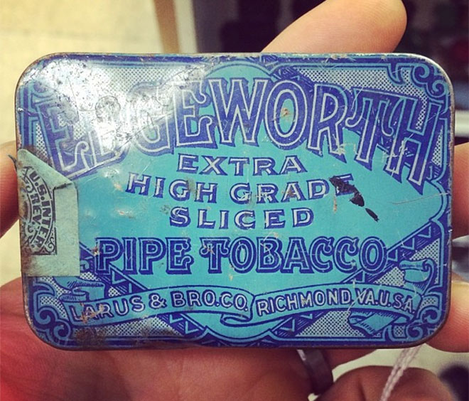
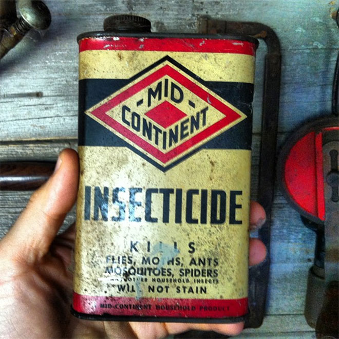
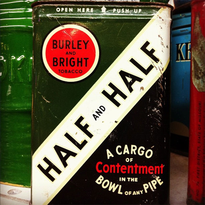
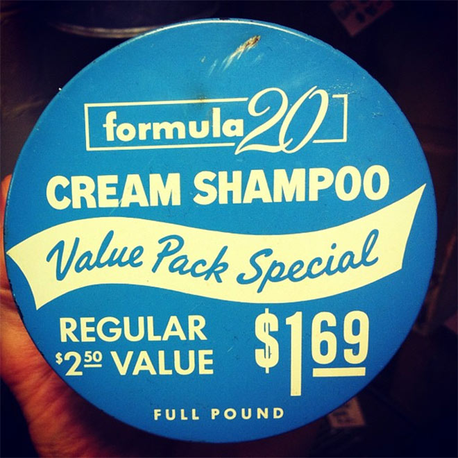
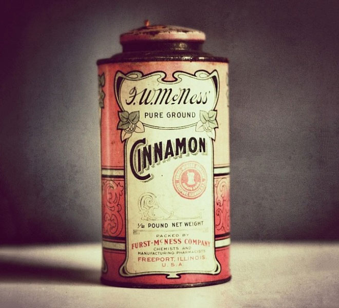
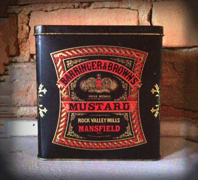
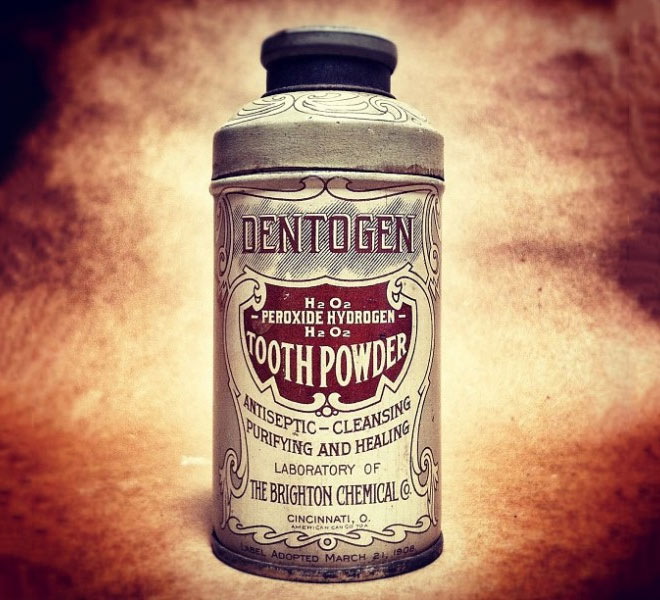
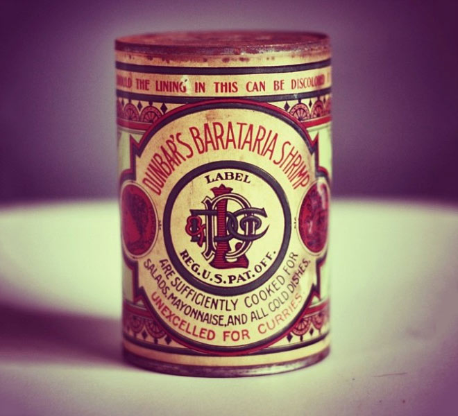
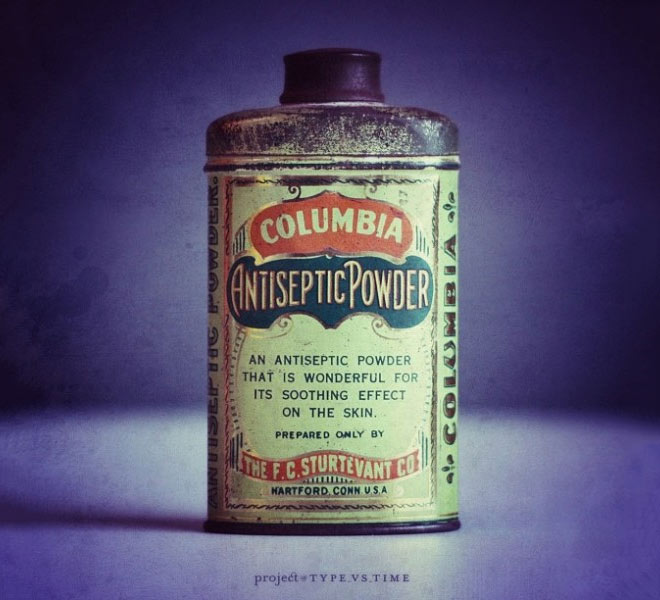
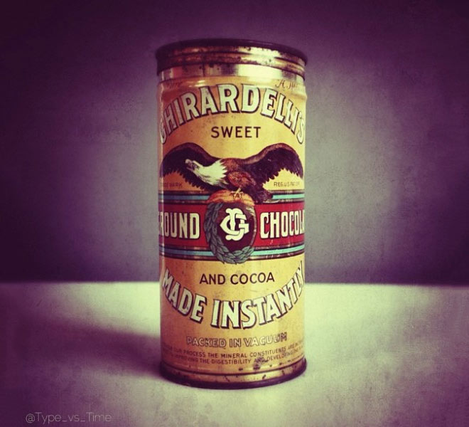
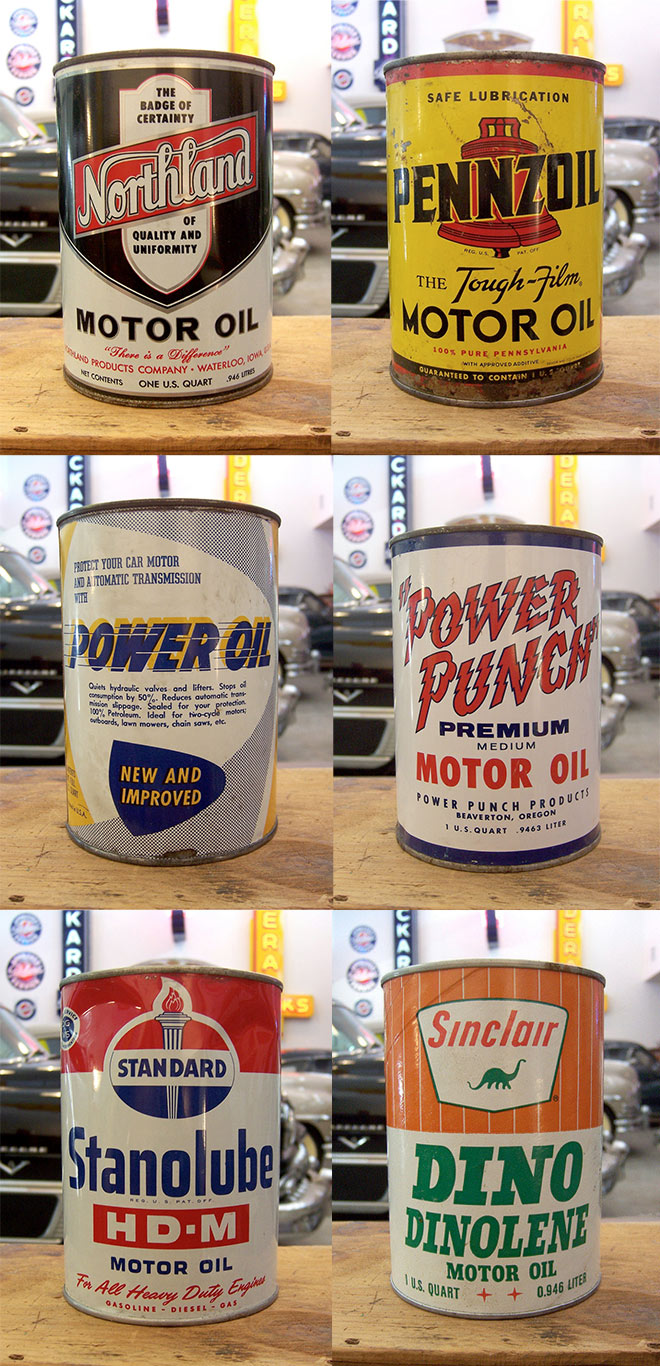
Old packaging designs from previous centuries provide the ultimate vintage design inspiration. The best way to achieve realistic vintage effects in your modern artwork is to study the aesthetics of authentic examples. These relics were once every day household products with ordinary packaging artwork for the era, but as design styles and printing technologies have developed, designers are now finding new appreciation for the classic look. Check out these rare treasures and make note of the colours, layout and typography to inspire your own vintage style designs!

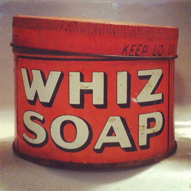
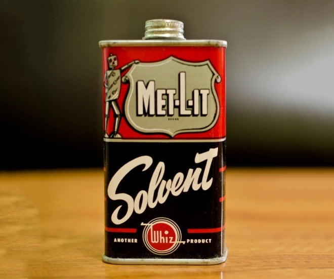
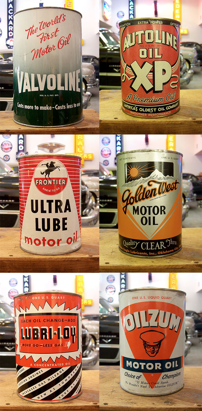

Whiz Soap and Oilzum! Great collection. Ta for post.
Thanks Blanche!
Thanks for the great roundup! Saved to my Pinterest board.
Great! I’m glad you liked the collection!
Thank you so much for this showcase! It really got my creative juices flowing this morning!
Great!
These are great! Thanks.
Thank you Rick!
Thank you so much for posting this !!! good work
Glad you liked the collection!
Gosh! It makes ya wonder what happened to all the brands. Such detail on some of the labels! Which, I see are all printed on the containers.
I remember getting a can of snack sticks, or potato sticks. In one place, the label was worn and my brother and I could see something written beneath the label. We scratched the label off to find a beer can underneath! Budweiser! Talk about recycling! That was 50 years ago or more!
Cool piece, Chris! Thank you!
Su
Thanks for your comment Su, its a nice background story to the post.
Fantastic collection, thank you!
Thanks!
Thanks Chris ! Really inspirational.
On the very last image you can see where Pixar got the idea for Dinoco in the Cars films… ;)
Good thing about vintage is that it inspire more when you see it “as a design” but for real… you cant use it to your modern product. Imagine you have new lotion produced and you want a design, tell me if you are going to use on of those above. it tests good in seen not in action
These are great, Chris! It’s interesting how a lot of these old designs have the manufacturer location front and center whereas nowadays that’s in fine print on the back. I wonder why that is…. Also, a lot of them proudly say “Reg. U.S. Pat. Off.” I’m certainly inspired to be more authentic! Thanks!
A very interesting question there Jesse… Thanks!
Thanks for the wonderful, fascinating and nostalgic pictorial! Really enlightening, entertaining… and just plain cool!
hi! thank you so very much for posting this!
Thank you so much for this great collection. Ta for post. Saved to my bookmarks.