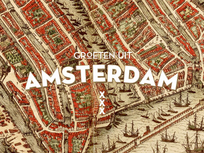
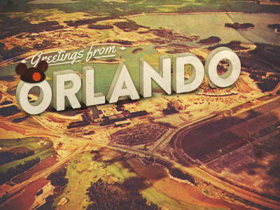
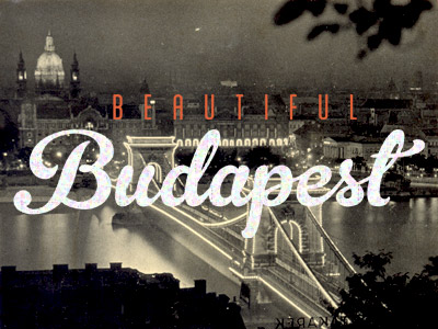
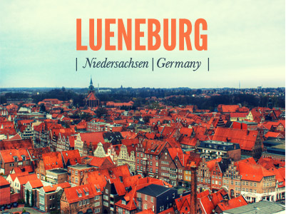
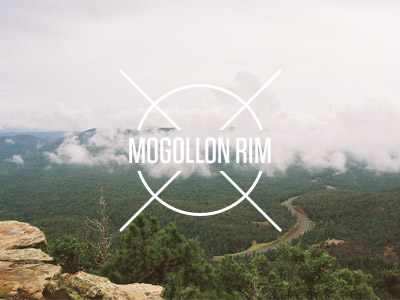
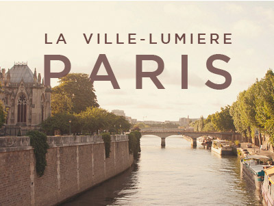
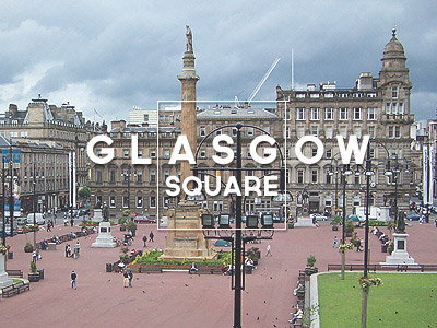
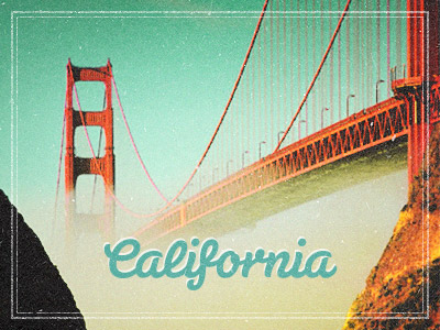
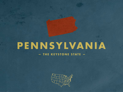
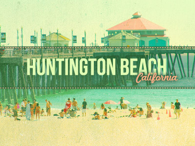
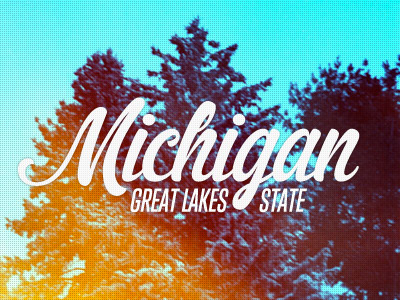
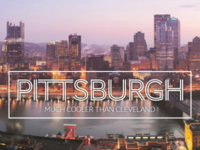
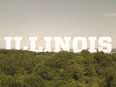
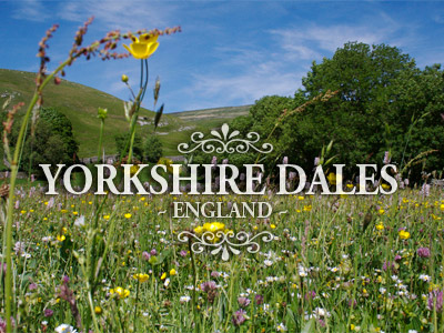
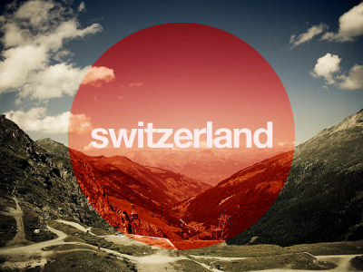
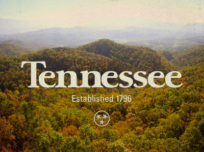
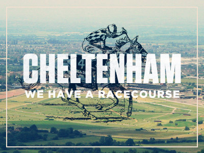
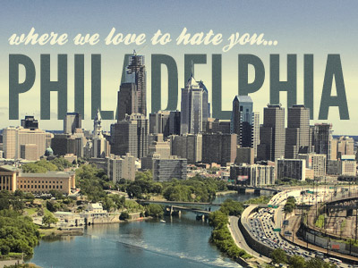
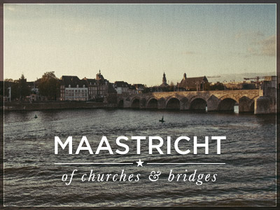
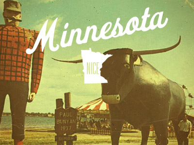
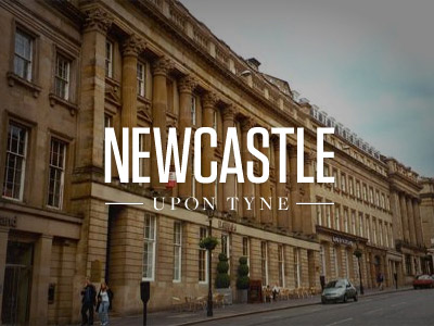
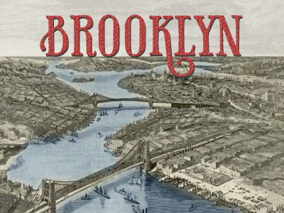
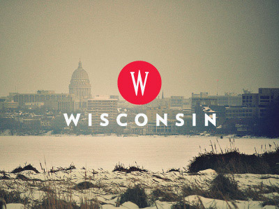
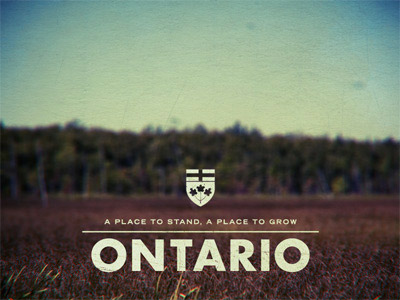
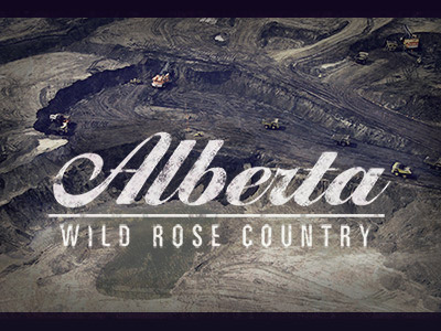
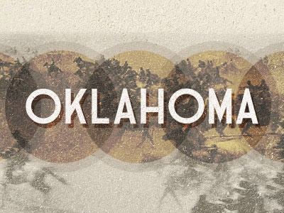
Every place on Earth has its own cultural influence that can be a great source of inspiration for a Designer. This post showcases a range of typographic designs that capture the character of various cities, states and countries from around the world.
Video inspiration
Wanting more?! This collection of “Live The Language” video commercials features some amazing typographic work by Albin Holmqvist, each showcasing the culture and language of various cities around the world.






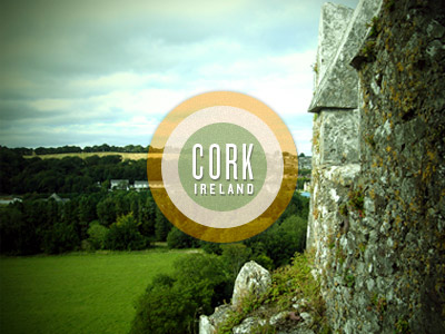

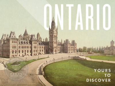
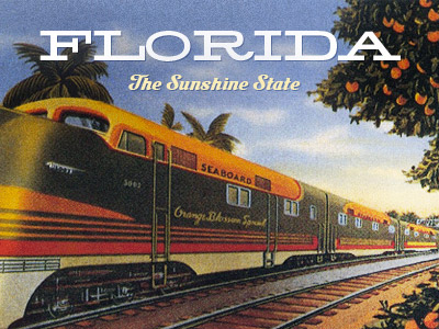

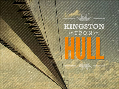

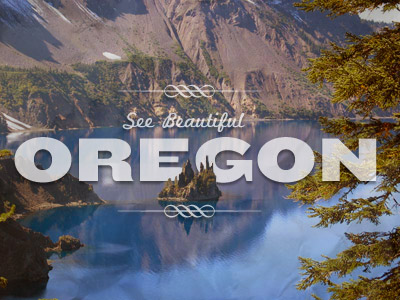
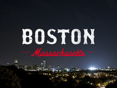

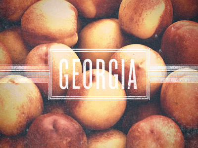
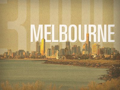
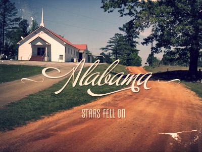
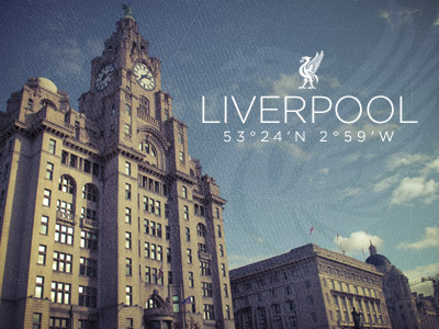



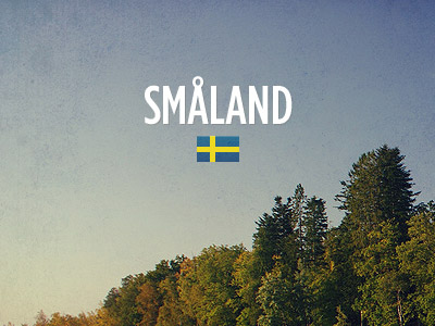
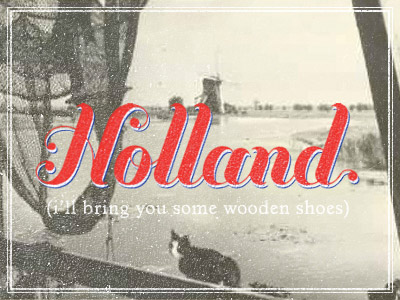
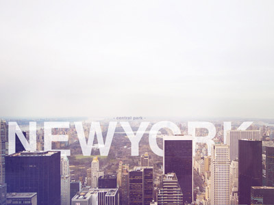
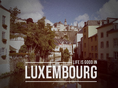

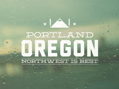

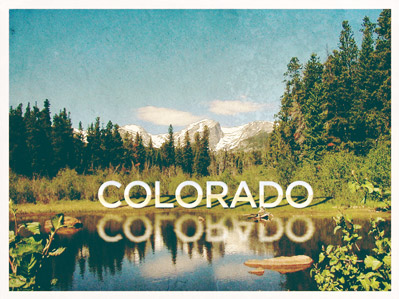
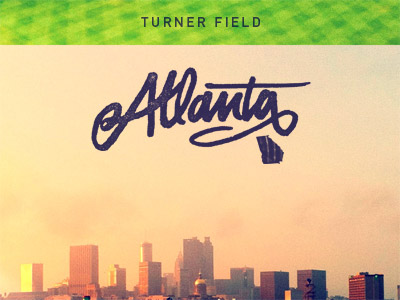

I guess its time for redesign, with bigger images :)
Wow, nice collection! I’ve seen these type of things loads in the past, but I’ve never really seen them all together like this.
Also, Newcastle represent!
Love it! Especially the inclusion of Alberta TWICE! Very political of you, too.
I thought I’d made a mistake and posted the same image twice, but there must just be lots of great designers from Alberta ;-)
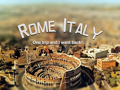
Lovely stuff. The kerning on “Italy” made me throw up in my mouth a little bit, though.
me too.
Me three!
Great collection as always!
ooh waw nice.
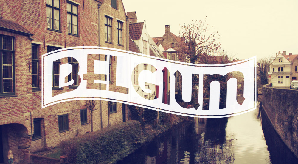
and YAY Belgium ^_^
Funny, I just created one for my trip photo yesterday and now I have got more inspirations on typography design! Thanks for the great collection!
Mate this is one fantastic collection, that must have taken an age to pull together. I especially like the Oregon image, but in general they are very good. Thank you
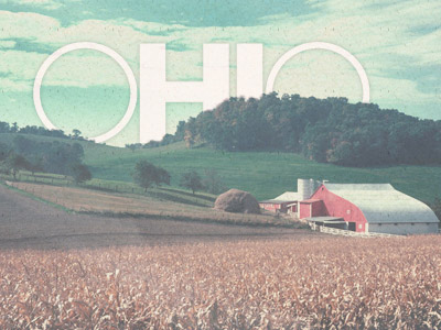
I love seeing these typography and image designs! I’d like to say that Ohio was my favorite to support my home State, but they’re all so good in their own way! As always, thanks for sharing, Chris! :)
Quality post Chris, check out these gems I stumbled on the other day:
http://been-everywhere.com/
– perhaps you’ve seen it.. more logo I guess but beautiful nonetheless.
Beautiful typogrpahy, my only wish is that I could view them without the images and all in plain white, then you can really compare them and appreciate their quality, without the distraction of the images behind – lovely as they are.
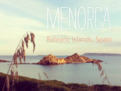
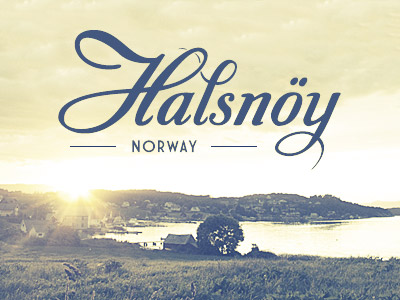
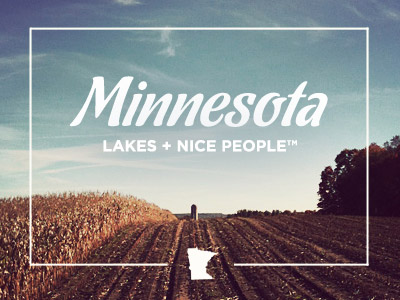
You get a real sense of character from each design, depicting the qualities of the said location. Some of my favourites are Oklamhoma, Michigan, Minesota, Halsnoy, Kentucky and Menorca.
Amazing stuff here! Thank you Chris ;)
Sweat awesome collection!
gh. The one for Rome is not beautiful as the others are! :(
Maybe could I help? :)
Lovely collection.
Hi Chris,
Great post, as you flick through you can tell that they are applicable to the city, suppose we should remember this when designing for clients…
Thanks
Joe
nice collection i love those color combinations thanks for to share ;)
I just love your blog Chris. Thanks for always producing such helpful posts. I love these city designs. Phuket was right on!
great design !
Hey. I love your blog. Um. May I ask what are the fonts used in those typos? :)
Beautiful set of type, I will try my own for the cities I call home! thanks for the inspiration as always
This has been awesome.
can we still submit an entry for our country??
I’m wondering the same thing! Can we?
oh dear! i want those fonts – at least a few!
needless to say that most of these are beautiful images anyhow.. :)
I Hope that Rio de Janeiro – Brasil, comes into your photo projects!