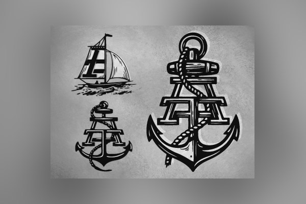
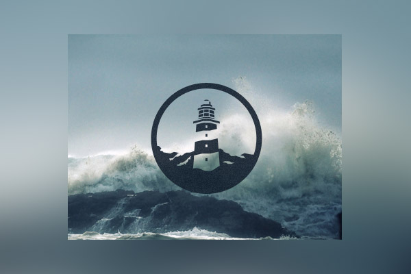
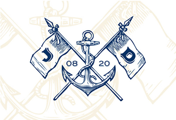
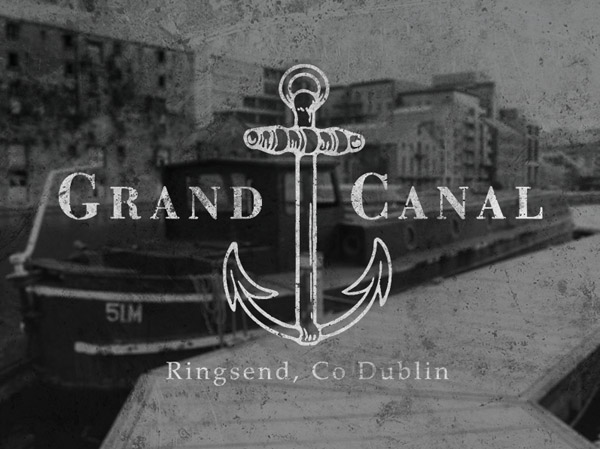
Nautical themed logo designs have remained popular for years, particularly in seaside towns and cities as businesses and restaurants preserve their coastal heritage. This post showcases some modern examples of how designers are using this naval theme in their logo designs, often incorporating icons of anchors, ships and rope as decorative elements or texturing the design to produce an old weathered appearance.




Don’t anchors make great logos / graphics.
I assume its because they have a nice shape and are symmetrical?
Love these designs!
Love these logo designs. I’ll admit I never new an anchor could look so good in a logo design.
Plenty awesome logo designs collection. You have done really a amazing work. All logos have detainee !!
I like them all. I didn’t know how great anchors can look like ;)
“The Galley” by Jonathan Schubert – looks ‘most classiest’ to me (probably the well fitted combo between imagery and color)
:)
~Steve
Nice list. I’m liking the distressed look on CXXVI Clothing and Nature’s Plaything.
That’s a nice collection you got there…
Yeah! A inspiration for this summer! Who wanna a customized logo for nautical?!
漂亮!!!
nautica is definitely not the easiest font to play around with but those designers whom you have showcased I must say they have done good job but I still think if you want to choose nautica you better think before doing it.
Very Cool Designs, Creative and Unique. Thanks for the inspiration!
Some really cool designs here. Love the “Never Fearful” one best.