One of my old posts from 2008 titled Designing for Print – Setting Up Crops and Bleed quickly shot to the top of Google and has become one of the most popular posts on my blog. I haven’t posted much on the topic of print design recently, but I thought I’d provide an updated guide to designing for print. Here’s my tips and recommendations for setting up, designing and exporting designs for professional printing.
Which program should I use?
Adobe Photoshop, Adobe Illustrator and Adobe InDesign are the three main options when it comes to creating graphic designs for print. There’s pros and cons to each application, but rather than create your entire design in a single app, you should make use of each program’s individual speciality.
Photoshop is a great tool for working with raster based images. Use it to edit photos and create awesome visual artwork for the background of your designs.
Illustrator is a great tool for creating crisp vector artwork, but it also features some comprehensive print design functionality. I enjoy using Illustrator for small scale print jobs that don’t require multiple pages.
InDesign is a robust desktop publishing tool. I use InDesign’s powerful layout tools to create multi-page designs such as brochures or leaflets.

When creating a design for print I’ll often construct a background in Photoshop (Don’t forget: 300ppi, CMYK mode), save it as a full size JPEG and Place it into Illustrator. On the other hand if the project requires multiple pages or long passages of text I’ll use InDesign’s powerful paging features to keep track of the full spreads.
What size should the document be?
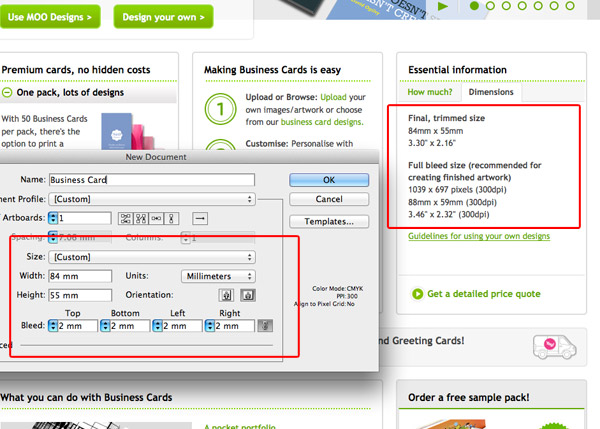
Printed products come in all shapes and sizes. Sometimes there’s a standard, such as A4 or Letter paper dimensions, but other products can vary drastically. Let’s take business cards as an example. The exact dimensions of a business card will vary from one printing company to another. Before starting any design work make sure you choose a supplier and find their document requirements to avoid having to rework your layout later. Most companies these days list their products online and provide sizing information or guidelines.
The beauty of working in print is you can also create bespoke products in custom sizes. This is when it’s handy to find a local company you can visit, or at least contact an online printing company to make sure they can accommodate your needs.
Don’t forget the bleed!
One crucial step when setting up your print documents is to remember to accommodate for bleed. Again, the exact amount may vary from company to company and product to product, but 3mm or 0.25″ is a common figure. Bleed is the area around your final document dimensions where your design is extended. This allows for slight inaccuracies when the printed sheets are being trimmed down to size. If the sheet is misaligned slightly, the bleed will avoid leaving a thin white strip of plain white paper down the edge of your design.
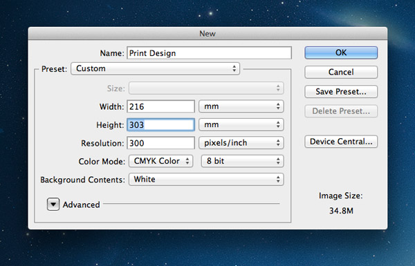
Photoshop doesn’t have any page layout features, so you’ll have to calculate the final bleed size yourself. It’s pretty easy though, let’s say you’re working on a 210x297mm A4 design and need 3mm bleed. This 3mm is added to each edge, so the width now equals 216mm (3mm+210mm+3mm = 216mm) and the height equals 303mm (3mm+297mm+3mm = 303mm).
In Illustrator and InDesign there’s options to add bleed when setting up your document. Enter the required amount and the program will offset a coloured margin around the edge of your design.
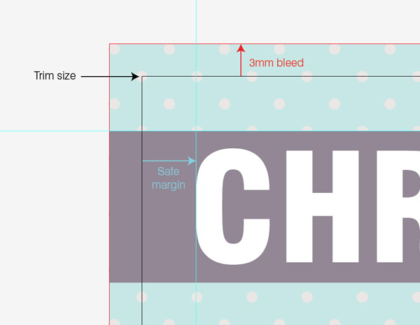
Only elements that touch an edge of your design need to extend into the bleed area. Background photos or images should be large enough to fill the entire bleed size (remember bleed area is trimmed off). Make sure your logo and any text elements are placed well away from the edges of the document so they don’t get accidentally cropped or look like they’re about to fall off the edge. It’s often useful to designate a “safe margin” between 5-10mm from the edges using guides. Place all your design elements within this safe zone to nicely balance your artwork on the page.
What color system should you use?
CMYK is the standard for print projects. Make sure you set your Photoshop document and Illustrator color palette to CMYK (not RGB) mode before creating your artwork. The spectrum of colours that can be produced in ink is much smaller than what can be created by light on your monitor, so working in CMYK from the start will avoid any unwanted surprises when you receive your freshly printed products off the press.
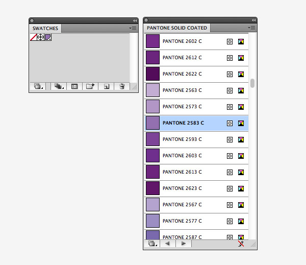
Pantone colors are another option. Pantone inks are ready mixed, so you can guarantee an absolute colour reproduction whereas CMYK colour mixes may vary depending on the printer’s individual calibration and setup. Most small print jobs will be entirely CMYK, but if you require an exact colour match (EG: a company’s corporate identity), you’ll have to open that library within Illustrator/InDesign and add the swatches to your palette. Keep in mind your printer will charge you extra for the use of the additional ink as it now becomes a custom job.
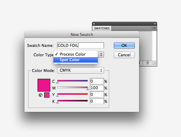
Pantone colours aren’t the only kind of custom ink, you can also choose crazy fluorescent colours, metallic inks and metal foils to really spice up your artwork. Again these custom inks drastically ramp up the cost of your prints and will require correspondence with your printer to receive specific instruction. Obviously we don’t have metallic colours or foils in Photoshop, Illustrator or InDesign, so you’ll have to identify these areas of your design with a custom Spot Color swatch with a recognisable name.
How do you export your design for print?
The required file type and delivery of files is again another factor that can vary between suppliers. Some online printing companies even allow you to upload a JPEG using their web UI. For small scale jobs with no custom inks a high resolution CMYK JPEG file can often be the safest way to go. It will avoid any strange reproduction if the vector file is opened in a different program or version.
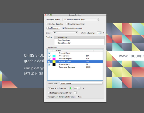
Otherwise an EPS file or a print PDF will retain your design’s full quality and preserve any custom swatch selections. You can even open a PDF file in Adobe Acrobat to see what colours swatches are used within the design and see their individual ink coverages.
When exporting an EPS or PDF file I prefer to outline my fonts to turn them into solid shapes (don’t save your working file after outlining!). Fonts usually cause the most trouble when a file is being sent between computers, so eliminating the possibility of a font mismatch will avoid any ugly prints coming back to you.
For large print jobs in Adobe InDesign, use the Package feature to bundle all the pages, placed elements and fonts into a handy digital parcel to send your printer.


Great Post thanks for sharing.
Its very similar to the way we follow for print here in my place. Thanks for sharing.
As I have previously commented that I am also practicing the same way. But I am facing color display problem. What I mean is I use LED monitor. It displays brighter colors in my design but after printing it looks quite different. So I want to know if there is any way to make my monitor display the actual color that is going to be printed.
Like Asoka I often struggle with color profiles and the way it is handled by both the monitors and the printers.
I don’t have a lot of print jobs, so I still use the old way of printing a lot of tests until I’m kind of satisfied.
Have you a more “scientific” way to handle this problem ?
Invest in a swatch book. You can get books for pantone colors or CMYK Mix percentages. Using a swatch book will get you much closer to your desired color on the first go around and save a tree or two.
Nice article!
On the topic of color spaces, it’s always best to check with the printer beforehand, since many printers nowadays use RIP software designed to print from an RGB file.
Benjamin, my favored method for getting colors right is to print out a sheet with as many swatches as you can fit on it using the printer that will print the final comp, then use that to pick colors, knowing the colors may not look right on screen.
This post couldn’t have been more timely! I like to do a lot of design work in Photoshop for everything from posters and banners to business cards and rack cards. Other than the larger file sizes, do you see any problems with this? Thanks!
What a brilliant way of explaining is such a way that your entry-level designer can understand! Thanks Chris :)
Great advices!
I would like to ask some tips to set up a document for web (*PDF) with ligh size and good quality.
Very creative design you have done. Nice explain so very easy to follow step by step. I think your tutorial is very much important for all types designer.
You can also include– after checking with your printer, of course– the use of varnishes in the list along with foils to bring something different to the party.
And to piggyback on Michael’s comment about swatch books– Creative Suite has a wide selection of built-in color libraries, including Pantone’s metallics. Obviously, you won’t see the metallic finish on-screen (that’s where the swatch book or fan would come into play), but it’s another option available in the tool kit.
Thanks, Chris, for an always timely post.
Very useful information!
I find that most printers prefer a PDF workflow and a Process Pantone book is a must have!
All great advice, Chris. You can be sure i’ll be sharing! When I discuss this subject with a client, I will usually ask for working files along with their print ready PDF, in case of a last minute correction. Of course, the designer will need to make the same said correction to their files in case of a future reprint, to preserve accuracy.
Keep up the good work!
Genial!, Gracias
This is really an extensive tutorial and I have learnt a lot as to how to design graphics for print only projects :)
Very essential graphic design tips. I will definitely follow these advice on my print projects.
I find it a bit uneasy to shift from web to graphic design and vice versa. Although some projects are easy enough like small banners and posters. Sometimes when clients want a high end banner design for their advertisements on billboards or flags, I cannot figure out how to switch from my web design skills to my graphic design skills. I know there is a thin line between them but it is hard enough to identify and use on every project. I know that with time and experience on all kinds of print design I can get a lot better specially with photoshop and illustrator.
Thank you for this article Chris.
Really helpful article for my new Graphic Degining Project. Guys keep it up .. and thanks for sharing with us
I have had a few times where the bleed for a few of my projects was completely off due to not checking with the printer beforehand. Great article
Adobe Photoshop is really awesome specially its latest version which is CS6. Using this platform, you can achieve everything, from photo manipulation, vector artworks, dynamic web design and different types of artworks. With Adobe Photoshop, sky is the limit. You may also find our portfolio here.
Thanks for sharing this wonderful article.
The monitor/printer color mismatch is one of the most common issues with printing images today.
I wish there was a way to set a monitor to show the ‘real’ final colors a printer would show, but I don’t think we can ever get that.
The use of swatches is the best method I can think of, too…
Cheers,
~Steve
Thanks Chris.
Font is not an issue for the case PDF
So its not require outlining the text for the file.pdf going to print shop …
Wonderful tips to follow. Thanks for sharing with us.
You have been great.