
Transparency effects in logo design help bring to life a digital mark, adding that extra level of depth and color. This showcase of examples provides some great design inspiration and shows how designers have creatively used transparency and overlaying effects to build unique logo designs.
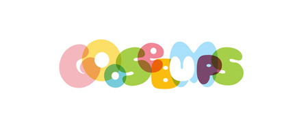
Goosebumps – Jared Milam
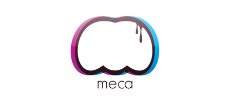
Meca – Andre Oliveira
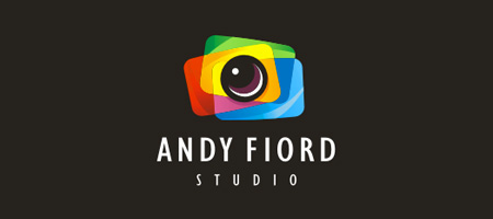
Andy Fiord – sbDesign
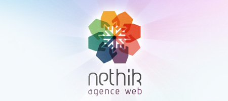
Nethik – Aurelie Ronflard
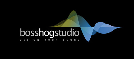
Boss Hog Studio – Mathieu Schatzier
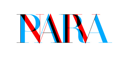
Paranaiv – Are Sundnes
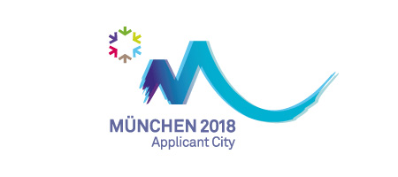
Munich 2018
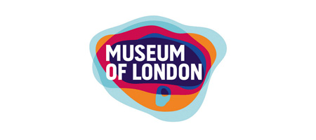
Museum of London – Corey Porter Bell
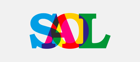
Saol – Stefan Romanu
Zipliner – David Pache

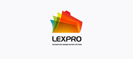
Lexpro – Kirill Demidenko
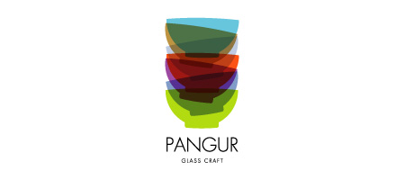
Pangur Glass Craft – Sean O’Grady
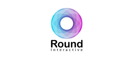
Round Interactive – Kerimov Stanislav
Chopeh – Pete Lacey
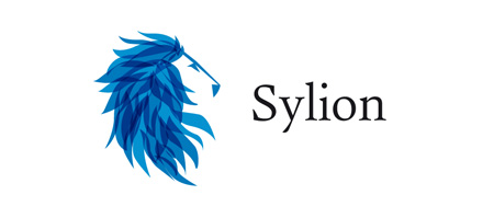
Sylion – Joan Pons Moll
tmiint – Bojan Stefanovic
Immobiliare.com – Mattia Moretto
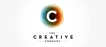
The Creative Company – Andre Gagnon
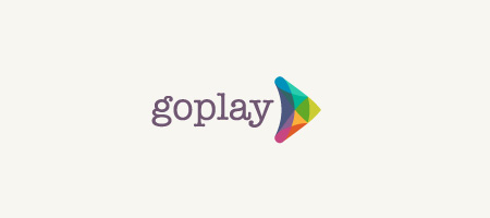
Go Play – David Pache
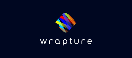
Wrapture – Nexqunyx
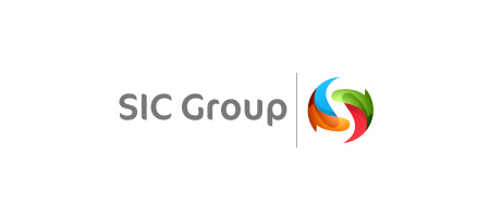
SIC Group – Misha Lepshey
Pousada Anduara – Dadado
World Moto – Firebrand
Creative Atelier – Aleksandar Grkinic
Demiu – Dalius Stuoka
Robin Rutherford, DDS – Bart ODell

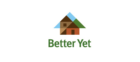
Better Yet – Firebrand
gonorth – Cris Labno

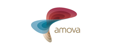
Amova – Roger Oddone
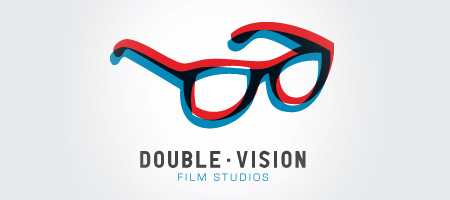
Seeing Double – J.Garner
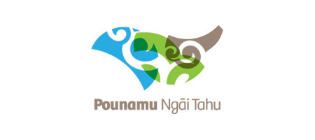
Pounamu Ngai Tahu – Simon Thornley
A.M.T. Ceramics – Efektyvus Dizainus
Capital Universe – Meansmore
Free Realtor – Kirill Demidenko
Otis – Craig Scott Russell

Great round-up Chris, seen most of these before but never been able to compare them all in one post before. Thanks! :)
Nice collection Chris Spooner.. i had seen so many ur articles that are amazing. whn ever i see a pic with staple pin i recognize you :) … “Examples of Transparency “i like to Add colorful word..
I really want to see the black and white (no gray) versions of these logos. I’m not being cynical, although as a design student it’s been drilled in to me that starting a logo in black and white first is most practical), I really am curious. I shy away from the fancy effects of these because I’ve got that B&W version at top priority. I’d like to see solutions for these logos for when they get faxed, shrunk, grayed out, etc.
I know where you’re coming from. My initial design was B&W, but as it was solely for my freelancing design side I wanted to create something a little fancier.
It’s designing a logo fit for purpose really, my logo will only really appear in digital form on my website. If it was to appear anywhere else on multiple mediums I would probably have done it very differently. Its a logo for me, so I control the usage. If it was a logo for a client I would use a different process as you never know where the logo could end up.
chopeh
I was going to add a section covering the whole ‘But these don’t work in black and white’ thing, but decided to leave it for a separate post. The thing is, almost every one of these logos can be made to work in mono by outlining the shapes.
It is definitely important to create a mark that can be used in a single colour, but I can’t see any problem in tarting it up for its primary use in full colour, as long as you also build flat colour and mono versions too so it covers every application.
oh, i definitely agree with that. if it’s only on the web or screen, go for it! i just want to see the other versions to see how the problem was approached, for inspiration and whatnot.
My favourite from the list, Saol and Sylion, great collection as always. :)
Awesome collection. Among these, the logo entitled ‘Better Yet’ uses transparency very cleverly. Thanks for collecting and sharing this, Chris
Very nice collection! Thanks for posting, can be really inspiring.
Thanks for including my logo! I didn’t realise there were so many out there that used a similar overlay effect.
My favs are: Otis Foundation, Double Vision, and Saol.
the meca, and the Capital Universe ones are by far my favourite ones – its really strange seeing such busy bright logo’s but they work really well.
Great post!! Very inspiring.. thanks!! :D
Cool! the interesting thing about transparency in logos is that most of them are in full colors and it’s so cool because it looks more alive.
very cool, i like these..
wow, these are really great! Very inspiring work. I wondered though, your logo should be versatile such options for one-color, reverse, grayscale, etc. I’d like to see how the designers handle those situations with these logos.
As alway nice inspiration and selection. I really love those logos which also have a gradient effect.
These are excellent. Sweet!
I haven’t seen to many transparent logos out there (surprisingly) it adds a neat element to plain logos :)
Nice to see a lot of Russians on the list
Love these examples Chris. Thanks!
Wow, nice list. Good for inspiration!
Nice roundup Chris, my fave is going to have to be double vision oo or SIC Group :)
This selection is a great showcase of transparency in logo design. All are inspirational works.
While all of these are really beautiful, I would see a problem with some of them when they need to get printed with only one color. Nice collection though!
Digging the selection. I am currently working on a logo that could perhaps benefit from a bit of transparency now that I see these.
Thanks Chris :)
Excellente cette collection de logo ;)
Brilliant round up of transparent logos, they are all just sooo beautiful. i agree with the comments about the difficulty with one colour versions but the suggestion of outlines would work for a few of them as well as by breaking the shapes up would work for some of them too. great post :)
All logos a fantastic! Cool list!
This is awsome!
Nice roundup. Some of these would work fine as a black and white silhouette too.
Amazing assemblage!
Wow.. nice collection.
„Sylion – Joan Pons Moll“ is my favourite! =)
Thx Chris
Creative Atelier,Sylion, Round interactive is simply amazing. Waiting for a collection of black&white logos.
I really love “Road Interactive” logo
awsome logo.very inspiring
Pretty, but are these practical? How will these hold up in one color reproduction? I know it’s mentioned above that they can be outlined, but does the design still hold. Some of these the transparency IS the design.
Thanks Chris for including my logo. I appreciate it!
Olás, muito criativos os logos, só tenho receio quanto a aplicabilidade de ambas… Cores para serigrafia, processos em pantone e redução.
Abraços
Great collection, although the Paranaiv logo seems unsuccessful (can’t tell what it says) and the Munich 2018 logo’s use of transparency just makes it look out of focus. Love the Gonorth and Sylion logos.
Nice!!!! I gotta say one of the best is the SIC group. Phenomenal!!!
Pretty nice collection. It’s easy to admire the look transparency adds to an identity. Thanks for the post.
– Josh
Awesome collection! much appreciated.
I’m delighted to have had a look at this collection – inspirational, Thanks for sharing.
Nice collection! Over all liked Sylion. Thanks
Great collection of logos, very inspiring
really cool for inspiring…
Nice to see a compilation of transparent logos but I’ve always loved “Pangur Glass Craft” and “Saol” logo and added couple of times to different logo collections on my blog too:)
Nice logos.
I liked all, except the Paranaiv. Its very hard to read and the both colors vibrates too much.
And dude, what a nice layout you have here!
Transparent logo have become a trend these day as they look really professional and elegant.
Wonderful logos compiled here. I especially like the Pangur Glass Craft logo by Sean O’Grady & OTIS logo
Nice…
I really like Sylion. The transparency overlay creates different shades of color of hair which is really nice an gives a bit of relief to the logo.
Great list.
ty
looks to be a trend at the moment, but a welcome one! a little bit of transparency can go a long way.
great logodesigns more please so cool :-)
Excellent list! Thanks
Excellent logo design collection. These are so creative. Its amazing how logo designs are able to represent a company’s motto as well as look so good at the same time.
I noticed you have a logo for “Road Interactive” but the logo itself says Round Interactive. Might want to change that…
Well spotted, fixed!
These Logo Designs are amazing! What creative and inventive use of this media!
Esto es increible, y se necesitamos plasmarlo en textil, utilizariamos hilos con tonos pasteles…
Great collection of logos.
The transparency effect isn’t something I’d usually use in my day to day web designing, but seeing how good you can make imagine like Lexpro by Kirill Demidenko, I’ll definitely be trying it out in the future. Free Realtor – Kirill Demidenko and Sylion – Joan Pons Moll are also favourites of mine.
Nice site yourself Chris!
nice post, there was some great logos
thanks for this post
Pretty good!
There’s some beautiful stuff there, but you REALLY have to know what you’re doing to get these to reproduce correctly across all media. Some very complicated overprinting etc to if you want to use Pantones. And with some of those really bright colours, you definitely do want to use Pantones. Be intersting to see how some of them reproduce in mono too.
I have to agree with Mark. All these logos are fantastic for web use, but one has to wonder how they’d fair in other uses. Some of these could never be printed in monochrome for office documents, etc.
I have a seen ur work its realy appreciated.its very beneficial for me.its full of filled with
information.I hope other people will gain things from here.
nice collection! thx!
They are great to get ideas. Best regards!
Thanks! They look great. I have featured this on my blog.
The principles here are so in line with the way a beauty designer in beauty school works. It’s impressive how much here is just a simple combination of colors we all learn in grade school. The designs are so structured.
–Esani of Esani Beauty School Atlanta
3348 Peachtree Road Northeast
Atlanta, GA 30326, United States
(404) 952-2244
Google listing should just be googled.
These are beautiful! Though I’d also like to see how they translate these to black and white.
Some of these concepts would look great on a page utilizing some css3 transparent divs
nice job!!!!
great post. thanks Chris!! were some of the logos removed? I could have sworn there was a great on for 19 collins street or something like that?!
Great examples here, Transparency effect is not useful in every kind of designing, as i think when you are designing a logo or corporate identity. You have to look many of its aspects that it will be printed as well.
Thanks for sharing though.
Regards