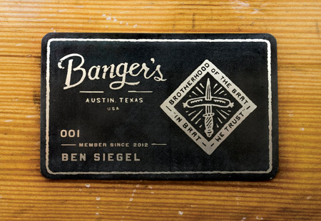
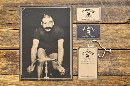
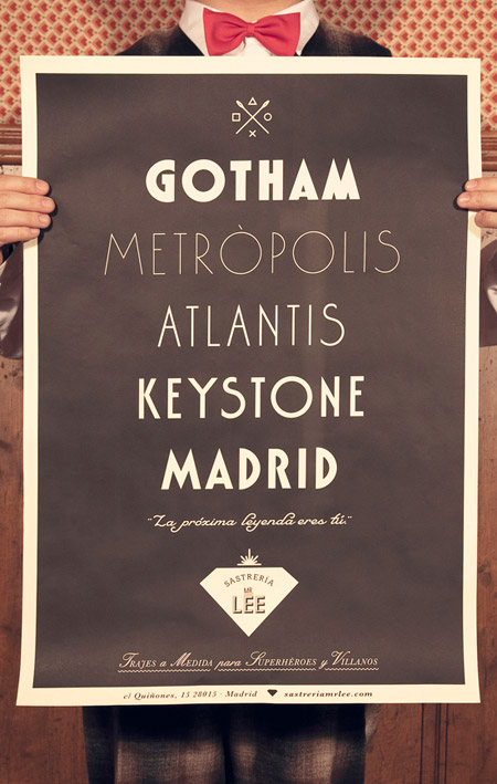
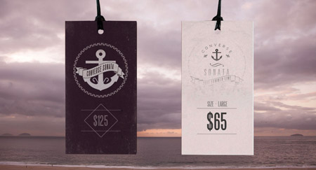
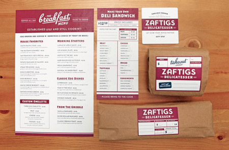
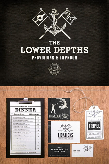
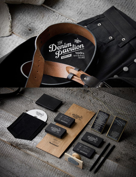
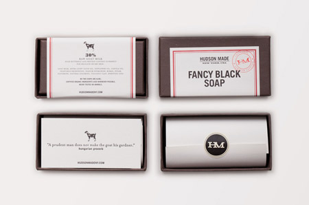
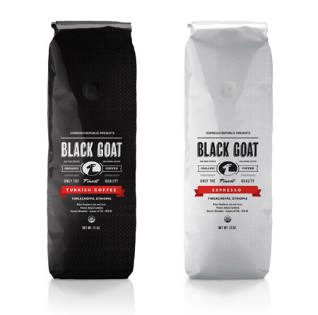
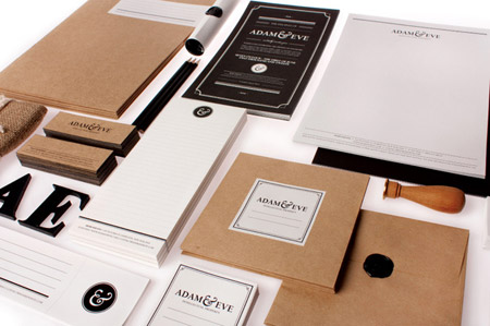
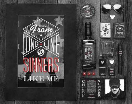
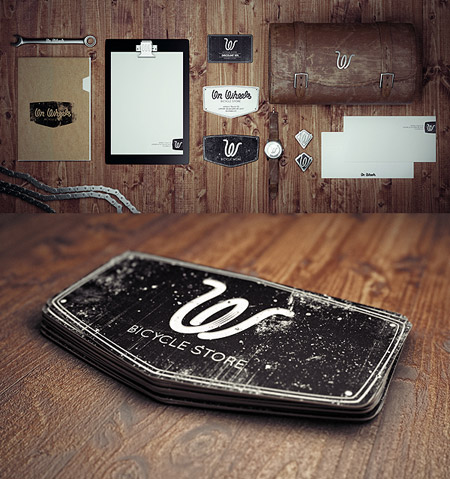
One of the hottest design styles at the moment is the revival of vintage theme. Designers are using classic typography techniques, muted colours and dirty textures to simulate designs from centuries past. This post rounds up some of the most inspiring examples of modern branding, packaging and print projects with a vintage style.


wow! that’s pretty nice collecting examples of graphic designs. all these graphic designs are unique from each other in some respects..you have done a great work over here…
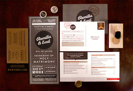
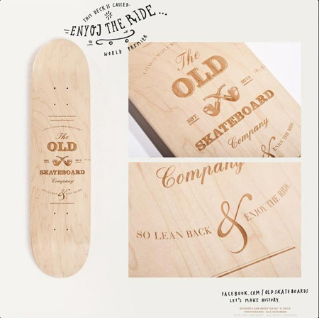
Great collection. Love the old skateboard company and also the wedding paper goods by Remilla. Some wonderful inspirations in this list. Thanks, Chris.
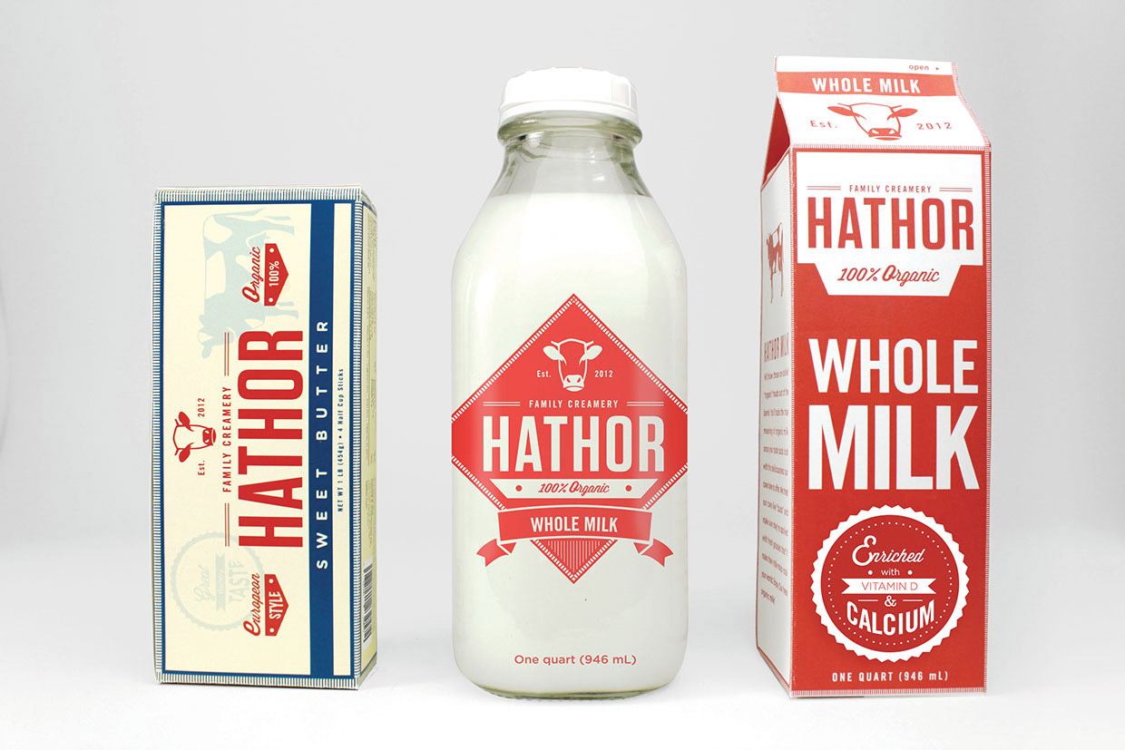
Nice collection. I liked the milk design.
Codo Design did vintage style work for The Libertine cocktail bar. You should check it out. http://www.cododesign.com/The-Libertine-Branding
I’m a huge fan of vintage styling, it’s something I’ve tried to incorporate into my architectural designs, I just need some more open minded clients,
I’m a big fan of retro design but you have to ensure its appropriate to the client and audience. So long as you can put a modern spin on it I think they look great.
This is awesome stuff right here. I love vintage design, and have noticed a rising trend, as of late.
I love the vintage styles that have been popping up recently! These are great and perfect for inspiration!
I do love a bit of vintage design! I’ve yet to find an excuse to use it in a project yet though. I think the style would work perfectly for a butchers or bakery.
Some relly nice stuff here. Love “Hathor Milk” images.
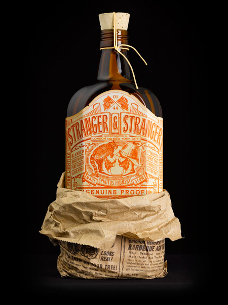
Love that ”Stranger & Stranger Spirit No.13”. Reminds me of the work of Devin Clark from Ugly Americans.
Chris,
You hit a soft spot…vintage design is my absolute favorite and all of these look beautiful.
Cheers,
Oscar (@SharePointOscar)
Great graphic designs! nice range of designs i really much appreciate all designing look so beautiful. thanks for sharing such designs….
I love the vintage styles that popping up recently. vintage design is my favorite and all of these looks beautiful.
amazing D
Perfect!
Those are great for inspiration. Most are minimal designs and their visual impact is striking…
Thank you Chris
Beautiful work. Love vintage art and even though Im working on an animation at the moment the colour palettes in some of this work is pitch perfect for me! This is my favorite post of the year!
all are great graphic design ! this kind of people love Mac OS.. I am Right.
I love these vintage designs. This makes me want to redo my site in this style.
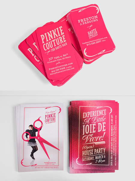
Love it. Vintage is all about the colours and font. Love the bright pink/aqua designs though. Infusing vintage with modern neon-like colours.
Vintage design at its best! love the clean minimilistic feel these designs give.
one better than the other. Fantastico
Really like these. Great inspiration. Just hope The Old Skateboard Company corrected that error. “ENYOJ” the ride? Oy…smh