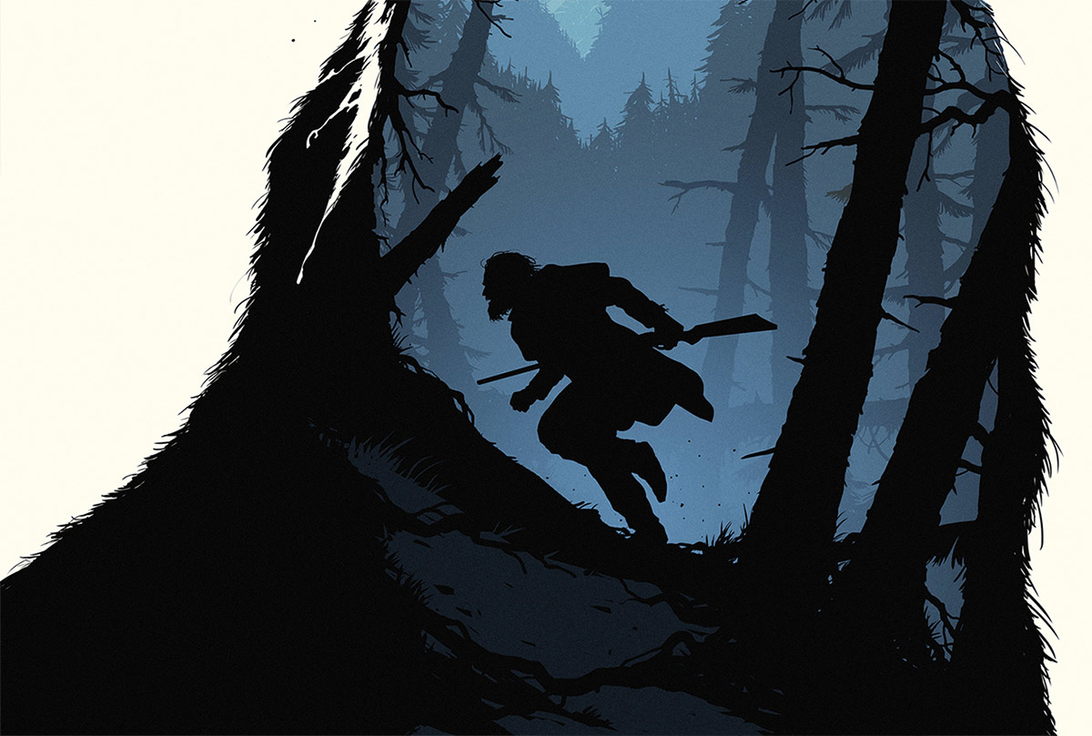
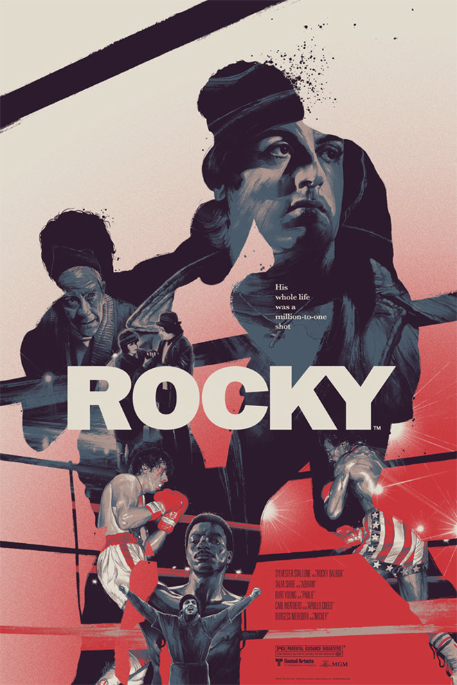
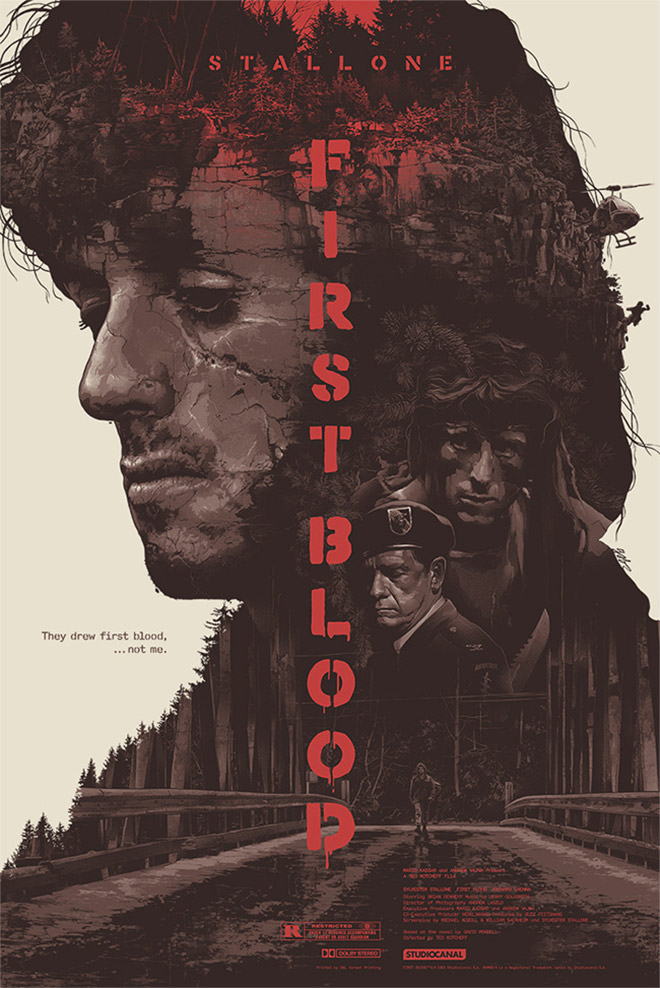
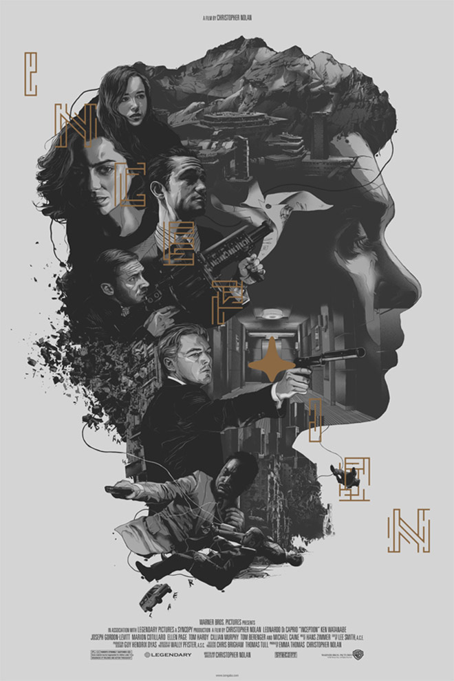
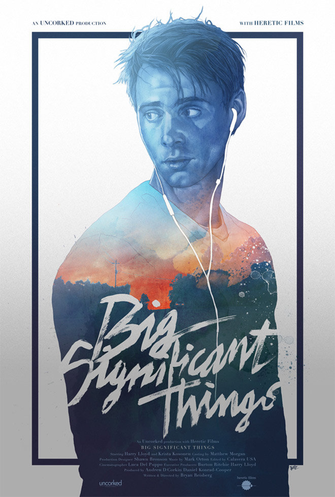
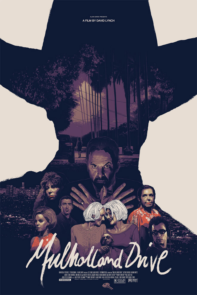
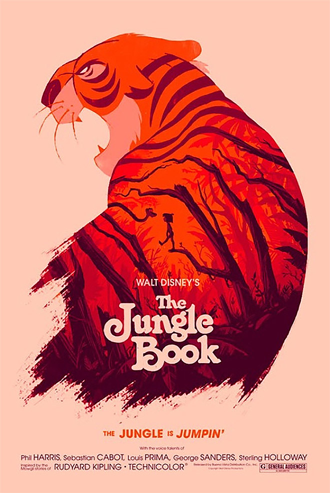
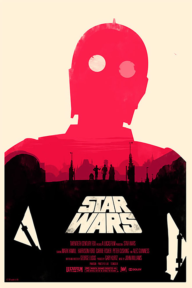
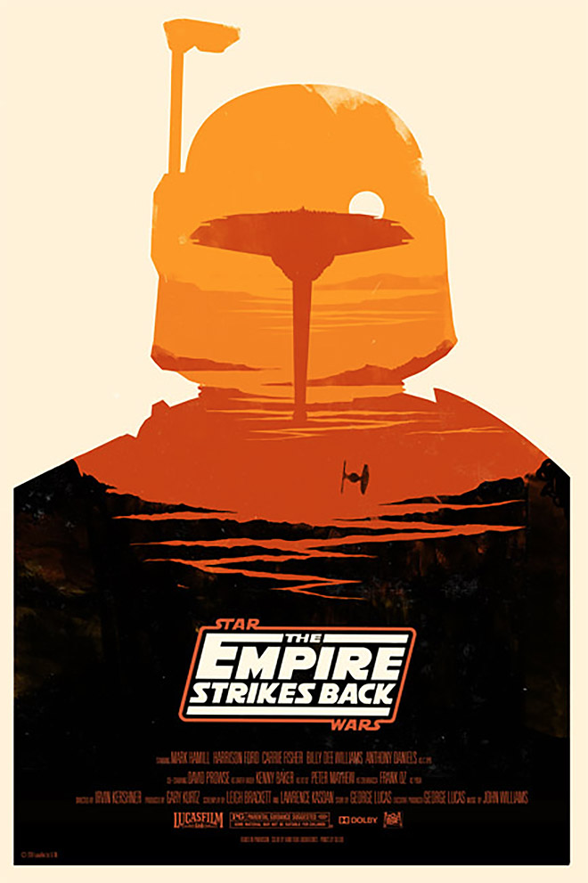
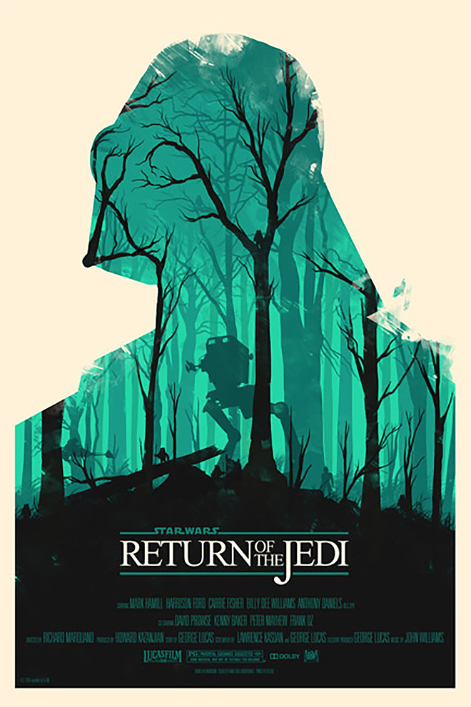
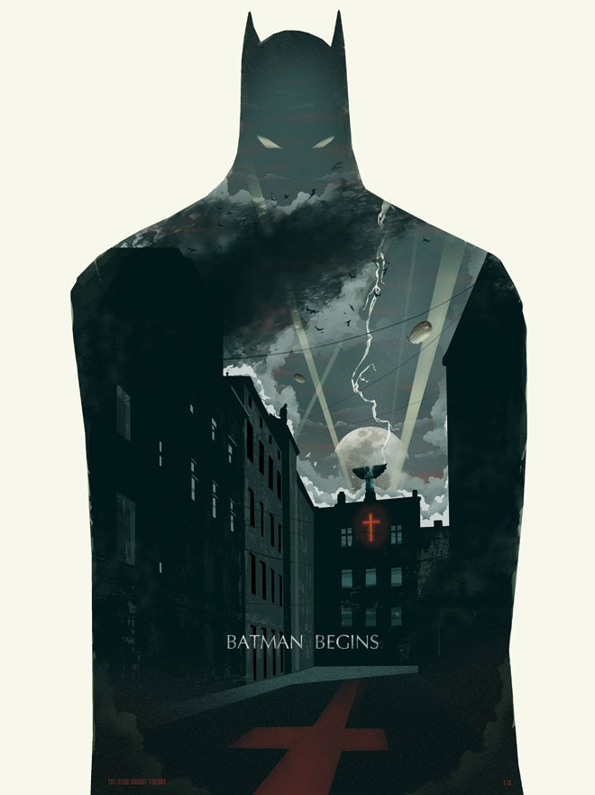
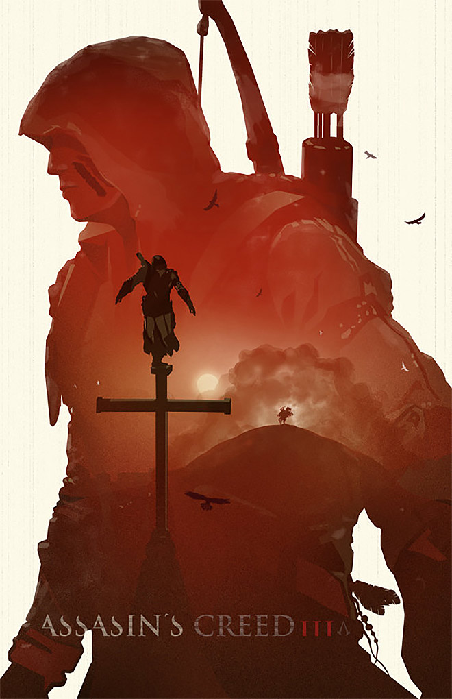
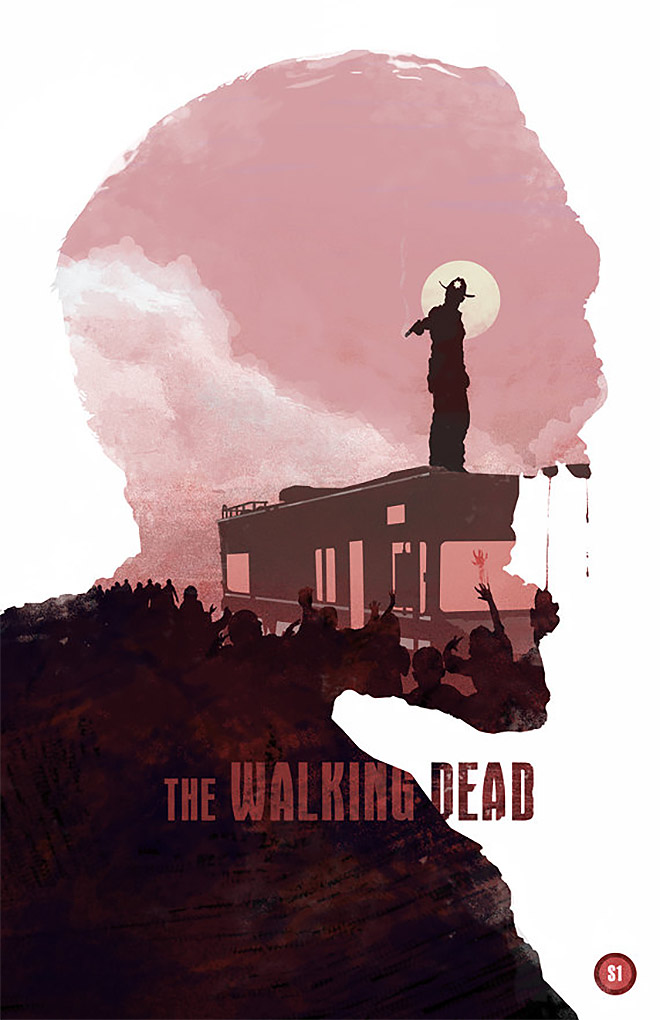
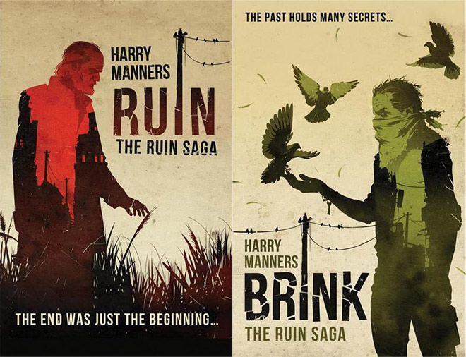
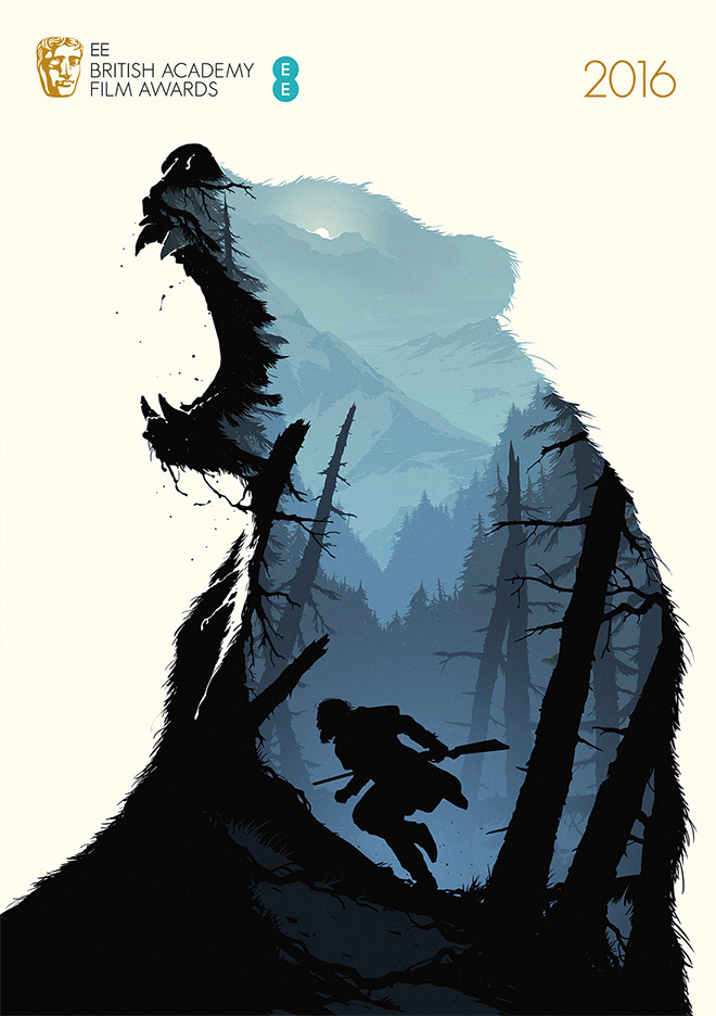
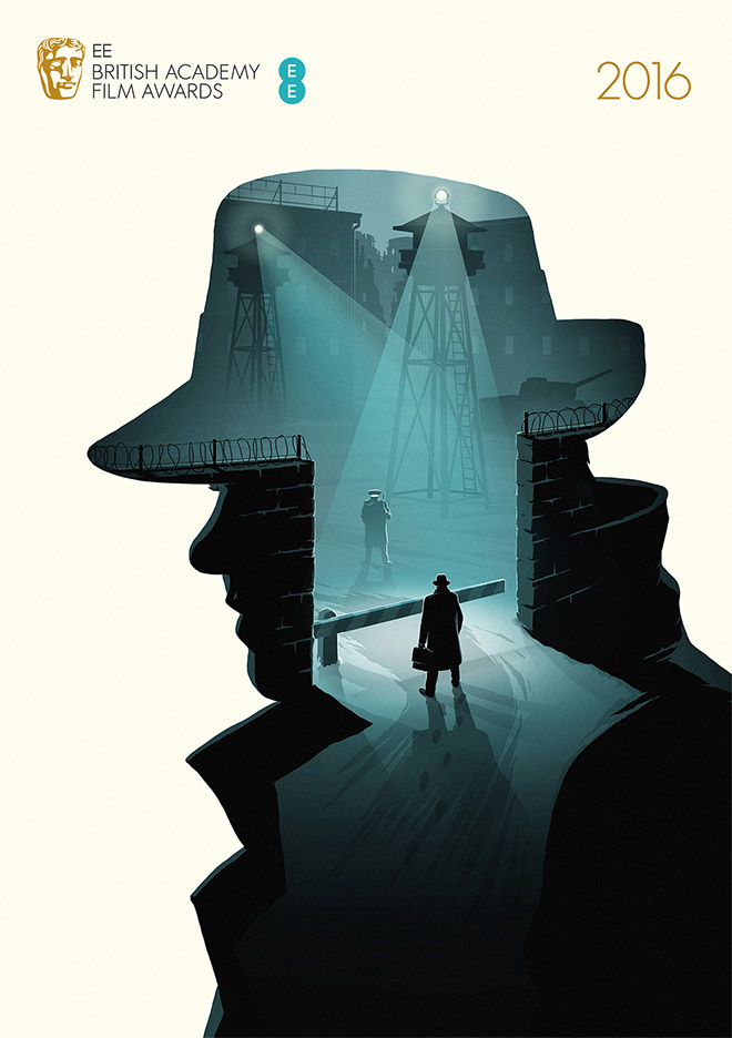
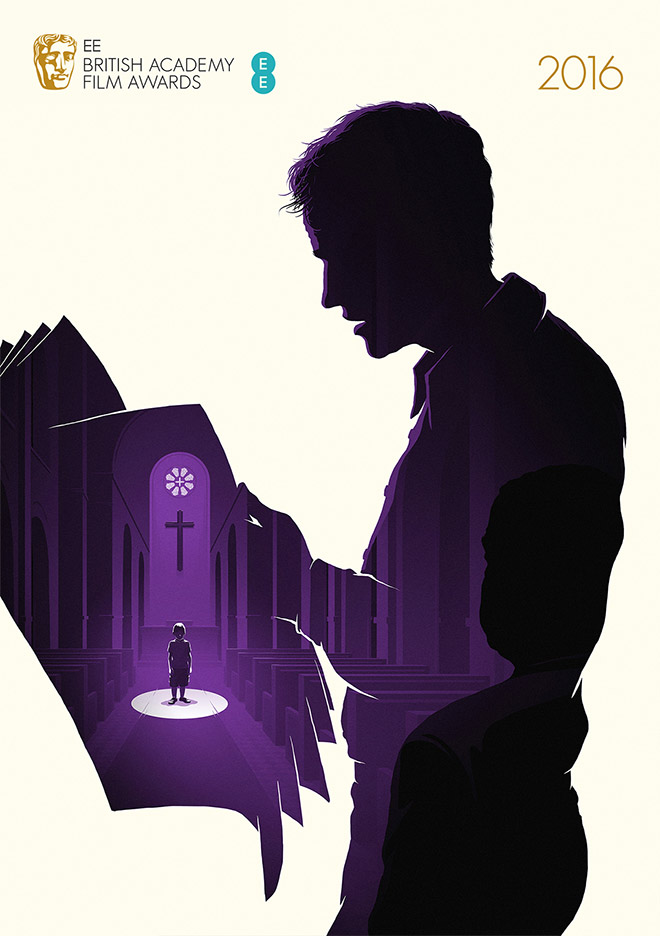
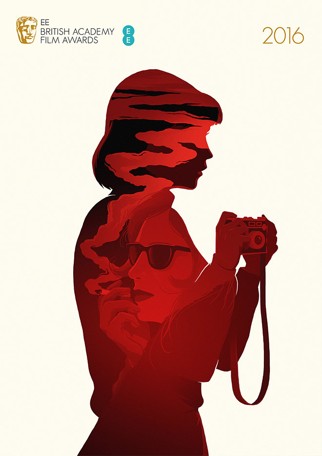
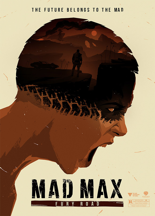
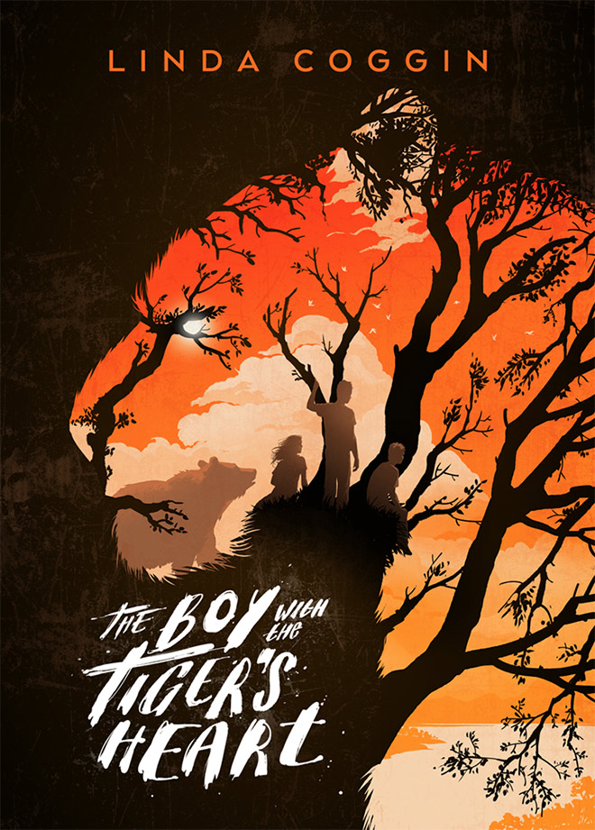
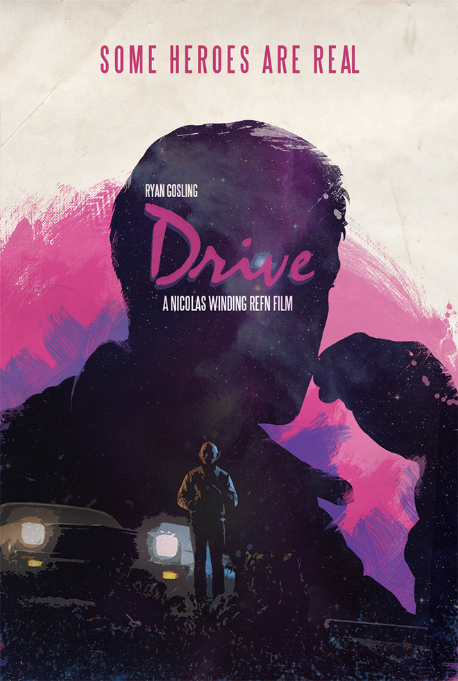
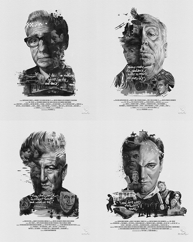
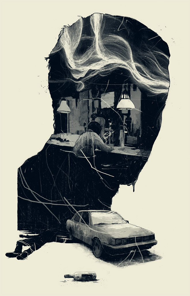
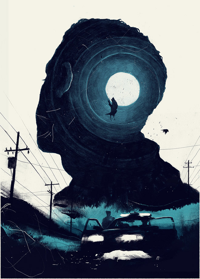
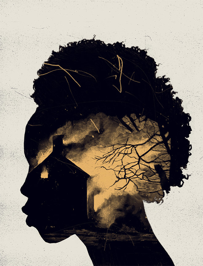
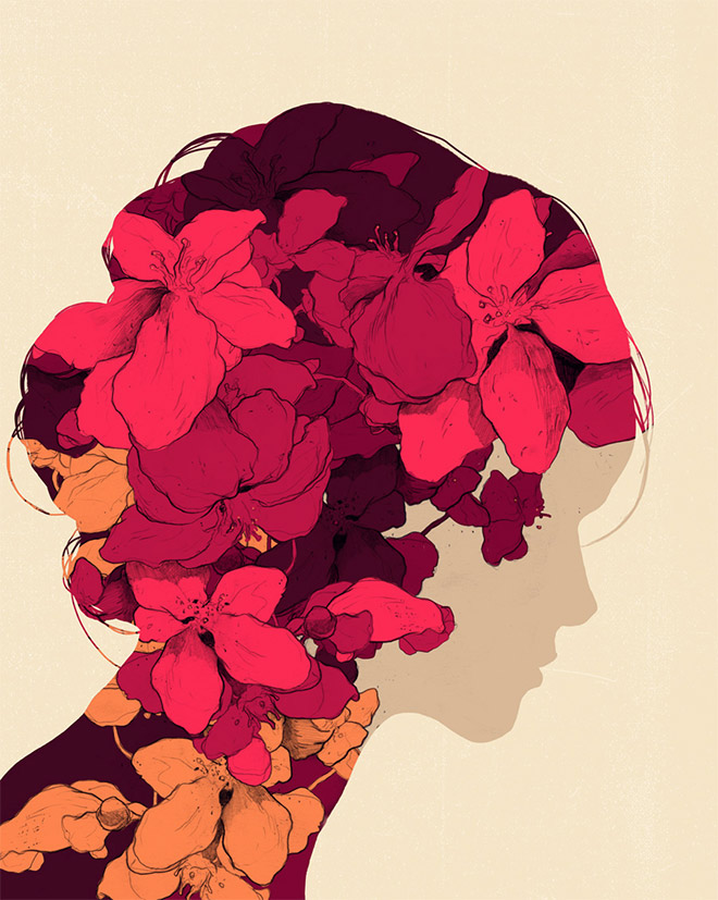
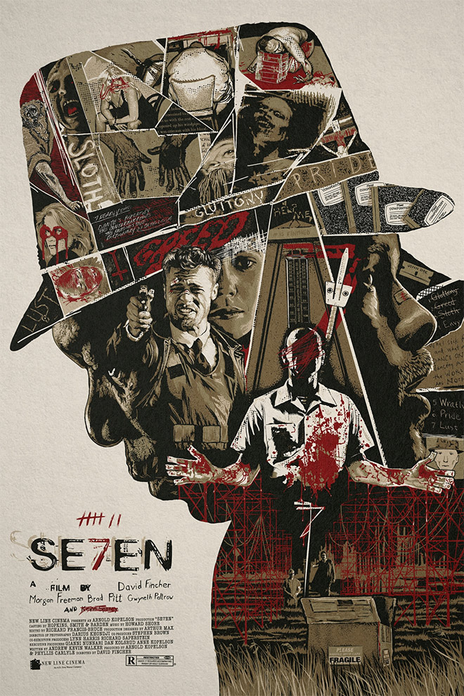
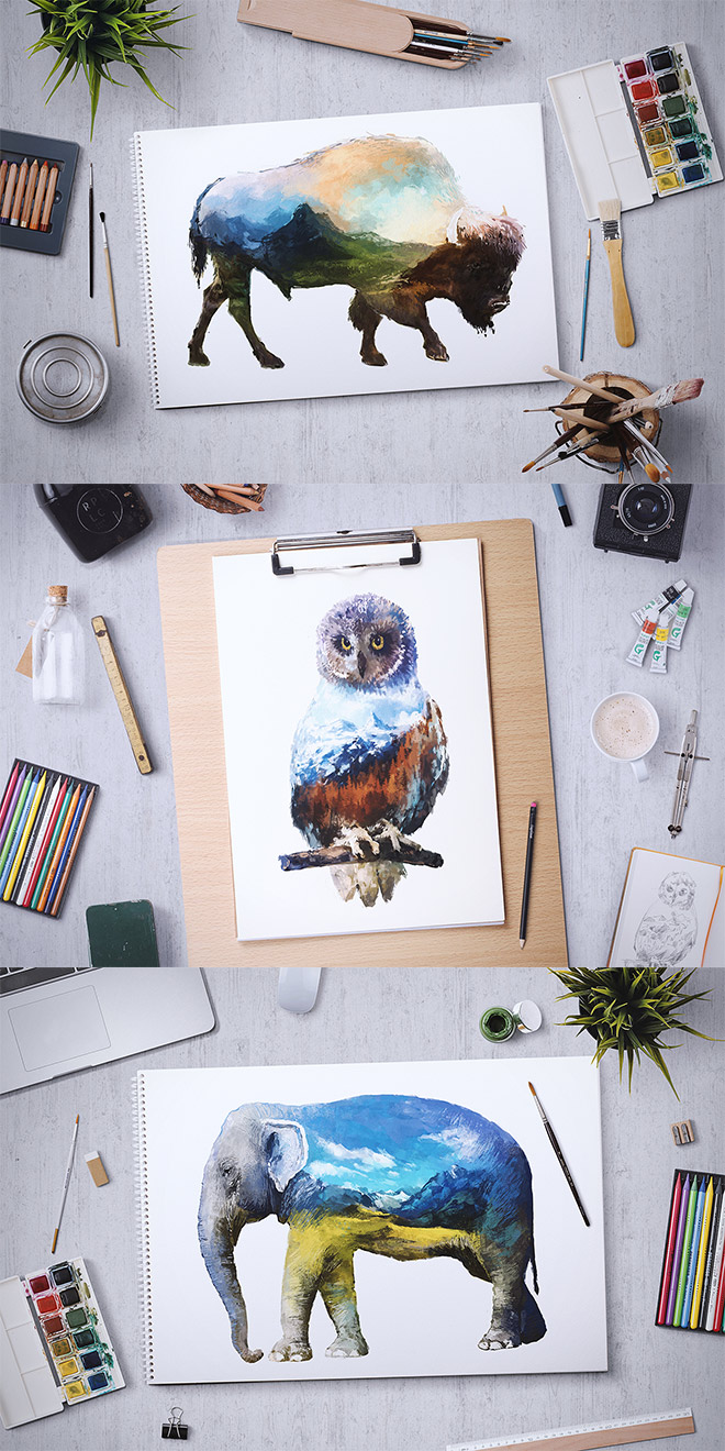
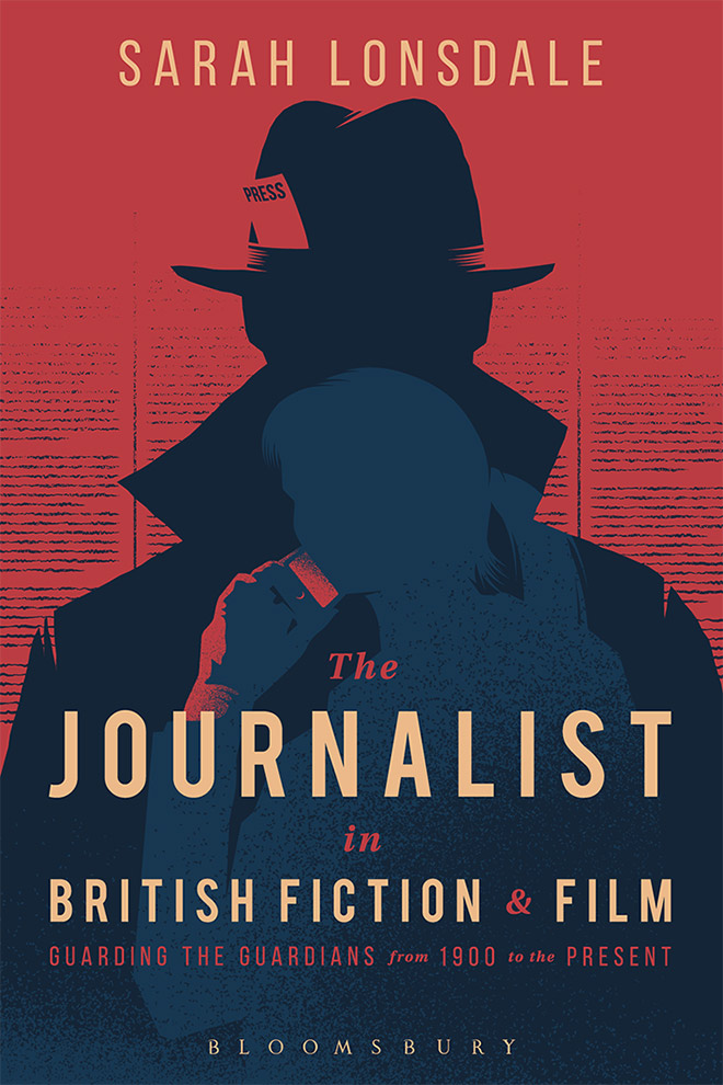
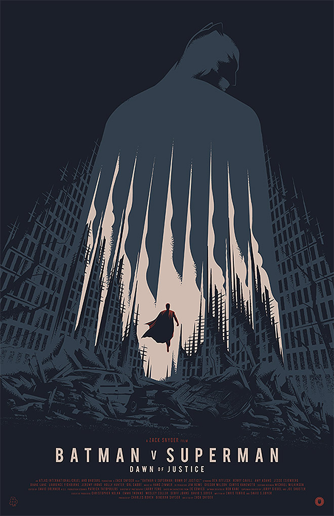
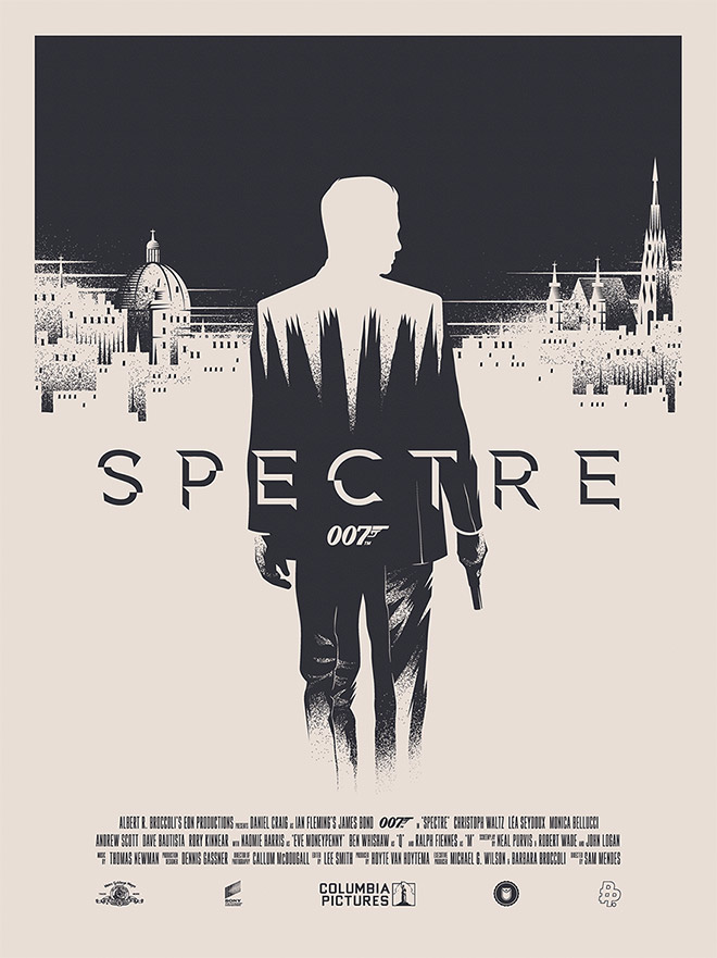
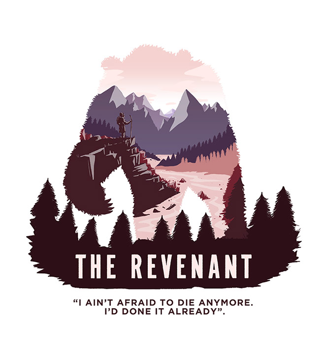
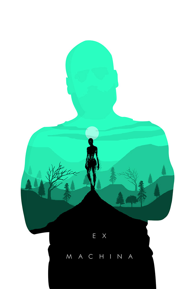
The double exposure effect has been extremely popular over recent years, and has been a featured topic before in my inspiration showcases. Originally the effect was produced using a photography technique where two images are exposed onto the same piece of film, but the style has since been digitally replicated by designers in Photoshop, as I explain in my recent double exposure effect tutorials. I’ve noticed the effect has also been adopted by illustrators who mimic the trendy double exposure style, but rather than use existing imagery, they skilfully recreate the effect by hand and combine multiple illustrations into one layout to form interesting compositions. In today’s showcase I featured 30 cleverly illustrated poster designs that have been hand drawn in the popular double exposure style.


Thank Chris…love this stuff.
Nice compilation. Thanks for taking the time to share this.
Thanks!
These are amazing! I never thought about how this was done. It’s fascinating the way the images, or the shape of the images, pertain to the topic of the movie/poster!
Very cool! Thanks for turning us on to these!
Su
I clicked on “MOVIE DIRECTOR PRINTS BY JULIAN RENTZCH” and found that the prints are gifs! Cool!
Thanks for your lovely words again Su!
awesome collection mister Chris, that’s really cool stuff. keep up doing good stuff for us.
Thanks! I will keep up the hard work :)
These are fantastic. I do like the Rocky double exposure and the movie director prints. Thanks for sharing these!
Thank you Dawn, the Rocky prints are some of my favourites too!
very nice sir, i want to learn from you…
Thanks Robin! There will be more tutorials coming up! :)
Great stuff here – thanks!!
Thank you Doug!
Great inspiration..
Thanks!
Think the Olly Moss ones nail it for me. The C3PO one especially, with the twin moons as his eyes.
That is one of my favourites too, as well as Rocky of course! Thanks Richard
I just know that this is called double exposure after read your post. I use to be called this picture in picture :-) I always focus on the picture inside rather that the outer picture which may exactly what the designer want we to focus into.
Hi Yunar, it’s interesting how you can focus on different aspects of the design with the double exposure effect.
Great stuff Chris.
Thanks
Great classics. I like all of them, but my favourite is Rocky.
One of my favourites too Ponju :)
Love the animals. Especially the elephant.
Thanks for your comment Roger
Nice! Thanks for sharing such great inspirations :-)
No problem PY!
Chris,
God has given a excellent creativity brain to you,,, well done.
Thanks,
Thanks Praveen
The buffalo reminds me of classic NZ Album cover https://en.wikipedia.org/wiki/Buffalo_(The_Phoenix_Foundation_album) I believe won best album artwork the year it was released.
Hi Roger, that’s pretty cool!
Well this is already long I was looking for, thanks bro
That’s good to hear, thank you!