This post was originally published in 2010
The tips and techniques explained may be outdated.
I’ve been wanting to get stuck into some good old photo manipulation artwork for some time, and after being inspired by the recent Alice in Wonderland movie I had to urge to create my own dreamy fantasy scene. Follow this walkthrough of my design process where I build a blissful fantasy scene with various lighting and colouring effects, then use the artwork as a base for a complete album cover design.
I knew before starting this little project that I wanted to base the theme on an inspiration from the recent Alice in Wonderland movie. Taking the ideas of thick wooded foliage and a curious girl to build a fantasy scene of my own.
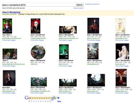
I started out with a spot of research through good old Google Images to refresh my memory and provide some ideas and inspirations.
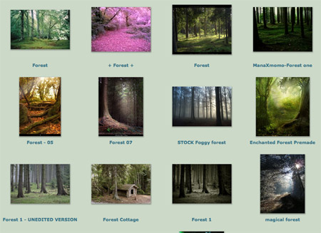
A forestry background was needed as a base for the artwork, so I scoured various stock photography websites in search of the perfect scene. I had a fairly dark scene in mind, with lots of trees and a covering of greenery on the floor. A strong light source would also have been nice. I eventually found two perfect shots from DeviantArt, one from Spiteful-Pie-Stock, and another from YsaeddaStock.
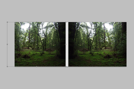
The first of the two images was imported into Photoshop, duplicated and flipped. This helped produce a long canvas which would lend itself well to being manipulated into cover art later. The two images were overlapped and merged together.
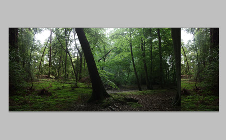
To hide the blatant mirroring of the scene, I imported and overlaid the second forest photograph over the centre. A layer mask added and the scenes carefully blended together.
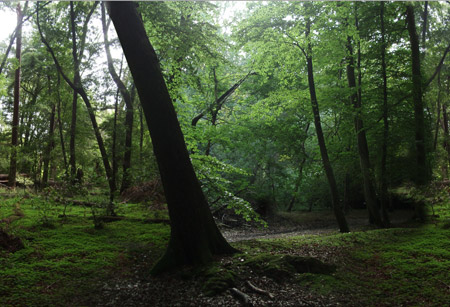
The dark tree in the second image helped act as a useful boundary between the two images, with just the ground level needing to be merged together with soft erasing.
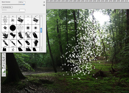
The light source from the right hand side was chosen as the main feature of the scene, the idea being that rays of sunlight would flood down to focus on a curious female figure. A basic scatter brush was used to paint in some rough particles on the document.
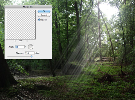
A Motion Blur then converted the particles into realistic rays of light, flooding through the trees and hitting the forest floor.
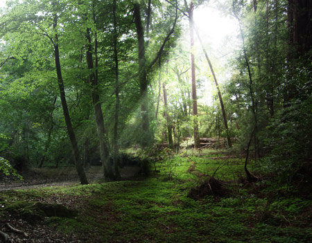
This layer of sunlight was duplicated a few times, with some layers being changed to Overlay and Soft Light to help illuminate the surrounding greenery.
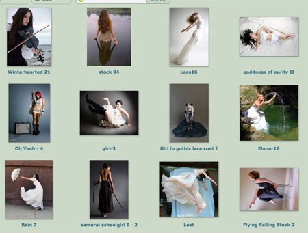
With the basic scene in place, a young female model was needed as the main focal point of the scene. I had a good idea of the style of character I wanted, so I set out scouring the stock photo websites once more to find a match.
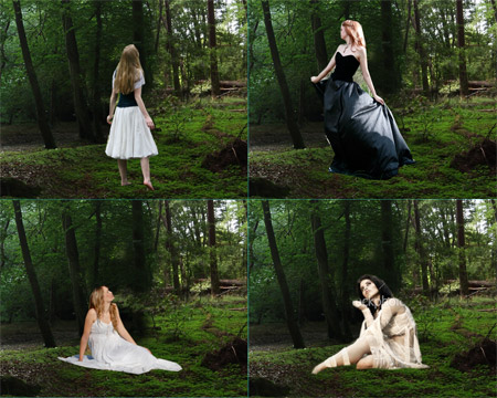
A few potential figures were roughly clipped out and added to the scene to test them in situ. The young girl looking up was a strong candidate, but I decided on an alternative shot of the lady in black.
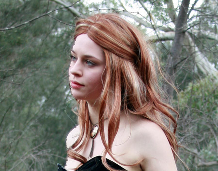
The full size shot of Bells Falls16 by DeviantArt user *Faestock was brought into Photoshop for some clipping and pasted into the main document.
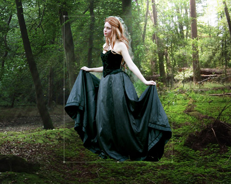
The figure was scaled to size and moved into place at the end of the sun rays, then the Color Balance adjusted to match the hues of the surroundings.
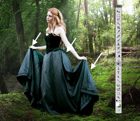
To better blend to the figure with the environment Dodge and Burn tools were used to highlight and shade areas of the dress according to the light source.
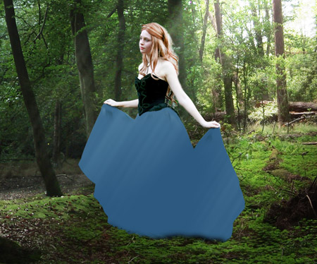
A blue overlay was drawn on the dress area of the figure in order to recolour it in honour of Alice in Wonderland.
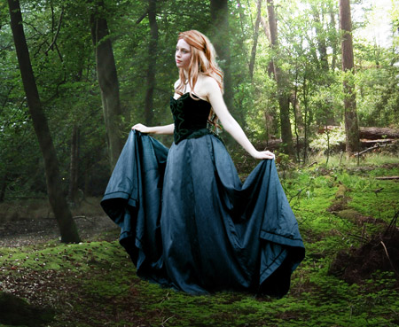
The blue overlay layer is changed to Color at 50% to allow the colour to blend with the original tones and creases of the dress.
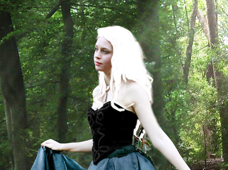
Another overlay was created, but this time a white covering over the figure’s hair. The blending mode then changed to Soft Light to lighten the hair into more blonde tones.
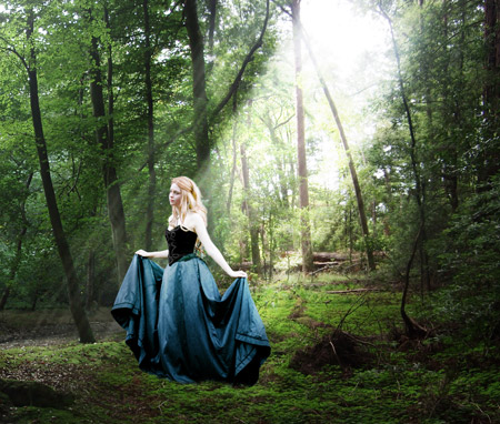
A few more sun ray layers were created and moved above the figure, so the light brightened areas of the skin and dress.
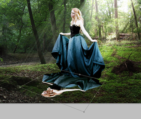
A shadow was needed to generate some realism, so the figure was duplicated and transformed into place.
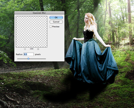
A black overlay and a Gaussian Blur created a recognisable shadow, which was then changed to 60% opacity.
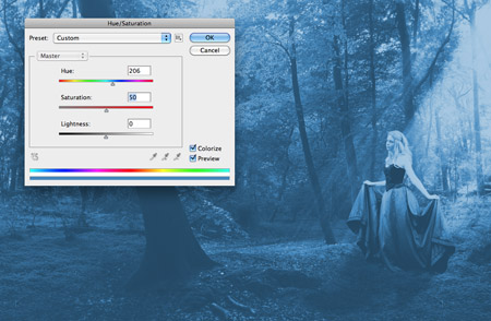
With the scene in place with the background, light source and figure all neatly finished off, it was time to add some atmospheric colouring. The whole design was copied and pasted on a new layer, the colour then changed to blue using Hue/Saturation.
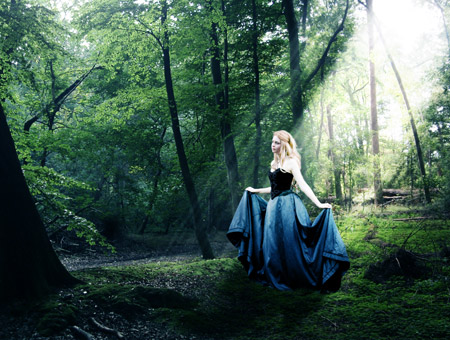
Changing the blending mode of the blue overlay to Soft Light mixes the cool blue tones with the original greens of the scene.
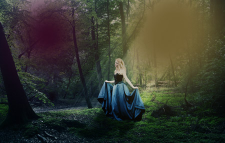
A couple of dabs of colour over other areas of the scene added subtle variations of tone, darkening the background foliage, or giving brighter yellow lighting.
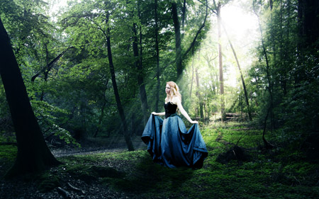
These overlays of colour really help add more contrast and provide that surreal feel to the design.
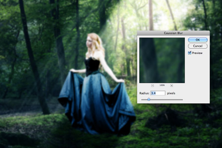
Another copy of the whole design was created, but this time a soft Gaussian Blur added.
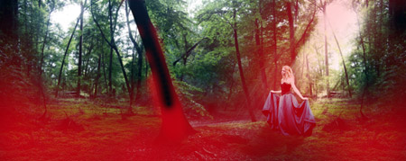
This blur was then toned right back using a layer mask, leaving only the background areas of the scene blurred to recreate a simple depth of field effect.
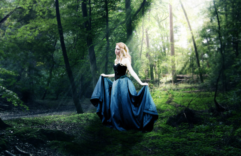
View the full-size version of the final artwork. The three stock images all combine to form a surreal fantasy scene, with lighting and colouring effects pulling the design together.
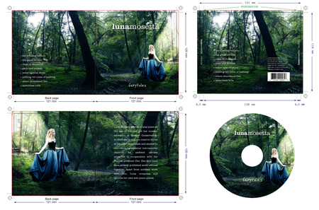
The design was destined to be used as album artwork all along, and the long canvas made the transition to the four page cover booklet easy, with the design spanning across the front and rear covers. A few typographic elements were added where appropriate to introduce the artist and provide track information.


Awesome, Chris :)
Maybe the shadow under the girl is not enough, otherwise everything is awesome. First of all I thought, that you transformed that tree in the center but then I read that it’s from different picture :)
Anyway, thanks for sharing :)
everything of genius is very simply!
bravo Chris.
Nice tutorial Chris. I especially like the rays of light effect. All of it is so simple and effective. Thanks for the post!
Hi Chris! Thanx for all ur great tutorials.
Can u please tell me or maybe do a tutorial on how u blend the backgroundimages together. i cant get it right.
anyways. thanx!
/DC
wonderfull! great tutorial :) thank’s for sharing
Whow! great,
I have to do something like this sooner or later!
Thanks for sharing
nice tourtials man thanks.
Great tutorial…nice work!
好久没来了,来送你新的祝福啊 呵呵
有空来看看我哦,
Great tutorial spoon! thanks 4 sharing
Awesome Chris, thanks a lot!
Thanks for these great tutorials !
Amazing tutorial, defiantly picked up a few tips to use here and there!
Thank you for this nice tutorial which taught me new tricks, especially lighting
hey Chris! you rock!!!
gr8 one…
So simple.. in genius “Motion Blur” who would of thought
i was ready to draw white strokes and blending them some how with opacity and a mask.. great tip
Love it. Well done. The art direction in Alice in worderland was amazing.
keep up the great post.
thanks for the great tutorial, you always keep mi inspired!
I am firlst time visting this site and I think its nice.
Great tutorial…nice work!
visit : movies.ewebtutorial.com
Nice tutorial. thanks.
This tutorial has helped me understand how to use layers more effectively with Adobe Photoshop. I like how you showed the use of Gaussian Blur to smooth down the rough edges of the additional layer.
Wonderful tutorial!
Thanks very much, Chris.
First time visiting this website, for certainly not the last one :)
Great tutorial! The lighting effect is awesome!
I’m not good at Photoshop yet but i love to see how thing works. Thank you for this demonstration. I’ll try to remember.
Nice tutorial, thanks a lot!
Nice tutorial! Very useful for me :)
great tutorial,it adds drama to the art,thank for sharing.i hope i can make these effect on my own work.thanks for sharing.
Great tutorial!! keep em coming. great outcome.
Nice Tutorials,
I think its very useful and really good collection thanks.
visit : news.ewebtutorial.com
Hey Chris,
I loved this one so much. I literally recreated the same atmosphere and very much happy to see the outcome.. Thank u very much
Thanks Chris for this detailed tutorial
Damn its beautiful, i cant make it dat nice as in tut :)
Cheers Chris! really nice final picture and its well explained as well. might have to give this a go
Good Tutorial, I never tried anything like this before. I’m going to give this a try later on. Thanks
I’ll be giving this tutorial a try to help my own photograph manipulations! I am the most interested in trying out the “depth of field” layer mask.
Awesome tutorial, thank you.
this is pretty cool and all, but this isn’t the coolest album cover in my personal opinion, i’m not being judgmental. do you know how to go for that heavy metal look on an album cover? i did his one thing where i dissolved chalk in a beaker of super strong vinegar and it looked a little like fire inside. i took nice pictures of that and messed around with layers and effects and what not. but i wanna know how to look as good as an ICED EARTH album cover.