In today’s tutorial I share my process of designing a business card and highlight some important considerations when designing for print. It’s super important that you get things like bleed, color mode and resolution right when you’re creating your artwork, otherwise you might end up having your files rejected by the printer, having to start again from scratch or even worse, receiving hundreds of prints back that look nothing like your design!
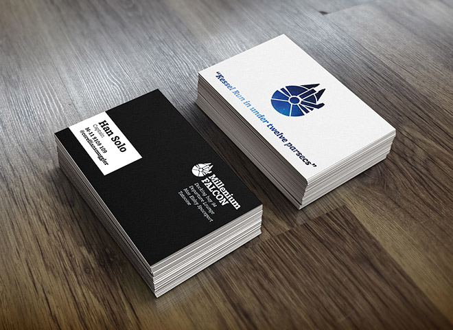
Business cards are a common printed product that are fairly simple to design, but before you start, make sure you receive specific artwork instructions from the print house you’re going to use. Every company has their own preferences, so the settings I’m using in this tutorial might not match up exactly to what your printer wants, but at least you’ll know what they’re referring to when they say stuff like trim size and bleed size.
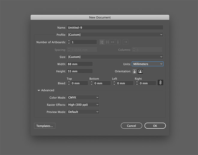
We’re going to use a mix of Illustrator and Photoshop to make the most of each application’s strengths. The overall design will be composited in Illustrator, so we’ll start there. Create a new document and enter the dimensions of the business card in the artboard size settings. A common business card size is 88x55mm, but again, make sure you check with your printer first on their exact product specs. If you’re in the US, you’ll probably find the measurements are in inches rather than millimetres.
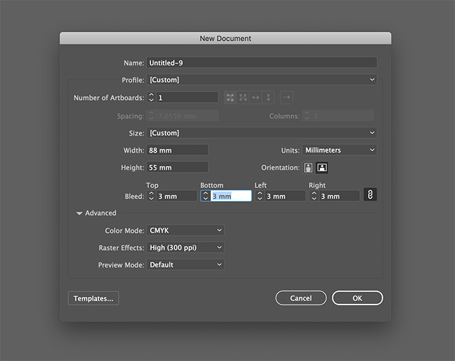
The print firms I’ve used in the past required 3mm bleed, so enter 3mm in one of the bleed fields and press Tab to apply it to all sides. Bleed is basically some padding around the edge of the design which is cut off during the printing process. It ensures that you don’t end up with tiny slithers of white paper along the edge of your prints if the machine isn’t lined up exactly.
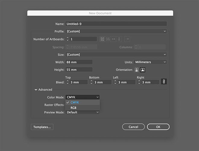
We’re designing for print, so select the CMYK color mode so we’re working in Cyan, Magenta, Yellow and Black inks as opposed to RGB light.
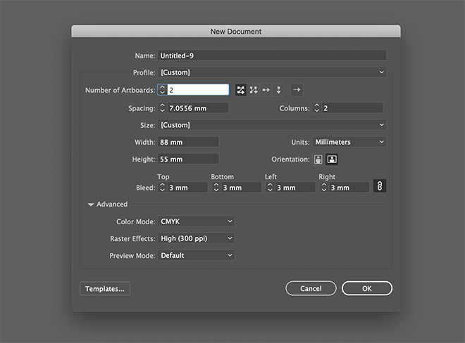
Most business cards are double sided, so increase the number of artboards to 2. This will create two business card layouts side by side, rather than have to create two completely separate documents.
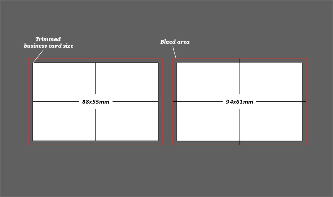
The main white area of the artboard is the finished business card size, also known as the trim size. The red outline indicates the bleed area which any backgrounds will need to extend to.
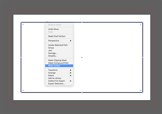
It’s also wise to highlight a safe area within your document. This not only makes sure your important elements like a name or logo aren’t too close to the trim area that they risk being chopped off, it also helps balance your design by applying some margin around the edge. The size of the safe zone is entirely up to you but 5-10mm shifts your elements inwards enough to look neat. You can highlight this area using guides, or create a rectangle at the correct size, then right click and select Make Guides.
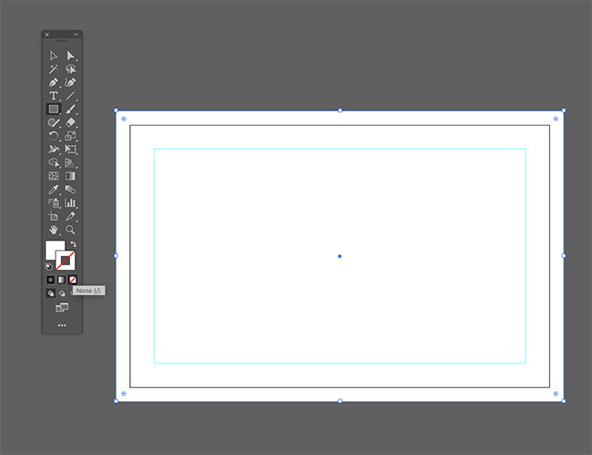
I want a black background for my card design, so I’ll grab the rectangle tool and draw a shape that covers the entire bleed area, clearing out the stroke to leave just the fill colour.
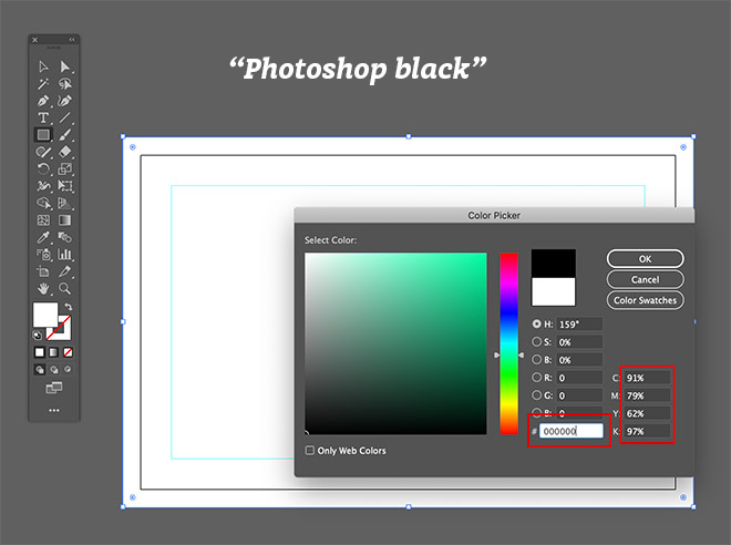
A black background sounds simple enough, but there’s a whole plethora of different black colours that can be printed. If you move the colour picker to black in the colour picker interface you’ll notice it’s made up 0,0,0 in RGB, which means there’s no light so it’s as dark as you can get, but look over at the CMYK values and they’re all over the place, totalling at 329% – This is way too much ink to be printed when you consider the general limit is around 260%.
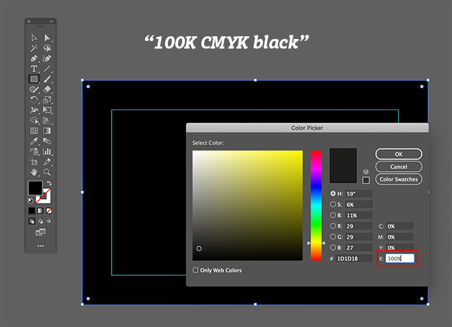
There’s the option of a basic 100% K black, which uses just the black ink from the standard CMYK process colours. This is a good choice for text because just using one ink out of the four CMYK colours means you’ll get the sharpest possible print, but when it’s applied to a large area it can look a little washed out.
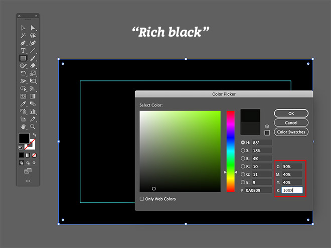
Rich black is the term used for mixes of Cyan, Magenta, Yellow and Black that result in a deeper black print. A common combination is 50, 40, 40, 100, which refers to the percentages of the four CMYK colours you set in your software and the amount of ink printed with each colour. The trouble is, this particular colour mix uses all four colours so it has a high risk of causing fuzzy text as the artwork is printed four times one of top of the other. This becomes particularly prominent if any of the print heads or plates are misaligned, known as misregistration in print terms.
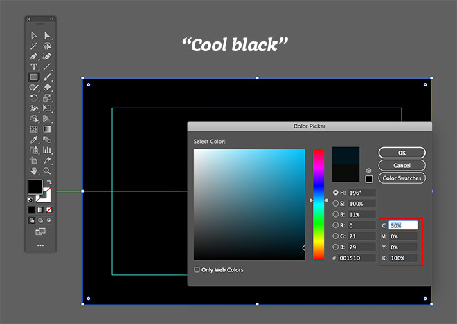
A couple more common black options are warm black and cool black, which mix 100% K with 50% Cyan or Magenta. These two recipes only use two colours so it’s much safer to use with detailed artwork while still darkening the black print. The difference between them, as their names suggest, is one has more of a cooler blue tone, whereas the other has a warmer browny red tone. I’m going to use blue elsewhere in my design so I’ll go with cool black to complement it. Set up the colour manually by entering the relevant percentages in the CMYK values.
You can now begin building your business card design by bringing in a logo. Scale it to size and align it to the safe zone guides. There’s no white ink in printing (unless it’s a super specialist print). Giving something a white fill in your software will translate to the other elements being ‘knocked out’ to allow the white paper stock to show through.
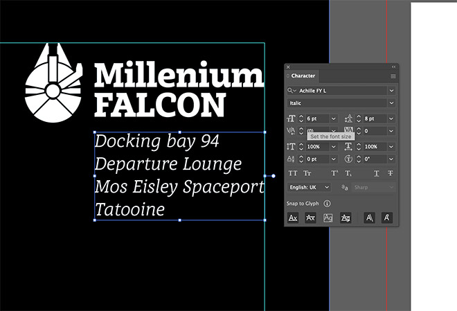
When entering the text for your print design, 6pt is usually the lowest you’ll want to go. A business card is held up close so you can get away with generally smaller type, but be careful if you’re using elegant fonts with high contrast, there’s a point where fine lines become unprintable. The slab-serif Achille font I’m using is pretty robust so it can handle 6pt even in its Regular weight.
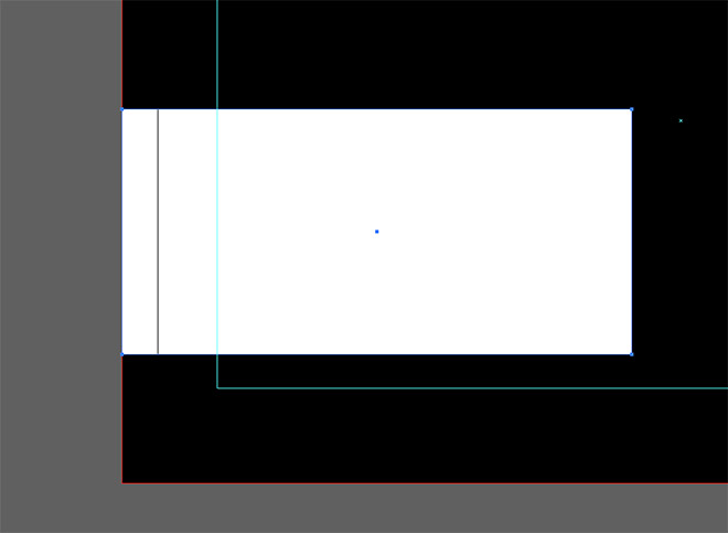
In my design I’m enclosing the main name and contact info in a white box, which needs extending up to the bleed area. One thing to keep in mind when designing for print is the paper stock forms a large part of the final design, which you don’t get to see on screen. A lot of people try to add gradients and drop shadows to make their designs more interesting, but these often just muddy the final print. An area of flat colour might look boring on screen, but when its printed you’ll see the texture of the paper with a matte or glossy finish.
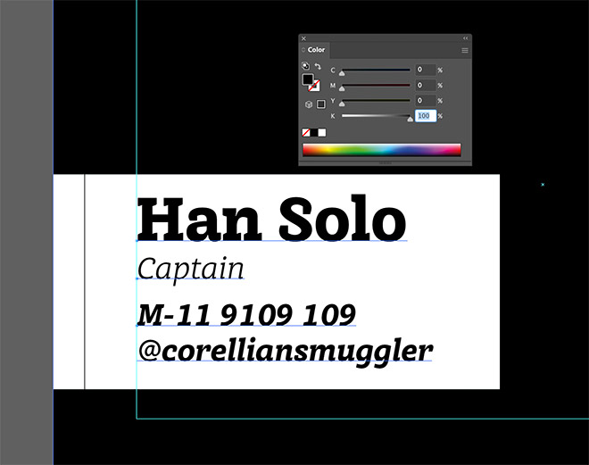
The text within this area needs to be black. I could keep using cool black with 50% Cyan, but there’s not really any point seeing as the text isn’t a large enough area to see the difference. Adding Cyan just increases the risk of a misregistration problem, which would result in a light blue haze around the text. On balance using the normal 100% K option is the better choice.
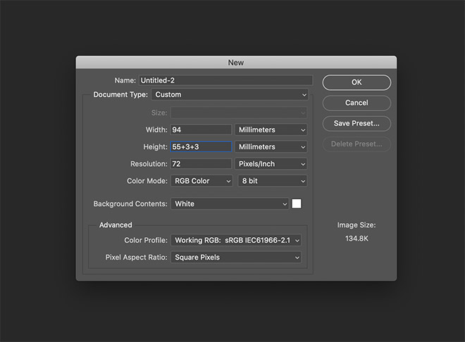
For the other side of my business card design I’m going to leave the background white but make use of a photo, so Photoshop comes into play here to use its strengths as an image editor. We need to recreate the business card document size in PSD format, so create a new document and change the dimensions to millimetres. Photoshop doesn’t have a separate bleed setting so we need to calculate the total dimensions. 88mm plus 3mm on each side equals 94mm, and likewise 55+3+3=61mm.
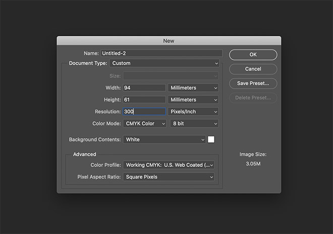
All print work needs to be 300ppi to ensure the raster image is detailed enough to print clearly, so change the resolution to 300 pixels per inch, then set the color mode to CMYK.
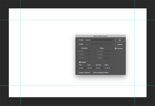
We can’t see where the actual trim line is but setting the safe zone up using guides will make sure the elements are laid out neatly. A quick way to do this is to create a New Guide Layout from the View menu. 3mm bleed plus a 5mm margin means the guides need placing 8mm from the document edges.
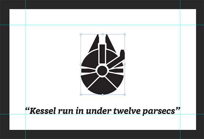
I want to have the logo and a tagline on this side of the card so I’ll paste in the logo graphic from Illustrator and type out the text with the relevant font. Usually it’s advised to add all your text in Illustrator because it’s made in crisp vectors rather than fuzzy pixels, but I’m going to overlay a photo, so Photoshop is the best option in this scenario.
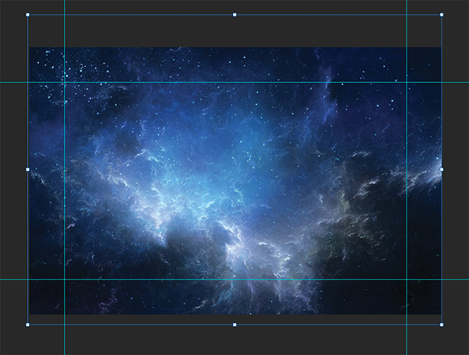
I’ve downloaded this space scene from Shutterstock. Pasting it into the document will automatically convert it to CMYK and reformat it to 300ppi. This is a nice high resolution stock photo so I’ve actually got to scale it down a lot. You don’t want to try and use low-resolution images because they will be too small to fit within your 300ppi print artwork, unless you upscale them, which will degrade the image quality.
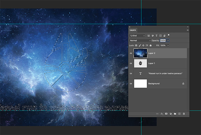
The effect I’m looking for can be created using a layer mask. A selection of the artwork layers can be made by holding CMD+Shift while clicking the layer thumbnails.
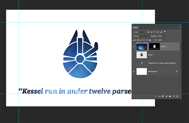
When the layer mask is applied, these shapes will be knocked out to reveal the space scene. Generally, it’s good practice to use Photoshop any time you’re working with textures and images as part of your print designs, then add text and logos in vector format over the top in Illustrator.
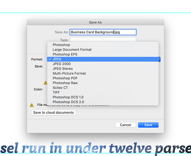
When you’re done, save the file as a JPG (or TIFF for extra high quality) using the normal Save As command so it retains the resolution and colour mode.
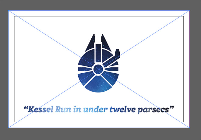
Back in Illustrator this background can be placed onto the artboard using the File > Place menu, then positioned centrally on the other side of the business card design. The Photoshop document was created at the full bleed size, so it fits neatly into the Illustrator artboard.
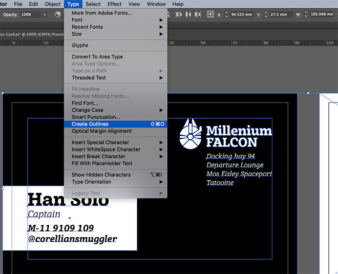
Before exporting the final print file it’s wise to outline your fonts by pressing CMD+A to Select All, then CMD+Shift+O to Create Outlines. This eliminates any chance of your typeface not being picked up when it’s opened on the printer’s computer and defaulting to a basic font.
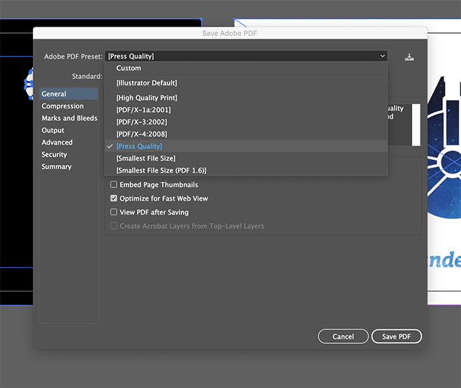
PDF is a common print format, so go to File > Save As and select PDF. There are several options that may or may not be required. This is where you should refer to your printer’s specifications. You might be asked to select a particular preset or standard.
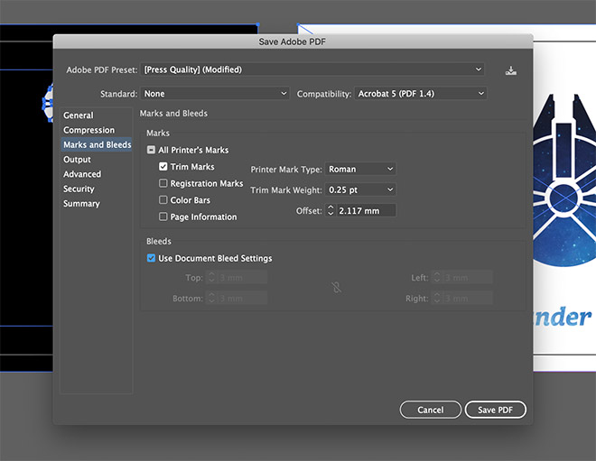
Sometimes a printer will ask for trim or crop marks, while others prefer to receive the basic art file to process themselves.
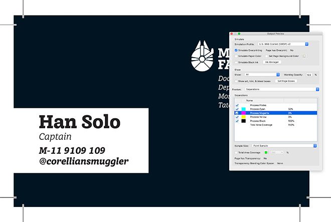
This file now contains both business card sides in one print ready document. You can give the file a quick check over by opening it in Adobe Acrobat. Look for the Output Preview tool and toggle the various separations to see how the design will be printed using the 4 process colours. In my design you can see Magenta and Yellow aren’t used at all on the first side and just 100% black is used on the name area when you hover the pointer.

Designing for print can seem like a minefield, but as long as you keep these basic principles in mind your print work will look exactly as you intended! The staff at good print shops are always happy to offer help and advice, so if you have any doubts, it’s always best to contact them to ask how they prefer to receive artwork. Many will even supply a ready-made template, so you don’t even have to worry about setting up the bleed and safe zone yourself.


Just for the Americans using traditional imperial dimensions, business cards are 3.5″ by 2″ typically with a 0.125″ bleed. This can obviously be flipped to 2×3.5, but keep your client in mind: vertical cards may seem “cool,” but business card holders — desktop accessories or slots punched in pocket folders — are almost ALWAYS horizontal. #buggers
I agree. Vertical cards seem cool until you hire someone with a long name or title and it doesn’t fit.
It’s a pleasure to follow you ,I’m enjoying the course…
Above all I’m learning so much technic about photoshop, the tools ,the app’s principles that I have to respect about design and more.
Thank you guys for this opportunity God bless
Really enjoyed this article! Always great to get back to basics and make sure your process is best practice. Especially the info about black ink, using the right black will make all the difference! Thank you!
I don’t know if Photoshop was really necessary here. You could just use a clipping mask (or two) on the raster. If only having one mask is terribly important, then you could use an opacity mask and move things around to your heart’s content.
The information on rich black and cool black alone are worth the price of admission. Nice refresher in printing basics.
I’m always concerned about the e-mail notifications from spoongraphics. It always one of the best way to learn new things.
Many many Thanks for the lessons and the artistic work.
Wish you the best.
<3
Very informative article! I regularly design business cards for print so I didn’t expect to learn anything from this article but I had no idea about “Photoshop black” being different! Sometimes it helps to have a refresher of the other concepts. Thanks!
Many thanks to you.. Very interesting and useful information.. Follow new tuts.