This post was originally published in 2008
The tips and techniques explained may be outdated.
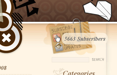
I recently decided that I wanted to add a little coolness to the RSS icon on Blog.SpoonGraphics by displaying the current subscriber count. Having seen plenty of javascript tooltip examples across the web I decided this would be the best solution, displaying the relevant information when the user hovers over the icon area. Using a combination of an extremely simple jQuery script and a PHP snippet follow this walkthrough on how to show your RSS count in a cool tooltip of your own.
Having already used jQuery within Blog.SpoonGraphics in the form of the collapsible comment area I set out to find a prebuilt tooltip script that could easily be implemented.
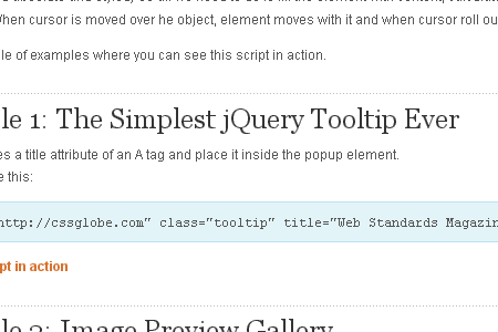
Learning jQuery is something I have planned for the near future, but luckily for us javascript noobs there are ready made downloads available, such as the Simplest jQuery Tooltip Ever from CSS Globe.
Download the bundle from CSS Globe or create a new javascript file from the source code supplied in the demo.
You will also need to download the latest version of jQuery.
Place the two files in a relevant directory in your website structure, using WordPress I save the files in my theme folder in their own ‘js’ directory. Reference the two files in the <head> section of your website, WordPress users modifying the header.php file like so:
<script src="https://blog.spoongraphics.co.uk/wp-content/themes/SpoonGraphics_V3/js/jquery-latest.pack.js" type="text/javascript"></script>

<script src="https://blog.spoongraphics.co.uk/wp-content/themes/SpoonGraphics_V3/js/jquery-tooltip.js" type="text/javascript"></script>
Also, paste in the CSS styling supplied from CSS Globe in your stylesheet.
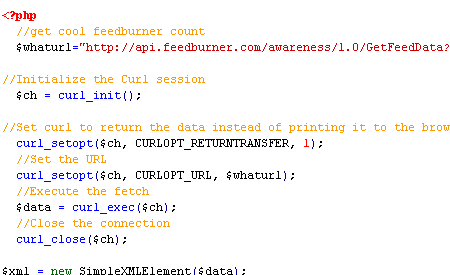
Next up is to generate the feed count using Feedburners API, if you don’t already use Feedburner to manage your RSS feeds simply head over and create an account. Using a great tutorial from 45n5.com, we can copy the PHP code and paste it into our webpage header, entering your own Feedburner id under ‘uri=’.

Modify your RSS Feed link by adding class="tooltip" to integrate it with the jQuery script. The actual text presented in the tooltip is placed in a title tag, output the feedcount followed by the word ‘Subscribers’ or ‘Readers’ like so:
title="<?php echo $fb;?> Subscribers"
The overall link should now look like:
<a class="tooltip" title="=" href="http://feeds.feedburner.com/YourFeed"> Subscribers"><img src="Your-RSS-Icon.jpg" alt="Subscribe by RSS" /></a>

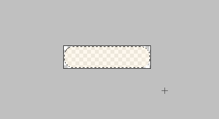
Add a finishing touch to the tooltip by creating a translucent background that will allow the underlaying site to show through. In Adobe Photoshop create a 178x46px document, draw a rounded rectangle, fill with a colour of your choice and drop the opacity to 60% leaving the image showing Photoshop’s chequered transparency pattern. Go to File > Save As and select PNG from the dropdown.
Alter the textual styling to match your sites content, and reference the PNG background in the CSS. In my case the CSS is as follows:
#tooltip {

position: absolute;

padding: 10px;

display: none;

font-family: "Times New Roman", Times, serif;

font-size: 22px;

font-style: italic;

font-weight: bold;

color: #707070;

background: url(images/tooltip-bg.png) no-repeat;

}

Upload the files and test. Now we all know that IE6 doesn’t like PNG files with Alpha transparencies, if you need to cater for prehistoric browsers don’t forget to add an IE6 PNG Fix.
Feel free to check out the live example here at Blog.SpoonGraphics by hovering over the RSS button in the header. While you’re there you may want to go ahead and subscribe ;-)


Awesome tip! I’ll be giving this a try on my site at some point soon. Thanks!
Great, your tutorial is very great, cool, easy and original. Thank you for this post ;)
great tutorial!
I hope to oneday write tutorials as good as this at haastek.co.uk
Very cool technique… too bad I don’t get enough traffic to justify implementing it. ;)
I see a strange behavior when the tooltip is activated.
The titles, both in the main content area and in the sidebar, as well as the sidebar links changes weight from bold to a sort of bold. Something like a true bold and a Photoshop Faux-bold if you know what I mean.
I also observed how the links in the main content area changed color. Did not effect the links in the Google ads though.
The changes were temporary, more like a long flicker.
The problems were observed in Firefox 2.0.0.14, Camino 1.6.1, Flock 1.2.2 and SeaMonkey 1.1.10.
Safari 3.1.2 and Opera 9.5.1 on the other hand did not show this flicker.
All on the Mac (OSX 10.4.11) as I was too lazy to fire up the Vaio and see how it looked on the PC side of things ;-P
thanks for sharing
I’ve mention your site on my last post on my blog.
Great work dude…
cool, I like it very much. thanks for sharing a such wonderful tuts here, I’m gonna use it for sure.
Good.. I really appreciate.
Pretty cool, now I just need a few months to get enough readers for my blog so I can be proud of using this new technique.
It seems to be really great.
I agreed with you
It’s really awesome i must have to try…
I assume that this will only count people who subscribe via feedburner, not those that have subscribed directly to the feed in some other way?