This post was originally published in 2010
The tips and techniques explained may be outdated.
Follow this step by step process of creating professional print ready design files for your letterhead and compliment slips stationery designs. We’ll build the design in Adobe Illustrator with the appropriate bleed and margin settings, then use a mix of Adobe Distiller and Adobe Acrobat to export and check over the final design files.

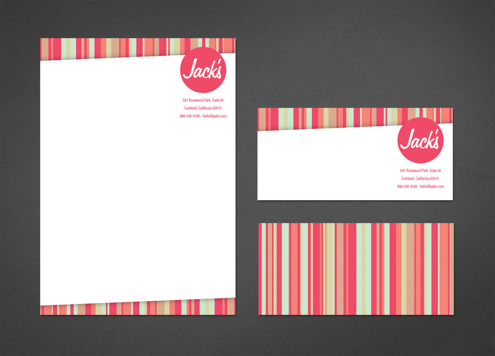
The letterhead and double sided comp slip designs for Jack’s are all tied together with the bright colour scheme and vertical stripes.
View the letterhead and comp slip designs
Illustrator?! Why not InDesign?
InDesign is often the application that springs to mind when people think of designing for print, but Illustrator actually has all the powerful print related tools you need to create simple print work. Seeing as I use Illustrator on a daily basis, I know my way around it much more than I do InDesign. Therefore I tend to use my own little rule that if a print project is just one or two pages I’ll use Illustrator, anything more like a booklet or brochure and I’ll make use of InDesign’s advanced paging tools.
If you’re considering using Photoshop. Stop right there! Although it’s quite possible to create print work entirely in Photoshop you really are better of laying up your design files in Illustrator or InDesign – These apps have built in support for setting up bleed, will render fonts much better and make it easy to export print ready PDF files. Use Photoshop for editing photos and making cool backgrounds but import these files as JPEGs into your print file.
Designing the letterhead
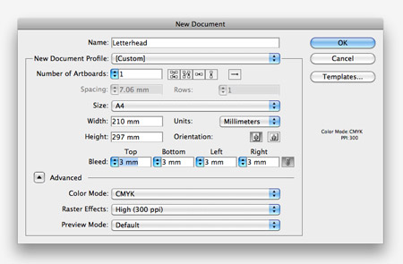
Open up Adobe Illustrator and create a new document. This is where we’ll set up the file according to our print specifications. I’m working in ISO paper sizes and millimeters here as that’s what I’m used to, but I know US folk use Letter proportions and inches. Consult with the printer you’ll be using to check what dimensions and bleed are required. An A4 page is 210x297mm, and most printers require 3mm bleed on each side. Make sure the Color Mode is set to CMYK (‘cos we’re designing for print) and set the Raster Effects to 300ppi (we’re not using any Raster Effects today, but this will make sure your Drop Shadows etc come out nice and smooth).
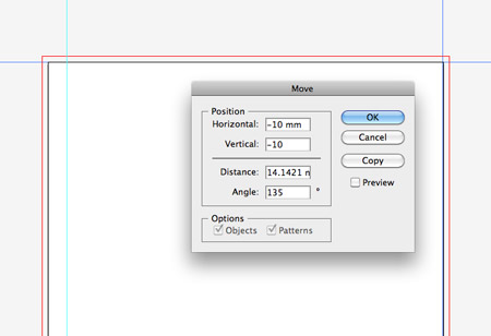
You can see the A4 document size with the 3mm bleed margin in red. One other margin we’ll need is our ‘safe zone’, this ensures our page elements aren’t so close to the edge that they’re at risk of falling off and generally helps balance your design. Drag margins to each edge of the artboard. Select the left and bottom margins and hit Enter. Input 10mm in both fields, then select the top and right margins, hit Enter and input -10mm.
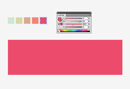
A nice colour scheme is crucial for any design. If you’re working on a stationery project chances are you’ll be using the company’s corporate colours. Here I’ve found a nice and bright palette from ColourLovers. In a new document draw a long rectangle.
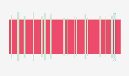
Select the first colour from your palette and draw a series of randomly sized rectangles vertically across the larger rectangle.
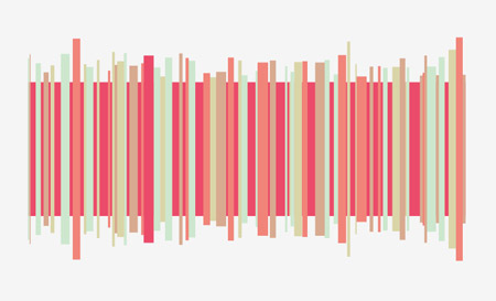
Select the next colour from your palette and draw more random rectangles. Continue this process until the whole area is filled with lots of lines.
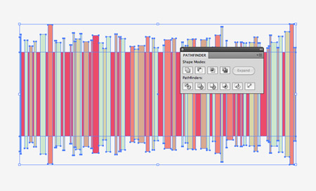
Select the background rectangle and make a copy (CMD+C), then group all the objects together. Paste in a duplicate of the rectangle using the Paste in Front command (CMD+F), clear out the fill then select this along with the group and click the Crop button from the Pathfinder palette. (Turn on tooltips in Preferences to see the icon names).
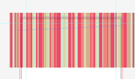
Paste a copy of the clipped series of rectangles into the Letterhead design file. Draw a thin rectangle within the bleed area across the top of the design, then use the Direct Selection Tool to move one of the corner points upwards to create a diagonal bottom edge.
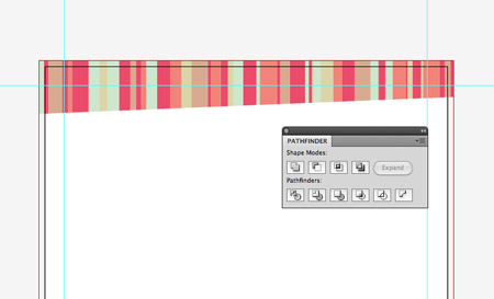
Select this shape along with the grouped lines and click the Crop button from the Pathfinder palette to trim down the lines to the confines of the masking shape.
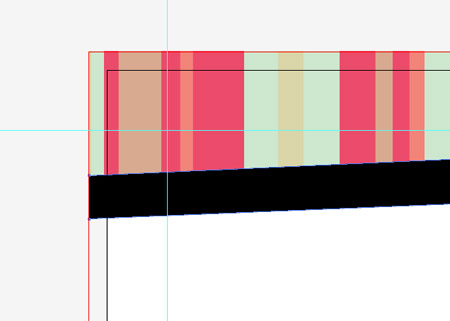
Use the Pen tool to place a point on the bottom left and bottom right edges to trace the angle of the diagonal line, then complete the shape to leave a thin angled rectangle.
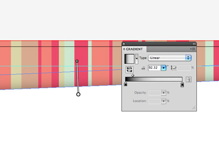
Fill this thin rectangle with a black to transparent gradient, then use the Gradient adjustment tool to rotate the angle so the gradient flows exactly perpendicular to the bottom edge. This gradient adds a subtle shading effect which really enhances the design.
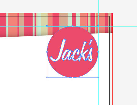
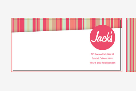
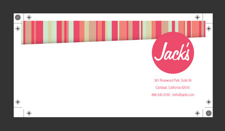
Paste in the company logo in the top left and align it to the safe margins. The Jack’s logo I’ve created is a simple circle filled with the darker pink from the colour palette with the name set out in the fun hand-written font of Freehand 575.
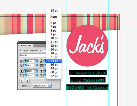
The company contact details are then laid out in Helvetica Condensed Light at 12pt with a large leading of 24pt to give a nice amount of breathing space around each line.
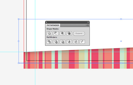
Copy and paste the series of lines from the top edge of the page, rotate them by 180 degrees and position them along the bottom edge. We don’t want the footer design to take up quite as much space, so align the diagonal line with the 10mm safety margin. Draw a rectangle to cover the lines up to the bottom bleed margin, then use this along with the Pathfinder palette to crop the footer to size.
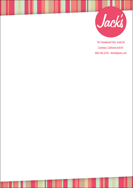
That’s the letterhead complete! The design includes some creative additions but still leaves plenty of space for the actual page content.
Designing the compliment slip
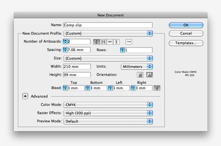
Create a new document for the comp slip. The general size here in the UK is 1/3 of an A4 page (210x99mm). Our cool client from Jack’s has agreed to splash out and has allowed us to create a double sided comp slip design, so make sure change the settings to 2 artboards.
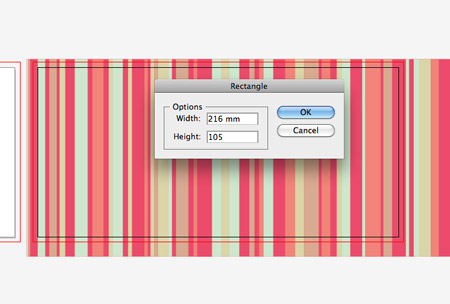
For the reverse side of the compliment slip we’ll fill the whole page with that cool lined design. Paste in the original graphic, then select the Rectangle tool and click on the artboard. Enter the dimensions of 216x105mm (basic comp slip size plus 3mm bleed on each edge).
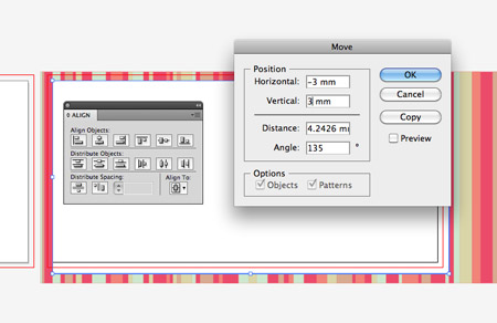
Align the rectangle to the artboard using the Align palette (change the settings under the Align To icon), then to move it within the red bleed margin hit the Enter key and input -3mm and 3mm in the horizontal and vertical fields.

Use the Crop feature from the Pathfinder to trim the design to size. This background design needs to fit within the bleed area rather than the main artboard so no thin white edges of paper appear if the printed document shifts slightly when the document is guillotined to size.
Typically comp slips contain the same design as used on the letterhead, so paste in the objects from the letterhead file and move them into place on the document.
Creating print-ready files
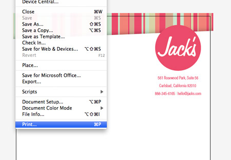
One everything is saved, approved and ready to send to the printer head to File > Print in your design files.

In the print dialogue box change the Printer drop down to Adobe Postscript File. Note: You can also print directly to PDF, see my other business card tutorials for the step by step.
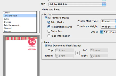
Move down to Marks and Bleed in the options and check the Trim Marks and Registration Marks boxes.
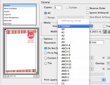
Move back to the General options section and change the Media Size to Custom. In the preview window you should see the print area has expanded to include the print marks.
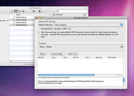
Save the file, then open up Adobe Distiller. Change the drop down setting to Press Quality then drag the postscript files into the Distiller window.
Distiller will save print ready PDF files into your folder. Open them up in Acrobat to check over the final details before sending them off to your printer. You’ll notice the double sided comp slip is all combined together into a two page PDF file.

awesome! as usual!
Very good!
You can also go File > Save as and set the file type to pdf. This still gives you all the printer settings like bleeds, image compression etc.
I agree, saving as PDF is simpler.
Chris, is there a reason to do it the way you showed, or is it just to teach is different methods?
Yeah this is mentioned in the article and links to a business card tut where it’s printed directly to PDF.
For some reason this doesn’t work on my computer. The PDF printer will run but I can’t ever find the file anywhere so I use the postscript method.
It’s always good to know about different techniques though, you never know when you might need to call on the services of Distiller!
I believe what you would want to do, to be able to find your PDF, is to hit the “Printer” button first. Then it will give you a box where you can choose where to save the file. I just finished the letterhead portion of this tutorial last night, I like your style! Please check it out – http://tinyurl.com/2clfrwx
Thanks for sharing such good stuff all the time :)
Great read, Really good to see how other designers set files up for print!
Awesome stuff Chris, just when I need to get stuff like this made up.
Just what i needed! RT’d and bookmarked!!
Cheers dude! :)
Or you could use Quark (ducks for cover!) some of us printers still use that too!
I use in-design for EVERYTHING print, and try to use illustrator only for logos or illustrations. However I may change it up next project and use Illustrator. Great post!
Awesome tutorial, was just working on stationary yesterday and then I saw this. Bookmarked!
Thanks for the tutorial! This is just what I needed to create a letterhead for an organization I’m involved in.
Great post Chris! It’s great to see that I set up my work in the same way :) Love the design too.
Good stuff, found the link from a fb design group. Can you provide a later tutorial for designing a matching template for use with Microsoft word, basically setting up the margins and fonts, then locking them so our nice clients out there don’t make such an amazing letterhead look like they dumped on it.
Chris…you are quickly becoming my hero. Thanks for this tutorial…it was simple, detailed and just what I needed!
Love it. I must try this! :D
Like always: a great and good to follow tutorial. That’s one of the reasons I always come on your blogs first if I need to do something I’m still not familiar with ;-)
Hi Chris, Great tutorial once again. Generally I tend to export my print documents be it from Indesign or illustrator as straight pdf’s. What are the advantages of saving your artwork as a postscript file and then to PDF as opposed to just saving it as a PDF immediately?
Hey Tom,
With larger files, when you run the postscript file through Adobe Distiller you tend to get smaller file sized PDFs, without a loss of quality. At least that’s been the case when I do it.
Seriously Good Tutorials , i like when someone make a Simple Simple Card and Letter & Brochure with Simple Colors , also you can use more effect on the Project like Noise !
anyway Good Job Chris
Terrific tutorial; the hint of a drop shadow definitely makes it come alive. Would you say that Distiller is your preferred method of PDF creation? Would you advise a new freelancer to purchase a copy?
I love that you’ve made some of the niggly final steps of getting a print-ready file seem much more straight forward. Thanks, Chris!
thanks for sharing this nice tutorial its really great . thanks for sharing this keep posting
beautiful idea you sharing for create letterhead design. thanks
nice design, what font have you used chris?
Another great design! We are a commercial printing company and deal with improper file preparation on a daily basis and would like to point out that most printers would rather you supply your art without crop marks. The reason is that if your file includes crop marks, it is hard to step the file for running 2 or 4 up on a larger sheet size. All in all great post thanks for sharing!
Brilliant timing with this :D I need to do something along these lines for my Graphic’s GCSE! :3
Nice design and well written tutorial… but most of all thanks for pointing out colourlovers site, this will save me many frustrating hours working out colour schemes… thanks!
Very useful stuff Chris, thanks
Another great tutorial. Nice work Chris, thanks for sharing!
I’ve had a few occasions where I have found PDFs straight from InDesign & QuarkXpress to have bigger files sizes even on the same PDF settings as putting them through Distiller. To be honest I use Distiller for piece of mind because I’ve never had any issues producing PDFs that way.
Thanks a lot for the tutorial. I love all the tutorials you put here. Amazing stuff. Keep it up man.
Great tut, Chris, I’ve experimented with a few colour variants and some fun font options. However, the one place that I did stray from the ‘lesson’ is in using the gradient as a drop shadow. I found it to be slightly murky, so instead I drew the white area of the paper as a block with an angled upper edge, then used Effect > Stylise > Drop Shadow at the appropriate angle. The shadow is cleaner this way. If – when you use this option – you find the shadow appearing where you don’t want it, just create a clipping mask to avoid that problem.
it’s nice designe
Nice tut Chris. Stumbled and retweeted!
Hi Chris I also use distiller for producing my printing pdfs, however, I always use the PDF/X-1a:2001 setting in distiller as a lot of the printers specify this. Take a look at our Quark tips re printing, same principle different programme, JJ
Ooops link http://jordantwiggdesign.co.uk/designblog/hints-tips/quark-8-tips/
Nice design and colors as ussual. I really like this tutorial! thanks :)
Nice tutorial. The colours and the drop shadow looks great.
The benefit of saving as postscript-to-distiller instead of straight to PDF is that Distiller is more efficient and creates smaller PDF files than either Illustrator or InDesign (you’d think it would be the same, but no).
It’s usually not a big deal, unless you’re submitting artwork to a newspaper or magazine via Quickcut, Websend or a similar, as they very often charge by the MB and even a small saving in file size can mean more money in your pocket.
Thank you so much for this tutorial. It makes it so easy to figure out the print side of things. You explained it so simply. I know that I will be able to add these steps to my workflow. The design is very nice too. I downloaded the font freehand-575. I am sure it will come in handy as well. Thanks.
That’s great tutorial .
Great work and nice tutorial. Love the design. Not everything has to be done in Indesign, Illustrator is very capable. I would also encourage designers to look into xara designer pro, for me it outshines illustrator in many ways.
nice tutorial, thx! u are the best! ;)
very nice. thanks..
Parabéns pelo tutorial amigo,
Obrigado
Thanks for share…this letterhead tutorial has been really helpful to me! :D
I have learned a lot from your tutorials, thanks for posting them.