This post was originally published in 2009
The tips and techniques explained may be outdated.
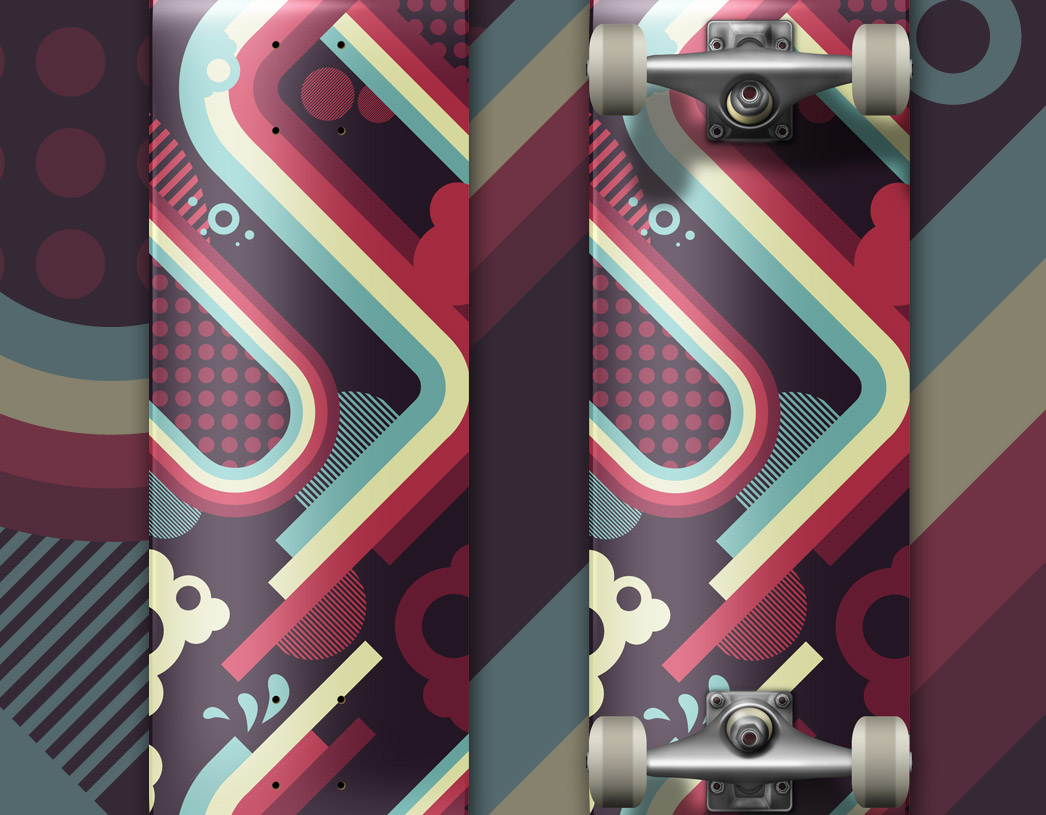
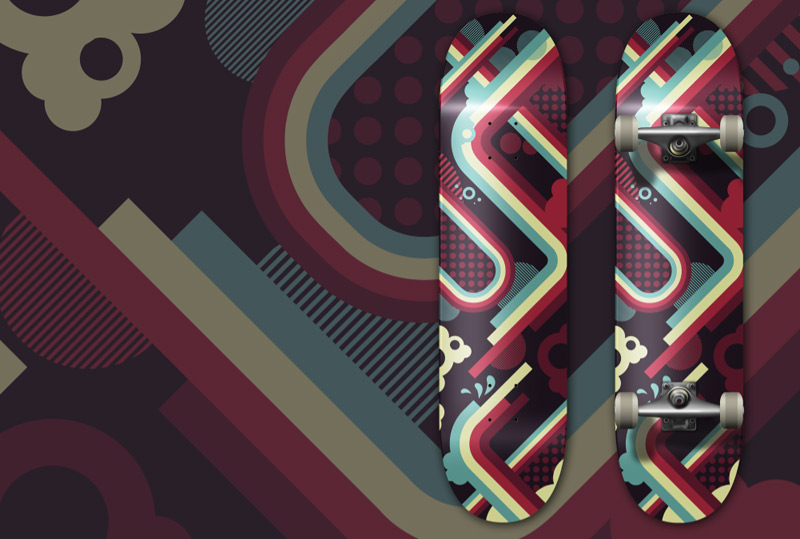
There’s nothing cooler than designing artwork for a skateboard deck! Follow this walkthrough in Adobe Illustrator to create your own vibrant and stunning vector artwork using geometric lines, shapes and a perfect colour scheme. The result is an awesome deck design ready for wall hanging, or hooking up with trucks and wheels for a session on the street!
Due to the size of skateboard decks it’s much easier on your RAM producing your designs in vector. 33x9inch Photoshop files at 300dpi can soon eat up some memory! Therefore start work by opening up Adobe Illustrator.
Depending where your design is being produced the exact board shape can vary slightly, but on average a common 7 ½ inch deck will require artwork at around 33x9inches in size.
Head over to ColourLovers.com for some inspiration for a colour palette for the design, the choice here is a crucial part of the process. I’ve picked out this cool selection called brr!!!gght.

Draw a rectangle across the whole artboard for use as a background, fill it with a solid colour.
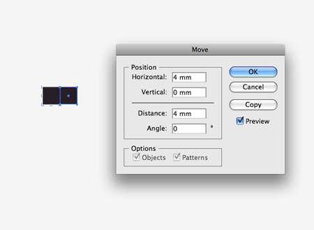
Using the technique previously documented in the Trendy Geometric Lines tutorial, draw out a square. Copy and Paste the square then press the Enter key to Move the object. Enter the width of the shape in the Horizontal option to shift to butt the duplicate to the side of the original.
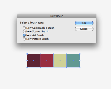
Repeat the process until a bunch of squares are laid out perfectly. Add a colour fill to each object. With the group of squares selection click on the New icon in the Brushes Palette. Select New Art Brush.
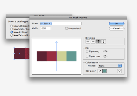
Make sure the orientation of the brush is flowing in the correct direction. Click OK to save the new brush into the Brushes Palette.
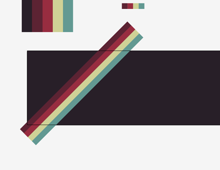
With the Pen Tool, draw a diagonal line across the artboard, hold shift to constrain the axis to 45 degrees. Add the previously created brush to add a striped effect to the path.
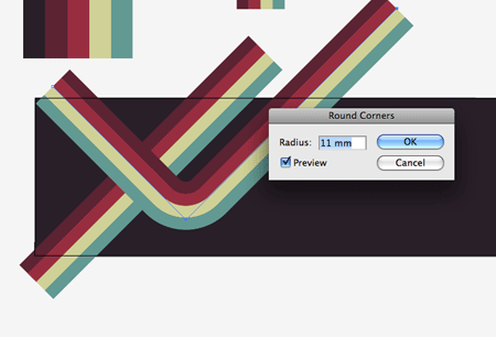
Draw a second line across the artboard, this time with a 90 degree corner. With the path selected go to Effect > Stylize > Round Corners. Enter a high enough figure so that the curve flows smoothly with no tight corners.
Draw a third line onto the artboard, flowing parallel to the other lines with rounded corners for visual interest. Change the stroke weight to 0.5 to give a thinner appearance than the others.

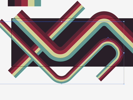
Draw a circle to the side of the artboard, then draw a long, thin rectangle and rotate it by 90 degrees. Copy and Paste (CMD F) the rectangle and move to the right while holding Shift.
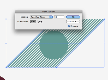
With the two lines selected, go to Object > Blend > Make / Object > Blend > Blend Options. Select the Specified Steps options and enter a figure that produces a striped effect.
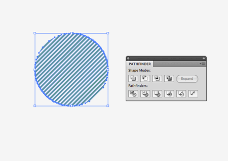
Go to Object > Expand and select only the Object option. With the lines and circle selected, click the Subtract from Shape Area option in the Pathfinder Palette.
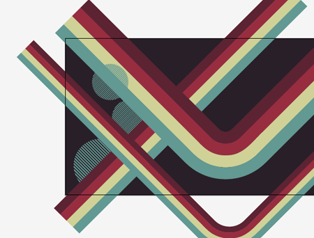
This abstract circle can then be placed within the composition. Use the shortcuts CMD+[ and CMD+] to adjust the stacking order of the objects.
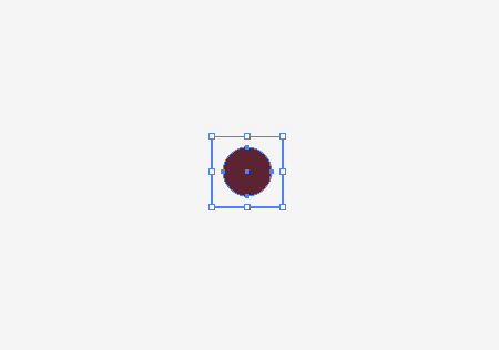
Create a dotted pattern by drawing a square with no fill or stroke, and a slightly smaller circle with a colour fill. Use the Align Palette to centralise them to each other. Drag this selection into the Swatches Palette.
Create rough shapes with the Pen Tool that fill out areas of the design, add the new swatch as the fill to give a cool dotted appearance.
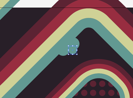
Draw small circles onto the board to customise and distort the crisp lines with tiny splodges, giving a fun and cheeky style to the design.
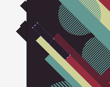
Use rectangles filled with the background colour to mask out areas of the main stripe, giving the appearance that each individual colour is spanning out at various lengths. An alternate would be to Expand the Stroke of the path, then use the Direct Selection Tool to manually drag the end points to their different lengths.
Continue the process of adding simple elements into the design to add visual interest and break up the flow of straight lines.
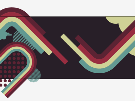
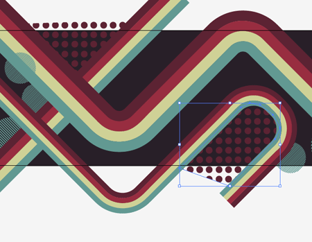
Approximately ¾ across the board add a focus point to the composition, here I’m creating an area where two lines form a gap in the flow where they break away into the individual strips.
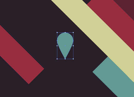
Draw a circle onto the artboard, then use the Direct Selection Tool to drag the lower point downwards vertically to form a tear shape.
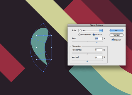
Go to Object > Envelope Distort > Make With Warp to add an Arc to the shape, creating the shape of a tiny drop.
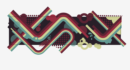
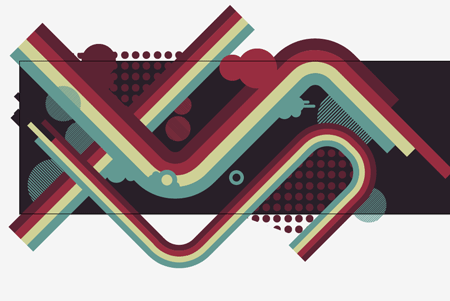
Finish off the composition with various shapes and elements, until the complete board is left with plenty for the eye to focus on.
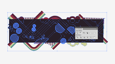
Select all the elements and Group them together. Duplicate the background rectangle and position it at the top of the stack (CMD+Shift+]). With both selected choose the Crop option from the Pathfinder window to trim down the excess design to the boundaries of the artboard.
The design is then ready to save for print, use a template from the board supplier to ensure no key elements are going to be hidden by the trucks of be cropped off the edge of the board. Check out my roundups of awesome skateboard deck designs here on Blog.SpoonGraphics, and a collection of designs and resources on my guest post over at Vectortuts for some design inspiration!

frickin’ awesome!
thumbs up!
Great tutorial. Your post about the beautiful skateboard decks is very good too
This is awesome, if I could skate i’d get myself one of those printed!
Indeed, it looks really nice on a skateboard deck.
Thanks for the tut.
Great design, Chris. I really like the colour scheme (funny that it’s called br!!!ght when to me it looks slightly desaturated, an effect which works well) and the composition. It’s an easy style to replicate, too.
Very nice tutorial. It’s amazing how well you get around Illustrator. It’s not easy to learn in my opinion. I still have a hard time making gradients and using the eye drop tool to get colors I want lol.
Excellent !! really
Fantastic tutorial.
Thanks for sharing
Very nice, someone should get that on a skateboard!
Oh Chris, touché man! This is so inspirational and a good excuse to get playing in Illustrator.
I’m getting on this now. But do you know anywhere to get it printed onto a deck? I’ve struggled to find anywhere affordable in the UK where you can order a single copy, most orders have to be in bulk.
Nathan
Not particularly UK based, but Zazzle and BoardPusher are two sites to check out for getting the odd design printed up.
Another nice post Chris. Loving the colour scheme too :)
This makes me want to print a skateboard just to have one. Great job.
Me likies, me likies very much! Serious though skateboard art looks fantastic in print!
Awesome work Chris. The design is incredible and I love how you incorporated in on the skateboard.
Chris this isn’t an impressive post… It’s a VERY impressive post! Really enjoyed this tutorial, great attention to detail with a really sleek end result. Keep up the good work.
Wow… I’m a Mad Colourlover – my great collections of palettes are here.. http://www.colourlovers.com/lover/fazai38/…
But i din know that the palette mean so much..
thanks for sharing…
Very nice indeed!
Really nice tutorial Chris!
The color scheme and design process was great!
Dugg!
Design was here!
Fantastic once again.
simple & clean..need to try this.
Phenomenal design. I don’t think I want one for my own though. Knowing me, I’d likely break several bones with the first skateboarding attempt.
And I love the idea for creating a multi-colored brush in Illustrator. You always make designing in Illustrator look so easy. Yet, it would have taken me a few hours to figure out what you just did within a few minutes.
Wow beautiful design, I’ve always wanted to design my own skateboard graphic… Out of curiosity do you skate, Chris? :P
Nah not a skater myself, though I like the general design influence etc. Wouldn’t mind giving it a go one day, and subsequently end up on my back!
Freakin amazing! Thanks a lot for this I would love to get my own design printed on a deck!
I love this site, you never fail to blow me away – amazing!!!!!
I really want to get a deck printed, but I’m worried about the fat shipping charge I’ll get on the door for having it delivered to the UK. The places I’ve looked at online don’t deal with the international shipping themselves.
I wouldn’t skate it though. As soon as I step foot on a new deck, whatever lovely graphics were on it will be scratched and smeared across my grandma’s stair rail.
nice tut
thanx for sharing
Hey Chris just wanted to pop back on and say thanks again. I spent a good few hours working on this yesterday, I’m still quite new to Illustrator and I learnt so much just by playing around with this tut. I’m really happy with the end result and a few mates really like it so I might look at get it printed up!
Cheers
Nathan
Awsome tutorial, good colour choice, reminds me of the colours Enjoi once used on a deck design. Good effect dropping the design behind the board design, and knocking the alpha down. Are the trucks and reflections etc vector, supplied by the board company?
Nice tut Chris! If I had a deck like this I’d put rail guards on it so the graphics never get scratched :p
Great tut Chris, keep em comin!
Chris, you rock, dude!
Hi Chris,
i love your work:-)and your tutorials are so helpfull. thanxx a lot.
esra paola
hi, very nica desing, thank you
elakiri, nice tute machan, thanks for sharing yuor knowledge
Sri Lanka
Awesome tutorial! I like the colors. :D
Amazing post like you ever do ,so keep em coming ,i learn a lot with every post here.
great tutorial… thank you for sharing!
muy bueno el tutorial, saludos me gustaria ver algo de como hacer reflejos.
English:
Very nice tutorial, cheers and i would like to see how to make a reflect with gradient, ty
Yours tuts are always gave +1 skill.
Thanks for the share.Again stumbled this post.
:P
Your post has been featured on March’s “Nerdiest of the Net!”
http://www.blog.designnerd.net/nerdiest-of-the-net-march-09
This is cool !
+1 for you.
Regards
Vidhu
Great post and very nice design.
very helpfull
thank you
Great, you went over some really usefull techniques for illustrator in this one.
This one caught me by suprise, very nice design; talented!
wao!…. increible esos efectos para el diseño.. voy a ver si me sale!!
Where can i find the skate deck template you used to show the final preview of the design?
Okay, really nice tut and everything, great outcome, but can ANYONE do that abstract circle made of lines???? It’s really pissing me off, I press subtract from shape are and the fucking lines disappear leaving me with a filled circle. What the fuck???
The rest is very cool though….
any idea where that skateboard deck template came from?
thank you very much for your help in advance. I’d be very pleased if it was somewhere to be downloaded.
what material should i use to print this onto my skate?! ive been looking all night, please, email me with the answer : brandonconnolly@hotmail.com
Я новенький! Давайте дружить! =)
nice, really nice!
i’m having a problem with the 90 degree angle. i draw it out with the pen tool but when i apply the brush it just turns into a triangle. i just can’t get it to be a 90 degree angle. btw i’m AI CS4. can you answer this for me please.
hey
im having trouble rounding corners..the outside rounds..but the inside seems to remain unrounded .. would you know why ?