This post was originally published in 2010
The tips and techniques explained may be outdated.
Follow this step by step guide to creating a fun cartoon style poster design. We’ll combine a quick character doodle with some bold and blocky text, then bring it to life with a muted colour palette and a mix of textures to give the poster an old and retro feel.
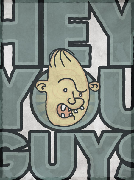
The design I’ve created is a mini tribute to the Sloth character from the Goonies. The quick doodle depicts the basic form with just a few simple doodle lines. All the linework, including the outline of the text is given a rough texture to create a hand-drawn feel, then everything is brought to life with a muted colour palette and a mix of texture additions in Photoshop.
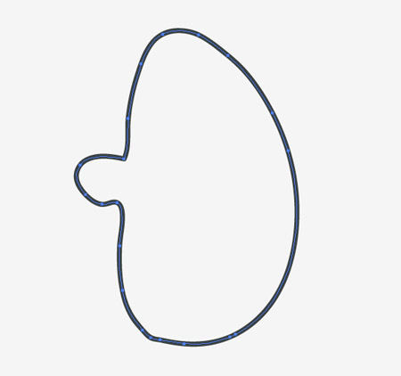
Create a new document in Adobe Illustrator and grab the brush tool. Draw the basic outline of the character’s head as a complete path. Tip: Double-click the brush icon to open up the settings. Use the Edit Selected Paths option to fine tune your linework.
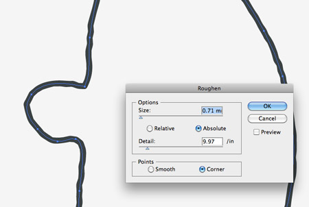
To give the linework a cool doodle effect, go to Effect > Distort & Transform > Roughen. Adjust the sliders to limit the effect down to just a few subtle bends and kinks in the lines so the basic shape is still recognisable.
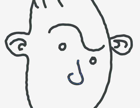
Continue drawing the facial features with the Brush tool. The same stroke and roughen effect should be continued through onto the subsequent lines.
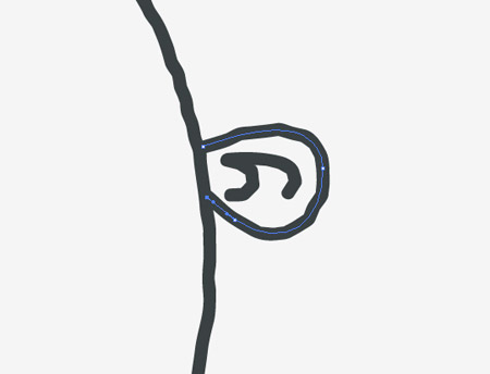
Use the Direct Selection Tool to tweak the position of the end points to ensure the lines overlap without a gap.
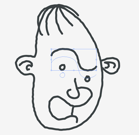
The great thing about doodling in Illustrator is you can easily move things around if you didn’t get the positioning quite right the first time.
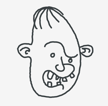
Finish off the character with the remaining facial features. Being a doodle the artwork doesn’t need to be super high quality. Anything goes, make it as rough as you like!
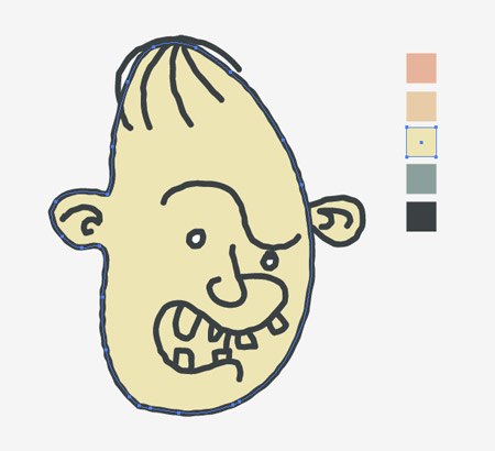
Find a suitable colour palette to use for your design. I found this muted palette from ColourLovers. Copy (CMD+C) the main outline of the head and paste behind (CMD+B). Clear out the stroke and add a flesh coloured fill from the colour palette.
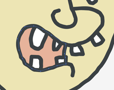
To fill elements that aren’t complete shapes, use the Pen tool to roughly draw an outline that stays within the width of the stroke. Fill this shape with a relevant colour swatch then repeatedly press CMD+[ to alter the stacking order until it sits underneath the strokes.
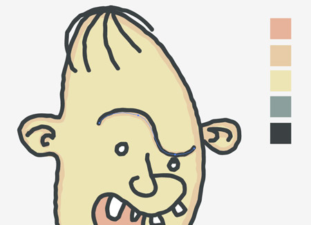
Select the Brush tool again and increase the brush size using the ] key. Add a slightly darker flesh tone as a stroke colour, then trace around the existing linework. The larger brush size will create a basic shading effect. Send these strokes below the darker linework using the CMD+[ shortcut.
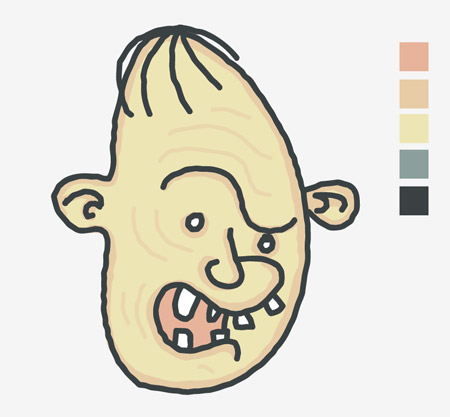
Decrease the brush size slightly then draw some subtle facial wrinkles using the same darker flesh tone.
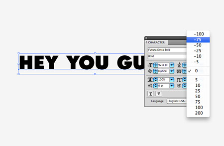
Sloth’s iconic “Hey you guys!” quote has to appear in the design. Type it out and select a nice chunky font. Here I’m using Futura Extra Bold with the tracking adjusted to -75.
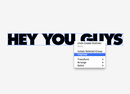
Press CMD+Shift+O to create outlines of the font, which essentially turns the text into editable shapes. Right click and Ungroup, then select each word and re-group (CMD+G).
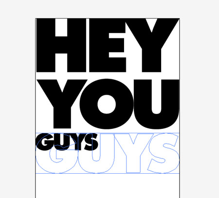
Scale and position each word onto a poster sized artboard. Hold Shift while scaling to constrain the axis and keep the text in proportion.
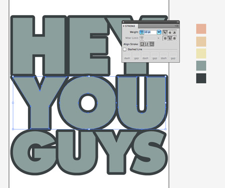
Use the eyedropper tool to alter the fill colour of the text, then add a darker stroke from the colour palette. Bump up the stroke weight and align it to the outside by adjusting the options in the Stroke palette.
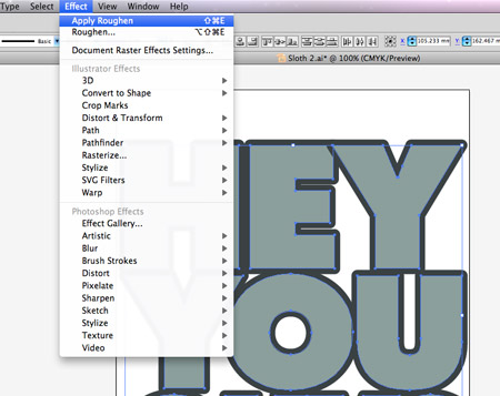
Give the text that same doodle feel by going to Effect > Apply Roughen – Because this effect was the last used this shortcut will apply the same settings.
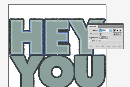
Copy (CMD+C) the text and Paste in Front (CMD+F). Clear out the fill and adjust the Stroke settings to a lighter shade aligned to the inside. Repeat the process on the other two words.
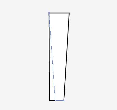
Draw a rectangle elsewhere on the page. Use the Direct Selection Tool to select and nudge the two bottom corner points closer together.
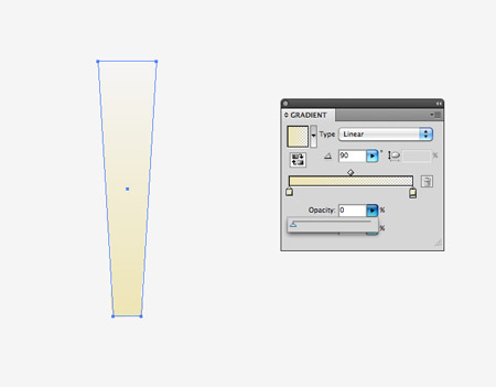
Add a Gradient as the fill colour to the new rectangle shape. Add a yellow swatch to both ends of the gradient spectrum, then adjust the Opacity to zero on one side.
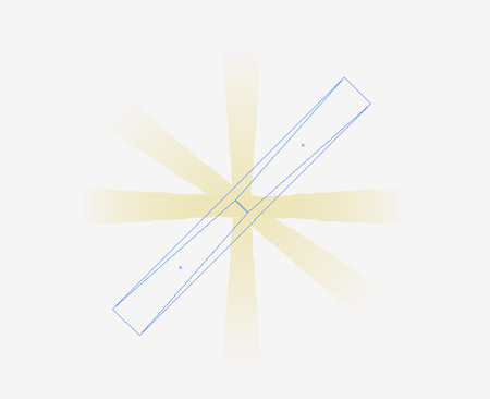
Copy and paste the rectangle and rotate it by 90 degrees. Align it to the lower edge of the original then make duplicates in order to form a series of radial flares.
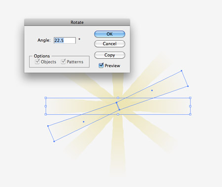
To fill the smaller gaps between the 45 degree angles go to Object > Transform > Rotate. Enter 22.5 in the options (45 divided by 2 = 22.5). Continue duplicating and rotating this new shape to fill out the rest of the pattern.
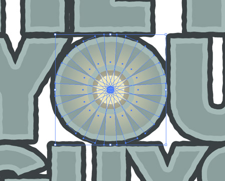
Position the flare in the centre of the letter ‘O’ on the design. Scale the flare to extend to the outer stroke of the wording.
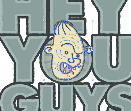
Paste in the character and scale it to fit roughly in the centre of the radial flares. Ensure the character is at the top of the stack by hitting CMD+Shift+].
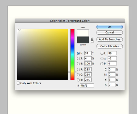
Next we’ll move over to Photoshop to add some cool textures and make use of the powerful blending modes. Create a document according to your poster size and fill with a subtle yellow background colour.
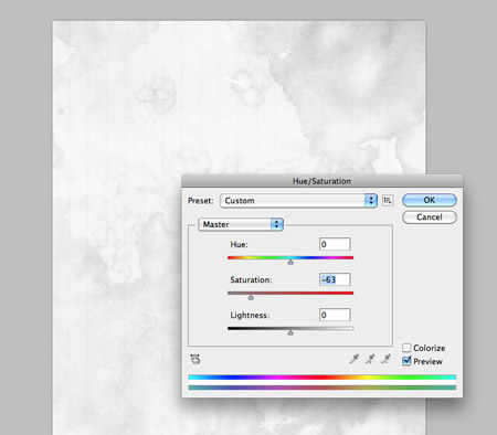
Paste in a detailed texture file and desaturate to remove the original colouring. Set this layer to Multiply.
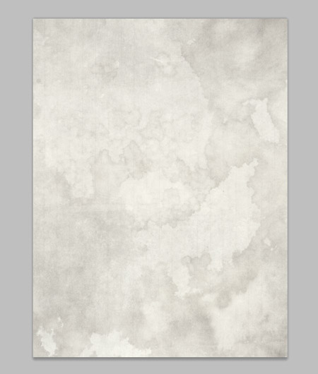
Paste in another texture file and set this layer to Multiply. The two textures will interact with each other as well as the yellow background colour.
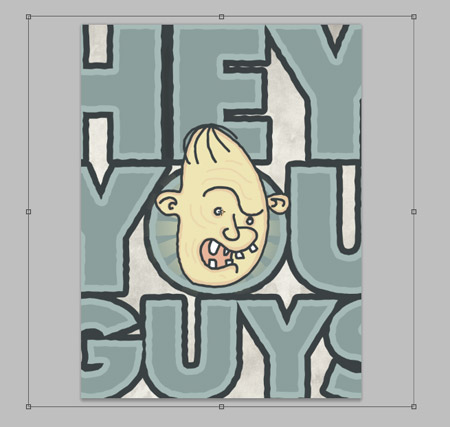
Next, paste and scale the vector design from Illustrator. Enlarge the design so the text completely fills the canvas.
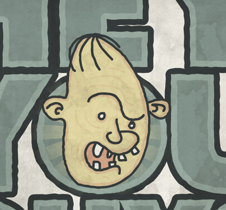
Change this layer’s Blending Mode to Multiply to allow the textures to interact with the crisp vector colours to give a cool retro feel.
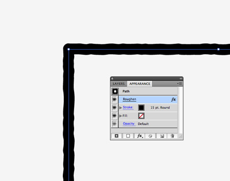
Quickly switch back to Illustrator to create a thick rectangular stroke with the roughen effect.
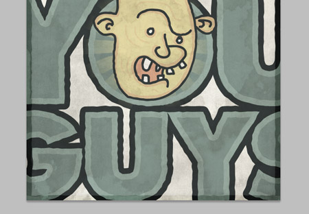
Paste this into Photoshop and change the blending mode to Soft Light. Adjust the Opacity to 80% to create a subtle border.
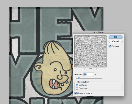
Create a new layer and fill it with white. Go to Filter > Noise > Add Noise and adjust the settings to around 50%. Change this layer’s blending mode to Multiply and turn down the opacity to around 20%.
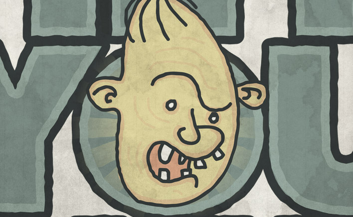
The final poster is complete! It combines the best of both applications – The sharp and crisp vector lines of Illustrator and the powerful blending modes of Photoshop.


I get so caught up in clean professional design that I forget about stuff like this. Very cool idea for a tutorial.
Funny image and great tutorial, thank you for sharing :)
really cool image you creating. thanks
Thanks for the great tutorial. And as Markus said, we do forget designs like these beneath all the client designs.
Nice, looks like a hand drawn drawing.
Funny illustration. :D
thanks for the tutor.
Really great one. Thanks Chris!
Very cute! Look at the adolescent teeth!Love it haha!
oh cool, ths for share
i visited your blog for the first time about a week ago…and now i check it out every day! thank you for all the great tutorials and stuff! spooner rules ;-)
Fantastic tutorial, though I usually start out sketching if I intend to draw figures. Nice!
Great tutorial, I can’t wait to try it out. I love the use of Chunk… what a great movie! :)
Err.. I meant Sloth, Chunk was the big kid! :)
wow ,how do u get these ideas ,its so cool ,im starting to see your tutorials every day now.lol
I didn’t end up doing the photoshop step, but really enjoyed this tutorial :)
http://ben.pondr.in/post/1047820627/i-got-bored-so-i-went-through-this-tutorial
I’ve seen that you’ve done a sunburst in a couple of recent tutorials, but your technique is a little time-consuming. I don’t know if you know about this technique, but if you select your shape, go over to the Rotate tool and Alt + Click where you want the center of your star burst to be, you can hold ctrl + d and make a much faster sunburst. After you alt + click (there should be three dots off the cursor when you hold Alt) you can pick the angle to rotate the shape. After that, you just hit “Copy” and hold ctrl + d until Illustrator makes the sunburst for you.
Writing it out makes it seem like a long process, but I promise, it can make a sunburst in 3 seconds. :D
WOW awesome!!!!!! Greate thanks for this tutorial! i love it!
Thanks again mate!
Fantastic tutorial, though I usually start out sketching if I intend to draw figures.
Nice tutorial, thank you Chris.
Very nice tip. I learn something new from this.
Thanks
The poster is a lot of fun. I am really impressed to see that this is possible. I am astonished of what i have seen :)
Hah funny illustration :) but tutorial is perfect :) Thanks
People Illustrations – Funny, Scary, Serious, Fantastic, and Everybody Else – http://www.cruzine.com/2010/09/02/people-illustrations/
Great Tutorial Chris. Loved it… :)
Grate Designs
For the past 10 years CrystalGraphics has been widely known as the developer and publisher of the market-leading PowerPlugs brand of Microsoft Office-enhancing products and services.
more details here
http://www.crystalgraphics.com/powerpoint/templates.backgrounds.main.asp?p=gpp_te&cgss=animated+powerpoint+templates
I like to send me news.