
This post was originally published in 2016
The tips and techniques explained may be outdated.
A fun personal project designers and illustrators often take part in is ’36 Days of Type’, or equivalent challenges like ‘Daily Drop Cap’ where artists express their style on a new letter or number every day. Initials have received decorative treatment throughout history, with examples dating as far back as early biblical texts. In today’s tutorial I’ll take you through the process of decorating a letter in Adobe Illustrator with a range of vector embellishments. We’ll make use of some really useful techniques that you’ll be able to make use of in all kinds of illustration projects in the future.

My chosen letter for this tutorial is an ‘S’, but it would be fun to play around with all the different letterforms to see how they each provide a different canvas to work with. Using some of the unique features of Illustrator and its powerful shape building tools, we’ll add a range of patterns that follow the shape of the letter, and create some embellishments to decorate the inner spaces.
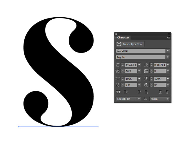
Open up Adobe Illustrator and create a new document. Use the Type tool to enter the letter of your choice and pick a nice font, which will provide the foundation for your creative style. Here I’m using an elegant modern serif named Goku.
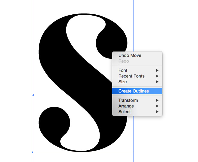
In order to work with the letter as a physical shape, it needs converting to outlines. Right click and choose Create Outlines, or use the shortcut CMD+Shift+O.
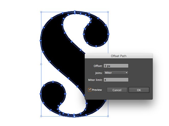
One Illustrator tool we’ll use multiple times in this tutorial is Offset Path. Go to Object > Path > Offset Path and enter 3px. Give this shape a white fill.
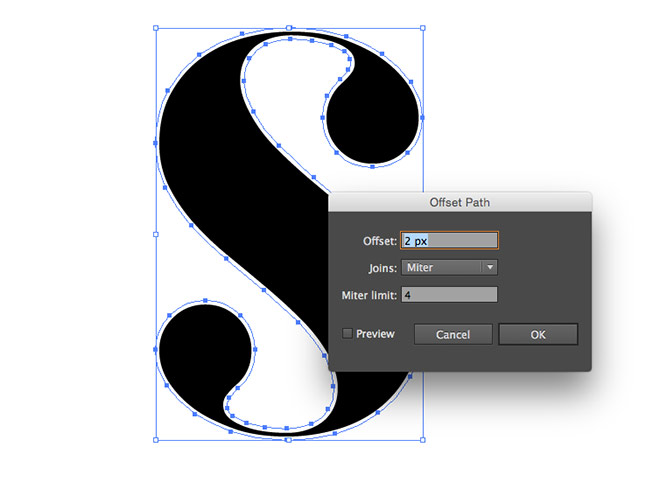
Head back to Object > Path > Offset Path and add another outline, this time at 2px in size. Give this one a black fill.
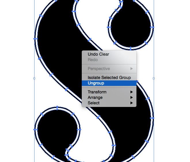
Right click and select Ungroup to break apart the three objects (the original letter, plus the two offset paths).
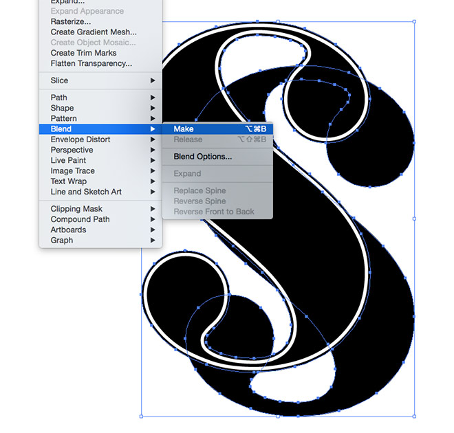
Select the outermost shape and Copy (CMD+C) and Paste Behind (CMD+B) a duplicate. Move this shape diagonally to the lower left, then hold Shift and select the original again. Go to Object > Blend > Make.
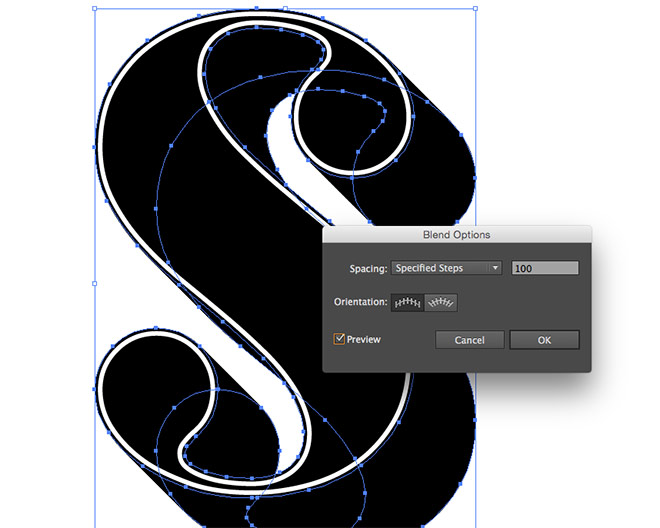
Go back to the Object > Blend > Blend Options menu and change the Spacing to Specified Steps with a large number like 100 to form a smooth transition between the two shapes.
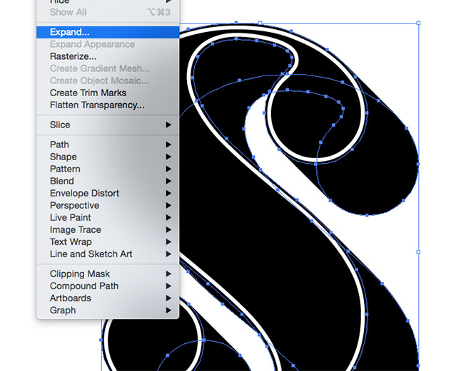
Permanently apply this blend effect by going to Object > Expand, which will convert the effect into a series of individual shapes.
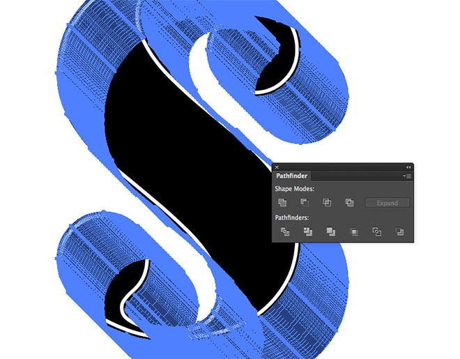
Merge all these individual shapes into one by clicking the Unite button from within the Pathfinder panel.
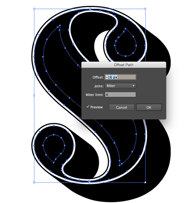
Select the original letter outline again, then go to Object > Path > Offset Path. Enter a negative figure such as -16px to create an inner outline in the centre of the letter. Give these shapes a white fill.
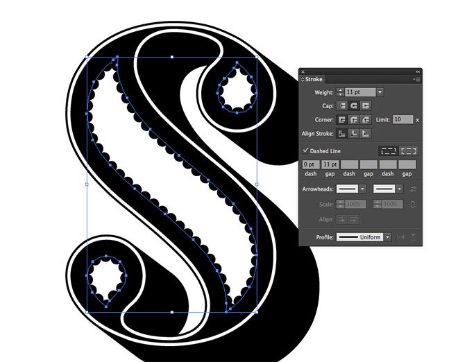
Copy (CMD+C) and Paste in Front (CMD+F) a duplicate of these shapes. Clear the fill, then set up a black stroke. Increase the weight to 11pt, then check the Round Cap option. Enable the Dashed Line option, then set the Dash to zero and the gap to 11pt. This will create a series of circular dots which make a nice pattern around the edge of the shapes.
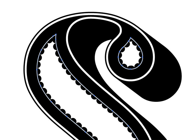
Paste in another copy of the shapes and switch the white fill for a stroke. Alter the stroke weight to leave a fine outline for an extra decorative touch.
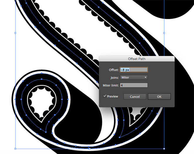
Select the original letter shape again and add a new Offset Path. This time enter half of the previously used figure to create an outline exactly halfway between the outline and the inner shapes.
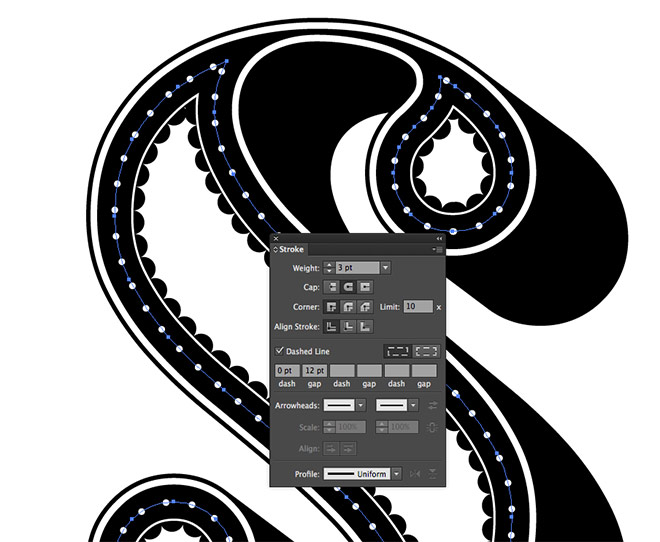
Set up a white stroke and configure the Dashed Line settings to produce a dotted effect. The key settings are the Round Cap and 0pt dash, which provide the dots. Adjusting the stroke weight controls the dot size, while the gap determines the spacing between them.
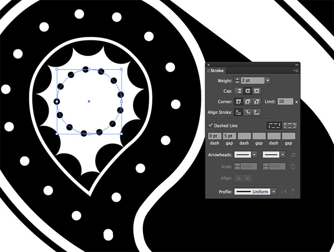
Zoom in and draw a perfect circle using the Ellipse tool within the gap left in the letter’s terminal. Use the stroke technique to apply a series of small black dots.

Copy and Paste in Front a duplicate of the circle and replace the stroke with a black fill. Reduce it in size slightly while holding Shift and Alt to scale it centrally, then press CMD+F to paste in another copy. Scale this new shape even further and give it a white fill. Add a third shape and scale it even further to alternate between black and white rings.
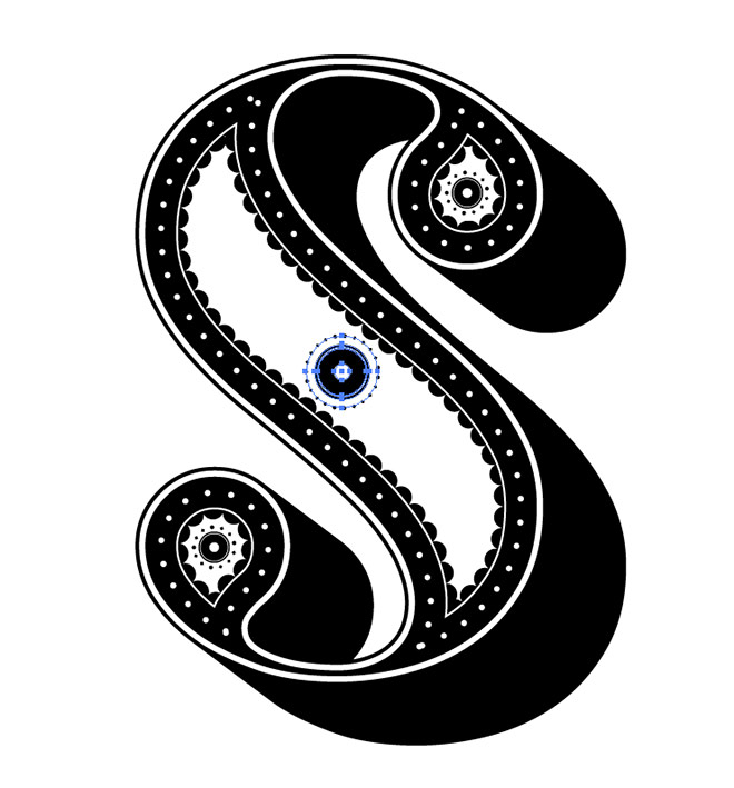
Select and group (CMD+G) all the elements that make up this decorative object, then make duplicates and position them elsewhere within the letterform.
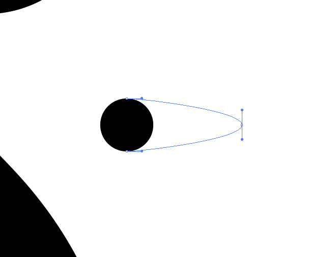
Elsewhere on the artboard, use the Ellipse tool to draw a small circle. Use the Direct Selection tool to drag one of the side points outwards while holding Shift.
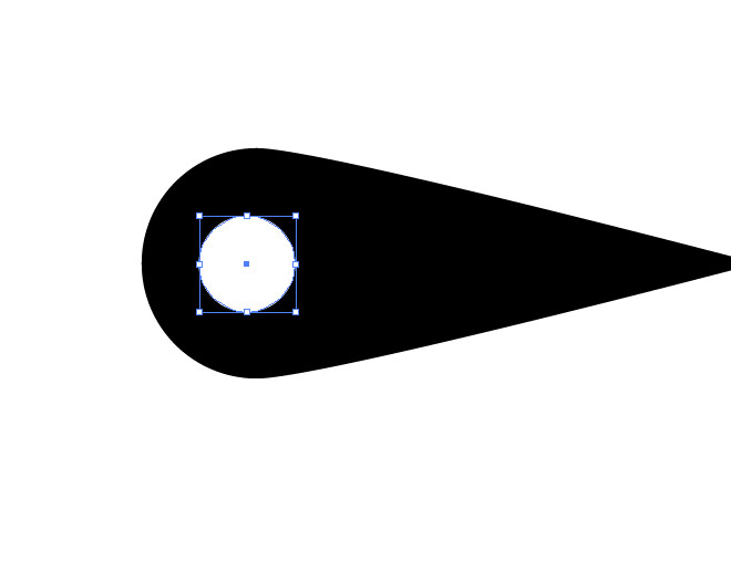
Select the Pen tool and hold the Alt key while clicking the offset point to remove the bezier handles, leaving a sharp point. Add a small white circle as a simple decorative touch.
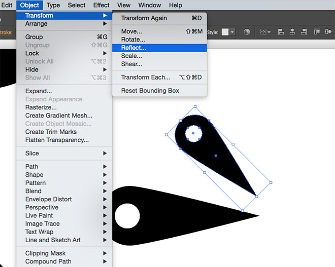
Copy and paste these shapes, rotate them by 45°, scale them down slightly and position them next to the originals. Copy and Paste in Front a duplicate, then go to Object > Transform > Reflect to flip it along the horizontal axis so it can be positioned on the opposite side.
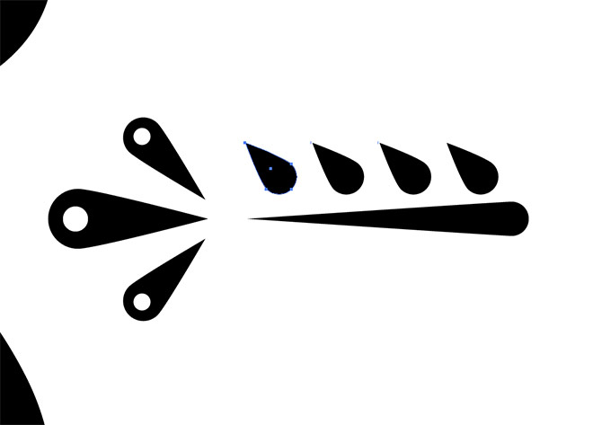
Make a copy of the teardrop shape and stretch out the point even further to make the stem of a floral embellishment. Scale, rotate and position a smaller shape to form a leaf, then make three more copies along the stem.
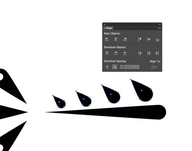
Scale the second shape down slightly, then select the third shape. Use the shortcut CMD+D to ‘Transform Again’ to repeat the scaling, but press the shortcut twice. Use the shortcut three times on the last shape to scale it down three times as much, leaving a gradual change of size between them. Select all the leaf shapes and click the Horizontal Distribute Spacing button from the Align panel to evenly align them.
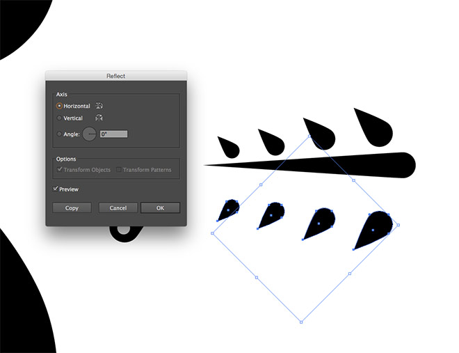
Make a copy of the leaves and flip it along the horizontal axis using the Reflect menu. Move them into place on the opposite side of the stem.
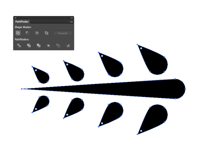
Select all the objects that make up this element, then click the Unite Pathfinder button to merge them all into one shape.
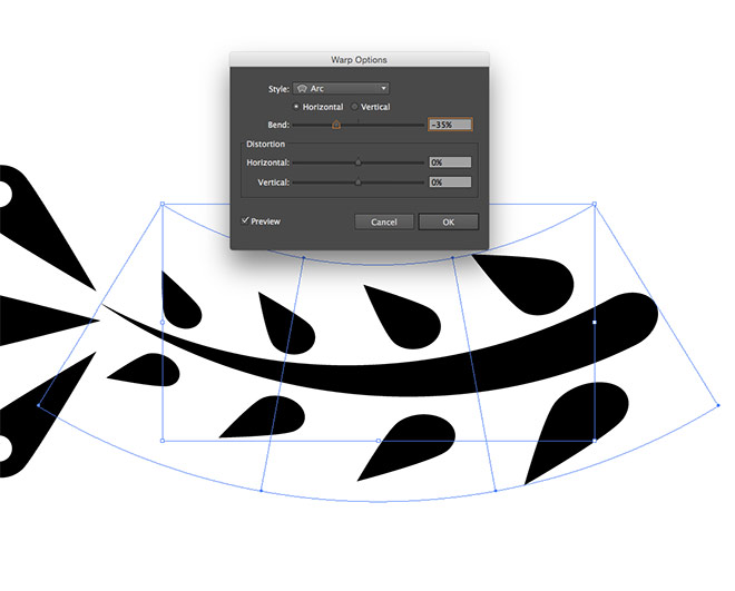
Go to Object > Envelope Distort > Make, then change the setting to Arc at -35%. Expand this shape (Object > Expand) to permanently apply this envelope distortion.

Copy, paste, scale, rotate and position these decorative shapes into place within the letter to fill out the empty space.

Simple shapes like a basic circle can also be used to fill out any smaller gaps to add subtle details to the artwork.
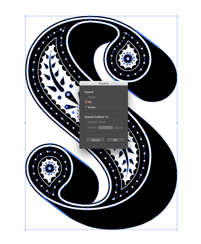
Once the layout is complete, draw a selection around everything and go to Object > Expand to covert all the strokes into solid shapes.
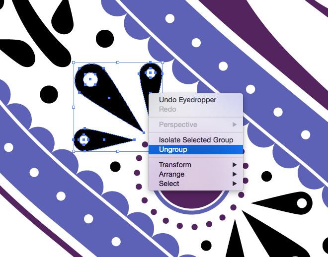
The letter can now be given a splash of colour to finish it off. Some elements will need to be ungrouped again to gain access to the individual pieces.

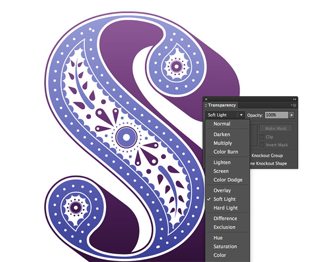
Replace the black fills with colours of your choice. Flat vector art is really popular at the moment, but a simple gradient can add an extra finishing touch.
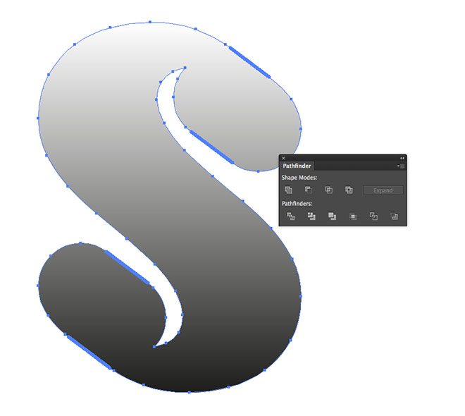
Select all the shapes and press CMD+C & CMD+F to make a duplicate. Click the Unite Pathfinder button to produce a single shape, then apply a black to white gradient fill.
Change the blending mode to Soft Light from within the Transparency panel to allow the gradient to interact with the original colours.
The final letter design looks great with its new decorative elements. Those simple Illustrator techniques of creating offset paths and dotted patterns made it easy to style up the original letter. The more details that are added, the more ornate the final result becomes, even though it’s only made up of the most basic shapes. Have fun creating your own type project by applying a unique style to 35 more letters and numbers!
Great tutorial as usual !
Thanks very much!
This was the coolest tutorial! Definitely a good, quick lunch-time activity to get my mind off of the daily work grind for a bit!
I hope you enjoyed your creative getaway :-)
Great tutorial! thanks for share it!.
I am pleased again like before.. Actually I love your presentation. It is easy to find out.
Thank you Biju!
Thank You so much chris! Its amazing.. Keep adding more tuts :)
You are a very professional designer. –<-<-<@
Super-Duper blogs! I love it really!! . Thanks for Sharing This Useful Information .Would come back to visit soon, again Thanks. Really important for a designer
Wow! That looks so easy! Must try! LOL
Thank you!
Su
Wow! All these years and I never knew how to make a dotted outline so simply and here you have it explained in a way that I am saying to myself, duhhhhh! Love, love, love this tutorial!! I can think of a hundred ways to incorporate this into my work. Thanks! Another brilliant, well explained, easy to follow tutorial!
Thanks Chris for your awesome blog. You are a great professional designer and your blog helps me to learn more things about design.
Great tutorial! thanks for share it!.