
This post was originally published in 2008
The tips and techniques explained may be outdated.
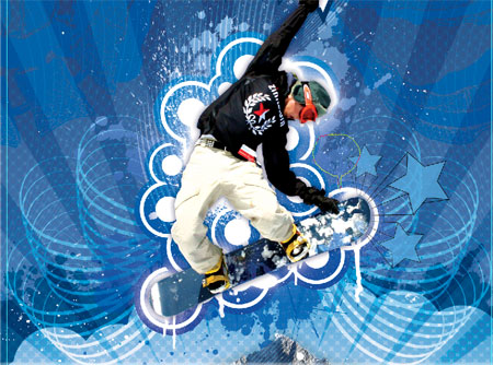
Back in Part One of the walkthrough we setup the basics of the design by clipping out and placing in the base photographs and began adding the vector elements.
Now in the second and final part we will continue adding elements and resources to finish off the artwork into a stunning composition.
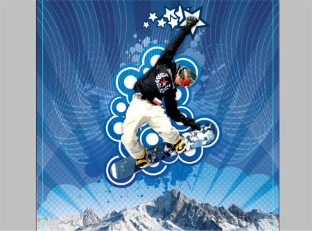
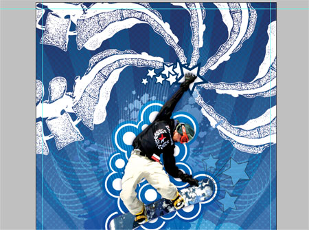
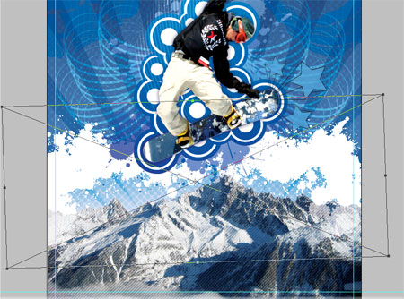
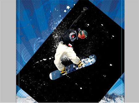
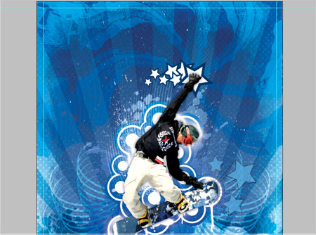
So far the design will look a little something like this:
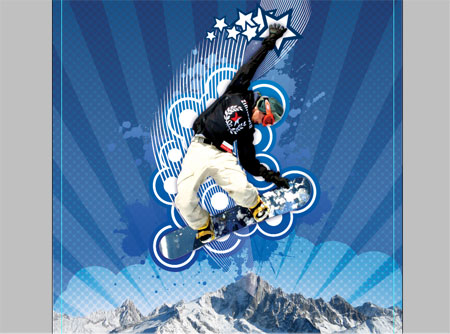
The added vector elements are really starting to add to the composition, let’s continue creating a few more…
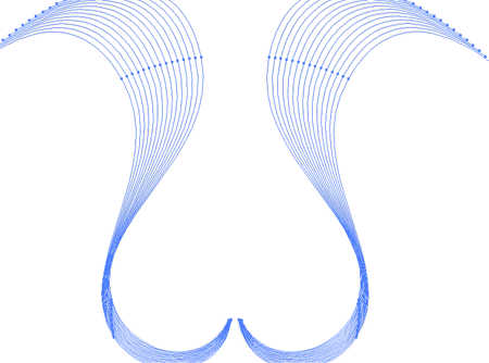
Vector Shape Five – Curly Lines
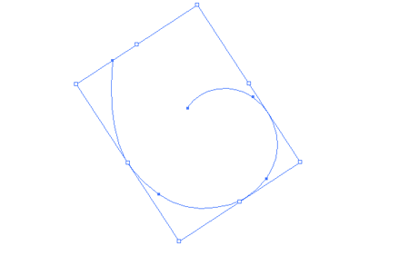
Switch back to Illustrator again to draw a Spiral on the artboard, use the cursor keys to adjust the amount of spiraling.
Use the Direct Selection Point to drag the end point of the spiral to give more of a sweeping motion. Apply the brush we made earlier to this shape.

Duplicate the spiral and rotate each one using the same technique as the Radial Lines to create a repeating pattern as shown above.
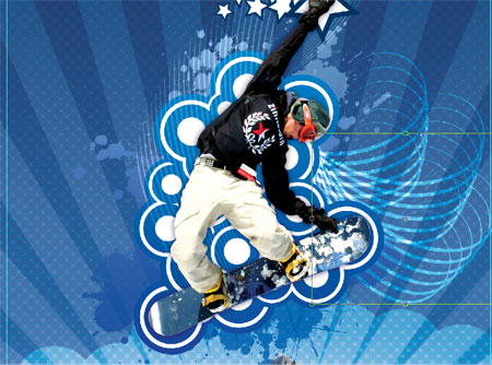
Paste the spiral pattern into the Photoshop document a few times rotating each one slightly. Merge the layers together and change to Overlay with 50% Opacity.
Duplicate the layer and flip horizontally to place the same pattern onto the opposite side of the boarder creating a symmetrical pattern.
Vector Shape Six – More Whispy Lines
Using the same techniques and used in the creation of the vector elements in Part One, create a set of wavy lines complete with blending effect, copy and paste then reflect along the vertical axis.
Paste these into the Photoshop document making them large enough to creep in from the edges of the canvas. Move this layer to the bottom of the stack and set to Overlay.
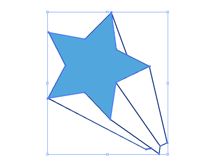
Open up the Punk Vector Pack again and take a copy of the retro star, ungroup the object and change the white area to a blue hue colour picked from the main document.
Paste in three versions each at a different angle and size flaring out from the front of the snowboard.
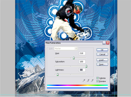
Using one of the freebie packs from the kind fellows over at Go Media, copy a vector spine and paste into the Photoshop document. Duplicate the layer multiple times and rotate each spine image to produce a radial pattern stemming from the Snowboard's hand.
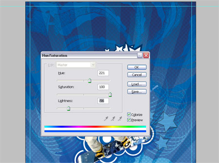
Merge the spine layers and adjust the Hue/Saturation to blend them into the document, drop the opacity down to tone down their impact.
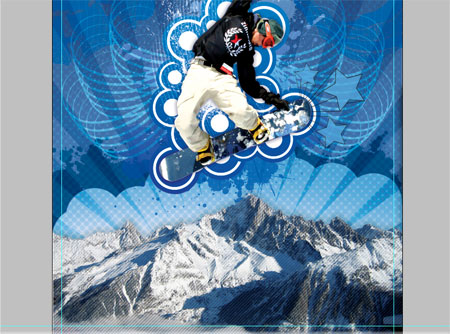
Vector Shape Seven – Diagonal Lines
Swap over to Illustrator for the last time to produce a range of diagonal lines.
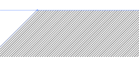
Start with a single straight line rotated to 45degrees, copy and paste then move horizontally across the artboard. Use the blend technique used previously to create multiple instances.
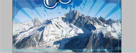
Paste these into the Photoshop document over the mountains at Overlay; 50%. Load the Mountains Path selection and delete any overlap beyond the edges of the mountain tops.
The mountains could do with a little more contrast and impact, duplicate the layer and set the layer style to Multiply at 40%.
Paste in one more set of vector splatters and position above the circular blobs. Delete out the selection from both the circular blobs and the mountains.
Adjust the Hue/Saturation to blend the splatters into the document's colour scheme.
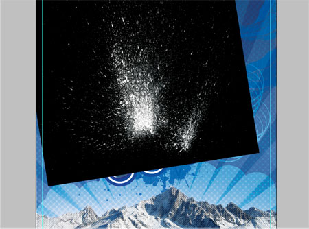
Now it's time to rough up the design to contrast against the crisp vector elements, open up an image of a spray paint splatter, adjust the levels and colours of the image to isolate the splatter onto black. Then, set the layer mode to Screen to render the black areas transparent.
Unfortunately the splatters I use aren't licensed to give away, but similar splatters can be found on Stock Websites or can be easily created with a spare tin of spray paint.
Go ahead and paste in varying splatters onto the document giving a really distressed look.
Use the Levels to adjust the impact of the spatters.
Using the huge Spray Paint Photoshop Brushes from Go Media paint in some drips and sprays, along with adding to the urban/distressed/super-cool style they also give the impression of icicles from the snowboard.
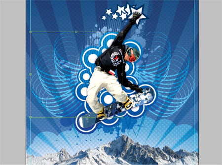
Using another set of Photoshop Brushes, this time in the way of the Watercolour brushes from Bittbox roughly paint in a border around the image. Check out the Rotating a Photoshop Brush tip for this stage.
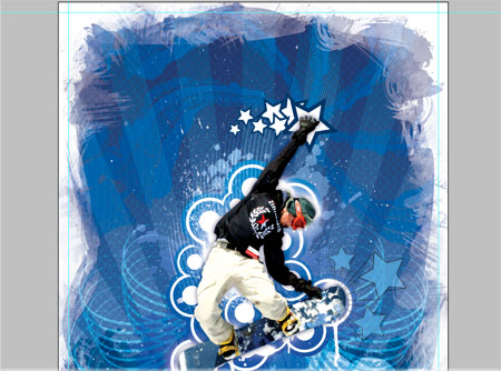
Using the same brushes delete out some of the border with the eraser set to a 50% opacity .
Scale the layer up to adjust the size of the border and how much of the image it will overlap.
Change the layer style to Overlay at 50% to add an icy blue frame surrounding the image.
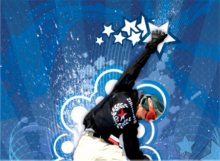
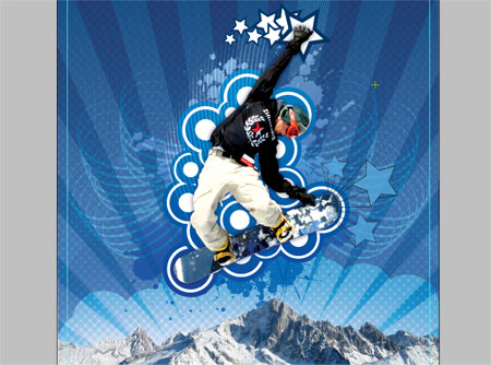
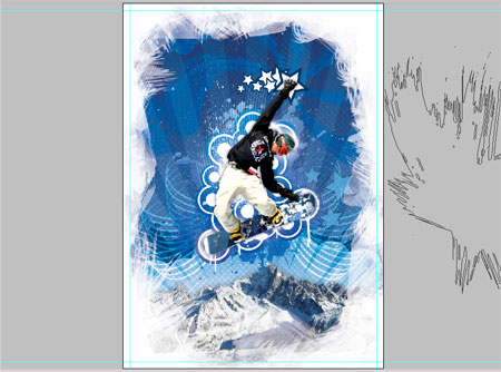
Take a close look across the image and make any necessary finishing touches. Here I removed some of the spray paint from around the boarder's head and duplicated the splatters to give them more impact.

Save and export the completed artwork.
Remember the steps here have outlined the basics of my personal techniques, there may be many other ways to achieve similar results, use and develop them to your own taste.
One of the key features is to create and collect a range of resources for your designer's toolbox ready for quick insertion into your next project.
I absolutely love it! Your directions are easy and your creativity is amazing!
Great Job. Very clear step by step instructions. Lots of good techniques here.
I’m finding that making tutorials is more time consuming than writing other types of articles. First you have to make the artwork. Then backtrack and show how you did it. Take loads of screenshots. Its lots of work. But fun stuff. Thanks.
Amazing!
Excellent tutorial and very nicely… er… explained!
Very clear.
Keep up the good work!
I’ve been watching my RSS gadget for this one, my only complaint is – why torture me into thinking that it had come out with that post about Dan Roosegaarde’s excellent work?!
Ace tutorial al the same though :D
Isaac
This is just Great!! First time i’ll have any chances to make anything that looks quite ok after reading all of this… Thanks man- keep doing tutorials :D
Wow, what a good tutorial. When i saw last picture on part one, i thought that is the final image. But, when i found out part two, what an amazing tutorial….
I’ll be waiting for your next great tutorial.
Hey man that is a amazing tut !!!! really help full
thank you verry mutch !!!
it is very Good man I love it
thanks
Hi, first time coming to your site… I found you through your stumbleupon page (because you stumble reviewed a page of mine). I really liked that tutorial and your artwork, but if I would change something on it, it would be the stars… too much of my eye is drawn to the stars as they stand out too much (the white ones) but other than that good job.
Amazing!
Excellent tutorial and very nicely… er… explained!
Very clear.
Keep up the good work!
thanks for this tutorial.. I learned a lot of new techniques.
Thank you for great idea. Scrap to my blog. That’s right?^^
Thanks bos!!! what a great n helpfull tutorial!
Thanks again to everyone for the comments.
@Sean Hodge – Very true point about how time consuming the tutorials can be, I’ve been told off for neglecting the Mrs on many occassions!
It’s nice to see people benefiting from the tutorials when they are complete and even better to see them Stumbled and Bookmarked!
@Isaac – Haha Yes, I planned on being evil and posting another entry before this second half. Shame on me!
its very good
thanks
can you spell A-W-E-S-O-M-E?? I love it! thanks
I can’t say it any better — this was great. I happened to be getting my head around some of these issues this morning [walking dog], and come home to discover this! You must be a genius to get through this thick head of mine! Thanks so much…
Adobe needs to make photostrator. a nice combo program to skip all this skipping around. Great stuff though, im refrencing it right now as im doing a project.
Hey i Made this based on your tutorial tell mi mi what you think Id appreciate your feed back
[IMG]http://img.photobucket.com/albums/v513/maxirx/guarded.jpg[/IMG]
http://img.photobucket.com/albums/v513/maxirx/guarded.jpg
ã©ã†ã‚‚ã‚ã‚ŠãŒã¨ã†ï¼¾ï¼¾
Great tutorial – really interesting to see how these effects can be created. I got a little confused at the point where the light blue border is added after you have used the watercolour brushes to remove the edges.
(where you say “Using the same brushes delete out some of the border with the eraser set to a 50% opacity .
Scale the layer up to adjust the size of the border and how much of the image it will overlap.”)
Could you clarify that for me please?
Thanks!
About my above comment -after a bit of experimenting, i’ve worked it out. Its probably just my lack of experiance… Again, great tutorial, its a real help =)
very cool, thanks
perfect
Muito bom mesmo
¡Wow! Great tutorial. Thanks
Very inspiering. I’m a 100% noob, just got my hands on a 30 day illustrator trial. This is the type of artwork I’m dreaming of doing. I know there’s a long way to go yet, but you’ve given me a good head start!
Great tutorial! It really inspired me. Thanks a lot :)
DUDE, you’re the best
Very nice site and tutorials, i love it :-)
And excellent inspiration too!
how can someone with such a ps and illu skills produce something that ugly is beyond my understanding capabilities.
Dude, anyone can cut copy and past different layers and add effects to them. but i have to hand it to ya it looks cool, a little to busy and gotty, but cool.
you’re a master with a variety of techniques, but in my opinion you went a little far. the key is know when to quit. don’t get me wrong, i think you’re very talented and you have a lot of great work (that’s why i keep coming back to check up on new stuff) but i just feel you put too many effects in the background. keep coming up with great stuff. i like what you do.
Here I have found some new techno trip, that i have used in my next project.
I love your work great work.
Thanks…
ok..
SUPER AWESOME!! Love those vector shape of yours!!!! Respect.
Hi!!
Thanks a lot for your great tutorial! It makes fun learning with you.
Greatings from Berlin
Excellent tutorial. I really enjoyed reading it!
Brilliant. Don’t listen to the “pure” haters.
for vector shape seven… instead of constantly copy & pasting and moving etc. i tuned that one line into a brush, held down shift and just brushed all on. I copied that into Ps as a SmartObject. Much easier!!
I find the work sophomoric in the extreme. It is overdone, garish and an eyesore. No artist worth the name would confuse art with this sort of illustrative effort better suited to a magazine than the world of art.
wooow this is so cool thanks!
thank you very much
wonderfull web site thanks..