
In today’s Adobe Illustrator tutorial we’re going to create a vibrant piece of vector artwork featuring three dimensional type from an isometric viewpoint. This isometric type effect is commonly combined with bright colours to produce a fun design style. Adobe Illustrator is the perfect tool to create such an effect; the 3D Extrude & Bevel tool easily generates an accurate isometric layout, then the artwork can then be broken down into individual vector shapes for easy customisation with colourful fills and detailed patterns.
Watch the video
Subscribe to the Spoon Graphics YouTube Channel
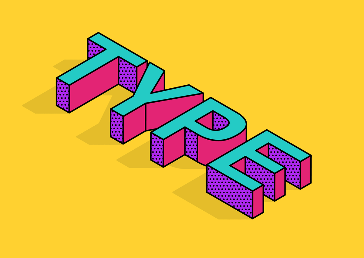
The isometric type artwork we’ll be creating in this tutorial features a faux-3D effect generated by the Extrude & Bevel function, which we can then customise by breaking apart all the faces into individual shapes that can then be recoloured to produce vibrant artwork. The addition of a shadow helps ground the text to further simulate the three dimensional appearance, while additional patterns help enhance this flat illustration style.
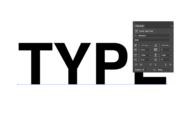
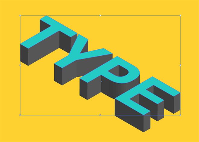
Create a new document in Adobe Illustrator and set out your type. Any font can be used, but a simple sans-serif, or even making a ‘pixel-font’ effect by manually placed squares on a grid provides the best result.
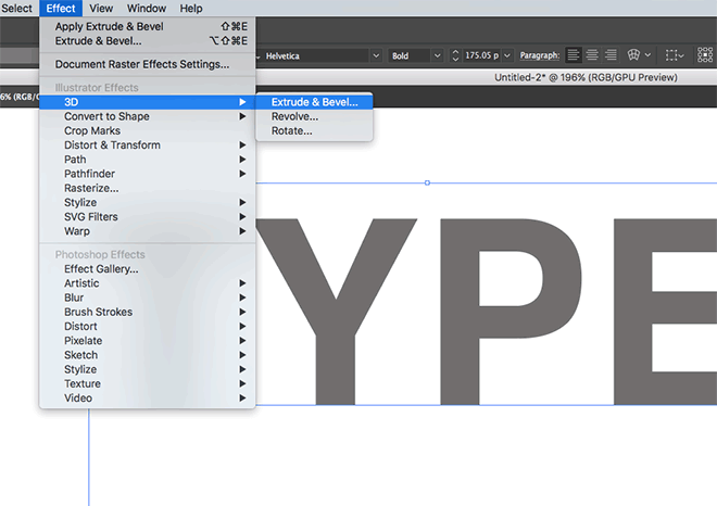
Give the text a mid-grey fill, so when we apply the Effect > 3D > Extrude & Bevel effect, the shading of the different faces will be visible.
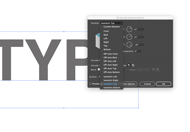
In the 3D Extrude & Bevel options, use the Isometric Top preset to automatically set the angles to generate an accurate layout.
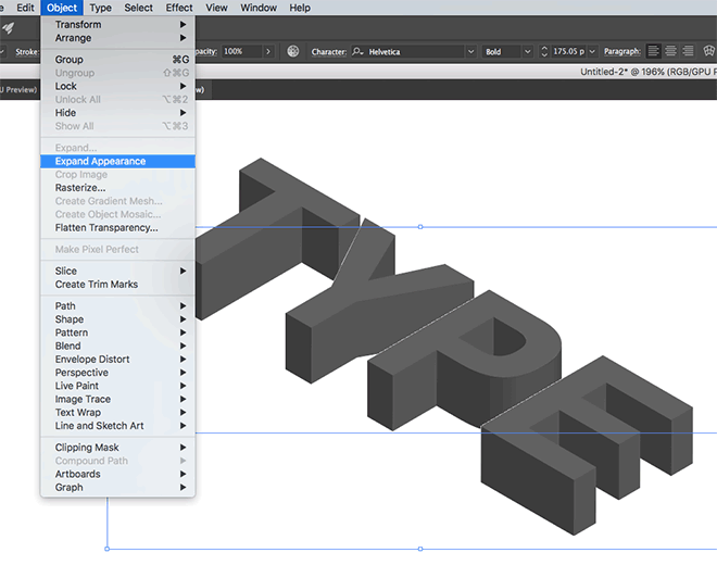
Go to Object > Expand Appearance to permanently apply the 3D effect and convert the text into a series of individual face shapes.
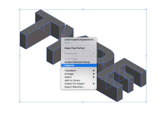
Right click and select Ungroup to separate the letters, then Ungroup again to break apart the faces that form each letter.
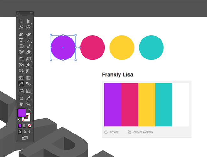
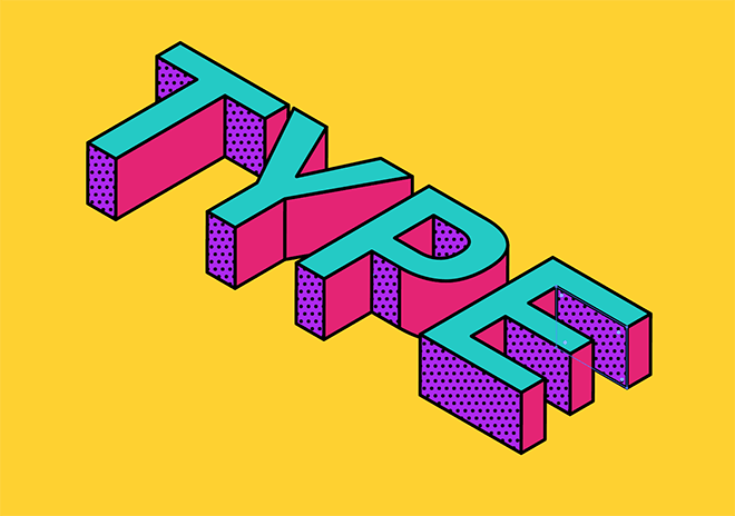
Find a vibrant colour scheme, such as this one named Frankly Lisa from ColourLovers. I like to draw a series of shapes and set the various fill colours with the eyedropper tool (hold Shift to sample from a screenshot image).
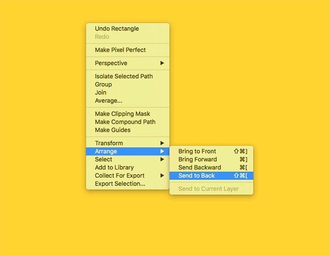
Using the yellow from the colour scheme as a fill, draw a large rectangle around the text to use as a background. Right click and select Arrange > Send to Back to place it behind the main elements. It helps to lock the rectangle (Object > Lock > Selection) to avoid accidentally moving it out of place.
Hold the Shift key and click on all the front faces of each letter. Swap the fill to the blue from the colour scheme using the eyedropper tool.
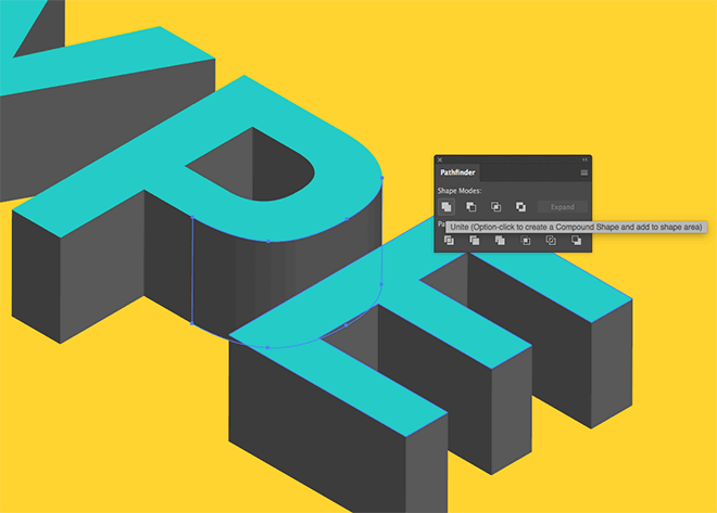
Letters that have rounded shapes are created using multiple segments by the 3D function. Select these portions and click the Unite button from the Pathfinder panel to merge them into one outline.
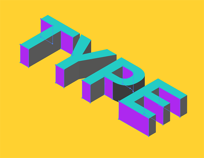
Hold Shift and selection all the shapes that face towards the bottom of the text, then change the fill to the purple hue from the colour scheme.
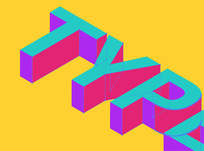
Select any leftover faces and add the last colour to fully customise the text with vibrant fills.
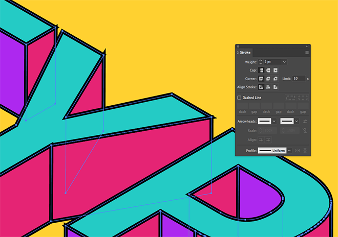
Draw a selection around the whole text to select every faces, then apply a black stroke. Increase the stroke weight to 2pt.
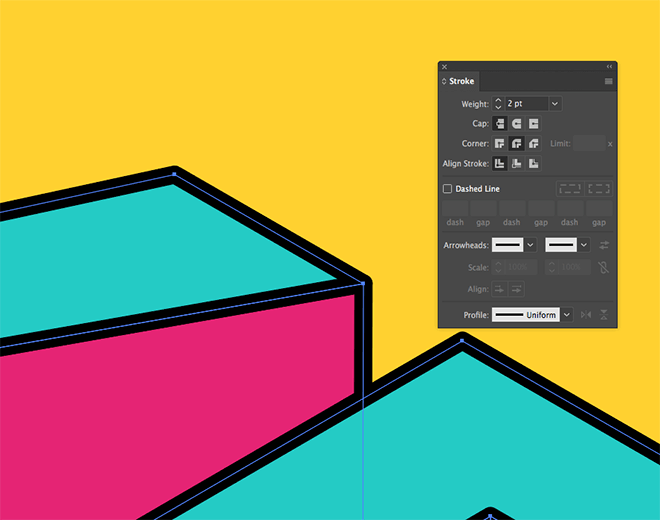
To fix the overlapping strokes at the corners, apply the Round Corner setting in the Stroke panel.
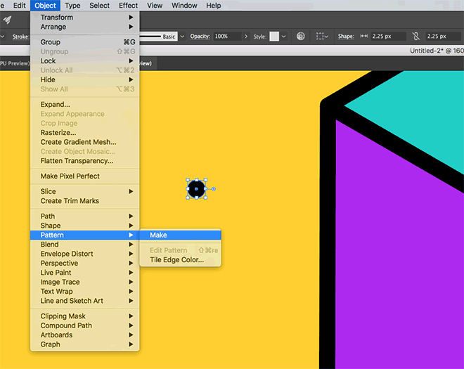
Deselect everything, then switch the fill and stroke around in the toolbar. Draw a small circle somewhere on the artboard, then go to Object > Pattern > Make.
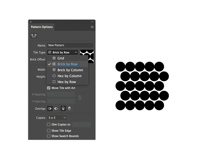
Change the Tile Type to Brick by Row to offset each layer of dots, then increase the Width and Height figures to space out the dot pattern. Click OK in the header to save the pattern swatch in the Swatches panel.
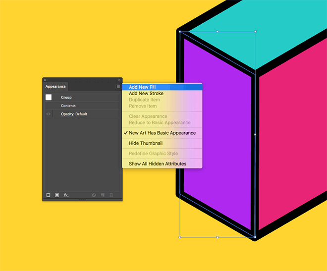
Select one of the faces and click the Add New Fill option from the Appearance panel’s menu. This will layer a second fill on top of the existing colour.
Choose the newly created dot pattern to apply some additional details to the effect.
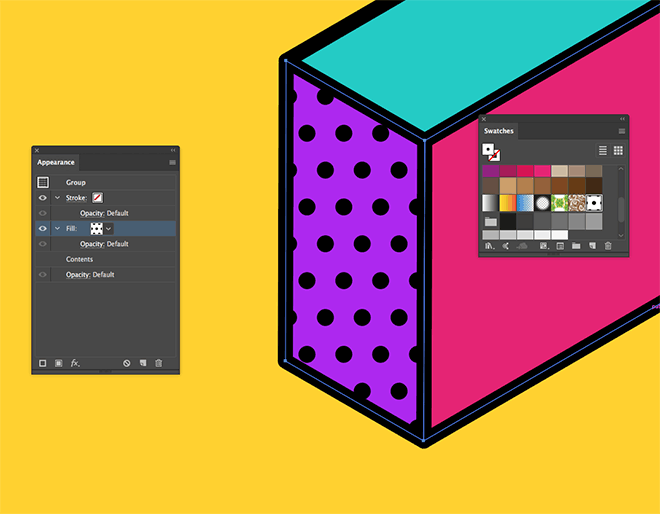
Add this new fill to any remaining faces of a similar appearance. Unfortunately this has to be done on an individual basis, otherwise the stacking order of the shapes is affected.
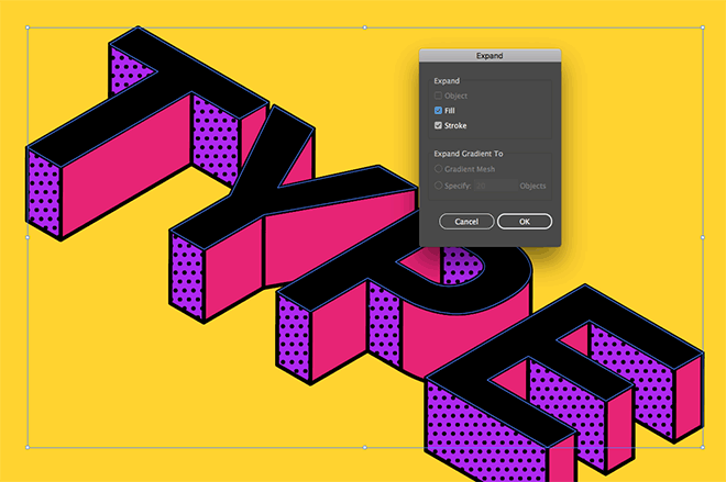
Select the top face and press CMD+C and CMD+F to Copy and Paste in Front a duplicate. Change the fill to black to match the stroke, then go to Object > Expand to outline the stroke.
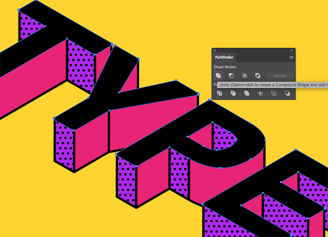
Click the Unite Pathfinder button to merge the stroke shape with the main text shape to create one single outline.
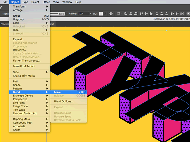
Copy and Paste in Front another duplicate of this text shape, then hold Shift and nudge it to the left with the cursor keys. Select them both, then go to Object > Blend > Make.
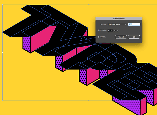
Head back to Object > Blend > Blend Options and alter the Spacing to Specified Steps. Increase the value to 100+ to create a smooth transition between the two shapes.
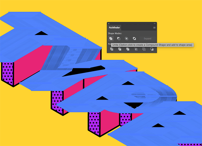
Go to Object > Expand to apply the blend effect, then Unite all the pieces with the Pathfinder tool to create one simple outline.
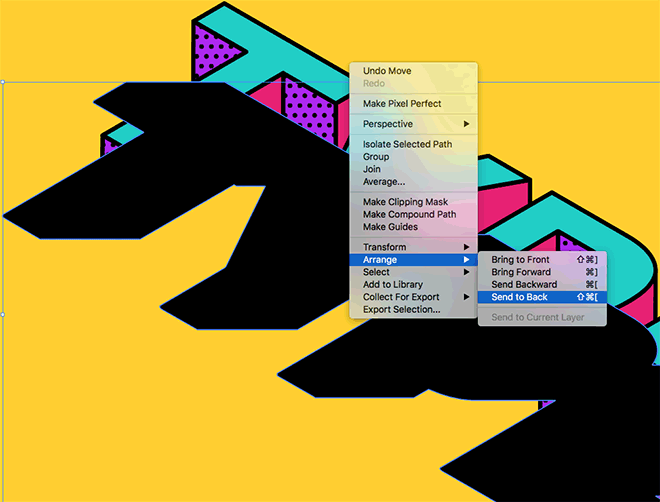
Move this new shape downwards until it aligns with the bottom of the 3D text, then go to Arrange > Send to Back, followed by Bring Forward to place it above the yellow background rectangle.
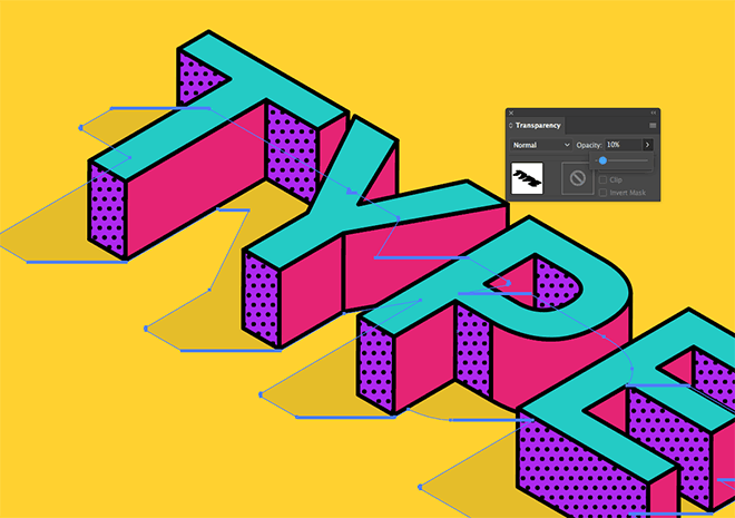
Reduce the Opacity of this shape to 10% to produce a ‘flat style long shadow’ to complete this colourful illustrative style.
Adobe Illustrator is the perfect tool for creating this vibrant isometric type artwork. The 3D effect is quickly produced using the Extrude & Bevel feature, while the vector functionality makes it easy to modify each face of the 3D text.

Cool looking type! Thank you!
Thanks Su!
As usual, a great tutorial! Mine turned out great. I just have one question: When setting up for the shadow layer, why include “Change the fill to black to match the stroke, then go to Object > Expand to outline the stroke.
Click the Unite Pathfinder button to merge the stroke shape with the main text shape to create one single outline.” ?
While I didn’t have time to test this without this step, (I wanted to follow by the letter :) ), I’m curious why it (esp. “Expand to outline the stroke”) is included as I do not see it’s function and your steps are usually as efficient as possible. Wouldn’t the shape of the letters work without this?
I’ve just tested this myself and that step does seem to be obsolete. The reason I added it in the first place must be just out of habit, I assumed the blend wouldn’t work with a stroke applied, but it does! Thinking about it now there’s no reason why it wouldn’t work.
Really fun and useful tutorial as always. I made a graphic style for the pattern sections, which made creating each one a lot quicker. You just have to drag the graphic style from the pane onto the relevant shape. Thanks Chris!
Good thinking on the Graphic Style usage!
Thank you.
Beautiful tutorial, thank you!
Enjoy trying this technique so much. Thanks, Chris :)
I learned a lot. Thank you for the awesome tutorial!
Thanks for the tutorial, it’s really helpful.
And i love the type, it’s so cool.
perfect one.i love this tutorials
thanks for sharing your knowledge to every one.
Thank you here is my result
https://preview.ibb.co/f3EAkS/Screen_Shot_2018_03_29_at_3_47_52_PM.png
Very impressive tutorial! I will try it some time today! Thanks!