This post was originally published in 2010
The tips and techniques explained may be outdated.
Use a range of vector shapes in Adobe Illustrator to create a detailed black and white emblem badge. We’ll use a mix of basic tools to align the various shapes together, then add some cool detail using the more advanced Pathfinder and Blend tools.
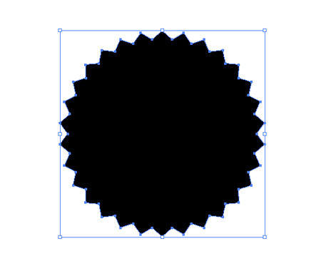
Open up Adobe Illustrator and create a new document. Grab the Star Tool and click and drag the shape onto the artboard. Before releasing the mouse, use the keyboard cursor keys to increase the number of points, and the CMD key to adjust the size of the spikes.
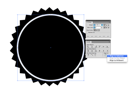
Use the Ellipse tool while holding Shift to produce a perfect circle. Give this shape a thick white stroke and no fill. Adjust the ‘Align to‘ option to Align to Selection from the Align palette, then select both objects and align on both the horizontal and vertical axes.

Copy the circle (CMD+C), then paste in front (CMD+F) a duplicate. Grab the corner handle and scale down the shape while holding the Alt key. In the stroke palette, reduce the weight slightly, then check the ‘dashed‘ option.
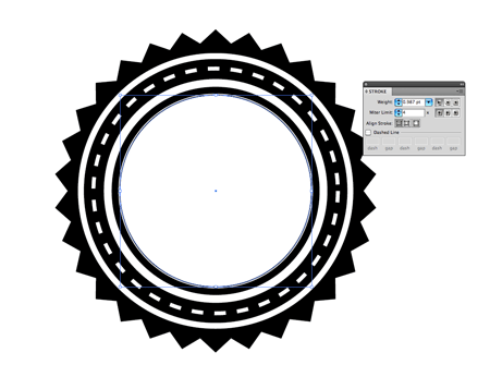
Paste in another duplicate and scale it down even smaller then give it a thicker stroke weight. Scale another duplicate a little smaller and change the stroke to a white fill. Finally give a third duplicate a thin black stroke and scale it very slightly smaller than the solid white circle.
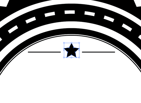
Draw a star with the Star tool, along with a couple of lines using the, err… Line tool. Group these three objects together then align them with the main badge shape. Hold Shift to add the outer badge shape to the selection, then give it an extra click to make this the key object. This will ensure that the small items move into place, rather than the outer badge which is already lined up.

Add some text to the design. Here I’m using the cool League Gothic font. Convert the text to outlines (CMD+Shift+O), right click to Ungroup, then re-group the letters of each individual word. Move, scale and align the text to fit inside the centre circle.
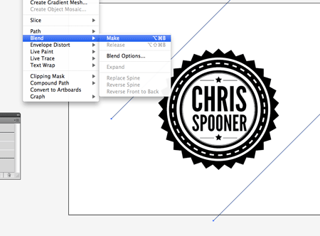
Hold Shift while dragging a line to constrain the angle to 45 degrees. Give the line a 0.5pt stroke, then duplicate it and move it diagonally across the artboard (hold Shift to keep those angles constrained). With both lines selected go to Object > Blend > Make.
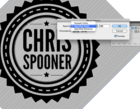
Head back into Object > Blend > Blend Options to alter the settings. Choose Specified Steps, then adjust the figure to form a closely packed series of lines.
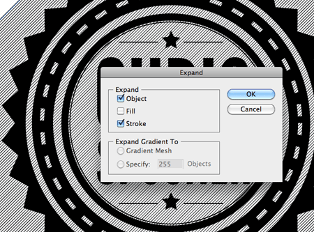
With the lines still selected, go to Object > Expand, then select the Object and Stroke options. Move the lines off to one side for the meanwhile.
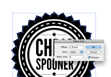
Select the main badge outline then go to Object > Path > Offset Path. Enter 1.5mm in the Offset field.
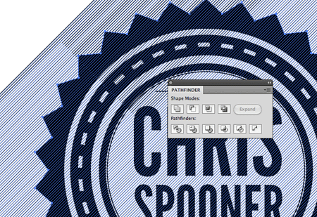
Make a copy of the lines and move them over the main badge design. Carefully select the offset path and the lines together and hit the Intersect option from the Pathfinder while holding the Alt key. Tip: To select just the two objects, drag a wide selection across multiple shapes, then reject these from the selection by holding Shift while dragging or clicking over the unwanted elements.
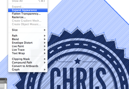
Clean up the intersection by going to Object > Expand Appearance. This will clear out the series of invisible lines around the object.
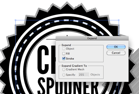
Select the dashed line in the centre of the badge and transform it into a solid shape using the Object > Expand > Stroke option.

Copy (CMD+C) and paste in front (CMD+F) a duplicate of the dashed line, then move another copy of the lines over the design. Use the pathfinder once again to intersect the shapes, leaving a series of patterned lines overlaid over the original white dashed stroke.

Copy (CMD+C) and paste behind (CMD+B) a duplicate of the text. Nudge this duplicated text downwards to create a basic shadow effect. Add a white stroke to the original text on top.
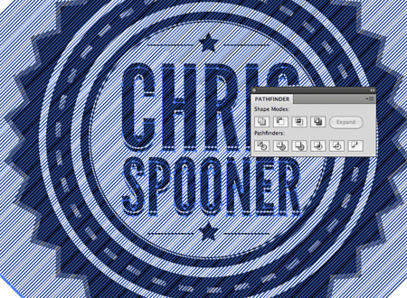
Paste in another duplicate of the pattern lines and add the lower text to the selection. Use the Intersect option from the Pathfinder to trim down the pattern to the outline of the text.




This tutorial is great, this would be ideal for designing a beer bottle label. I’m a York based graphic design and print company so it’s always helpful to see how other graphic designers achieve results using Illustrator. Well done and keep up the good work Chris!
Simon Hall, All Design & Print Ltd, York.
Awesome tutorial.
Thank Chris Spooner
thanks heaps… this will help me IMMENSELY!
Awesome as usual Chris. Might use this for something coming up.
love the diagonal line detailing! cool stuff Chris!
I love it!
Excellent design Chris, really looks great. Also very similar do the work Brian Hoff done on his new blog design.
Nice, really nice touch the diagonal line detail
Great tut Chris. Love that line effect. So many possibilities!!
Thanks Chris :) cool stuff :) Great tuttorial.
beautiful vector badge and i think you also using this beautiful vector in your blog design tutorial, stunning designs with techniques. thanks
Chris, amazing as ever! I adore this font. I also have it (probably because its free – bad design attitude!) Do you like doing screencasts? I prefer them.
Incredible, your stuff gets better exponentially.
WooW
Wonderful effect will certainly need it to work!
Thanks
Hello!
I’m from Brazil, I love your work, i’m learning so much in your site.
Congratulations!
Ps- I love illustrator cute.
I had a few frustrating minutes trying to get the Pathfinder Intersect to work. The only way I managed to get the same results as you was to go back to Step 9 (Object>Expand) and deselect “Object” and “Fill”, so only the “Stroke” was selected on the offset lines. After doing that it worked great. Very nice effect, good job!
Ah the old Pathfinder. Such a great tool but can sometimes be very frustrating!
Expanding the objects or Ungroup and creating a Compound Path usually fix any issues.
Nice usage of diagonal lines!
Great effect, good work!
Awesome! Good tutorial!
Cool tut! Great final out come.
Love this retro/vintage style badges. Kinda like a stamp. Great work!
I really like the diagonals. They’re so simple but they add so much style to the badge. Awesome tut. :)
Really enjoyed this one, thanks Chris!
This looks sweet!
Thanks Chris!
Just can’t deal with the dashed lines spacing discrepancy on the right quad point. Any thoughts?
so good as EVER, great outcome so simple keep em coming……..
Wow, I’m digging the old school 3d effect on the text.
It gives the type a ‘western’ feel.
Thanks Sheriff Spooner
Thanks for the great tutorial Chris — any thoughts on why my Pathfinder Tool refuses to Intersect. I’ve tried everything you listed above, but it is not working. Any ideas?
I had the same problem…Once I selected the two items to intersect, I expanded the selection, then alt/option clicked the pathfinder intersect. On the outer badge intersect, I had to then send it to the back to only be visible for the expanded path.
Thanks for the headsup! I’ll give that a go — I found a work around that worked well. I found that the intersect option worked beautifully on a single text selection, but I ended up getting to work after a couple of hours
Good tutorial and good badge. Nicely executed. Some techniques used are really useful for beginners. Thanks for the tut and keep up the good work.
Rafi, Graphicsfuel.com
Nice! I really loved the way you added the dashed details!
Always wondered how this was done. Thanks man ;-)
The star in your new logo is well deserved.
Great black & white work.
I have a problem with intersecting too. Well it “seems” as if the alt+intersect click works, the selected items disappear (but they’re still clickable when I position my cursor over them) however my “expand appearance” option is greyed out and so I can’t click on it :( What’s wrong?
weird, why my
“Clean up the intersection by going to Object > Expand Appearance. This will clear out the series of invisible lines around the object.” & “Paste in another duplicate of the pattern lines and add the lower text to the selection. Use the Intersect option from the Pathfinder to trim down the pattern to the outline of the text.”
not work? the ” Expand Appearance” not enable at all.
can help?
same problem here!
Same issue….
Great Tutorial – Just needed this ;D
very nice and useful Tutorial
very nice work
Great tut Chris; as usual it’s very clear and useful, thx and keep up the good work :¬)
quick tutorial, but wow so much details. I loved the way you made that shadow effect of the type.
Hi Chris.
Great tutorial, excellent explanation. However, i couldn’t get the steps with the intersection and the lines to work. I’m using CS5.
Esben, Denmark
the beauty in your tutorials is that you explain it so simply.
thanks for all the lessons…..
cheers…
wizard of oz
Anybody find a solution to the Expand Appearance step? Is there another way to achieve this look by avoiding the Expand Appearance? Its being grayed out on CS5. If so hit me up at http://twitter.com/DennyEng
Wonderful tutorial! Thanks for sharing it. =)
Sorry but i’m new in illustrator. What does mean CMD key?
Claudia, CMD means Control or Command :)
Maybe this sounds silly, but I don´t know how to create that shape using the star, step 1.
Diana, all you need to do is just go on the tool panel, where you have the Rectangle and the Ellipse tool and the rest. If you click there and hold it down for a short while you will get a sub menu with the Star tool on there.
Hope that helps.
Chris as always great work mate.
Thanks
Thanks, Hazim!
The lines dont work for me. I followed it step by step and they disappeared after intersecting them. So i just copyed the main bg and offset to position :(
http://i36.tinypic.com/2e2nea1.png
Refrising minds HAHAHA
http://www.vazto.com
Seth,
See Eric’s comment on July 26 and Chris’s response to that comment. That should help! TOTALLY made it work for me!