Us designer types just can’t help ourselves when it comes to rebuilding our own sites, just months after giving it a refresh it’s all torn down to start again! I’ve just finished up an overdue redesign of my portfolio over at SpoonGraphics.co.uk, here’s a mini overview of my thoughts behind the refresh.
The last version of the design was put together when I started out working for myself. I went balls out to market myself as a freelance designer and created the site around this main focus, however one year down the line things have changed slightly.
After having the opportunity to manage a good selection of projects over the last year, I’ve found I much prefer projects where I’m conversing on a personal level with the client. Jobs I’ve worked on with fellow designers/developers from the community are included in these favourites, who often get in touch through the blog, or via Twitter. They are the people who know me personally, rather than reading some freelancer sales pitch.
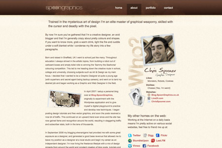
With the new version, I wanted to strip it back down to being a personal portfolio, and to give an insight into my personality and showcase my favourite work. A few ideas I had in mind were to:
- Talk more about my blogs, which now take up a large portion of my day-to-day routine.
- Toot my own horn a little to promote the things I’m proud of, such as working for myself, producing work for worldwide clients and appearing in the odd magazine.
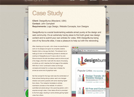
- Display a couple of case studies for the odd project, giving an insight just like the blog posts I sometimes write.
- Remove the search engine optimised areas for ‘freelance designer’ to allow the site to just be a portfolio for Chris Spooner.
One of the main changes was in the site copy, this has been completely rewritten from a first person point of view, with a touch of humour here and there. I wanted to make sure I sat and wrote out the entire copy for the site before getting started on any design work to allow the content to be tied into the overall layout of the site.
Once the copy had been written I then jotted down some notes of the style I was going to pursue based on my recent inspirations. A couple of ideas I had in mind all along were to:
- Tone the interface right down and pay more attention to designing the content.
- Use a larger type size overall, with 14-16px being the standard for body text.
- Use my own design work to create large feature areas, such as the slideshow on the front page.
Other than these little ideas I’d been itching to put into practice, the colour scheme was to stay true to my usual brown/beige branding and the overall theme continue my general grungy/subtly textured look I often go for.
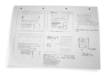
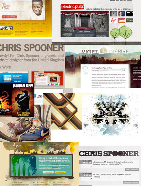
As with a lot of my projects, I started out on paper and sketched out a couple of ideas floating around in my brain. I even went on to produce a mood-board to really flesh out the ideas and styles I had in mind.
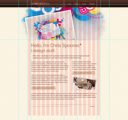
When the time came I eventually booted up Photoshop and setup my usual web document structure with 960px grid, guides for visible portions in various resolutions and a large overall canvas to visualise how the site would look on a widescreen monitor.
Subtly was my main aim for the interface, so I created most of the design using the Noise filter with a very low setting, and added the odd distressed mark with Watercolour brushes.
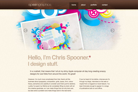
On the homepage I outlined a huge area to display a slideshow of featured work, all blended in with a mix of brush textures. A couple of issues I was worried about was the filesize of these large Jpegs, and how the site would actually work in 1024×768, as this slideshow broke well out of the 960 grid. However when it came to developing the code, a keen eye on the image compression and a little tweaking in the CSS soon brought it all together.
As previously mentioned, the type was all laid out in large sizes and generous line-heights to allow for easy readability. Having seen a bunch of site heading down this route I see it as an upcoming change in the web world.
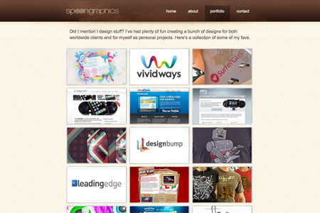
The portfolio page has also undergone some slight changes, this time there’s a collection of personal projects alongside client work, some of the stuff is even born from tutorials here on Blog.SpoonGraphics.
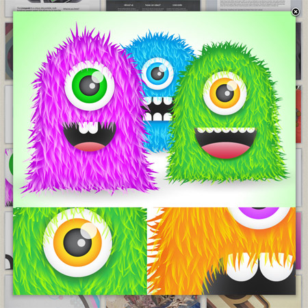
Four of the portfolio pieces have also been transformed into case studies, complete with text overview and supersized detail shots. Given the popularity of the odd walkthrough I post here on the blog, I figured they would be a good addition to my portfolio.
So, I’m happy with the outcome. For now at least! Feel free to check out the freshly baked site and let me know your thoughts.



Hey Chris,
I’m glad to be the first to write a comment ;-) I think Your new portfolio is really brilliant as well as Your other works :-)
I’ve founded Your blog few months ago and since than I’m Your big fun and also Your “student” if I can say it like this ;-)
I’m looking forward for Your next posts and articles, which I really enjoy!
Great! as usual. I am a fan as well. Writing from a first person point of view makes your reader feel more involved in what they are reading. Likewise, adding just the right amount of humor is also a very welcome development. Keep up the good work!
Well my gravat shows exactly my reaction on your redesign Chris. Excellent work :)
Hi Cris,
Congrats for new design.What I feel being a designer is the greatest challenge to design your own portfolio your own website.
waiting for more…
love the big slideshow with high quality images and the little water colour effect, i didnt realise you did the redesign for design bump either, good job with that too.
Awesome, I really like it, I don’t remember why I went to your portfolio this week and I saw it, and I was thinking “If I were Chris I’ll make a post about it, to promote my new design”
and here it is. Anyway, as you re-designed your portfolio, are you thinking of redesign your blog or make some changes?
Really like it! The large type is great! The colours you’ve used are so vibrant aswell, it’s great when you leave a dull mundane site to come across a well designed COLOURFUL one. Excellent redesign.
Really like the new design. Your work and contribution to the interwebs design community is very much appreciated.
Would you care to share that template .psd you always start out with (pink grids)?
I guess Chris acquired this template from http://960.gs.. Works brilliant.. @Chris, I really enjoy reading your blog and inside tips and tricks.. Keep them coming.. Greetings from Holland.
Nice work!!! Nice color scheme, I like this website.
I love reading about the process and thoughts that go along designer site’s re-design. Nice work, Chris.
I’ve got two questions:
1) Why didn’t you include BLOG into your top navigation of your portfolio site? (You do reference to it from the sidebar and the content, but still…)
2) Why don’t you link to the sites you’ve designed, limiting the viewer only to a large preview image (or an non-selectable text)?
Great stuff, Chris. Always inspiring. [m9]
Hey Chris, I really like it, except for the “Hello, I’m Chris…” part. It’s just very generic. There are a lot of design blogs with basically the same into text, in basically the same format. To my eye, it’s like you’re choosing to present yourself as just another designer, instead of doing something to set you apart. Imo, the “Hi! My name is completely forgettable, and I do something which I mention here to sound different and interesting, even though it’s really kinda obvious” is the most unfortunate trend on freelance design blogs ever. It’s just such terrible copywriting.
I hope you won’t take this the wrong way. I really like your design overall, and your work in general—which is why I’m giving my frank opinion. If I didn’t care, I wouldn’t speak up (:
Kind regards,
Bnonn
Hi Chris, I saw the new style of your site and I love it. I redesign my site, if you have time, turn and look…
Thank you,
Jasmin
I love the redesign, your use of subtle texturing is just amazing :)
What is a mood-board? Never come across that before, Well Apart from that, amazed at your design process, always insightful:)
Chris, could u give me trick how to be great designer like u? :-)
cause i’m newbie here, and i’m sure that i have feel of designing.
btw, this post really inspiring me so much… thanks
You’re awesome!
Very nice, Chris! You should implement it into the blog as well. :)
It’s great that you get to share such an in-depth post about how the process went of your re-design. Really nice read for web designers everywhere
Love the new look, Chris! Thanks for sharing. I for one love your blog’s look however. I say keep most of it.
Hey Chris,
Love the new design. The really large rotating header images look so nice. Also loving the large text and plenty of spacing.
All in all a great portfolio site.
A great read up for people to get a glimpse of your design process as well.
Keep it up my good man.
Wow, fantastic work. Without doubt one of the prettiest things I’ve ever seen. Congrats.
this is rocking Chris
Thanks for including the moodboard, Chris. I’ve done similar things but never had a name for it, now I know what they’re called. Usually when I finish cut-and-pasting all my clippings on a moodboard I try to identify what exactly attracted me to each of the clippings. Sometimes it’s a color, sometimes a font, sometimes the openness of a layout. Then each of those — the open layout, the font, the color — can become ingredients for building something completely new.
I think it has the same feel as http://www.designbyhumans.com
Chris,
Really love the changes – it’s nice and quick to load, considering the image quality!
I think it’s a great step towards perfection, and every pixel helps!
Joe Swinn
Gungurru
your portfolio is amazing, well done :)