I've just finished a little review of the site, making some behind the scenes changes alongside some more visual alterations. Read on to discover the full list of tweaks.
The main reason for the overhaul was to recode the Blog.SpoonGraphics design, originally this was built upon the default WordPress theme which meant that some of the styling elements were being used despite them not quite suiting the overall design. Also, there were a lot of duplicated or unused CSS styles left in the stylesheet from this default theme, the aim was to completely recode the site from scratch allowing for me to put into practice my own coding techniques which I feel have developed since the site was originally created over a year ago.
Seeing as I was recoding the complete site I thought I might as well take the opportunity to make some slight visual changes too, these include:
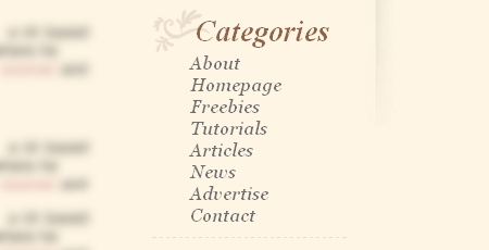
Removed top buttons in favour for a restyled Categories list in the form of a navigation list.
Moved Subscribe by Email link and placed into the same paper tab as the RSS Subscription link.

Continued the ornate shape and dotted lines from the header illustration into the design of the main content areas.

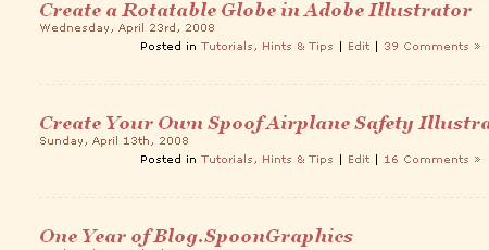
Changed title font to a more stylish italicized Serif typeface.
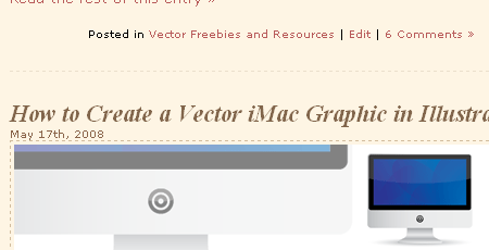
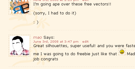
Continued colour scheme and design replacing default areas such as comments list and form fields.
I've also added a little extra tweaks to develop the functionality of the site slightly, these particular changes include:
Linked Blog.SpoonGraphics logo back to the homepage.

Added Google Bookmarks to the sharing and bookmarking icons.
![]()
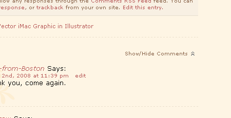
Created a Show/Hide Comments button using a fantastic jQuery script from Andreas Eberhand.
Modified the Search function to display unlimited results, rather than paginating them based on the WordPress settings. Originally discovered from HackWordpress.com.
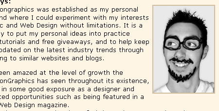
Created an About page, giving a little insight into the personal side of Blog.SpoonGraphics.
So there you have it, a few minor tweaks and changes that hopefully give a little boost to the performance and visual appeal of the site.


cool. i like the updates.
*goes now to read new about page*
The search button is slightly out of the right column. Other than that, I like it more.
Hey, your site is pretty cool. But I think, the type for you headlines isn’t the right one. I would choose another type.
The italicized font does not render well in firefox. it looks great in the screen shot you have though. maybe its one of my settings. great updates!
Nice touches, Chris. I just noticed the background image here on the comment form. Is that new?
Dude, you have your system’s anti-aliasing disabled? Are you nuts?!
Here’s to evolutionary changes.
I’m a big fan of redesign through subtle enhancements and re-thoughts rather than huge sweeping change.
I love the new tweaks. I’m still looking for some floral background vector tutorials though.
Updates look good. I was reading some where on your site that the paper was scanned. Was the paper clip scanned also or was it made?
Thanks
All the little details you’ve added really make a difference in how well-polished the site looks. I particularly like the background graphic in the comment form! Nice touch!
Thanks for the link to the hack to increase the number of search results per page. That was something I found frustrating (though obviously not enough so as to go hunt for a solution!)
Can I make a critique? I think most people are used to a top navigation, at least for the main content and it’s a little disorienting to have it only in the sidebar, where subnavigation usually goes. Also, as David noted above, the Search button is stick out a little on the right side (I’m forced to use IE6, though, so that may be a browser issue).
The background doesn’t quite line-up on the new RSS and E-mail subscribe clip.
also, I’ve just noticed that depending on how large I make the window in IE the body and footer images go out of line.
Other than that, very nice changes.
Someday I hope my blog would be this pretty.
http://www.whiskeylima.com – comments welcome
-sorry for the shameless plug, tried to buffer it with useful comments!