Articles & Inspiration
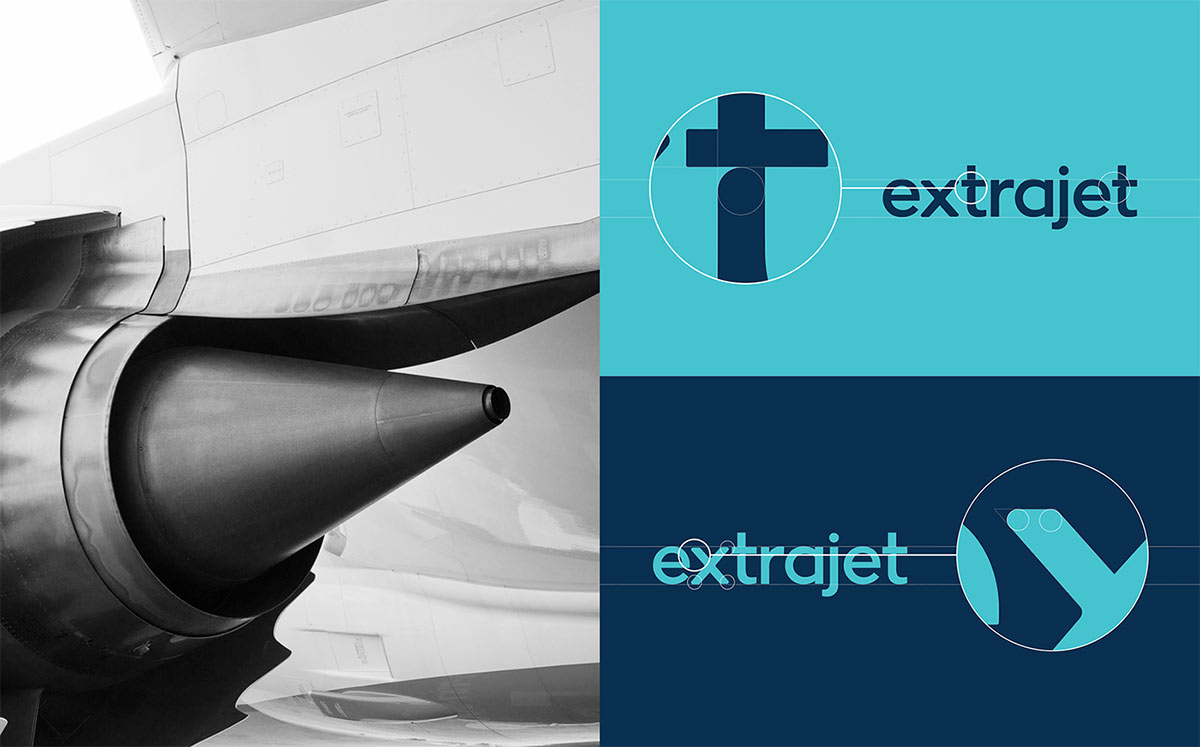
Developing a brand identity involves more than just making a logo design. Research into the company’s values is necessary to collect inspiration from which to draw ideas. Concept sketches are then developed into a visual identity that represents the brand, which consists of not just the logomark, but also a complementary colour scheme and typography that provide consistency across the entire brand image. Rather than presenting just the final logo graphic in their portfolios, the designers featured in today’s showcase have produced thorough case studies that completely breakdown their brand designs. See how they neatly present the concept alongside stationery mockups and examples of real life usage.
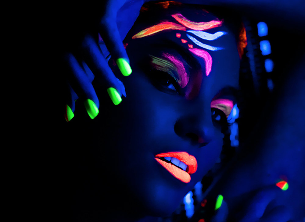
The lighting of a photograph is one of the most important factors that determines the atmosphere and mood of the picture. Natural light can give an image a warm feeling, whereas low-key lighting results in a dramatic looking image. Photographers can also go to the extreme with their lighting setups to create surreal images by illuminating the subject with ultraviolet or neon lights. These colourful photographs featured in today’s showcase are created with the combination of fluorescent paints and blacklight bulbs, or the vibrant glow from intense neon lighting.
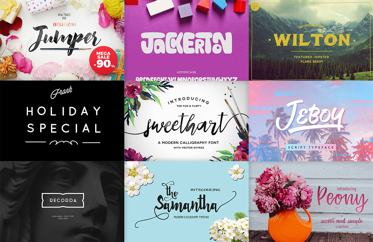
I’ve made a few posts that round up some of the best free fonts available on the web, but those good quality free resources are quite rare. To develop a font library worthy of your professional design projects, you have to be willing to invest in some premium typefaces. You don’t have to spend thousands though, in today’s post I present 20 great premium fonts you can pick up for under $5. Many of them are packed with additional weights, OpenType features such as ligatures and stylistic alternatives, and even bonus extras.
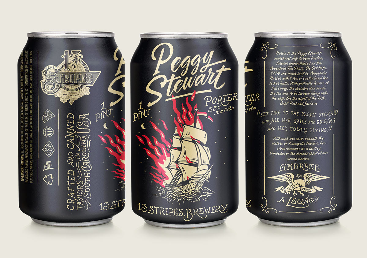
The explosion of the craft beer scene over recent years has given graphic designers a great opportunity to create artwork for beer cans. Unlike the mainstream brands, independent microbreweries can be more experimental with their branding, which leads to some really cool packaging designs for their products. In today’s showcase I present 40 of the coolest beer can designs, including some magnificent illustrative work, colourful abstract artwork and nostalgic vintage styles.
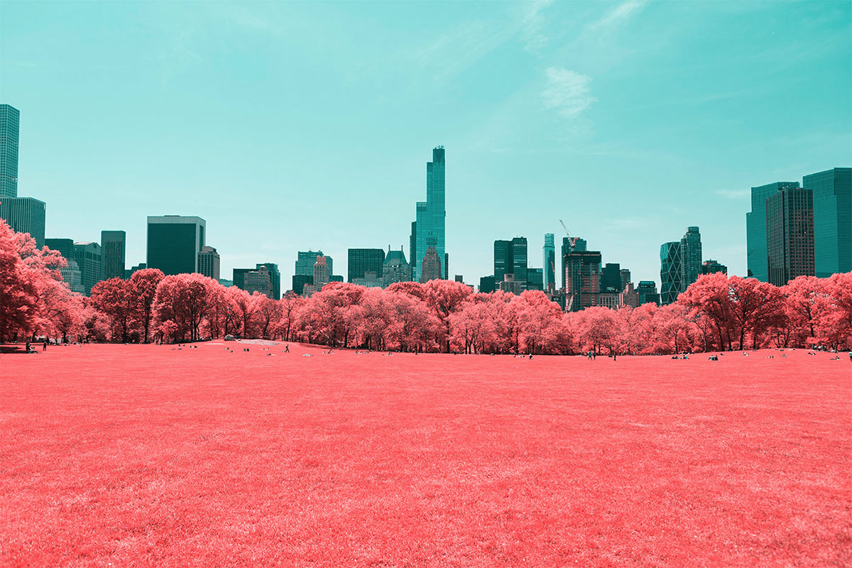
Infrared photography is typically used to create black and white pictures of landscapes that feature incredible detail, sometimes with a dreamlike glow. When infrared images are processed using film such as Kodak’s Aerochrome series however, the shot is reproduced with false-colour, where the reds, greens and blues are reversed. The result is a surreal scene where elements such as trees and foliage appear as a vibrant pink, which often looks like the photograph was taken on another planet! Digital photographs can be post-processed using a variety of methods that offer different looks, but the false-colour aesthetic is still a favourite among photographers. In today’s showcase I present a range of breathtaking examples of infrared photography with surreal colours.
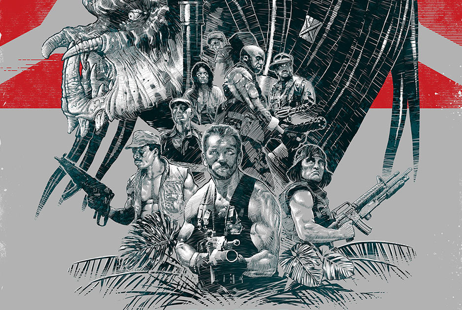
Alternative movie posters are fun side projects designers and illustrators enjoy working on to show off their own take on the promo art for a popular film. There’s a huge number of examples of discover in portfolios around the web that feature a range of movies across all genres and years. For today’s showcase I’ve picked out 25 reimagined poster designs for your (okay… my) favourite 80s classics. Each one is redesigned in a unique style that beautifully represents the characters, scenes and memorable moments of the movie.

