I recently finished up a website redesign project with Andy Wheatley from IT-IS International Ltd. The project involved a redesign and rebuild of itisint.com, and used the WordPress application to cover the core functionality of the site. Let’s take a look at the process of tweaking WordPress to transform it from a blogging platform to taking on the job of a typical Content Management System.
The Client:
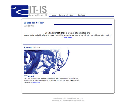
IT-IS International are a small research and development company working in the life science industry, they develop software and instrumentation for the analysis of DNA (PCR- Polymerase Chain Reaction). Sounds complicated, right?!

Andy was a fantastic example of an awesome client, giving complete creative freedom and providing excellent feedback throughout the project. It’s lines like this in an email every designer dreams of –
I hope that this project might be something you could really get your teeth into (free reign on the design).

The key requirements for the site were to showcase the company with creativity and innovation while being updateable by the team. The structure was pretty simple with a collection of static pages, a news archive and a client only area.
The Solution:
I’m a big fan of the WordPress application, and use it for pretty much every website I take on, whether it’s a blog or not. WordPress has some amazing versatility, and can easily take on the role of CMS, eCommerce and more!
The IT-IS International site could easily be ported into WordPress. The static pages could be listed as WordPress pages, the News section could make use of WordPress’ blogging functionality, and the Client Area could be tackled with a mix of the default WordPress user hierarchy and a handy plugin or two.
The Design:
The design was put together using the IT-IS International Ltd corporate colour scheme of blue, grey and white. I took inspiration from the typical website design styles of web apps that use subtle details, and white space to create a fresh concept.
Being a topic focusing more on the WordPress section of the project, I’ll not go into too much detail on the design and coding stages, but here’s a screencast I recorded of the process of cutting and coding up the concept into a working XHTML/CSS page.
Building the WordPress Theme:
Once my coded concepts are complete, I’ll then move onto the WordPress theme creation. I have a handy template saved on my machine that’s based on the Default theme, but with the majority of the HTML removed, leaving the collection of PHP snippets ready for insertion in the relevant areas of the theme.
Active Navigation States
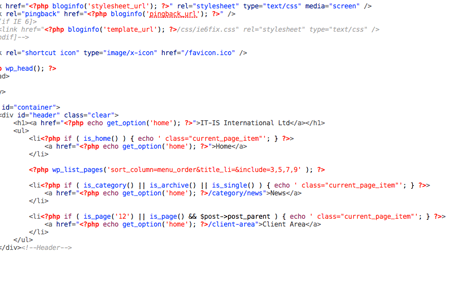
A little customisation was required in the navigation bar to allow the active link state to show on each item. The home link was inserted manually, followed by WordPress’ default list_pages tag. The News area needed to be active whenever the user was viewing a category, an archive or a single post so conditional tags were used to tailor the appearance of the active link class. A similar tweak was also needed for the Client Area section; This area uses sub pages, so the menu also needed to be active when a child of page ID 12 was active.
Date Stamps
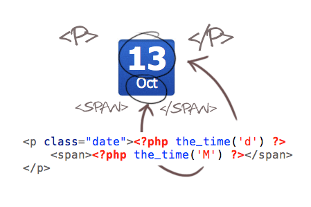
The little blue date stamps were easily built using a mix of CSS and the_time PHP tag. The whole date is contained within the paragraph tag with a class of date; within this is a span that contains the month of each post. There’s an extensive range of options available for the PHP date function, so it was a case of simply choosing which letter represented the type of date I required. I needed a good old number (d), followed by the shortened display of the month (M).
Custom Pages
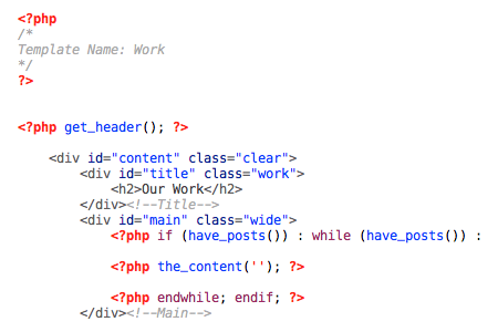
To apply custom styling to individual page, I used custom page templates to specify a unique title graphic, and to determine whether the page had one or two columns. Custom page templates also came in handy for inserting the map on the contact page, allowing the embed code to be slotted straight into the code, safely keeping it away from the WordPress editor.
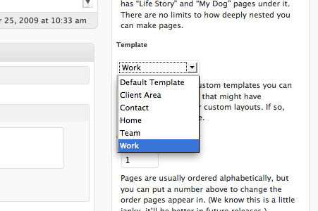
This page template could then be attached to the specific page in the WordPress admin area.
Client Area
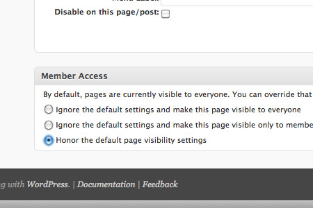
To create a hidden client only area on the site I employed a mix of plugins to work alongside the default WordPress user system. The relevant pages were created, then a handy plugin called Member Access allowed permissions to be set on a per-page basis. This covered the main chunk of functionality that was required, but the user still needed to be able to login…
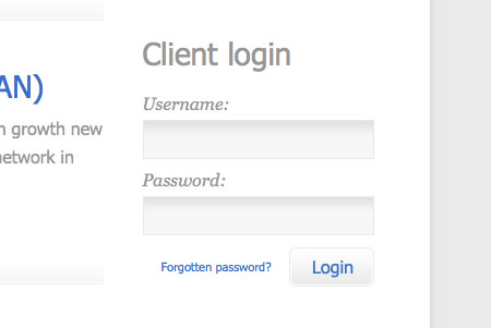
This is where the second plugin comes in. Sidebar Login creates a username/password login form that can be placed anywhere in the template with a little template tag. Once the user logs in, a collection of links are displayed in place of the login form, allowing the user to access their profile in the WordPress dashboard, or to log back out.

A mix of new CSS styling and some tweaks to the HTML in the plugin file soon tailored the appearance of the form to match the rest of the site.
To completely finish off the login screen for both front end users and the IT-IS admin, the awesome BM Custom Login allows super easy customisation of the default WordPress login screen, giving a branded appearance that ties in with the rest of the site.
Overall, it was a pleasure working with Andy and the IT-IS International team. I hope this little insight into the customised areas of the WordPress site provides a couple of handy tips to anyone taking on a WordPress based project of their own!


Great Post,
I’m pretty much working on a similar project right about now, just without a client area like in this project. Some of your tips really come in handy.
Thank you for this post. That helps me a lot for my current project. But how are you handling images on the custom page templates? I always have a problem with that. Do you use the custom fields in wordpress or how do you do that? Are there any plugins for that problem?
Stefan
Awesome Resource! Excellent presentation.. thank you for this!
Great post as the others said.
Was wondering what the MHTL editing app you are using in the screencast is?
>Was wondering what the MHTL editing app you are using in the screencast is?
I think it’s Coda. I use that as well, it is really neat, I love it.
http://www.panic.com/coda/
Thanks Petter!
Shockingly I only learned about Custom Page Templates the other week /shame but since then I’ve been looking into applying them to a project I have coming up. Should be fun.
I dig it!
Just out of curiosity, the time lapse video – about how long do you think that took in real time?
Great Article!!!
thanks a lot.
Great post. I’m working on a site that’s using WP similarly right now. I didn’t design it, but I’m still trying to brainstorm ways that we (well, the guy who did design it) could make it fit our needs better. This is a good start.
Also, I’d love to hear any suggestions on this if anyone has them: This site is a Nintendo fan site. We have a lot of reviews that we’ve already put up (as WP posts). However, WP doesn’t let us alphabetize them, which is what we’d like to do. Any workaround so that people could view the reviews alphabetically?
constantly amazed at how perfect your timing is with these tutorials! I’m working on a wordpress site too.
My client is after a client database with a newsletter mailout system, has anyone achieved something like this with WP before?
chris.
Great post – love the outcome!
Hi Chris I really enjoyed this post and how you showed what you do in a typical WordPress package.
Say, how did you inserted an active class state for the links generated by WordPress’ default list_pages tag?
Nice post. it’s always cool to see how different people handle wordpress designs/coding.
@Ted Goas – the default list_pages code usually spits out a class item for the active page. The class item it automatically adds to each of the li’s that are active is “current_page_item”
Thanks Mike!
Its always interesting to see how good designers tackle projects. Thanks a lot for the post…
OMG!! Wow… can I ask just one question? Where do I learn to make websites like this one?? I’m not kidding, you’re amazing!! O___O I’m a graphic designer and work some web design too with PS and Flash, but css and xhtml are still unknown to me, could you please recommend me some tutorials or starting points to this awesome art?? Thank you so much for your time on reading this! Congratulations!! :)
Great article, i am always keen to know how great designer (like you) follow the procedure to overcome the issues arises during custom design. Thanks.
The outcome is sure worth the hard job, great work.
Superb article very informative. I always like to see other peoples design process. Thanks for this
Thanks for the kind words Chris, it was awesome to be able to work with a true professional. The workflow was seamless and you delivered on point without fail, frequently exceeding expectations. I think the outcome speaks for itself and needless to say you left us, the client, with BIG, BIG smiles on our faces :) If anyone out there gets the opportunity to work with Chris grab it with both hands, I can guarantee you won’t be disappointed!
Great blog design, showing the entire process was very helpful! I hope to see more web design case studies like this in the future.
Great design! If I could make one comment though? The font color is a little bit too light (not enough contrast against the bg color). I had to squint my eyes a bit to read the text due to the low contrast, there may be others who will have the same issues. Just a thought, otherwise, I really admire your work.
Great work, Thanks
I told this so many times, you’re the man!
This tutorial really kick ooshies! I was scared to face a design like this in the past, well, not anymore!.
Brilliant Chris. Ever thought of doing any video tutorials?
You are awesome Chris Spooner. I am really fan of you. Thank for this nice article, really great.
I don´t understand nothing about coding but what a neat work :)
Great post dude.
thanks for the article it was very interesting and helpful. I’m searching high an low for as much info as i can get on transforming wordpress templates from just a blog to a cms, and on designing them myself. do you have any sources you recommend
thanks
Am I the only one who downloaded the video and went through it bits at a time? ++
I picked up a lot of little tricks and learned a lot watching your workflow.
Chris, thanks for all your great tutorials and ideas.
Continued success!
Hi Chris,
1 nice post, thank you for sharing
2 I am curious… what is the content of the client area? just page/s with images/text/multimedia or there’s some service?
This is amazingly helpful as a WP tutorial for people are wondering how to make use of wp at a CMS. Thank you.
Great article, really appreciate the look into your build style. Thanks.
Martino
Hi
Great and useful information about wordpress designing and there are many designers can get knowledge from this post.
Brilliant. Definitely agree with you about using wordpress as a CMS, and like you i tend to use it for alot of my sites too.
Great article, really appreciate the look into your build style. Thanks a lot for that one
Great post dude.
Most of the time the only insight you get from graphic based design blogs is from the polished end. It’s nice to see it from a different more build oriented perspective.
Hi
In this site very super , very useful for me, keep develop, design also very super ,
i bookmarked in this blog
Thanks for your information
Hello. Watch Free NHL live P2P streaming. TVU, tvants, justin.tv, ustream.tv, sopcast, uusee, ppstream, etc.
Watch NHL schedule, live streaming and much more.
Thanks. I’ll be using the login-formular soon on my upcoming site: http://www.lineofbeauty.dk (Danish), And I think I’d better be looking into that “Custom page” – too… :)
Very interesting and informative. Great tips Chris. Thanks for posting!