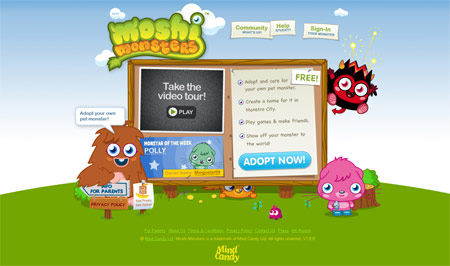
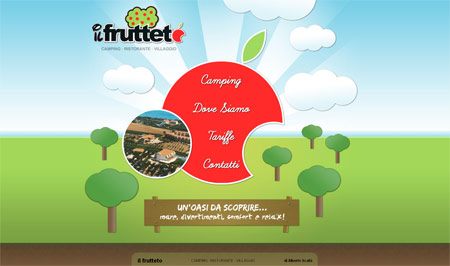
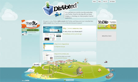
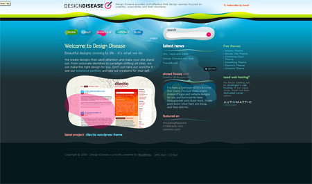
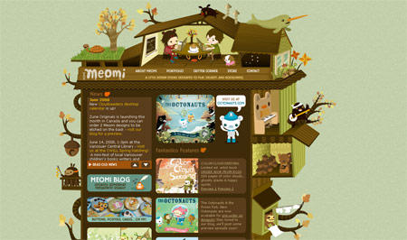
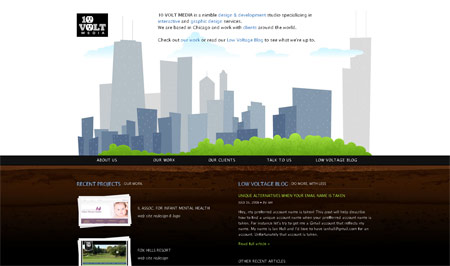
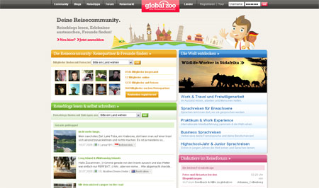
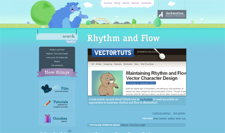
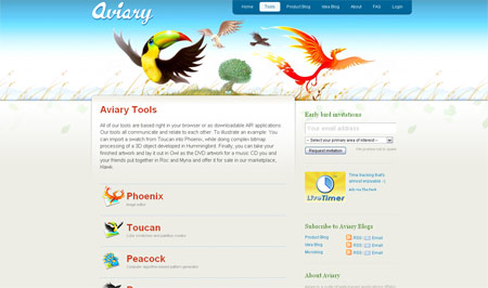
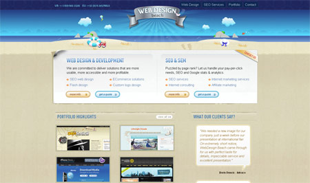
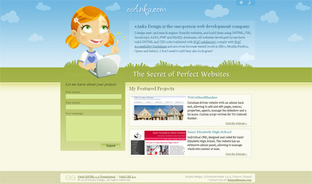
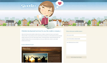
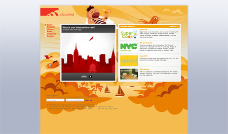
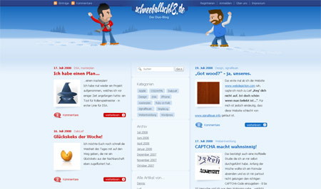
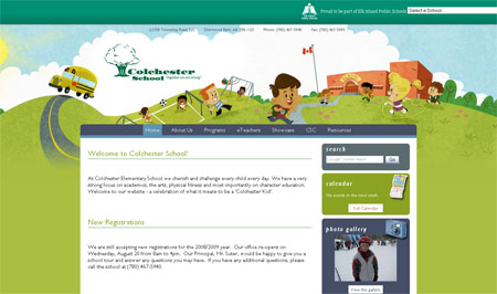
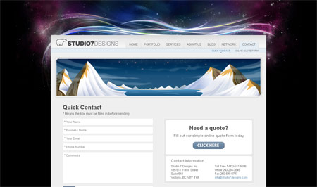
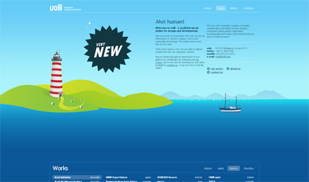
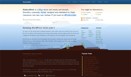
I’m a big fan of illustrated elements in web design, particularly those that use vector cartoons or characters. A popular trend I’ve noticed is the use of illustrated landscapes, used as part of the website header or built into the complete website design. These often depict grassy fields, blue skies and water, but read on to see a roundup of some fantastic landscape illustrations from various website designs.


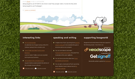

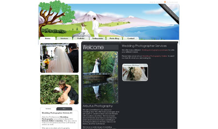
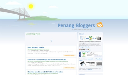
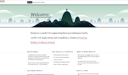
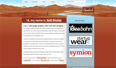
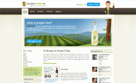
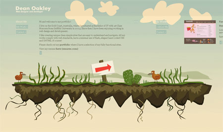

These are great looking sites. I especially like that Banjax header.
Long live vector landscapes!
:) i almost jumped on that boat!
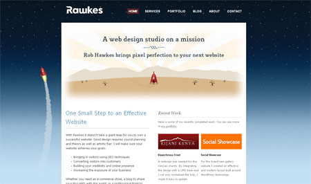
Some awesome sites there, thanks for including Rawkes!
Good list. I think this is a great trend in webdesign.
This is a great collection of really beautiful illustration. Meomi has been a favourite of mine for some time, but I definitely love the grass & sky landscapes.
hey, you’ve forgot about my blog, it has unique desing too.
Take a look: http://www.seowriter.ru
I agree – the vector illustrated landscapes are very cool. Good source of inspiration that you have put together here!
Thanks for the feature!
Excellent compilation, many of the sample sites are truly amazing!
Brilliant, nice collection – Love the styles on display here!
Thanks for mentioning our site. This is a great list you’ve put together with quite a few I haven’t seen before.
To be honest, we struggled a bit with the idea just because it is such a prominent and growing trend (no one wants to look just like all the other kids). In the end, we decided we liked our skyline concept so much that we really wanted to do it anyway.
What’s great about the list you have is that, while all using a common vector-landscape base, they’re all -very- unique. The execution on each is superb and they all stand out beautifully on their own.
awesome list, thanks for mentioning me!
Great List and great Websites
Thanks for the comments, to those that were featured – it’s a pleasure, congrats for creating a unique and inspiring design!
http://www.worldofsniggles.com is also a very cool one with a Vector Landscape!
Gosh, thanks!
i agree, this is definitely a trend that’s only building steam right now. nice examples!
I am so glad of this trend. It is such a simple but visual approach.
i love your header! ;) nice article.
Another website that you might want to include is http://www.vimeo.com/ they have a awesome landscape as their footer.
Wow, I love the vector design. It is something that I want to get into more as I have noticed some very nice works with it.
Some nice examples. I too almost jumped on the vector bandwagon, but at last second decided not to.
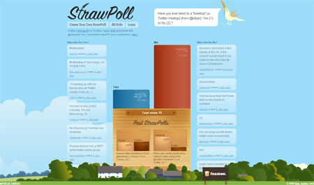
I’d seen Straw Poll design before, but it still looks impressive! Adit Shukla’s design was also quite eye-catching.
Great list!
All these examples are great but I don’t find big corporations deploying an illustrated header. I think illustrated artwork in websites makes one believe that the person is not serious and that is why the big corporations don’t use it. Just my thought though.
great post keep em coming
thanks for sharing
Thanx 4 this gr8 list of sites :) Keep em coming…
Hi!
I like your post. It’s great to see some great web designs…the green grass, the azure sky, the blue water and vector cartoons.
Payel
Here’s another awesome one… beautifully illustrated and very colorful, and animated in JavaScript:
http://www.bestmortgagedeals.co.uk/
hey!! look this portfolio and ilustration site
http://rodrigoferrari.com.br
;)
Hey check out this landscape site i just finished! the company is just a behind the wheel academy, but they got one nice site!
http://www.safedrivingacademy.net
Really nice examples! ;) Keep up the great work!
Ovi Dogar
AbsoluteCovers.com
Thank you, after searching for a few hours, I finally found the inspiration I was looking for. Thanks.
Really nice. What do you think about this web design. http://www.rudnosiukas.lt vector style
Another nice one! Thanks!
go vector design go!!!!!!