As an avid cinema go’er I always enjoy keeping up to date on the upcoming movie releases, and as a designer I particularly enjoy checking out their movie poster artwork.� Here is a compilation of upcoming movie posters for 2008 from IMP Awards with a range of different design styles.
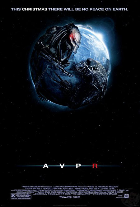
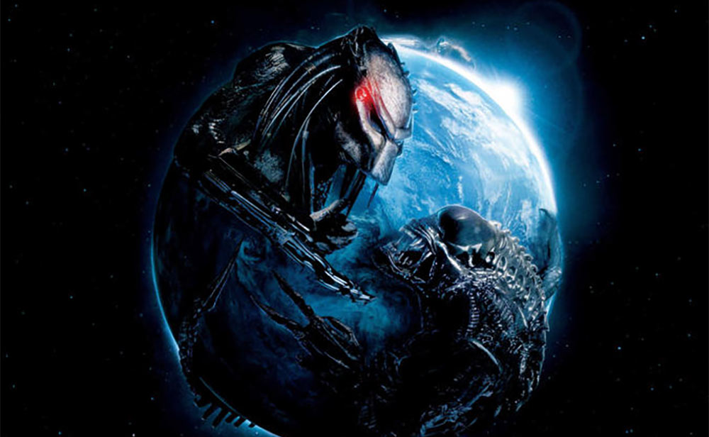
Alien VS Predator
New Firefox logo anyone?! That would have make a great marketing campaign during the build up to it’s release.
Says Christmas on the poster but it’s only just come out here in the UK, so it still counts for 2008!
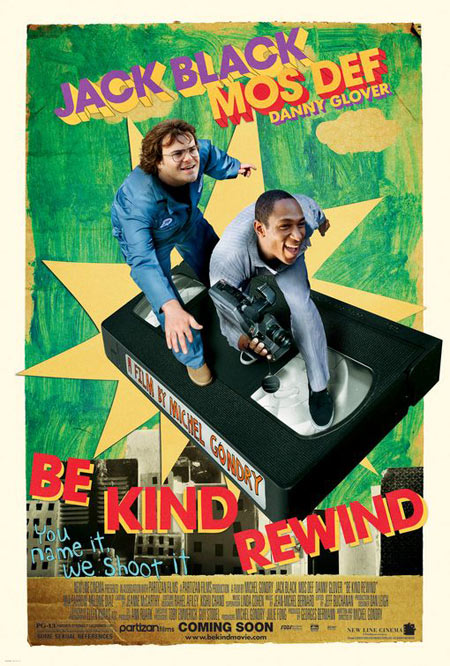
Br Kind Rewind
A fantastic piece of artwork creating that retro collage look with hand made elements.
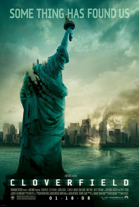
Cloverfield
Along with the trailer this poster and it’s effects have created a real mysterious buzz around this movie.
The Photoshop work (or maybe 3D?) creates a scene of destruction that outlines exactly what the movie is about, but keeping the suspense by not giving away too much.
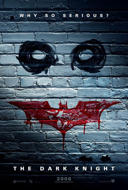
The Dark Knight
As a Batman fan I really love this poster.� Everyone knows the story of Batman and The Joker, which gives the designers the opportunity to come up with something really creative.
As with the Cloverfield poster, this artwork outlines exactly what the story is about without any imagery of the characters themselves.
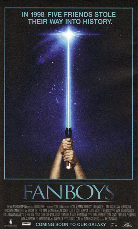
Fanboys
Another great concept behind the Fanboys poster, pulling in the theme from the original 70s Star Wars artwork.� Take a close look and you’ll notice a toy version of the lightsaber with it’s collapsible sections, adding to the comedy of this movie.

Hancock
More amazing photography and Photoshop work, with a little Spiderman esque cityscape reflection in the lens of the sunglasses.
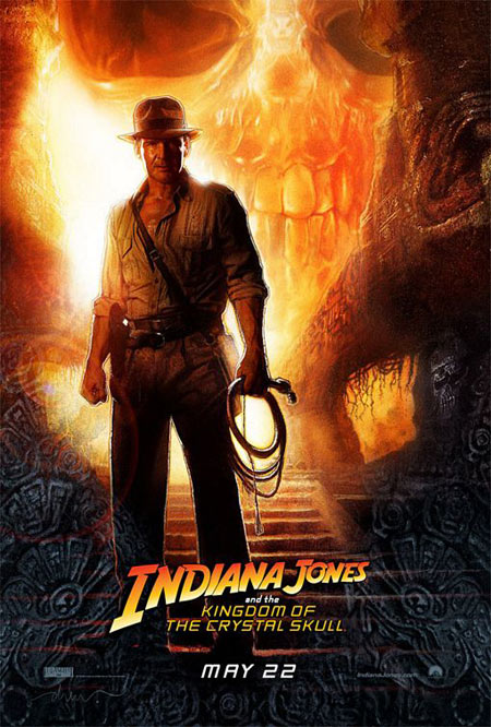
Indiana Jones
Retro is the word with this movie poster, taking you back to the originals with the hand illustrated artwork.
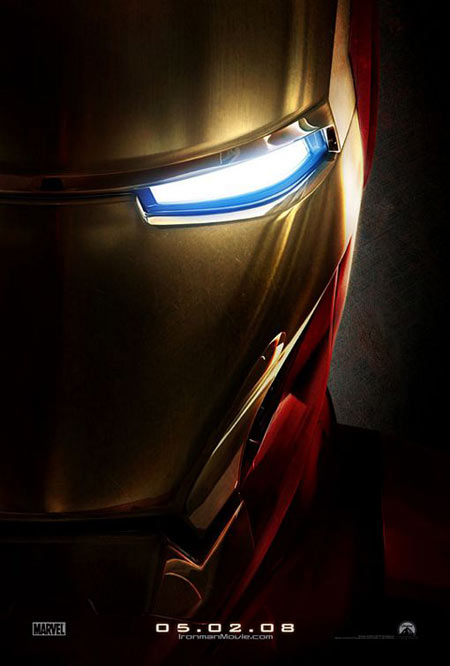
Iron Man
It seems close-up teasers are pretty common with superhero movies, as seen with Hancock and the recent Transformers release.
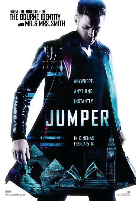
Jumper
Pulling in some high-tech effects the Jumper poster looks pretty stunning isolated on white.
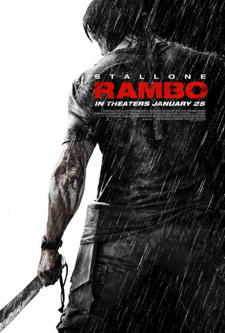
Rambo
As mentioned with The Dark Knight poster, working with well known trademarks gives the designer the opportunity to come up with something really creative.� This Rambo poster makes brilliant use of contrasting black and white imagery, whilst highlighting key elements such as the blood and title in red.
Along with that, the slightly illustrated look gives a real atmosphere to the poster.

Star Trek
Yet another well known icon, and more examples of the close-up teaser technique!� A great idea pulling in amazing detail of the uniform fabric.
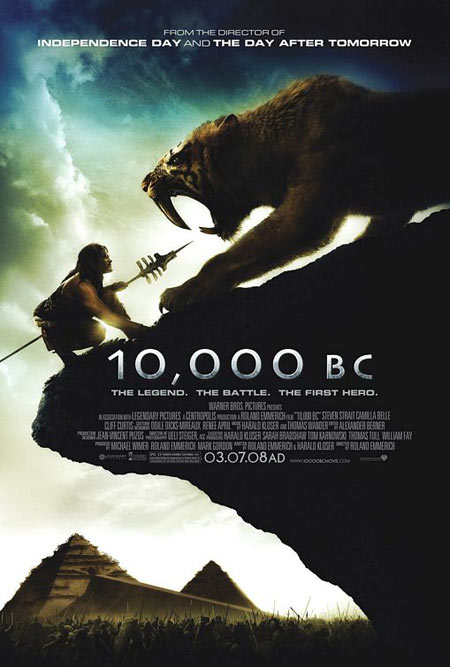
10,000BC
I love the composition of this design and the huge silhouette masking out most the the foreground.� Today’s level of 3D expertise allows for some great photorealism.
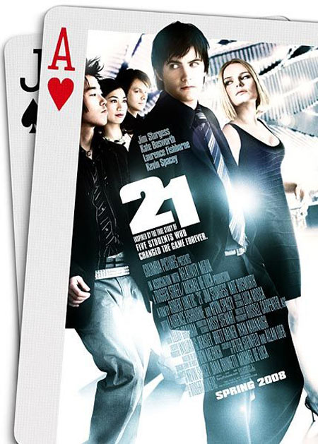
21
Half of this poster comes across as your usual hollywood style with a bunch of straight-faced characters looking a differing directions, yet the inclusion of the playing cards gives a cheeky insight into the topic of the movie and adds a strange sense of scale to the poster.


I love the comentary for the last one. You know some ill sh** is going to go down!
After looking at some of these design blogs for the past month or so i really can see how these posters are made too. Little pat on the back :)
Thanks for this compilation.
Yet another reason, letting me know, I correctly took a ‘feed’ on your blog.
Interesting as well is the subject matter: Movie Posters.
As an avid fan of the cinema as well, and a confessed fan of three actresses, I’d cheekily like to submit my ‘poster’ for your review. ;) It’s not a movie yet “on the lot” yet, but wouldn’t it be nice to imagine these three in a film, about anything?
My attempt to get a movie made… :)
i’m only looking forward to “Be Kind Rewind”, nothing else.
uh, rambo sir jorge? or do you just have horrible taste?
I’m excited about “Be Kind Rewind.” None of the others seem that great to me, but I’ll probably end up being dragged to “21” or “Dark Knight” (honestly, I’ll probably like the latter). The main thing that bothers me about “10,000 BC” is the title. No historians use the terms “BC” and “AD” anymore. They haven’t for a while. It should be called “10,000 BCE.” Maybe I’m just too nit picky(spell check tells me that’s two words. Okay…).
Hey there,
This is a great compilation and indeed the Alien VS Predator poster it does look so much as the firefox logo (or rather, FireFox VS IE).
The most i like from these posters is Alien, Indiana, Iron man and Rambo, they just have some more style.
vil fa hancock
i want learn make a poster design please help me
“The Curious Case Of Benjamin Button” opens 12.25.08 and since they do not have a movie poster yet, I have designed one for them. Does anyone know whom I could get in touch with to see if my designs possibly could be used or maybe even just to help with other ideas. Any little nudge of a foot in the door would be helpful. i am a second year graphic designer student who is more interested in having a GREAT portfolio, than large incomes at this time. Thanks!