In this week’s roundup of creative goodness, we have a super useful tip when creating print stylesheets; a great introduction to colour correction in Photoshop; some handy tips to consider for web navigation; a cool vector Illustrator tutorial; and a showcase of light texture use in web design.
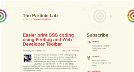
The Particle Lab
Creating print stylesheets can be a real pain in the backside, but this super useful tip from The Particle Lab really takes the hassle out of testing your print only CSS. With just a few clicks in Firefox, you’ll no longer be tediously refreshing a print preview.
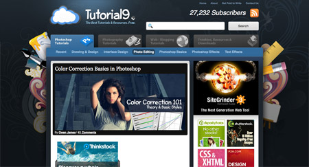
Tutorial9
Tutorial9 present this in depth article that talks about the various colour correction techniques, allowing you to tweak your photos so they look their best. Learn how to quickly add some popular colouring effects to your photos to give that professional look.
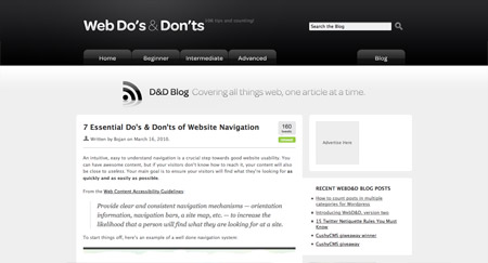
Web Do’s & Don’ts
Navigation menus are often quickly thrown together during a website design, but there are some important factors to take into consideration in order to boost the usability of your design. Web Do’s & Dont’s takes us through some examples and best practices.
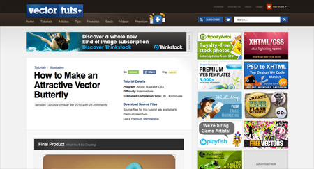
Vectortuts
Vectortuts are continuously pumping out great vector based tutorials. This recent Illustrator tutorials takes you through the process of creating a bright and attractive butterfly graphic, using gradients and highlights to add details and depth.
Vandelay Design
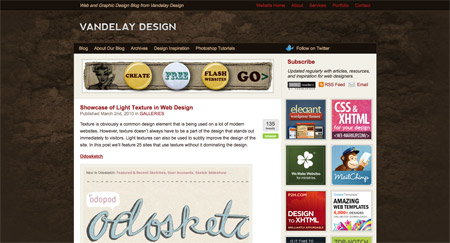
I’m a big fan of using subtle textures in my design, so this inspirational roundup post from Vandelay Design was right up my street. Gain inspiration and see how designers are using textures to add a tactile feel to their website designs.



Thanks for the fave, Chris!
This site design is sick by the way. Love it!
Nice roundup, thanks for the mention.
Great picks, gonna go check out Tutorial9! :)
Liking the Web Do’s & Don’ts article on navigation – always good to go over the basics.
And like the Vandelay Design article – I love texture in web design, it makes the whole internet experience a bit more personal.
Good picks as always =D
Nice roundup of useful stuff.
I think all this sites are same.. ) imho
Nice roundup, thanks for the mention
Nice roundup of useful stuff
I checked the first 3 so far & getting ready to check the final ones. I just wanted to say that so far I found the tutorials Very helpful & glad that they made the weekly pull. So far the color corrections tutorial has proved to be the most helpful & definitely was worth my time following it.
Thanks for the great tutorials, I look forward to seeing more on this site in the near future.
always find vandelay a great source of inspiration
I like the way the article with do’s and don’ts was written. By the way, I like the “access all areas badge in the sidebar”.
ok yhanks