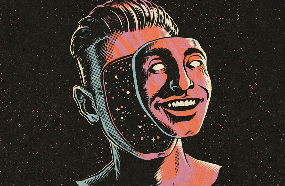
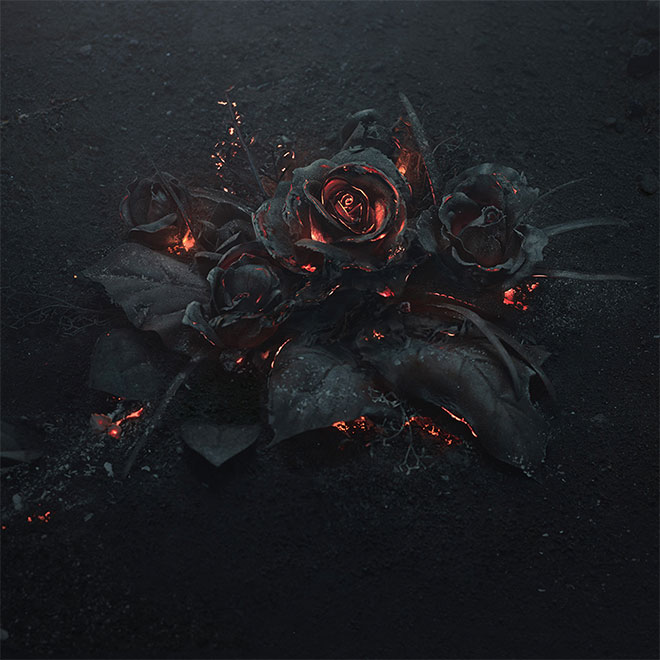
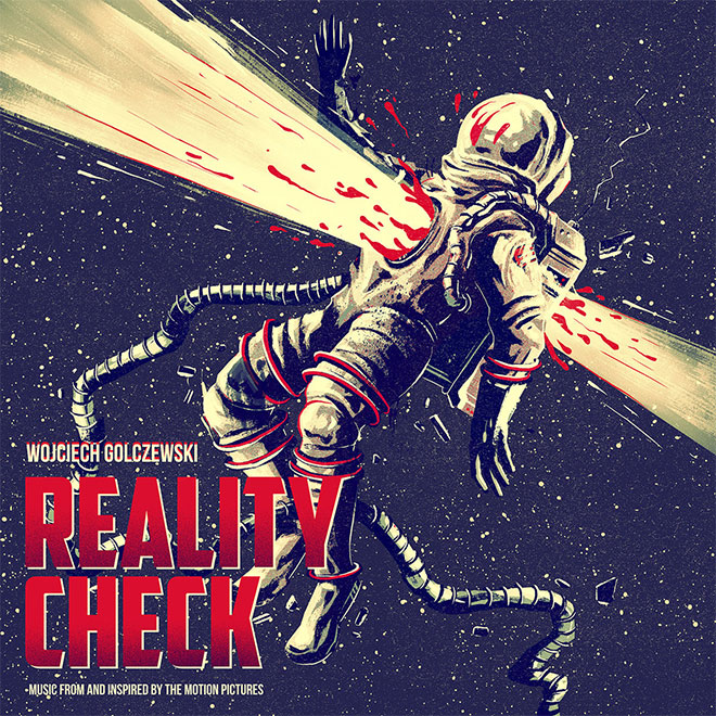
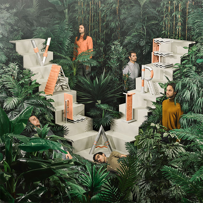
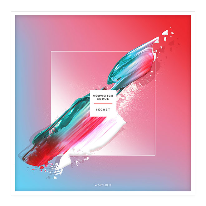
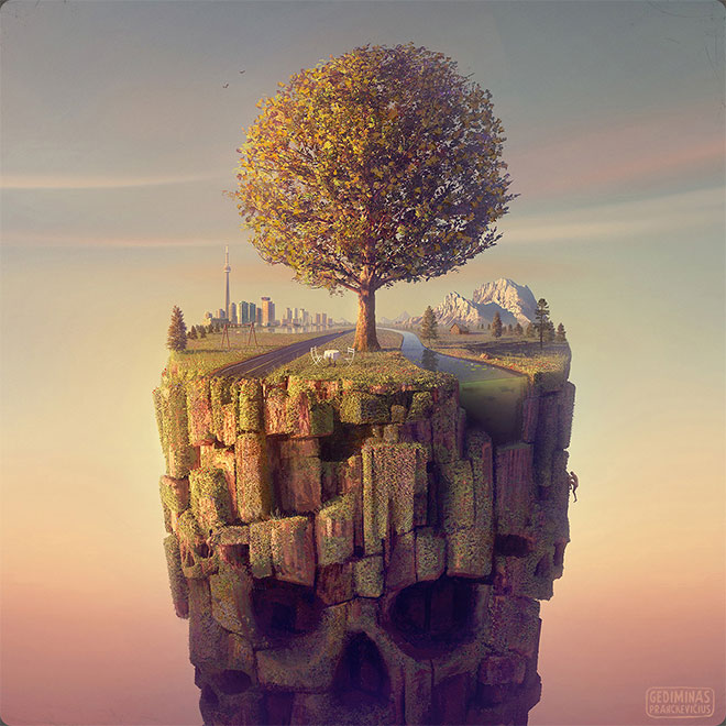
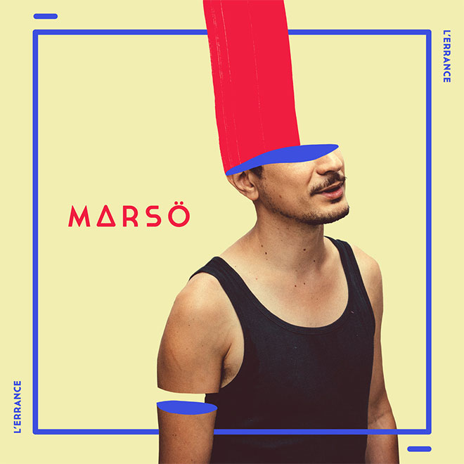
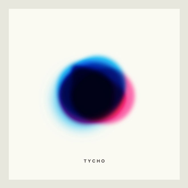
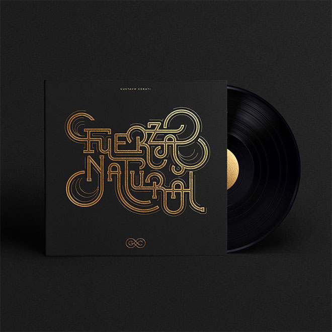
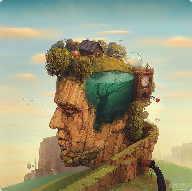
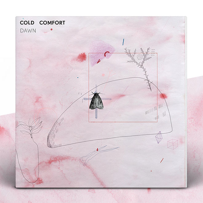
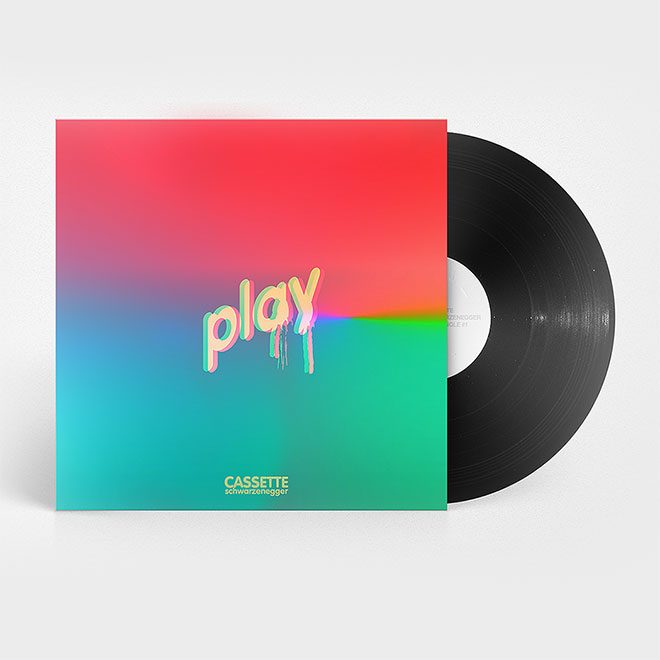
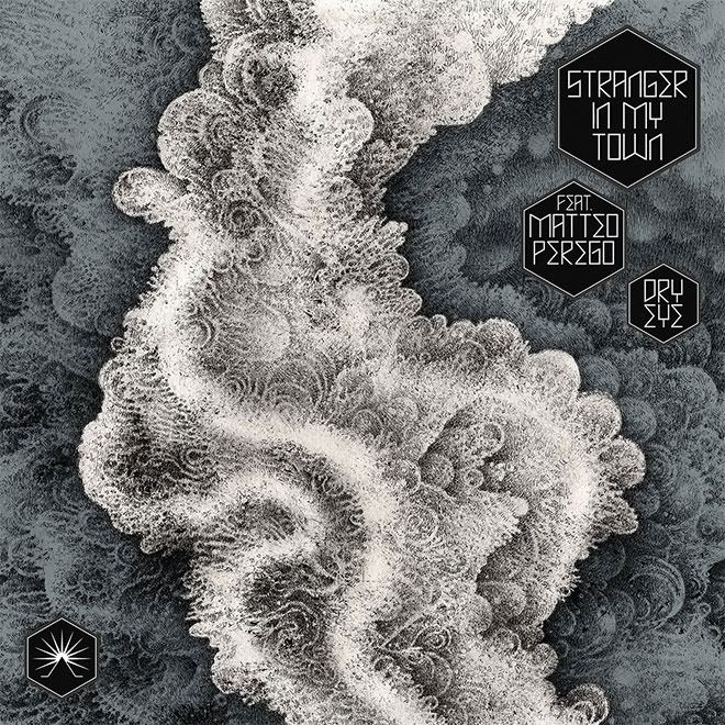
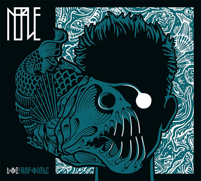
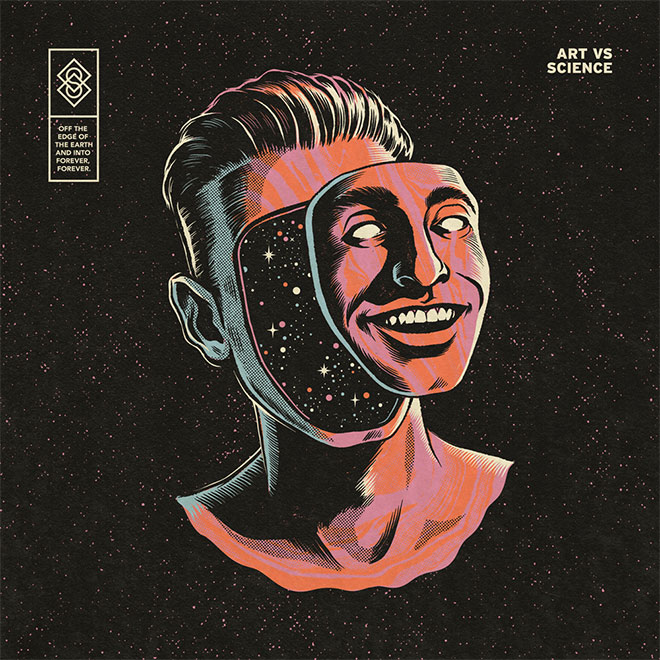
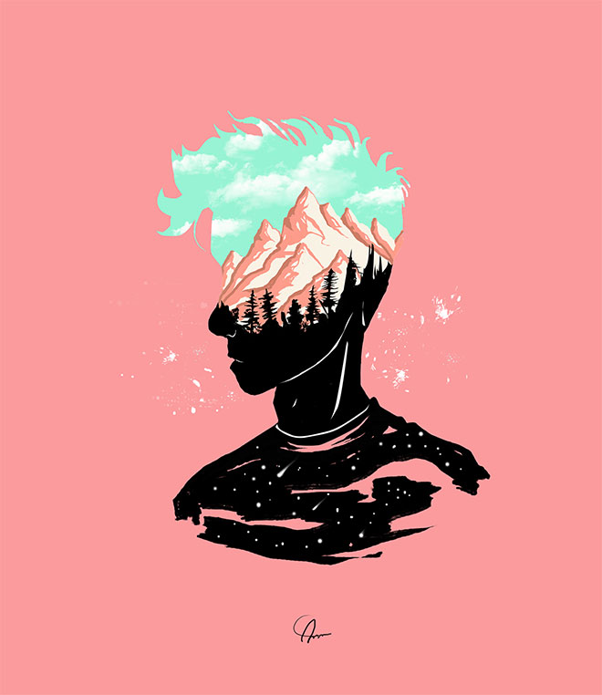
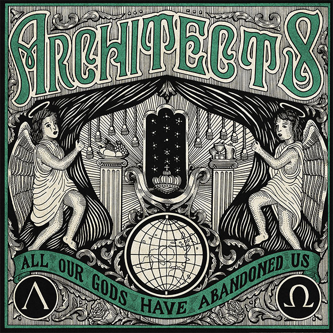
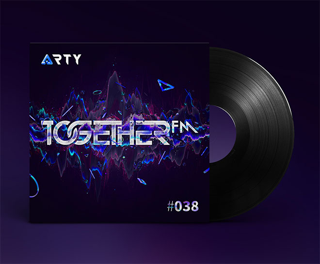
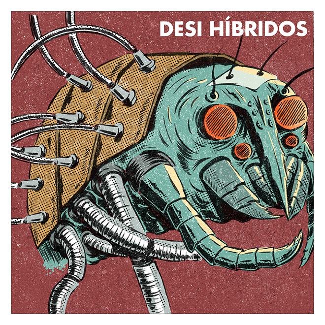
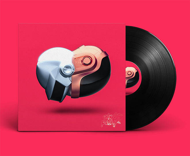
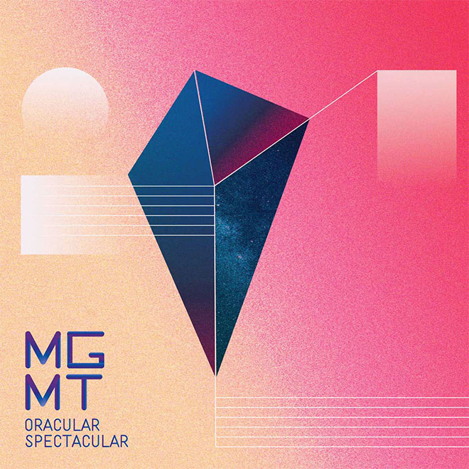
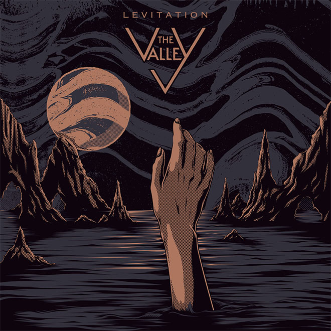
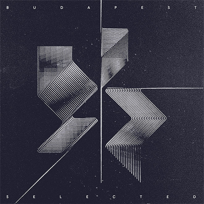
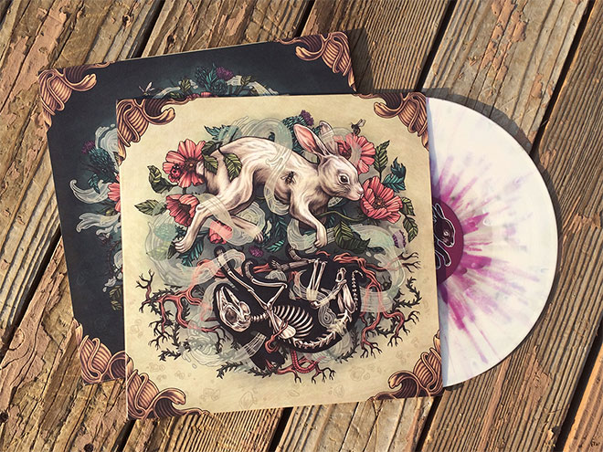
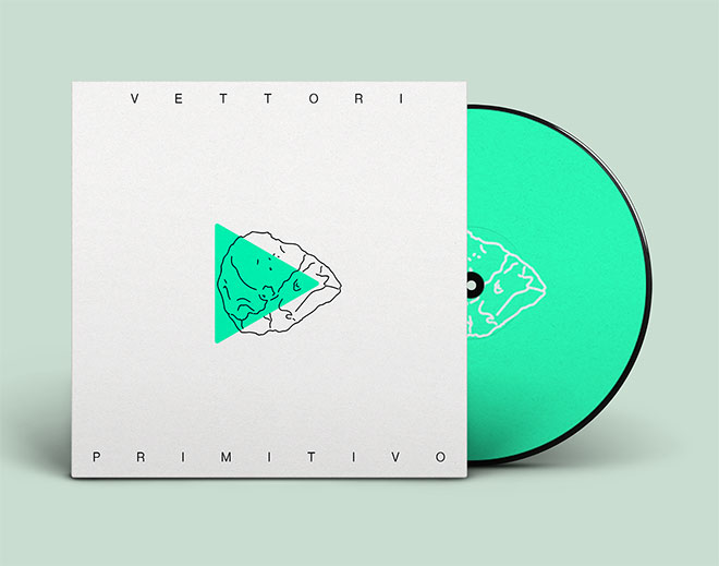
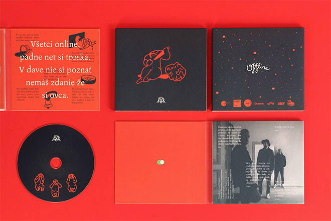
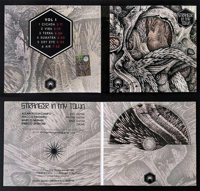
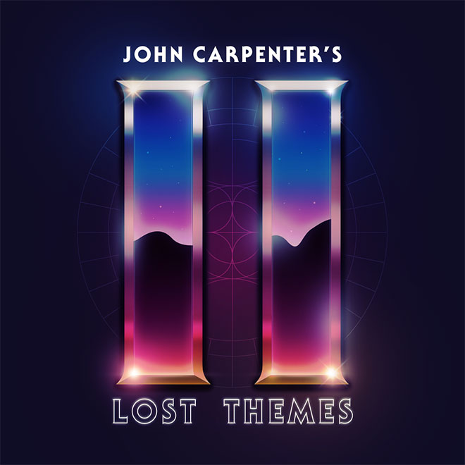
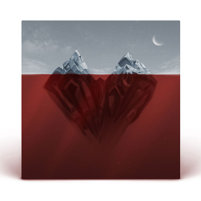
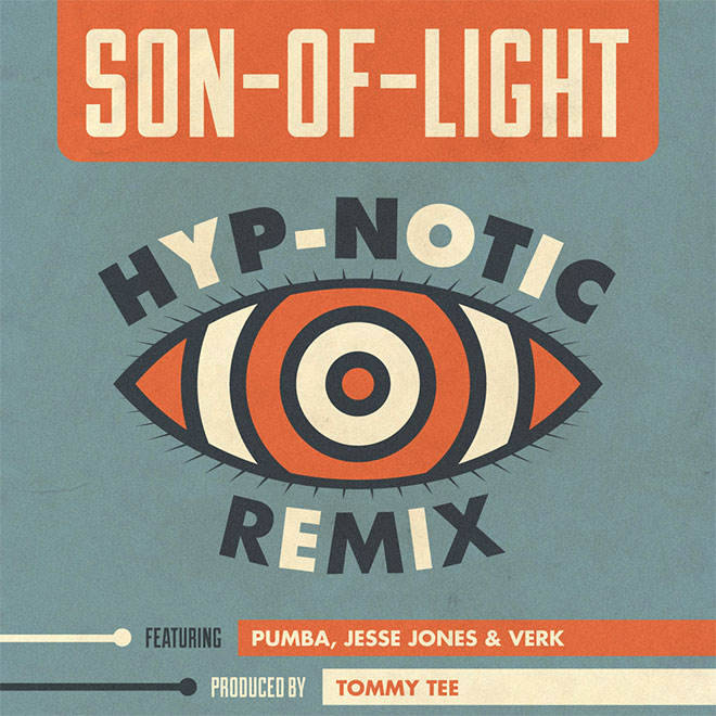
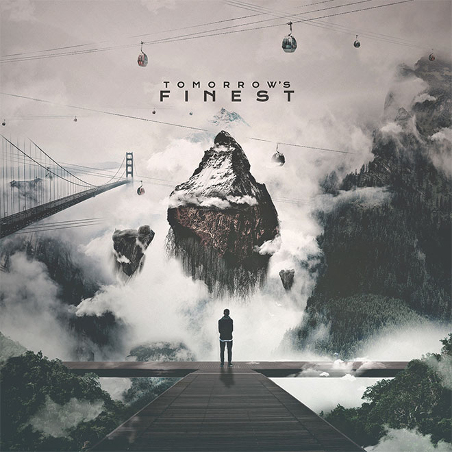
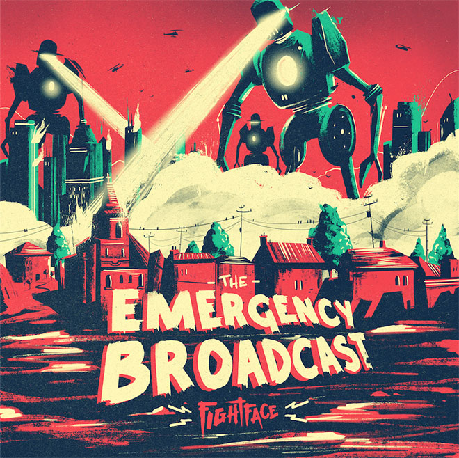
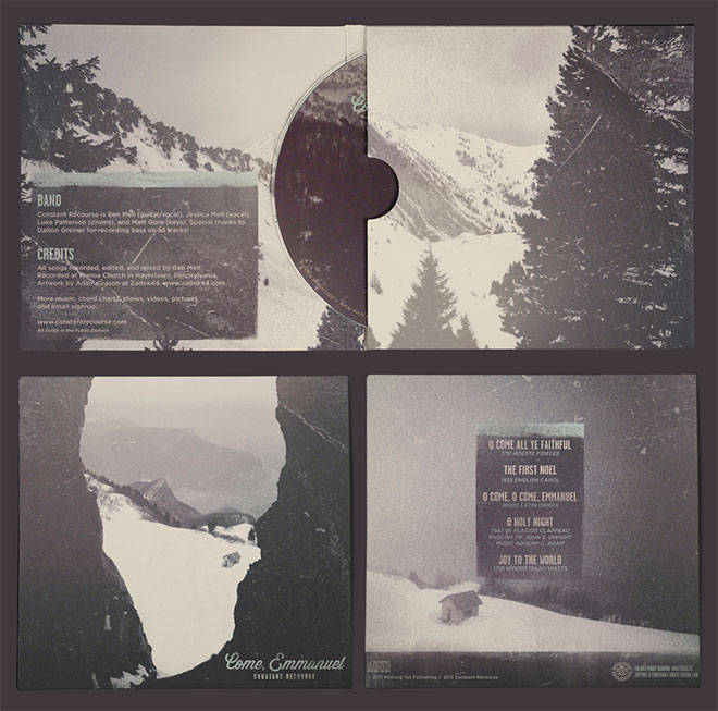
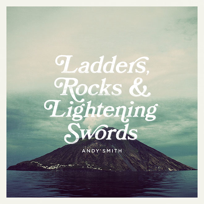
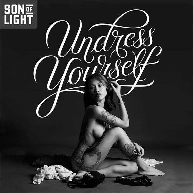
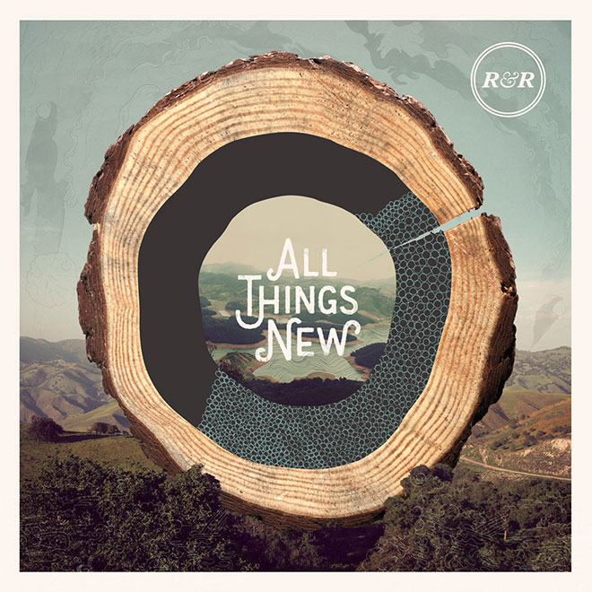
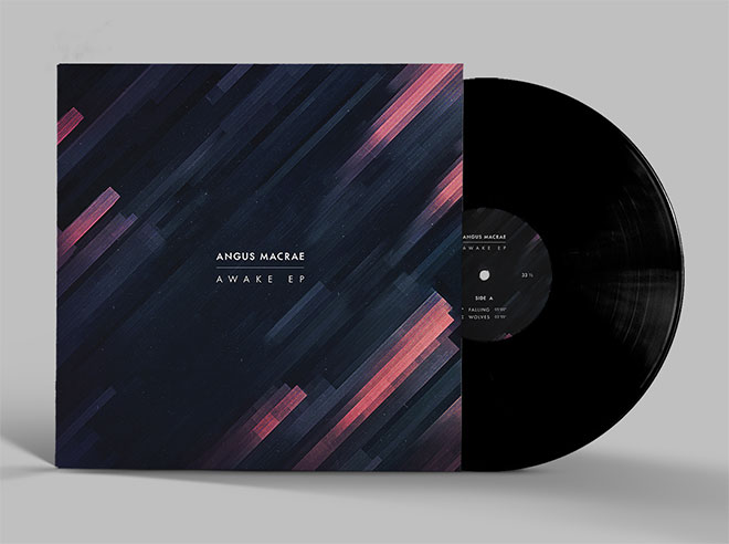
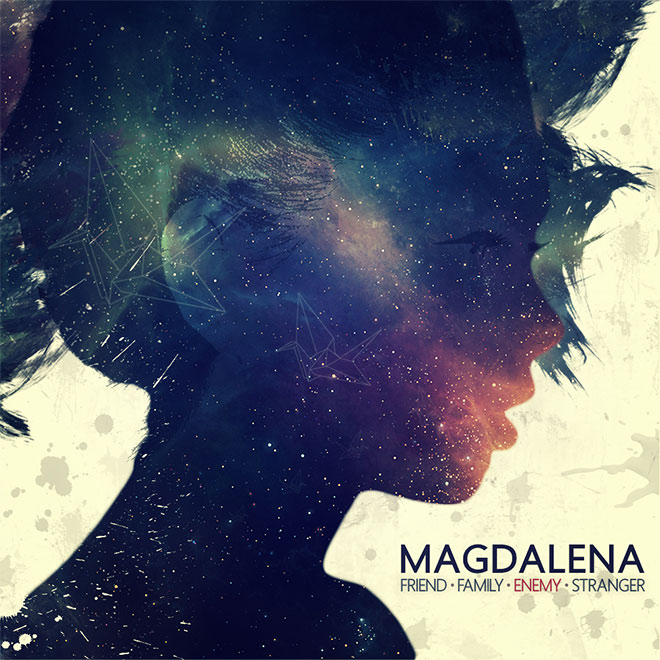
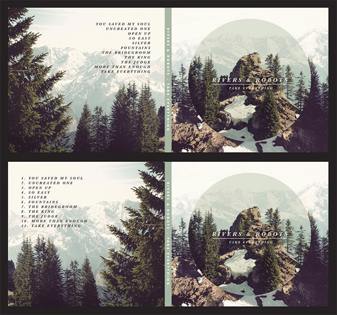
Album cover art is always a great source of inspiration because there’s such an eclectic mix of styles to feast your eyes on. There’s no rules that determine what an album cover should look like, it just needs to be attention grabbing, possibly relate to the genre of the music it represents, and present the name of the artist along with their album title (although some examples don’t seem to make this requirement much of a priority!). This gives the artist or designer complete creative freedom to experiment and innovate, which can sometimes lead to their work becoming iconic as their artwork forms a recognisable identity for the album. In today’s design showcase you’ll find over 50 creative album covers, made using all kinds of disciplines from complex illustrations to clever photography.



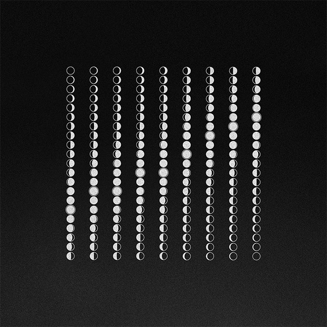
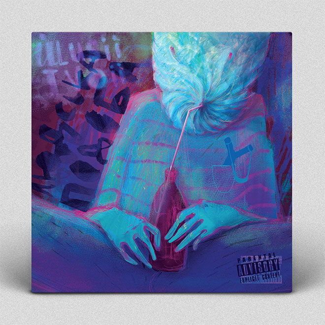
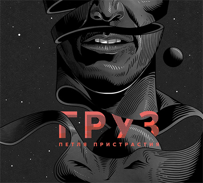
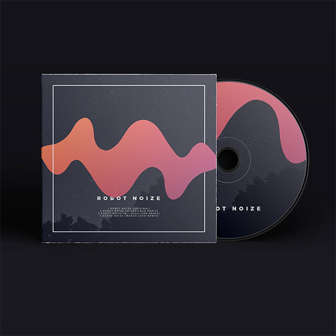




All of these cover designs are looks gorgeous . Great thanks for shared this post on public .
Glad you like them Barbara!
Very creative and thoughtful. I love to think myself creative and recently taking a graphics design training as well. I hope someday I would also be able to think & design things like these. Thanks for sharing.
This is an amazing blog for all graphic and web designers. Lots of inspiring ideas, tips I found from here on my first visit only. Loved this blog and going to visit this from now onward.
Thank you very much for your comments! Appreciate it!
Awesome and very inspiring, thanks!
Thank you Terry!
Just what I need for my current project, great reference and inspiration- thanks Chris!
Great timing then :) Glad I could help!
Yes, really interesting mix of styles etc. Particularly like the Tommy Lee’s Tomorrow’s Young by Peter Schreve and the Angus Macrae by Adam Flynn. Ta for blog
Thank you for your comment Blanche!
No offense, but these all stink.
Great Design is in the Eye of the Beholder….
Jeffrey’s Eye(s) just see Great Design differently than Mr. Spooner! AND… one Decent out of 12 shows that Mr. Spooner has a good grip on Great Design!
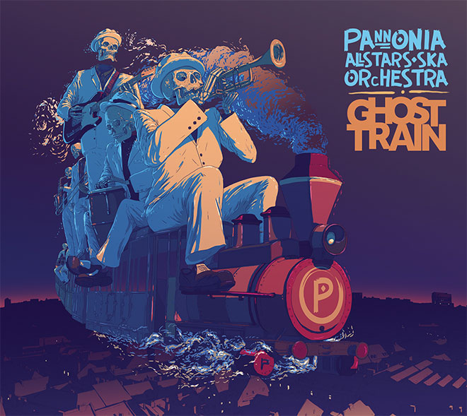
Ghost Train cover design looks gorgeous.
It’s a cool idea having the skeletons riding the ghost train.
These are inspiring & amazing, thanks for sharing!
Thank you Faraz!
These creative album cover designs are uncompromising tranquil, and I truly enjoyed themselves. I love these various graphics cover designs. Great source of inspiration.
Great stuff! Glad you found some inspiration!
Great Collection of relevant Graphic Designs all in ONE Place!!
Thank you for doing the Foot Work!
How did you come to select these particular Cover Designs?
I am sure you must have found more than are displayed here… do you plan to display other Cover Designs soon?
I am NEW to your Blog and am very impressed so far!!
Congratulations to you and your efforts!
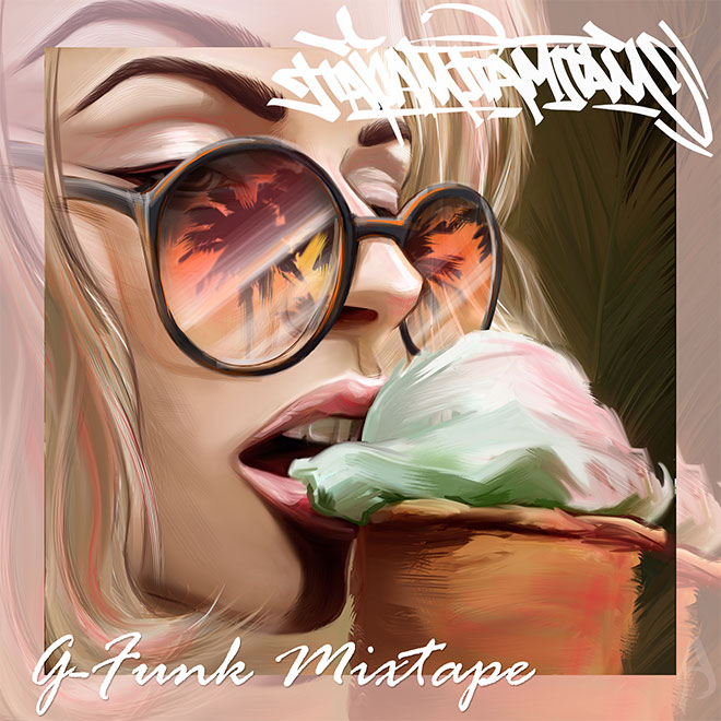
My Favourite: G-Funk Mixtape Album Cover by Anastasiia Rafaliuck