Earlier this year I posted a showcase of inspiring art & designs that made use of cool overprint effects, so today I thought I’d talk a little about the process of using overprint in creative ways in your own print design projects. Read on to find out what overprint is and how you can use this technique to produce colourful overlapping effects in your prints.
What is overprinting?
Whenever you create designs for print, by default your design software automatically sets your elements to “knock out” the artwork below. If it didn’t do this, all the colours of your design would be printed on top of each other and result in a muddy mess! However, we can use the process of overprinting a colour directly on top of another for specific purposes.

One such purpose of overprinting is to eliminate the chance of “ghosting”. This is when the print plates are slightly misaligned and cause a thin outline to appear around text that is knocked out from a background colour or photograph. Rather than having the printer punch out the shape of the text from all the separations, you can instead set it to overprint to print directly over the top of the other colours.
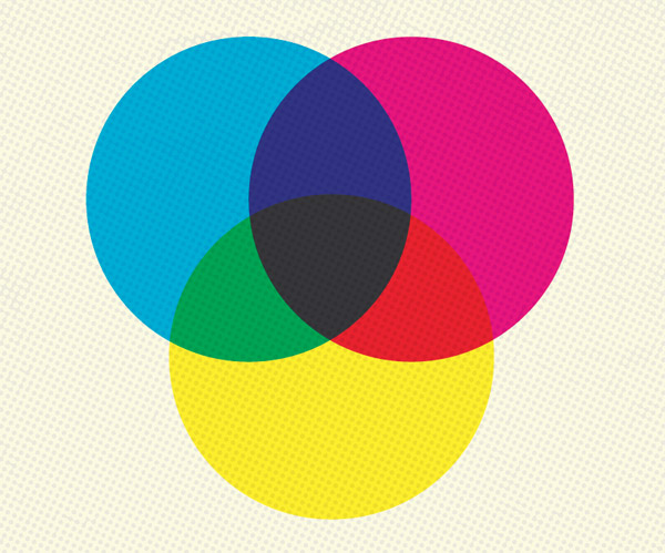
Overprinting is also a really handy technique when you’re working on a print with limited colours. You can blend two colours together to produce a third, which provides opportunities for creating really cool overlapping artwork.
Overprint vs Multiply (or Darken)
Overprint is a specification in your print file for certain colours to be mixed with ink, whereas Multiply and Darken are transparency modes in your design software that mimic effects similar to overprint. The main difference between these settings is the overprint effect won’t be visible unless you turn on Overprint Preview in your document, because after all, it’s meant to be a prepress feature rather than a design feature.
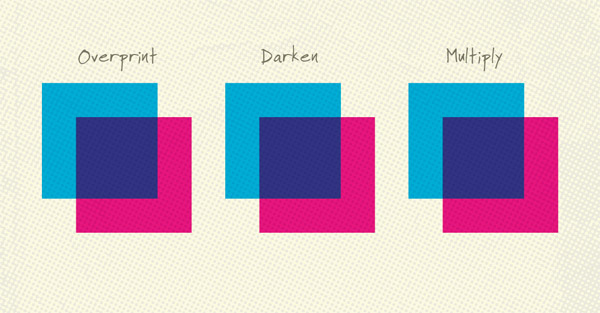
If you overlap a magenta square over a cyan square and set it to either Overprint, Multiply or Darken you’ll see the same result. Illustrator and InDesign use similar rules to the Overprint setting to export these effects in your print file, meaning the elements won’t be “knocked out”. However, keep in mind there are some differences between these modes.
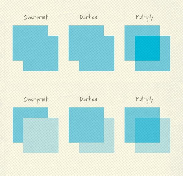
Change all the magenta squares to blue, then reduce the fill percentage to 50%. The Overprint and Darken configurations are still identical, but the Multiply version has a darker overlap area. Reduce the fill amount of the overlapping squares to 25% and things get even more confusing! The Overprint and Darken examples are now completely different.
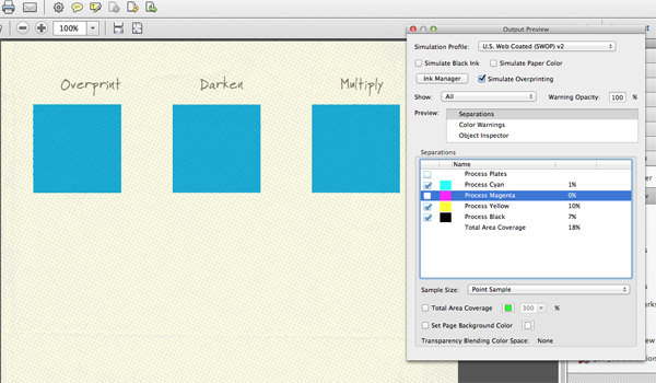
It’s always worth checking the separations in Adobe Acrobat using the Output Preview tool to make sure your elements aren’t being knocked out. This feature confirms that Multiply and Darken are replicated in the same way as Overprint, but I have heard that same print rips don’t like these blending modes. To be safe I’d recommend using the proper Overprint method whenever you’re going for an overprint style effect.
How to create effects with Overprint

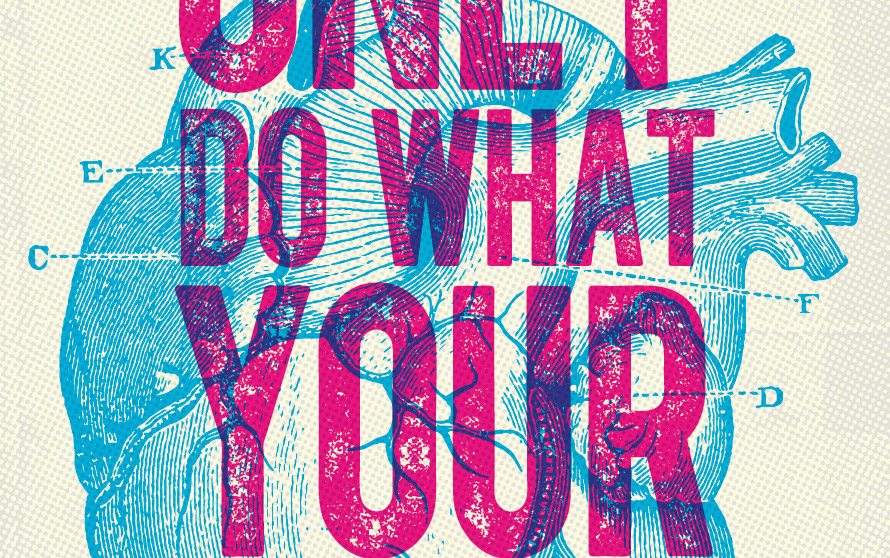
We’ve already seen how Overprint can be used to mix two colours to create a third. This technique can be used to create cool print effects where two different types of artwork are overlapped. It’s especially useful if you’re working with a limited selection of Pantone colours.
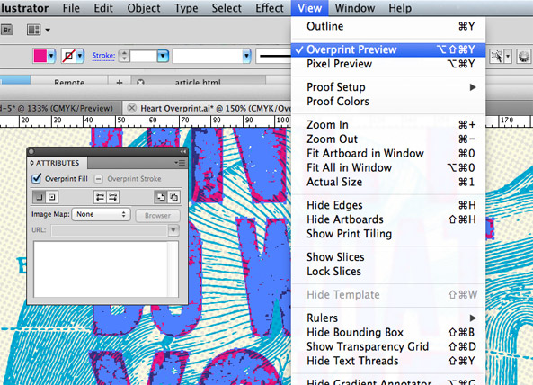
You’ll find the option to set an element to Overprint in the Attributes panel. Don’t forget to turn on Overprint Preview under the View menu to simulate the effect, otherwise it won’t look like anything has changed.
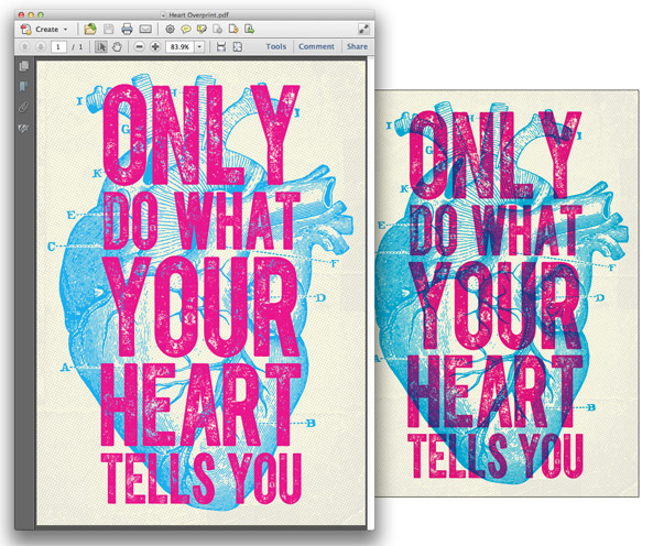
The potential problems continue when you export your artwork for print. By default the Print to PDF or Postscript options are set to “Preserve” the Overprint settings, but they don’t actually show the effect when you view the PDF.
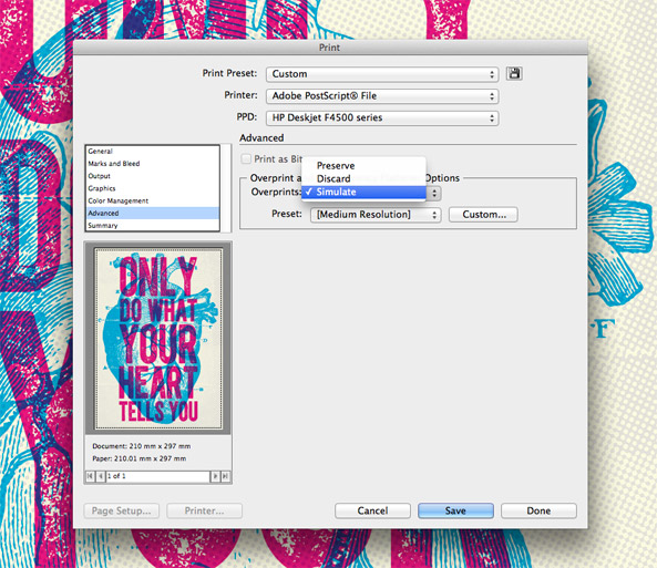
Under the Advanced options in the Print settings change the Overprint and Transparency Flattener option to “Simulate” to allow your PDF to show the full overprint effect. Alternatively, you can view the “Preserve” Overprint effects when the Simulate Overprinting option is checked in Acrobat’s Output Preview tool.
The requirement that you turn on simulated overprinting at the design and prepress stage can be a real risk when it comes to having your art professionally printed, so be sure you thoroughly communicate your desires with your chosen printing company. As we’ve seen though, the Multiply and Darken blending modes perfectly simulate the overprint effect, so it can be much easier to fake it for web based graphics or basic digital printing.



Thanx a lot, you’re post is very clear to understand, and great source of inspiration, as usual…
Wow, thanks a lot for this. I always used ‘multiply’ to mimic (a.k.a. ‘guess’) what the final print will look like. I’ll definitely start employing this technique now.
Brilliant!
Awesome! This will help me overcome my transparency fears.
Nice post. Thanks for sharing about overprints and how to create overprints.
So easy to understand, finally!!! Thanks a lot.
You are 100% right that some rips do not like these blend modes. When setting files up for print I only use attributes. Especially when dealing with various screen percentages. Having 2 screen values blending over one another will not give you the print result you want. Screen values will gain by 25% or more in the overlapping areas.
Really, a truly great & informative tutorial. Thanks for sharing :)
This is a great technique and howto create overprints – Stephany, like you i use ‘multiply’ to get an idea what the print will look like before i send it to the printer.
I didnt know the trick to enable the overprint view in the view menu.
Thanks for this great post!