Apple products have a solid following in the creative industries, so it’s no surprise that a range of Apple products including iPhones, iMacs and Macbooks make their way into website designs. Check out this collection of excellent examples, and follow on to a comprehensive collection of resources including icons, imagery and tutorials ready for use in your next web design project.
Apple Products in Web Design: Examples
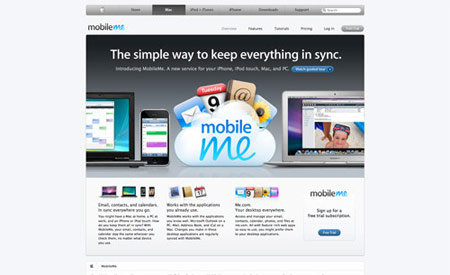
Apple.com/MobileMe
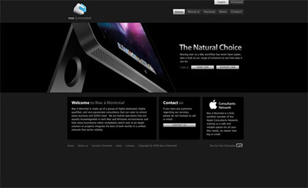
MacaMontreal.com
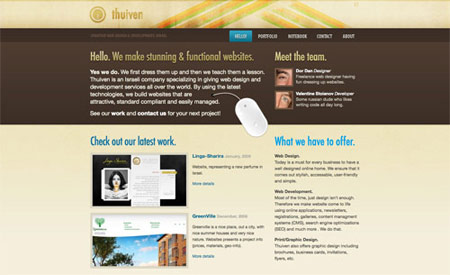
Thuiven.com
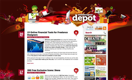
WebDesignerDepot.com
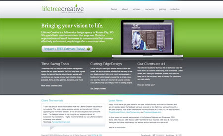
LifeTreeCreative.com
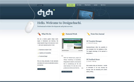
DesignChuchi.ch
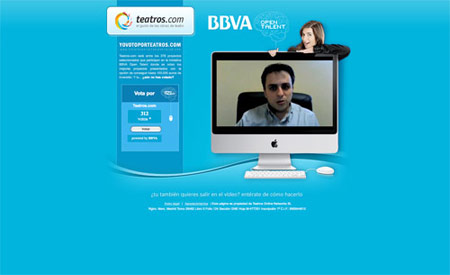
Teatros.com
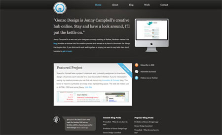
Gonzo-Design.com
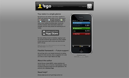
Ego-App.com
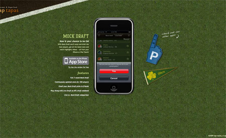
MockDraftApp.com
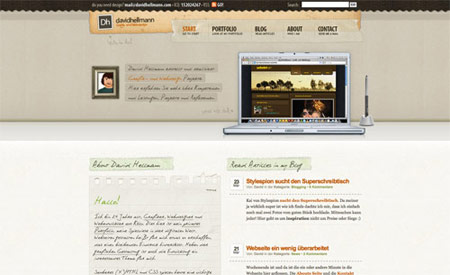
DavidHellmann.com
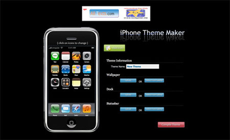
iPhoneMaker.com
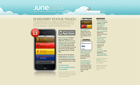
JuneCloud.com
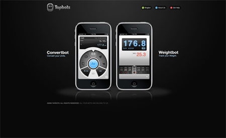
Tapbots.com
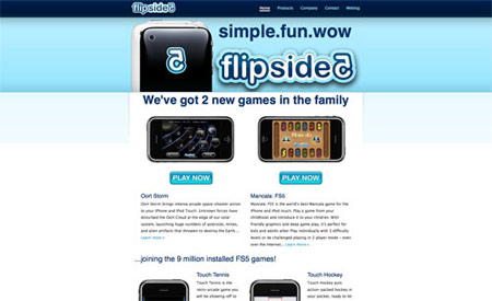
FlipSide5.com
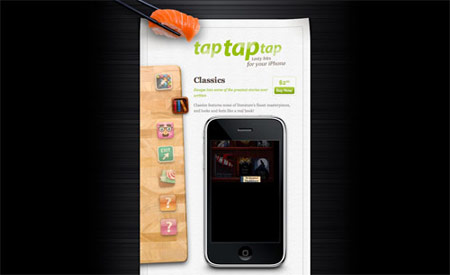
TapTapTap.com
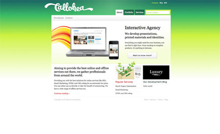
Callohea.com
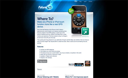
FutureTap.com
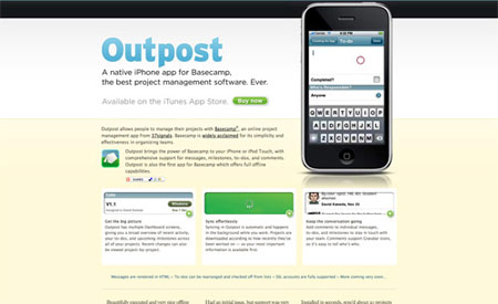
OutPostApp.com
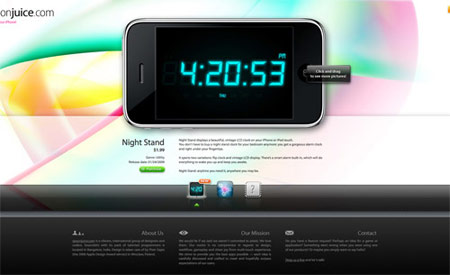
SpoonJuice.com
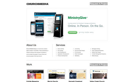
ChurchMedia.cc
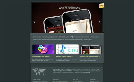
IconDesigner.net
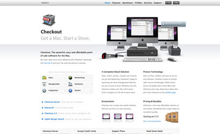
CheckoutApp.com
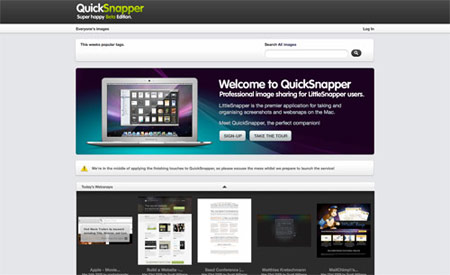
QuickSnapper.com
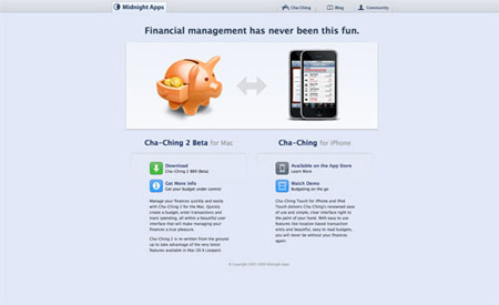
MidnightApps.com
Apple Products in Web Design: Resources
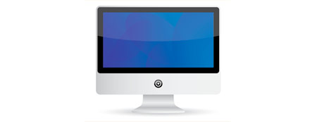
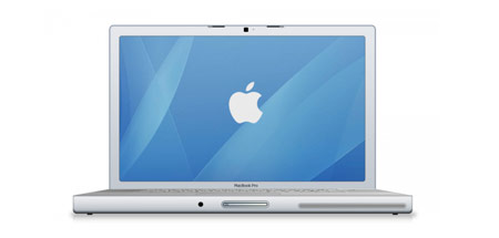
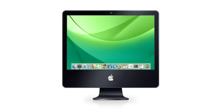
In need of some resources for your own designs? There are a range of free icons and vector images available, here are some of the best:
Apple Products in Web Design: Tutorials
If you would prefer to create your own graphics from scratch, there’s a handful of tutorials for both Adobe Photoshop and Adobe Illustrator that can help out:



You must have had a hard time deciding where to place this article – B.SG or L25 ;) . Anyway, by including those tutorials / resources, you did a great job placing it here. Really liking the article, pretty inspirational.
Also, I like the iPhone GUI from teehan+lax more than the one provided by SmashingMag. tehaan+lax is way more advance and has loads of options. Check it out:
http://www.teehanlax.com/blog/?p=447
Keep up the good work Chris!
That’s right, I don’t want to neglect Blog.SpoonGraphics of any web design topics now I have Line25. You can be sure to expect a decent spread over the two!
The iPhone GUI is definitely another useful resource. Thanks for the link.
Apple products are in a class of their own, their user interfaces allow for easy development and designing. They are quick and efficient, they don’t crash and they run with the user in mind. I used to use PC’s to do all my work, and i was one of those guys who said PC’s are great…However, i was so wrong. Put it this way, i bet when Steve Jobs presents a new operating system, it doesn’t crash….and infront of all those potential investors and clients……damnnnnnnnn!!!!!!
interesting post!
i’m about to sell my ipod touch 16gb to get an iphone, find it a pain in the arse having to carry my phone and touch round at the same time when I use my touch for calendars, email, browsing, games, movie times etc, and my phone for ringing and texting!
I don’t own a mac unfortunately, I just bought a Sony Vaio which is the same spec as a macbook pro but £1000 cheaper! Maybe in a year or two i’ll invest in a mac!
Great post
and to ensure the best from your web design project, till May 2 every designer has a chance to win a new MacBook Air @ http://tinyurl.com/cplar2 ;)
Thanks for featuring my macbook icon…
(The one with the .psd included)
Nice round-up!
Cheers from Bonn, germany,
Oliver
Very interesting post. Seems like everyone should adopt for the Mac’s instead of the old PC’s without the Mitchell and web commercial :)
Chris,
Great collection. I have noticed the a trend using macbooks and Apple displays to show featured web work. It is interesting how creative’s automatically assume their work looks more professional displayed inside apple displays opposed to something like a Dell widescreen display.
This makes me happy. Great roundup!
Yeah great round-up i love Apple products thanks to @chrisspooner for pointing this one out
I really like the way that Teatros.com put the video inside the iMac. Mac’s rule!
Well, Apple computers look pretty, no question (check this: http://gizmodo.com/343641/1960s-braun-products-hold-the-secrets-to-apples-future).
Anyway, they do crash from time to time – but no one talks about. It’s like no one talks about about a perfectly running PC, it just does not fit :-D
In the end, you can do great design work using a Mac as well as a PC.
Ugh, Mac fanboyishness is overwhelming the discussion. Don’t get me wrong, Apple has great designers, but I hate it when people treat them as some sort of religion.
Anyway, nice list, definitely looks beautiful.
I use Apple’s UI as part of my designs among the countless inspirations on the web. Great article! ^__^
Thanks this is an interesting post. I think the apple design team do come up with some creative work, but I do tend to believe that alot of mac related websites actually copy alot of their operating systems designs, which actually only puts them in the category or not being very creative!
Not that I am trying to start a flame war but I picked up the following from the comments!
re: James Mann comments
James who cares mate, this site is about ‘web design’ not operating systems. Regardless of what system you use, whether it crashes or not, amazing designs come out of both, whether or not those designers choose to use a mac or pc I say….who cares!
re: Antonea Nabors comments
I fully agree with you, but I have a slightly different view I’ve noticed when talking to clients they ‘assume’ you own or work on a mac, when you tell someone you went to uni in a design related course they honestly believe you worked only on mac’s (technically they made us work on both). Its only my opinion so take it or leave it but I think designers know this and choose to display there work in a mac/apple style display so as to come across as either a degree qualified designers or working for a design firm, rather then from home…but I could be wrong!
re: myDevWares comments
Couldn’t agree with your more!
Apple products are used a lot by the creative industry, web designers included. Not only are the machines and products that Apple Mac, revolutionary, efficient and excellent, they are also usually great looking things too!
Even my companies’ homepage has use of the new Apple monitors, they just seem to work so much better than anything else.
One thing however that I noticed is that some of the examples above include ‘dated’ Apple Machines, which could reflect on the web-site.
very nice round up. I will be taking inspiration out of these….
Hi everyone, this site http://robson_arthur.vilabol.uol.com.br/Index.HTML use the mouse and the design clean of apple.
ps.: sorry the bad english :P
really amazing collection :) Lovely designs :)
really creative showcase
and really creative sites
:-)
Great post! I love some of the app sites.
Thank you for putting together this collection. Our chicago web design studio is a mac based and love their style of design from both a web and product standpoint.
great post, thanks for the list..
Hello Chris!! Congratulations for blog. It’s excellent!! Man, today I overcome me. 40 minutes navigating in Spoon Graphics!! Chris, I have a question. How I place a picture in the comment?
Really interesting.
I see apple products everywhere, not just online.
Ikea catalog for instance has apple macs on their office layouts and what not.
Is Apple still seen as products made for designers BY designers, and therefor deemed cool?
£100
my two cents…
In all of the above designs, the incorporation of mac products, is less so about the use of macs to showcase what they are, their relevance, or their “undeniable awesomeness” as per many people’s opinions, but instead in alignment with the minimalist design of these pages as a whole. Or alternatively, in line with the image they wish to portray to their visitors.
Mac products and icons are widely used because of their iconicity, simplicity, brand recognition, and then because of their cult status, all of which other brands will have a difficuult time competing with.
I say all this as a proud owner of a dell :D
Great post thanks for sharing,macamontreal is awesome
nice list, thank you! I love mac.
That is interesting. I have seen some of these sites and noticed the Apple presence within them. I think that when people think of art and design, they right away think of use of apple products. It is known that apple is superior for graphics.
thanks
Great collection!!
I heart Apple !
I once worked for Apple, smart company who have taken a series of niche markets/products, bye knitting them together they have created a mass market, yet most people still see Apple as niche brand. Apple now embraces developers and from a brand that Oracle were going to buy for a song they now sit right up there with other iconic brands
I like iphone web page, thanks
agee with anistock, it’s a very smart company! :)
I just started working at this website design studio. Majority of the people here use mac, they’re trying to convert me. I’m still on the fence about it, been a Windows guy for as long as I can remember. I guess we’ll have to wait and see.