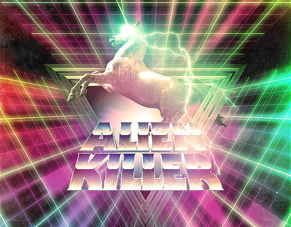
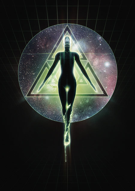
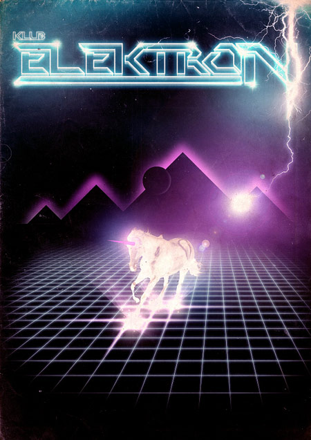
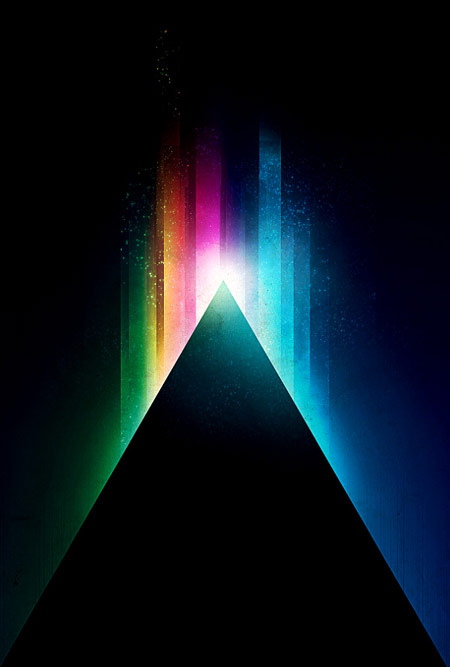
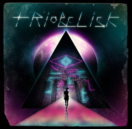
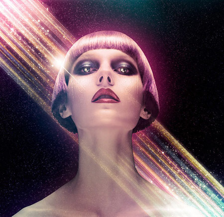
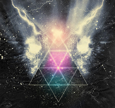
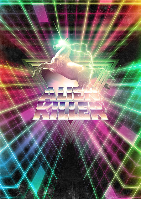
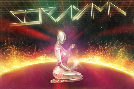
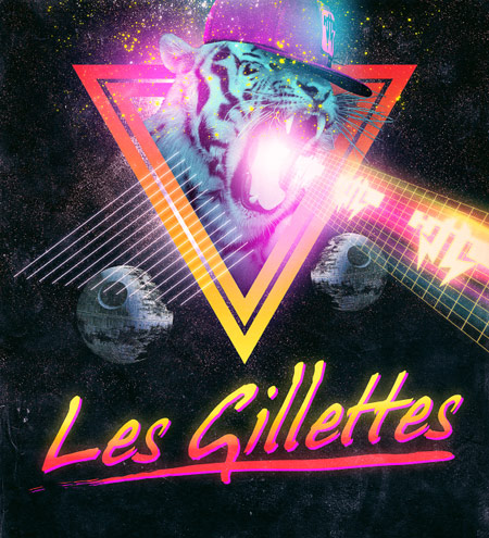
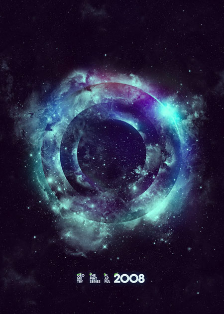
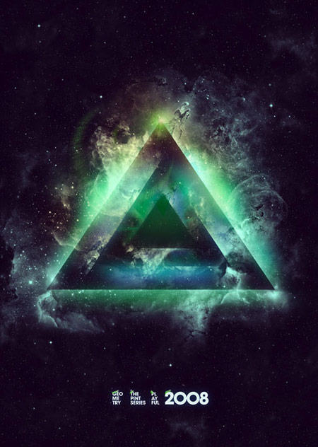
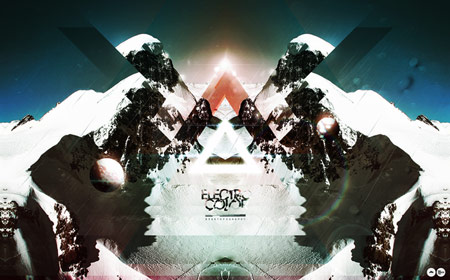
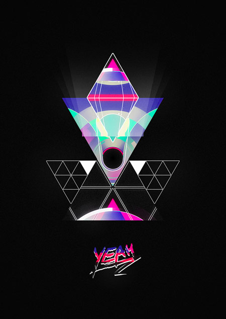
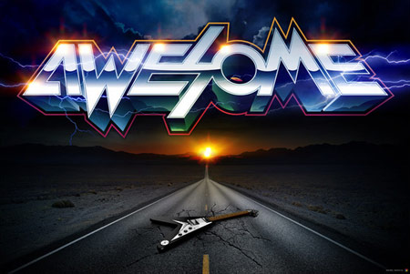
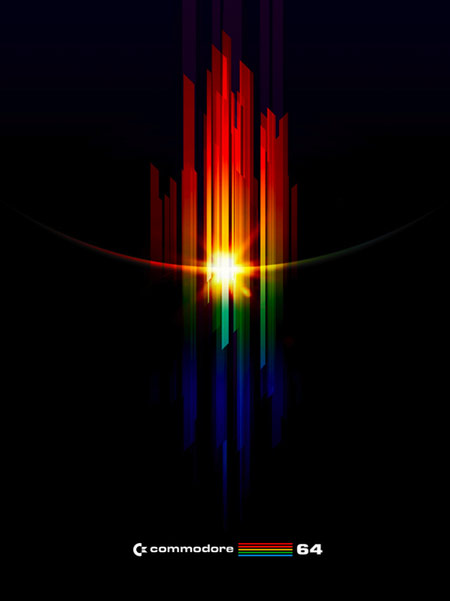
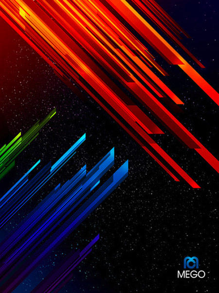
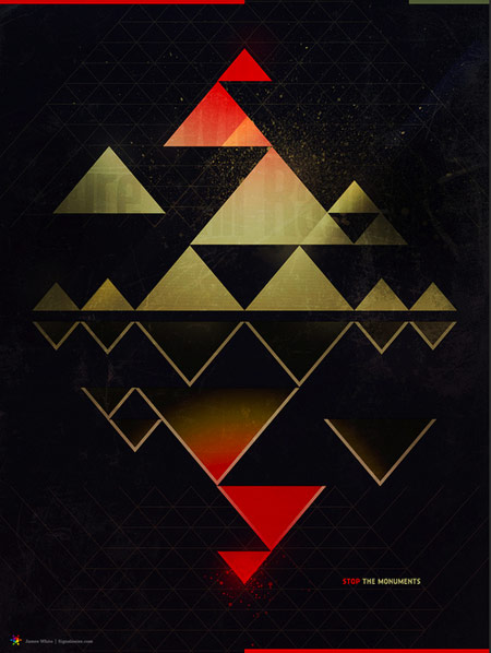
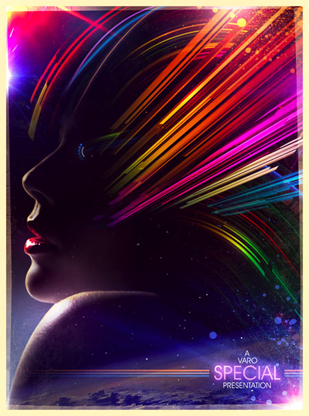
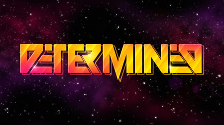
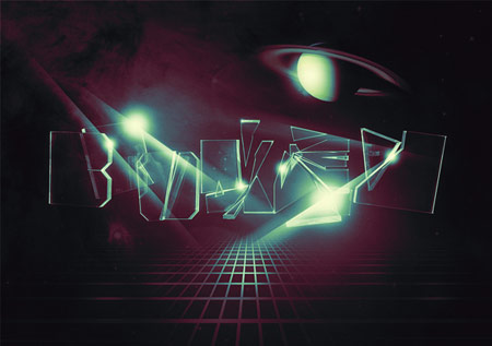
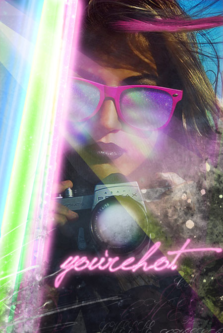
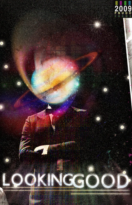
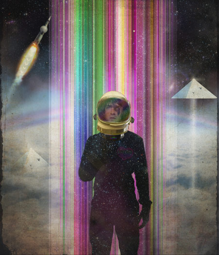
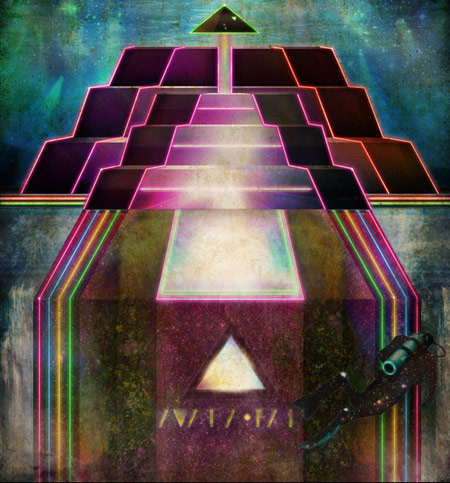
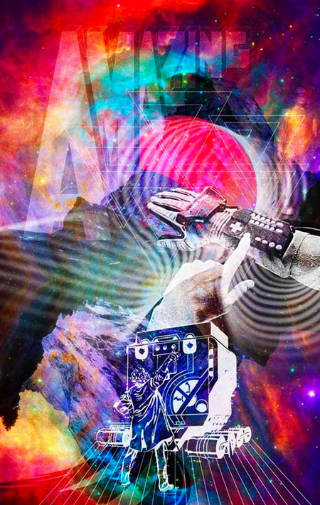
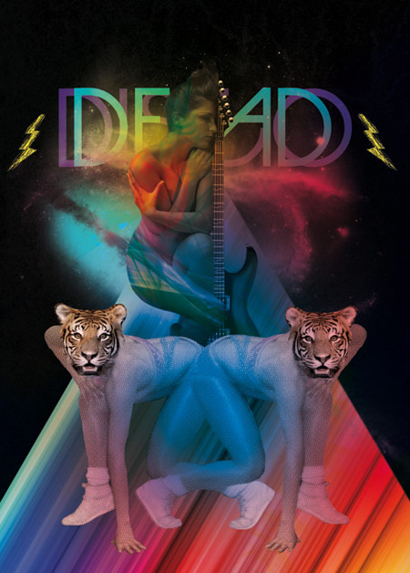
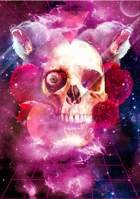
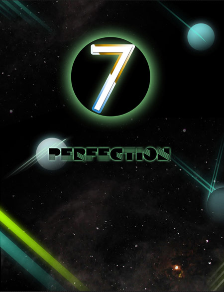
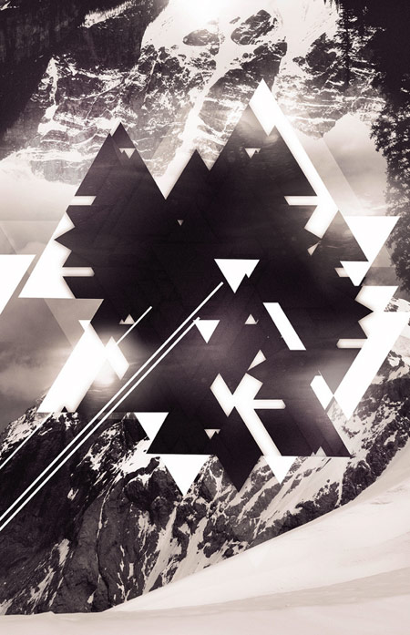
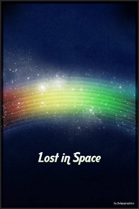
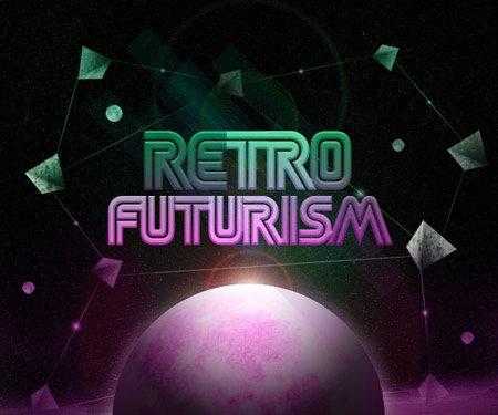
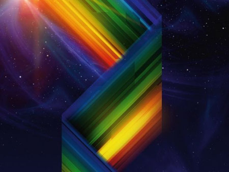
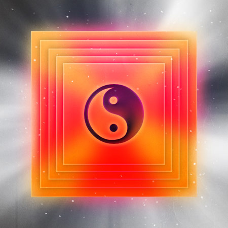
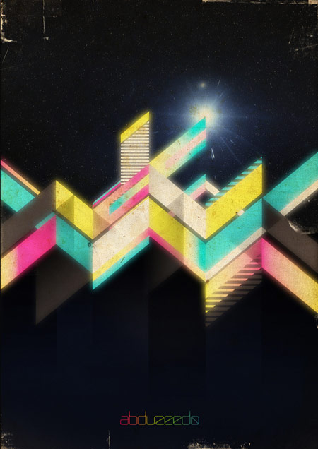
Retro Futurism is the term used to describe artwork depicting a view of the future, from the eyes of the past. The artwork itself also has the appearance of something old and vintage, basically blending both past and future into one style of artwork that blows your mind! Digital artists are creating their own modern interpretations of the retro futurism style, often taking inspiration from the game covers of retro consoles such as the Atari or Commodore. Check out this collection of some amazing examples of contemporary takes on the retro futuristic style, and continue on to a bunch of handy tutorials giving tips on how to create a stunning design of your own.
Hannibal Chew
Sakke Sioni
Pablo Alfieri
Joao Oliveira
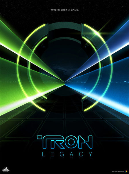
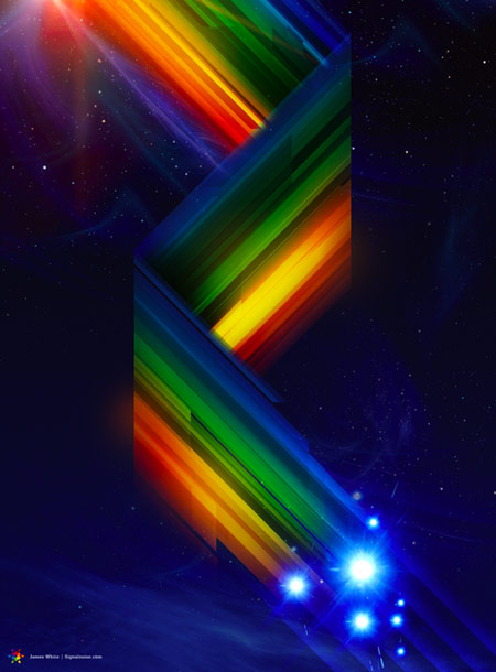
James White
Nicolas Alexander
Alex Beltechi
Peter Nudo
Pinar Demirdag
Stefanie Kegel
Niko Vartiainen
Matthew Tabor
A Message
Create your own
Fancy giving it a go yourself? Read through these handy tutorials. Each one covers the steps involved in creating your artwork with a mix of Photoshop and Illustrator, and highlights the important ingredients for creating the cool retro-futurism style.


There’s some pretty sick work here!
Excellent showcase, lately you are really into the retro futurism era.
Nice collection.
Pretty cool. I think I will have to go through the tutorials and learn some of the techniques. Seem a few similar illustrations in websites recently and wanted to try my hand at replicating them… Thank you =D
Retro futurism has been very trendy this year heh!
Excellent post, I’m really into this style at the moment!
Futurism isn’t the right word for most of these see http://images.google.co.uk/images?q=futurism&oe=utf-8&rls=org.mozilla:en-US:official&client=firefox-a&um=1&ie=UTF-8&ei=IlySSuOCOMarjAf7lfDuDQ&sa=X&oi=image_result_group&ct=title&resnum=1 Futurism was an early 20th century British art movement.
these are more like retro sci-fi and retro futuristic.
Great collection! Very inspiring. Thanks for the post…
trash
You’re trash.
Great collection. Some of these I had not seen before. Also wanted to say thanks for including my tutorial.
I love these effects, colours and scenes.
I create things like these.
http://thegoldenflux.com/portfolio/
;)
The grids, the triangles, bright colors, and unicorns – it all reminds me of growing up in the 80’s. I remember Trapper Keepers with the unicorn running on the grid. Good stuff.
Yeah this isn’t retro-futurism at all. Think of the Welcome to Las Vegas sign, or old diners, or even the McDonald’s arches. Read up on Googie (not a Google typo)… http://en.wikipedia.org/wiki/Googie_architecture …The Jetsons were a parody on Futurist art. So retro-futurism is more like Dexter’s Lab, or of course, Futurama.
The gorgeous art above is probably best term Retro-Prism-ism. The Dark Side of the Moon cover should get credit for inspiring the trippy-space style above.
…and in case anyone here is too young to know Dark Side. How’s this for album art?…
http://www.bandsanddesign.com/wp-content/uploads/2009/02/pinkfl-darksi-488×488.jpg
Money.
Very nice showcase, Chris. Thanks a bunch.
Pretty cool collection. These have a very artistic approach and who knows how far creativity can go. We should have to keep pushing to see what we can come up with.
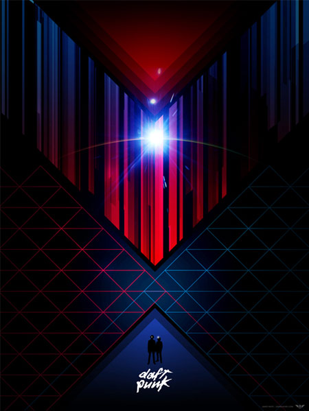
Sakke Sioni and James White define this movement! There is some great art here, particularly the new Tron Legacy poster by Mr. White. Thanks Chris!
Noooo! I’m too young for what I grew up with to be trendy again! Very reminiscent of the 80s, but with a certain Photoshop polish to them.
So where’s the Lisa Frank inspired art?? Coming soon perhaps, huh?
Really nice retro design pieces
好酷呀,我喜欢这种边框的表现形式。
they have a retro/80’s feel, I’m old enough to remember disco. very nice
…”that was back in the Eighties…”
Kapot cool!
Thanks for including PSDFAN’s tutorial Chris! This is one of the better roundup posts I’ve seen recently, some really excellent work here.
Cool list! The thing I like best about Retro Futurism design is the way they use the colours. I tend to struggle with colour combos but these dudes get it so right.
Great post Chris. There are many here that I hadn’t seen before.
Great list! Maybe he’s not considered Retro Futurism… but Ronald Ashburn has been doing this with some of the best style I’ve ever seen. alias – Electriksuicide. His site is down but here is a link to his flickr
http://www.flickr.com/photos/electrik_suicide/2443630805/in/set-72157604741188899/
Wow, great post!
80’s light effect is just beautiful.
loved them.
very inspiring! guys.. i am pretty blank in subject. i know it is all starts inside head first but which software is used to put this final touch into it?
Sakke Sioni works with this slight fogg on top..
Thank you for sharing the phenomenal talent of these graphic artists. The work is truly amazing. You got a Clipmark, an Amplify, a DIGG, and a blog post out of me! Great work.
Being 41 years old, I’m a child of the 80’s. The images brought back memories of posters and black lights. Awesome!
Wow .. some pretty neat stuff here! retro is gaining so much more momentum this year .. I am loving it! Thanks for sharing some amazing talent :-)
I’ve really enjoyed making videos for webmasters. In the most recent recording session, we decided that it would be fun to talk about some of the “hidden gems” of Google: features, products, or tips that you might not know about, but you might like
great post! James White’s work is flawless!
Wowwwwwwwww!!
Beautiful collection……
Thanks for sharing :)
Great list!
Love some of the ways that colors are applied to keep nice feel to the works.
Nice site, as well, Chris. I’ll definitely be reading around here more!
fantastic collection. terrific splendid of colors.
A great collection of Retro art, great post here! All of these artist are very talented
Great stuff! Btw, it’s Sakke Soini, not Sioni. :)
Great!.. check this retro futurist laser 80s video
http://www.youtube.com/watch?v=_HYtCMl0PMs&eurl=http%3A%2F%2Fwww.theuncoolhunter.com%2Fhome.php%3Fidioma%3DESP&feature=player_embedded