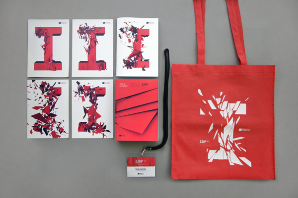
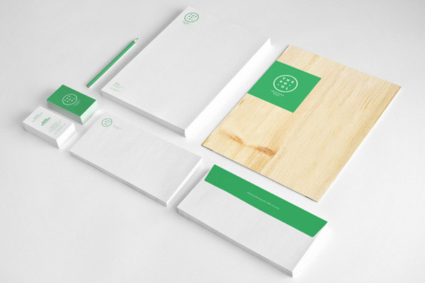
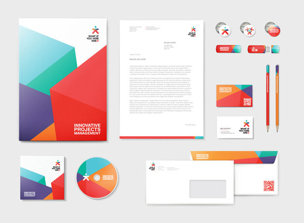
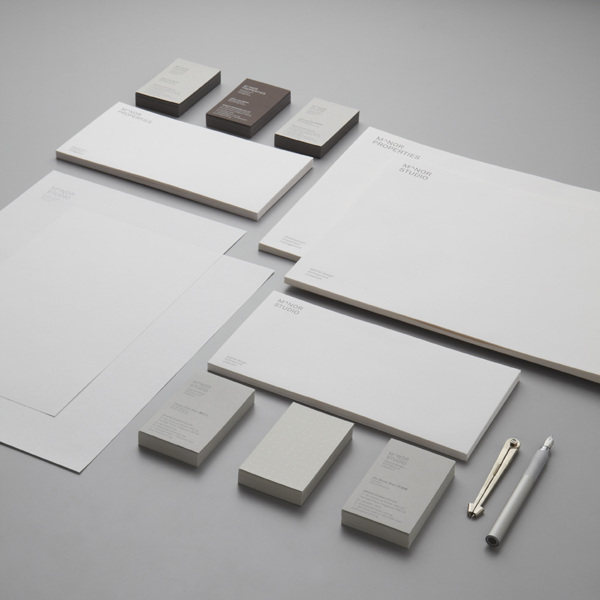
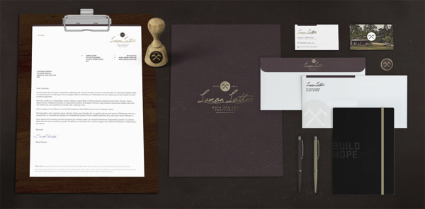
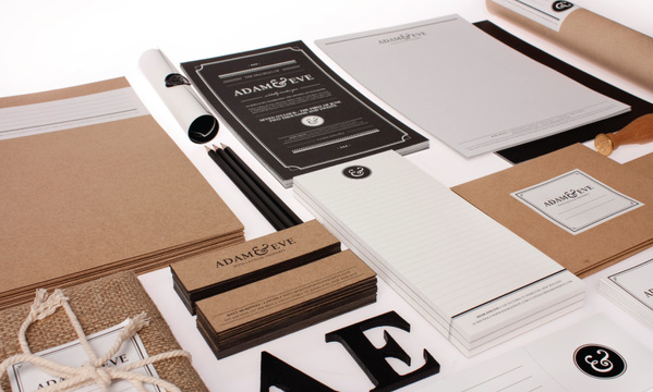
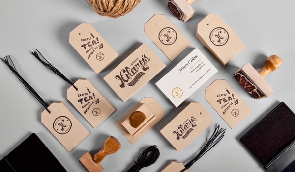
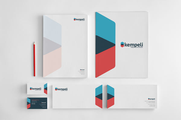
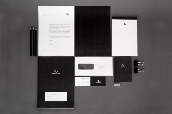
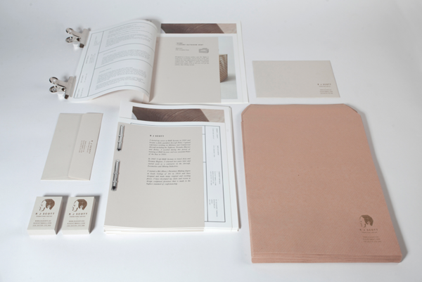
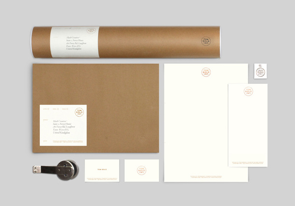
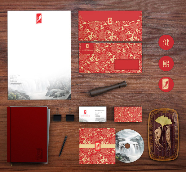
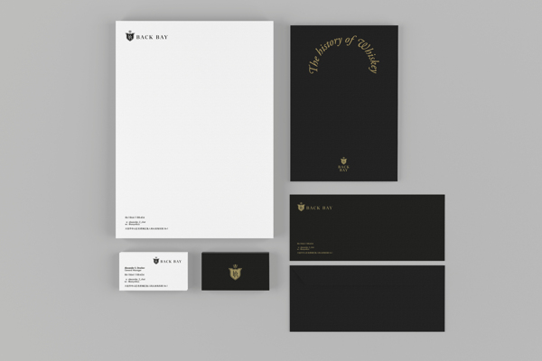
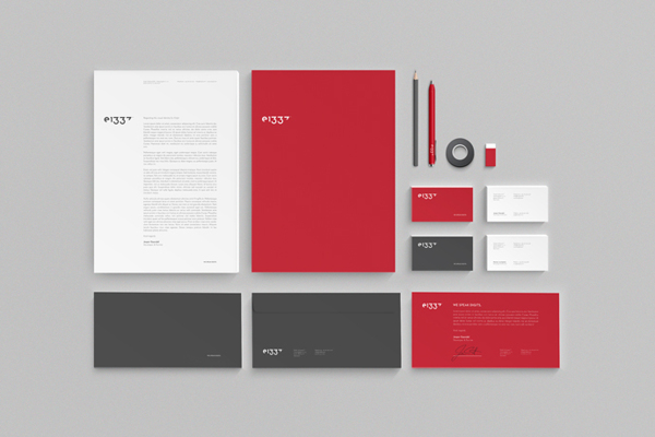
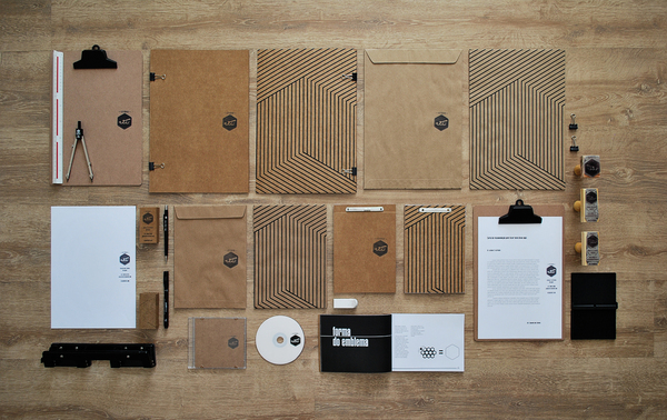
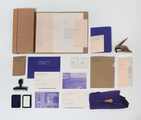
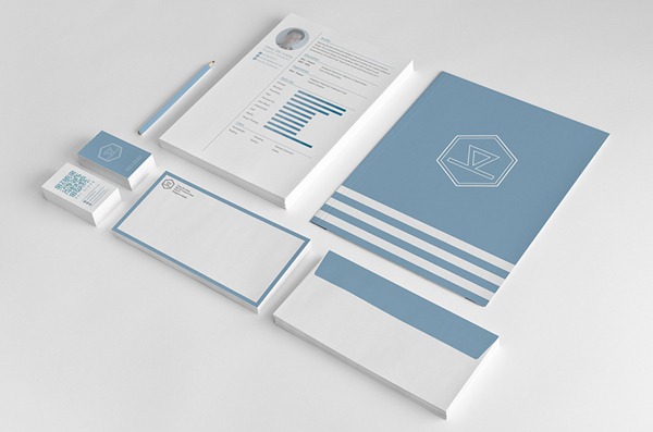
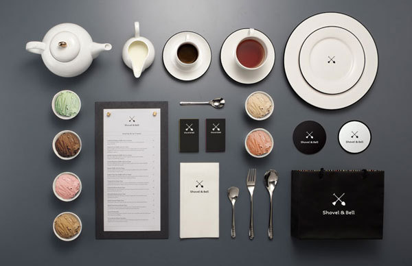
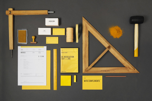
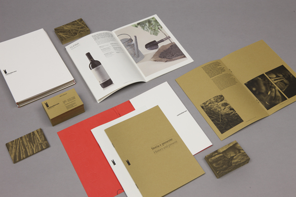
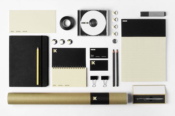
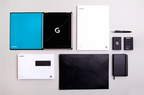
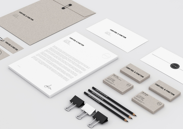
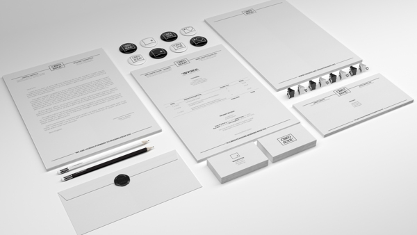
Print is definitely not dead! No matter how big the web becomes the tactile nature of printed material will always form a crucial part of a brand’s overall identity. This post showcases a huge collection of inspirational branding and identity projects with each example presented in a neat layout, often with clever complementary objects that reinforce the theme or style of the design work.



Hey,
very nice list. Nicely done!
But I think you put one picture wrong.
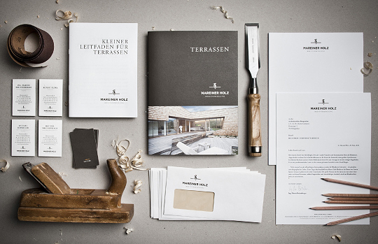
I just noticed that the picture for Mareiner Holz and ACRE are the same. The links are correct, its just the picture that isn’t.
But again, very nice selection.
Well spotted and thanks for the heads up! I’d entered the number 13.jpg as 31.jpg.
Hi Paul,
I’m sure you’d notice but there is also wrong picture for ZITO’S SANDWICH SHOPPE ;)
Cheers mate
genial…. simply genial
Thanks Chris for this huge collection! Most are very inspiring…
Some very nice work shared but this looks more like a nice collection of Corporate Identity packages than Branding.
Superb design examples. Long live print!
These are all fantastic! I love the minimalism and negative space these all incorporate. I can only dream of having my branding this clean.
great post! Shovel & bell and Acre are good.
Chris,
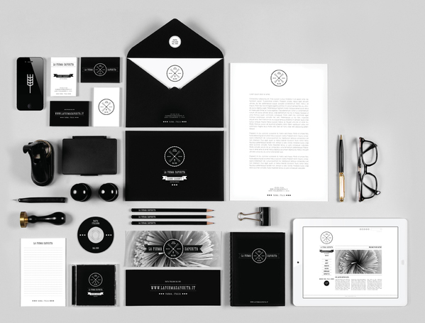
I hate to sound stupid, but there is one trend/motif I’ve noticed lately in some of the “vintage”/”retro” designs — the “X” formed by some items in the design (e.g. SHOVEL & BELL and LA FORMA SAPORITA). Is there a name for this kind of motif? And who, if anyone, really brought into style?
Are the samples mostly Vector drawings?
May be a stupid question, but if they are, I have an idea to try it myself.
It’s a great idea for my “return” portfolio.
I need shtuff to show!
And yes, long live print, even if you help it along with vectors :))
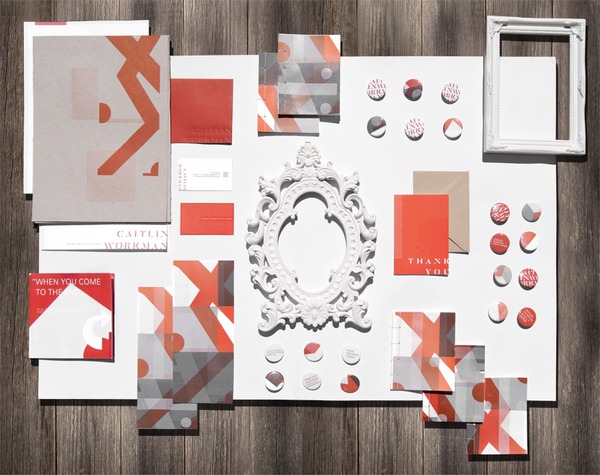
Caitlin is confusing….
Yes surely these are the most beautiful design projects I ever seen and give superb themes of inspiration for multiple designing work.
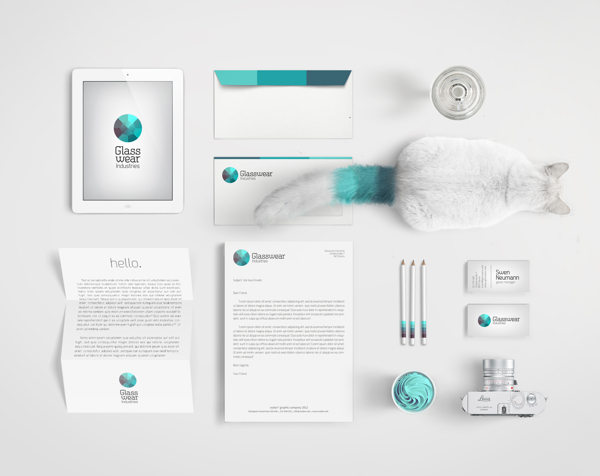
This is a beautiful collection and it is very inspirational. The cat of Glasswear Industries is absolutely fantastic, maybe he is the printer…
Love this round-up … there are some gorgeous identities here!
great pick of branding identity design projects, So hard to pick which I like the best. I think my favorite is from Glasswear Industries. It has just a pop of color to add interest. The cat is also a nice addition. Is he included with each promotional piece. :-)
I also thought Traditional China Medicine looked sophisticated and elegant with the choice of color combinations and pattern.
thanks for posting this!
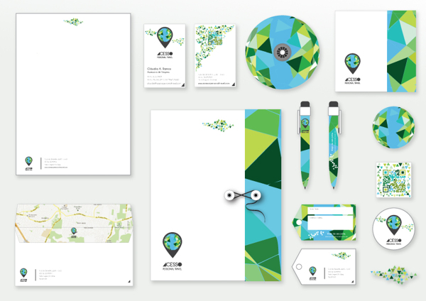
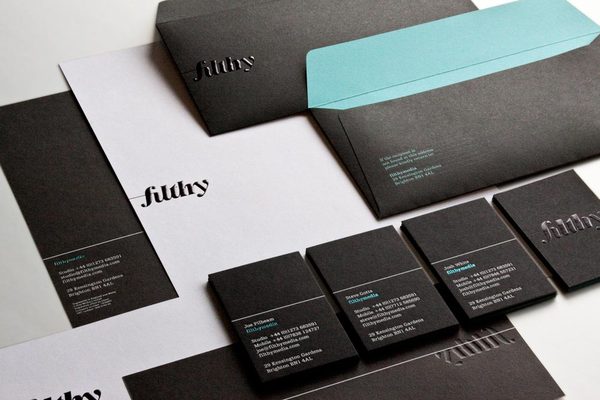
I love the playfulness of acesso personal travel and the simplicity of filthymedia – not filthy at all!
Great list, thanks for posting!
Beautiful collection. Really inspirational :)
Great collection, thank you for putting it together!
I love the one with the cat! These are so creative and beautiful. I love design.
Simply Awesome.. These designs are very creative and motivating for all of us.. :)
it was really nice designs…Great collections
ive added too concept in my visiting card