
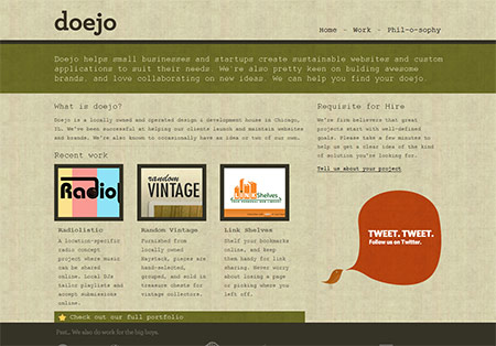
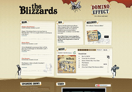
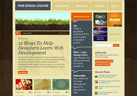
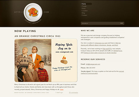
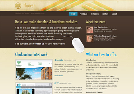
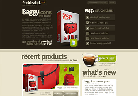
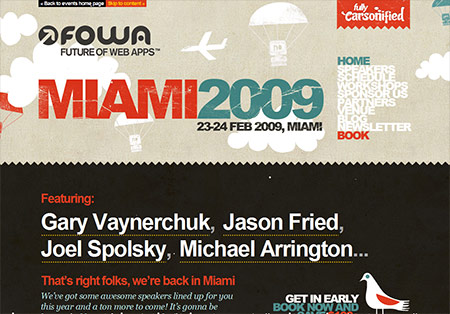
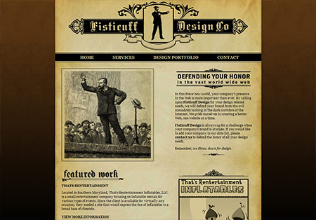
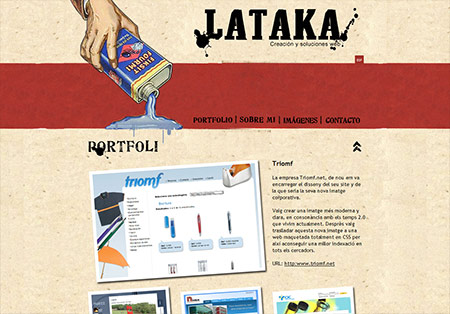
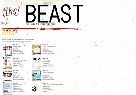
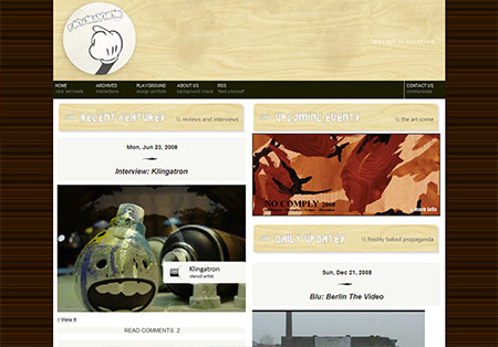
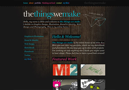
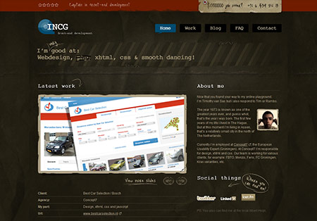
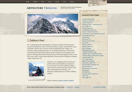
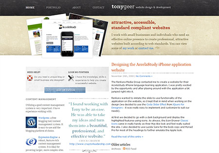
A muted palette could be described as a selection of subdued or restrained colours which appear quite soft and easy on the eye. Compared with the bright and brash colour schemes of many modern web designs, these muted palettes give the impression of sophistication and modesty. Often using browns or subtle greys along with pastels and subtle highlights they make a great collection of inspiring designs. Check out these 25 hand picked examples from across the web.


Very nice. I like the softer colors used in these sites.
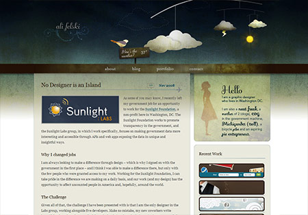
Ali Felski’s site may very well be one of my favorites of 2008. The header’s design is brilliant!
I agree with Zach about Ali Felski’s site. It’s beautiful and the attention to detail is impressive.
Many thanks for including me on this list, I am featured here along with a bunch of great sites and I appreciate it greatly :)
Hi…
Very good web templates.I like the softer colors, gradient and stylish curve used in these sites.
Really like the colors!
Some of these don’t appear to be very muted on the colors, such as the Web Design Ledger site with the bright oranges… however, there is definitely a theme throughout all of them.
great list! I love the softer colors of them!
my blog
Really nice post, some of those sites are very attractive especially in the current web environment with so many stark white,blue,black sites.
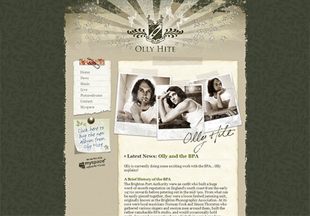
Olly Hite one is my favourite.
Nice designs, and great to see a chilean website on the list (teapot.cl) :-)
Thanks for your january calendar too.
Hmm…… this site is also kinda a mute effects
Your site actually should be in that list too.. nice list by the way, bookmarking for later use :)
Swell collection, dude. I actually fell in love with the color schemes of most of these designs :)
Gorgeous collection.
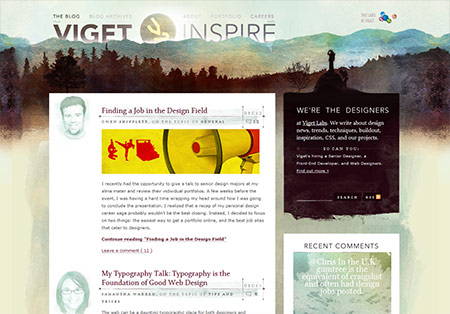
I saw Viget on a “colourful sites” round up not too long ago, so I’m not sure if muted colours would be the best way to describe all these sites. They definitely have something in common though. Perhaps the browns?
I disagree. This example is quite muted.
Lovely collection, plenty of amazing inspirational sites.
Thanks.
awesome…
your great team…
Thanks
nice collection thanks..
Some great sites in there, reminds me of how badly I need to re-design my ‘from college’ portfolio site.
Great list Chris!