Trendy Geometric Lines Design Tutorial
This post was originally published in 2008
The tips and techniques explained may be outdated.
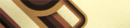
Starting with the design application of Adobe Illustrator create a group of vector based geometric lines at dynamic 45 degree angles, then follow the walkthrough to rough them up with brush textures in Adobe Photoshop resulting in a cool and trendy design style.

The use of angled lines adds a dynamic flair to the composition of a design allowing the viewers eye to follow them across the page. Combining this layout with colour, texture and typography can result in a cool, modern poster design.

Start the design in Adobe Illustrator, draw out a number of blocks faced up to each other filled with the colour scheme of your choice.

Select all the blocks and click the New Icon in the Brushes Palette, in the option box select New Art Brush.

Check the direction of the brush is flowing in the correct direction using the arrow buttons.

Now the brush is saved in the Brushes Palette begin drawing the geometric lines. Use the Pen Tool to draw a 45 degree line across the page, hold Shift to constrain the angle.
Click the custom brush from the Brushes Palette to apply to the striped effect.

Repeat the process with multiple lines, scaling them slightly to give varied sizes and widths.

Produce another line with the Pen Tool, but this time alter the direction of the line back on itself, remember to hold Shift to constrain those angles to 45 degrees.

Give the line rounded corners by heading to Effect > Stylize > Round Corners.

Enter a desirable radius for the corners, for my document at A4 I used 30mm to give nice flowing edges.

Position the curved line over the large straight line, matching up the colours exactly.

Use the same process to create a longer curved line, this time flowing across the document crossing the other lines, maintaining those angles.

Select the group of lines and Copy, switch over to Adobe Photoshop and setup a new document. Paste in the lines and scale appropriately to crop off the extras beyond the edges of the page.

On the background layer fill the page with an accompanying colour, I use a 20% Yellow to give a pale tint.

Sample a dark colour from the geometric lines and use a large spraypaint Photoshop Brush from my previous Photoshop Brush giveaways to place a couple of textured areas on a new layer.

Change the layer style to Multiply and drop the opacity to around 40% to tone down the texture.

Select a couple of accompanying colours from the colour selector and draw a dark to light gradient across the page, set this layer to Color Burn to bring out the colours from the layers underneath.

CTRL/CMD + Click on the geometric lines layer to make a selection, then create a layer mask on the spraypaint texture layer. Fill the selection with a 50% black to tone down the spraypaint texture beyond the edges of the main lines.

Use the spraypaint brushes to bring back a little texture to the same layer, painting in areas of white on the layer mask to bring back their visibility. This helps add a little tonal variety rather than an area of flat colour.

Duplicate the geometric lines layer and use the Polygonal Lasso Tool to select an overlapping area, remember that Shift key to get that exact 45 degree angle.
Inverse the selection and paint in a shadow with a large soft black brush.

Create a new selection around the unwanted extra from beyond the lines, add a Layer Mask and fill these with black to render them invisible.

To repeat the process on a curved line use the Pen Tool instead of the Polygonal Lasso to create a flowing curve.

Right click and Make Selection from the path, do not add any feathering to ensure a crisp edge.
Add as many shadows as you see fit to add depth to the lines, feel free to download my version as a desktop wallpaper.

1680×1050 Widescreen Wallpaper

1280×1042 4:3 Wallpaper

320×480 iPhone Wallpaper

This design style works perfectly when accompanied with typography, add textual elements following the same angles and composition to create a trendy and modern poster:

this is cool man. Keep up the good work
wow! i like it a lot!
Awesome ;)
That’s really great, keep up Garcia ;)
These look amazing!
I will certainly use this tutorial in the future for some template designs!
Great work!
Nice tutorial. Really well done. Makes sense now that I see how its done.
this is nice. I like it. Thanks. Both for Photoshop and Illustrator.
Really nice work, very helpful.
http://www.tixilite.co.cc
Very cool geometric lines! I like your touch of aging and shading, using the brushes.
Very nice, thanks!
Great tutorial, thanks
Very cool tutorial!
Thanks for the information, Spoongraphics!
Nout van Deijck – Blog
Chris your blog is amazing, keep working !
best regards from Brazil
really good tutorial,
The 70′s live!
I really like this one. Thanks.
looks great, thanks for the time and effort you put into it :)
Easy but really cool tutorial.. Senk you alot..
so cool.
i like your works very much!
I really like this one. Thanks.
This is a very good tutorial! Thanks a lot. I’ve made a design with this. I linked back to this site.
Thanks again!!
finally, thank you. i didn’t realize it was just blocks of color applied to a brush. that is awesome… keep up the goodness
I have always wanted to know the easiest way of going about this, and thanks to you I have found it. Thanks alot!
Wow, that’s really fantastic. Definitely will try it soon.
Great tutorial. Easy to follow and the techniques described are applicable across a wide variety of designs.
Your tuts are always comprehensive and give excellent results – thank you!
Smashing tutorial mate. thanks :D
Feed your head free your mind,
http://denzuko.deviantart.com/
Damnit man! You are good! I LOVE it!!!
this is quite simple, but i always forget what good stuff you can create by making your own brushes for illustrator… should always have some post its… :D
sheesh, that is a much quicker way of making the designs then the way I was doing. I was making each of the lines by hand which took forever on larger works.
Wow…didnt realise it was just a brush with colored lines! thanks for the tip and great tutorial!
really simple but effective. nice one
Love this!!!
I dedicated you a post on my blog!
Nice. Very reminiscent of the wonderful artwork of Scott Hansen of http://www.iso50.com
Very easy and fantastic result!
Thanks a lot!
Wow, It’s great easy to follow thanks.
I think I’m being thick but how do you scale the lines to make different sized lines? It’s driving me mad! Thanks!
I’m having an issue with my lines not curving on the inside. And I’m also getting white halos around the strokes. Any help?
Yeah, I dunno how to resize the lines. I’m new to Illustrator. ):
Awesome tutorial, could you tell what’s the name of the font in the “iphone” wallpaper?
Many thanks for all the comments, a couple of thoughts for the issues:
Lines not curving on inside – try increasing the roundness of the corners, if you look carefully on my example there is a corner that is slightly squared off due to this.
Increasing / Decreasing size of lines – check out my previous Illustrator Quickfix
Hey man, very good, and thanks, I apologize you I have a question, know yuo how to export these geometric lines to after effects? separately? thousand thanks. Excellent work!!!
Hey man, muy bueno, y gracias, disculpa te hago una pregunta, sabes como exportar estas lÃneas geométricas a after effects? por separado? desde ya mil gracias. Excelente trabajo!!!
Wow. You made it so simple. I saw another tutorial at tutorial9 using photoshop and was wondered if it was not easier in Ill. Good job.
Hey Rob! I just take a look and… yes is very easier Thanks !!! gracias totales!!!
So very nice tutorial. Thanks for make me pro about Illustrator ;)
Any chance you could post the Photoshop file? I am having trouble when I add the layer mask on the spray paint. I cannot figure out what I’m doing wrong. I was thinking that if i could look and see your settings that I could correct my mistakes.
I would greatly appreciate your help.
Dude,
You kicked some serious ass right here.
Amazing, great tutorial!
Very cool tutorial! I had never seen the rounded corner effect before and had always done that manually. The bauhaus style is my favorite. I created a t-shirt graphic using similar shapes but a little less complex a while back. Check it out here.
http://www.oneoftwenty.com/Clothing/WomensTShirt_01.html
Cool tutorial !!! indeed
Hello and THANK YOU! I LOVE your work! Appreciate your generosity!
i really want to try this, thanks for the tutorial :)