Create a Grid Based Resume/CV Layout in InDesign

Use the power of grid based designs to create a structured and professional page layout in InDesign, which can then be populated with a range of information to produce a polished CV or Resume.

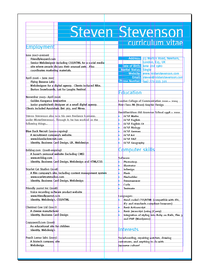
I was recently invited to participate in the Steven Stevenson challenge over at Smashing Magazine. The goal was to produce a CV or Resume layout for a fictional character using the details supplied. My approach was to create a minimal two colour design that showcased Mr. Stevenson’s sophisticated Graphic Design skills through a clean and structured layout.
Let’s go back through the process of creating the document, and see how the initial grid layout was produced. Hopefully these techniques will not only help put together your own Resume/CV design, but also span across other Graphic and Website design projects.
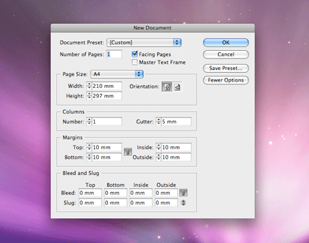
Being a design aimed more towards print, and one that concentrates on the fine grid details, we’ll use Adobe InDesign as the application of choice. Being a desktop publishing package InDesign has a bunch of useful tools for creating complex layouts. Create a new document, set the page size to A4 and place margins at 10mm from each edge. We’re not planning on mass-producing the document so no bleed is necessary, but it could be handy if you’re planning on trimming down the final page if doubled up on an A3 printer.

With the basic document set up, go to Layout > Margins and Columns. Create five columns with a gutter of 5mm.

Go to the InDesign preferences and look under the Grids section. With the planned design using a lot of Cyan, it would be handy to change the colour of the gridlines from blue. Choose a colour such as Light Gray. Also change the start to 0mm from the Top Margin, Increment them to every 13pt and untick the Grids in Back option.

Ensure all grids are visible through the View > Grids and Guides menu. Our page is now ready to place elements accurately in relation to the structured gridlines.
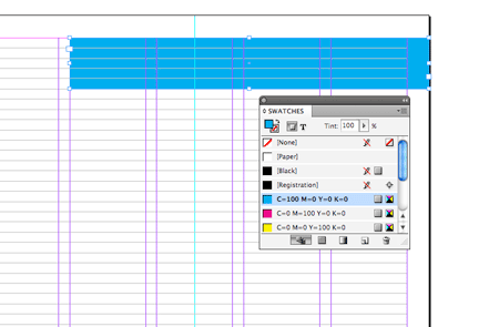
Use the Rectangle Frame Tool to draw a box in the top right corner, with the option to Snap to Grid active the shape should fit exactly to the gridlines. Fill the box with 100% Cyan.
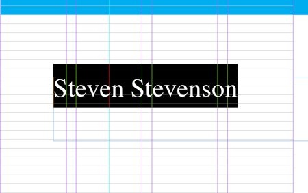
Create a text area with the Type tool and spell out your name. Here we’re using the fictional Steven Stevenson character along with all of his details.
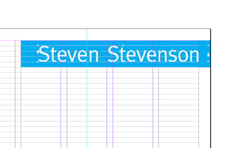
Change the font to a stylish classic, such as Meta. Adjust the size of the type so that the text fits perfectly between the baselines. Once the type is positioned correctly, go to Object > Fitting > Fit Frame to Content.
With the title being large in size, any slight inaccuracies will be much more visible, spend a few moments to kern the letters. Place the cursor between two letters and nudge using the Alt and Arrow keys.

Repeat the process with the second line of text, but this time make the type smaller in size. The key is to ensure the elements align accurately to the nearest gridlines.
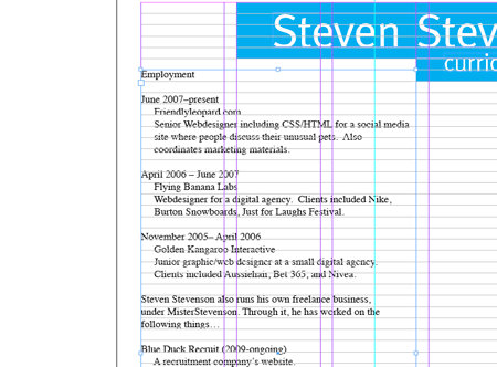
Draw a large text area spanning the first three columns of the page. Paste in a large selection of textual content.
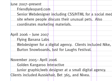
Edit the text by setting in the appropriate font, set the size to 10pt and leading to 13pt to match the baseline grid. Indent the text to provide easy scanning and clear sections for each area of information.

Alter the titles in size and add the Cyan fill. Using variations in size and colour gives prominence to these elements, and helps display the various sections of information clearly.
Also alter the sub-headings to develop a clear hierarchy. The main titles at the top of the page stand out the most with their size and vibrant background colour. The secondary information is displayed under medium sized titles, which are also displayed in blue. The next level of information is set is a stronger weight font, but is toned back slightly with an 80% black, and finally the body text uses the standard 10pt black styling.
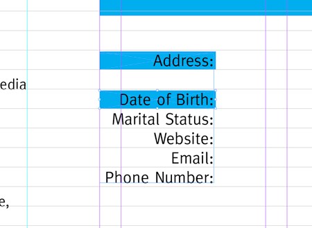
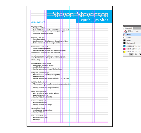
List out the contact details at the top of the right hand column. Draw a blue rectangle behind the text, but shorten it in size to just under the height of the baseline. When duplicated this will leave a tiny dividing line between each item.
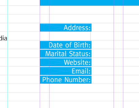
Change the colour of the text to white and align it to the center of the rectangles, as opposed to the baseline itself. Notice how these elements flow neatly from the same gridline as the title.

Enter the remaining details and align as appropriate.

Add the remaining information to a text area spanning the remaining two columns. Use the same text styling and visual hierarchy on the titles and sub-headings.
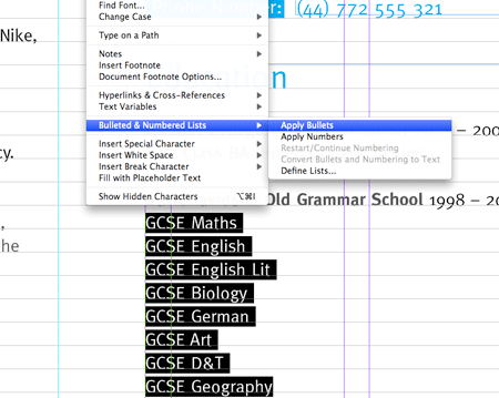
Select the bunch of list items and go to Type > Bulleted & Numbered Lists > Apply Bullets. This will automatically indent the text and add points to each line.
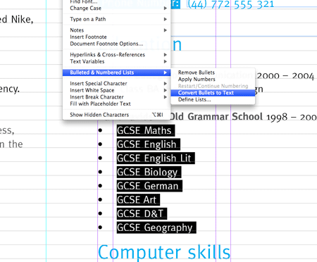
With the list still selected, go to Type > Bulleted & Numbered Lists > Convert Bullets to Text.
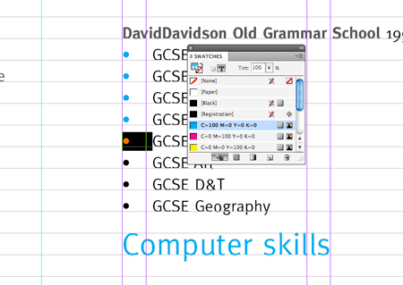
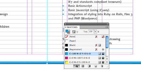
We can now go through and select each bullet point, and change the text colour to Cyan, adding a little visual tweak to the page design.
Finish off the bottom of the page with a neat border using a rectangle at 210x2mm. Fill the shape with Cyan.
Zoom out and review the layout. Make any final checks to the page elements and ensure all items are aligned to the underlying grid.
When viewed without the guides the design holds itself together well with neatly aligned content and a clean, structured appearance. Go to File > Print, or export the layout as a PDF document.

Looks beautiful! It’s definitely not easy to structure so many information. To use a grid is wise. Maybe I’d have tried to give it more space between the heading and “Employment”…
Thanks for the tip on gridlines, and setting this up! Off to work on mine now…
thanks for this, i really should start work on my cv/resume soon – only a about 50 days left of college.. i’m counting! haha!
This Grid based approach to design is really worth learning… I am going to the steps that have been mentioned and hope to familiarize it soon…thanks for this wonderful tutorial
Oh, this is great! My resume’s been on my to-do list for the longest time. I designed it in InDesign, but haven’t had a chance to update. Thanks for the inspirational reminder
Nice and clean, no distractions the way every designers resume/CV should look.
Nice work.
Sexy resume,
Mine is so simple. Only 1 employment in my whole life. :/
Im a turd face.
:((((
:D
Sike!
It’s worth noting that in the US, you shouldn’t include your marital status on a resume/CV. It will hinder your job search because employers aren’t supposed to ask about that information lest they discriminate, so to avoid the headache of dealing with volunteered information, employers will often just toss a resume/cv that includes it.
Some questions:
The right-hand column seems to begin in the gutter. What about that?
Tweaking the header sizes to fit the grid seems to ignore font scaling (12,18,24,36, 48). What about that?
Thanks for your article.
I love how all your tutorials are like perfectly aligned with my assignments in school for what we are doing LOL
Unless you are applying to agencies and know in advance that they will accept PDFs and use a color printer to print out your resume, this wouldn’t work, however great-looking it is. Practically all companies require word documents or even worse – plain text. This is where the design skills come handy: designing around limits that are set by HR and corporations and still be able to stand out is a real challenge.
I strongly endorse Alana’s comment. Unless you are applying to a creative agency, you’re going to want to go black and white and allow a healthy margin for inkjet printers. This means no bleeding (like your cyan footer/rule). It also means that your typographic variations for headers and subheads be defined in ways other than color (i.e. reverse type, bolding, italics, lower case, upper case, point size, etc.).
I also recommend having a basic, Microsoft Word version of your resumé for less tech-savvy companies who might not have that latest, up-to-date version of Acrobat Reader. It also comes in handy for institutions that require you to apply via forms online. All that fancy typography will do you no good when it comes time to copy/paste all your info into an online database. That’s when having a Word doc or even a TXT file will suffice.
Also, many online enrollment forms search documents for keywords. Many of them still detect keywords in PDF documents, but any special characters in your document can really screw things up.
My advice: less is more. Work well within the box instead of trying to destroy it. Reserve the balls-out resumés for creative-driven agencies ONLY.
Really cool! I like how you did this.
I originally laid out my resume in InDesign, but using a grid this way is a great idea! A little weekend project on the horizon I see for myself…
excellent man so good tutorial…
great stuff man, is’t easy as 1,2,3 and very helpful, thank you :)
power- & usefull!
thanks for the helpful tutorial..
You can upload the final psd with a real example?
Wow, it’s refreshing to see an indesign tutorial for once.. particularly something outside of “how to create wrap-around text”!
Great job and great idea for a post, Chris!
Great post.
Some daft comments tho, Still cant please everybody.
Been using grids in Illustrator for some time now and makes life a bit easier when you get to grips with it.
thank you very much.
very good.. thanks…
thanks for the tips! really cool!
good…thanks
thanks for the helpful tutorial..
What elements would you keep, and how would you change them, for a matching letterhead (for the cover letter)
Nice write-up, though I do wonder why you chose to redefine everything individually, rather than just setting paragraph styles for everything.
For example, I’d think that creating a ‘List’ style where you define the form, size, shape, and colour of the bullet to use and simply apply that style to all the list items you have on the page would be much easier than manually selecting and changing the colour of each bullet—no?
Or were you perhaps just trying to avoid making a simple tutorial too long by working around the Paragraph Styles palette?
thank you
Being a graphic designer, I see a mistake in this resume. If you look closely you will see that there is only one line gap before the heading Computer Skills and the rest have two. So guys, leave two lines space before Computer Skills.
It’s really nice, totally work for me!
First, thanks so much for posting an InDesign tut. I work in InDesign daily and know a lot of the ins and outs, but it’s still nice to see this program get some props.
I know a lot of time and effort goes into producing any tut, which is why I feel bad for mentioning anything negative. Nevertheless, I don’t think the design of this CV works. From a layout perspective, where do you want the reader to look fist? As it stands, my eye goes down the right column first without ever looking at the left column.
I think a better layout and hierarchy would go a long way toward making this an even better CV.
thanks for this post..
i think, all freelancer need it