Tutorials
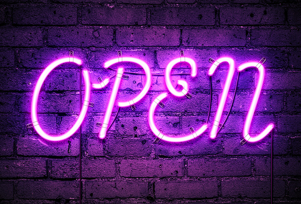
In today’s Photoshop tutorial I’m going to show you how to create a bright, illuminated neon sign effect. I’ve created many tutorials in the past that provide you with a combination of Photoshop layer styles to produce a colourful glowing effect, but today we’re going to take it to the next level with more detail to make this neon effect look much more realistic with glossy tube reflections, wall mounting brackets and dangling power cables.
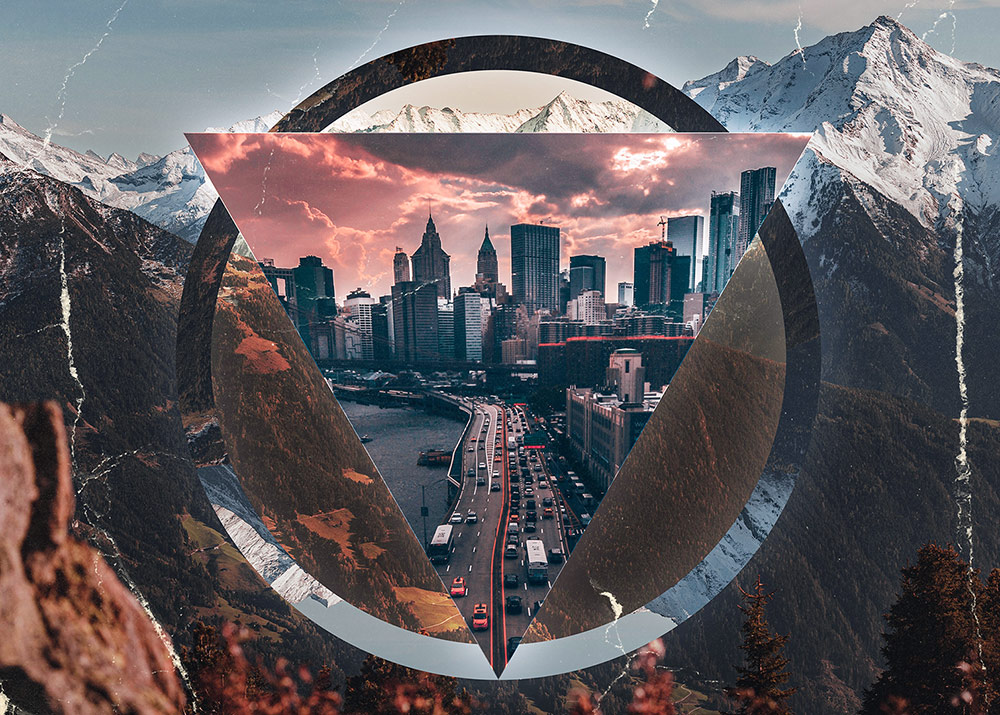
In today’s Adobe Photoshop tutorial I’m going to show you how to create an abstract piece of retro-futuristic artwork known as a Polyscape. It’s a combination of polygon shapes and landscape or cityscape photographs, and sometimes even pictures of outer-space! These photos are then cut and pasted into a digital collage, using Photoshop’s editing tools rather than scissors and glue. The use of geometric shapes and unusual contrasting landscape imagery gives the artwork somewhat of a sci-fi feel, as if it’s a gateway to another dimension. Follow along with this tutorial to recreate this polyscape in Photoshop, or experiment with different assets to achieve a unique result every time!
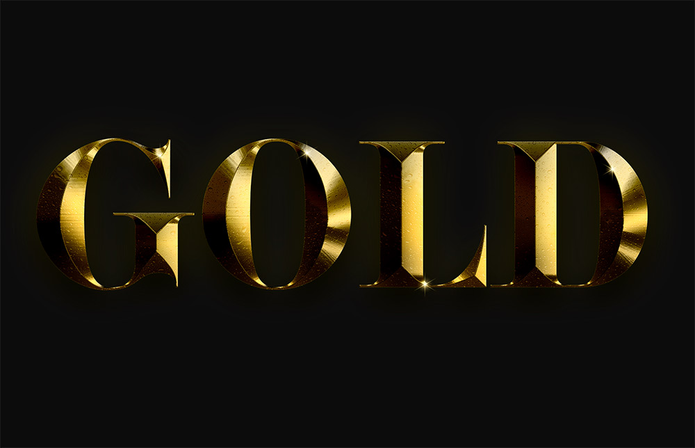
In today’s Adobe Photoshop tutorial I’m going to show you how to create a lovely gold text effect. It’s made using a combination of Photoshop layer styles, plus a couple of my own secret ingredients that really brings the effect to life with a nice shiny finish. What really makes this gold effect look so realistic compared to some other basic gold text effects is the layering of Photoshop’s layer styles. By applying multiple effects such as Bevel and Emboss over two layers, it enhances the result with much more depth than could be achieved with just one layer.
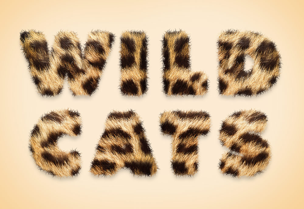
In today’s Photoshop tutorial I’m going to show you some simple steps to create an animal fur text effect. The process makes use of a real animal fur texture for maximum realism. In my example, I’m using Leopard spots to create the wording ‘Wild Cats’, but a variety of results can be achieved by using source photos of different furry animal skins. The fur photograph will take care of the realistic furry effect in the centre of the text, but I’ll also show you how to create a custom Photoshop brush to apply the soft hairs around the edges of the text to eliminate the hard letter edges. Depending on the animal your source texture is from, the result can depict a variety of colours and common animal prints to create a range of safari or zoo themed text styles.
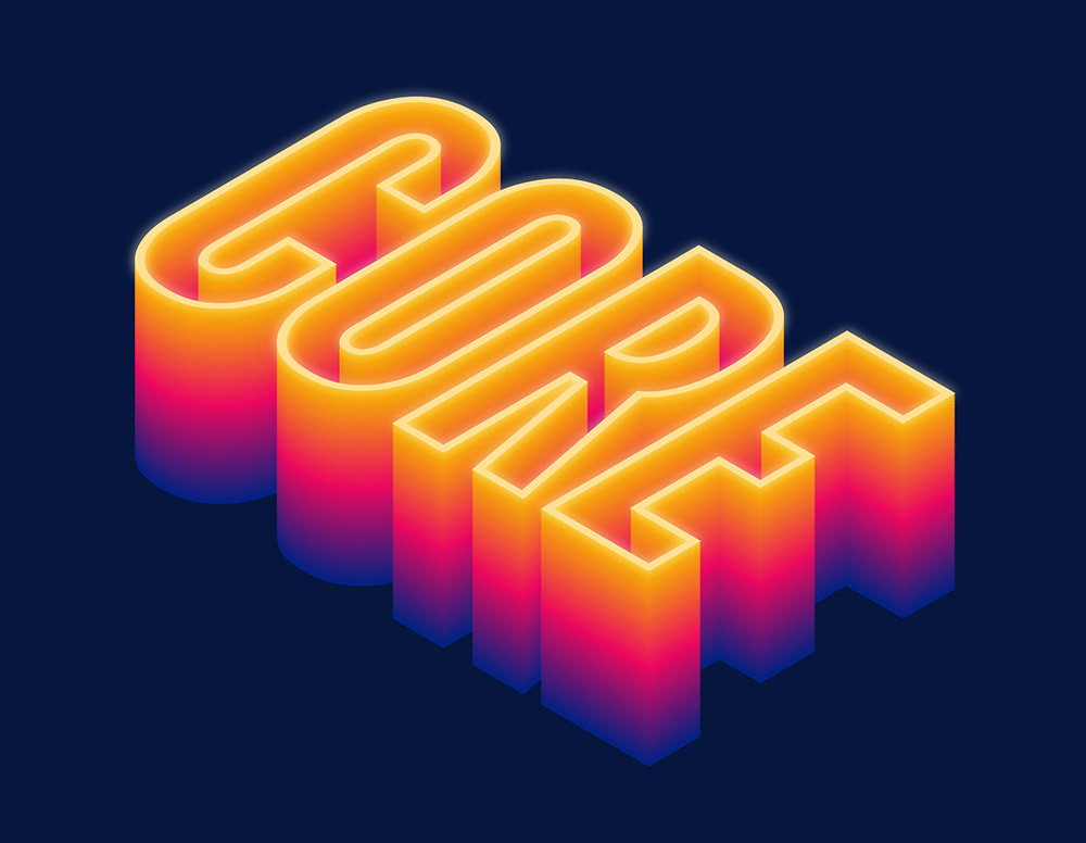
In today’s Adobe Illustrator tutorial I’m going to show you how to create a colourful extruded isometric text effect. It has a 3D appearance with hollowed out letters, finished off with a vivid spectrum of hues and a subtle glowing appearance. It’s a relatively simple effect to create that makes use of a combination of must-know Illustrator tools.
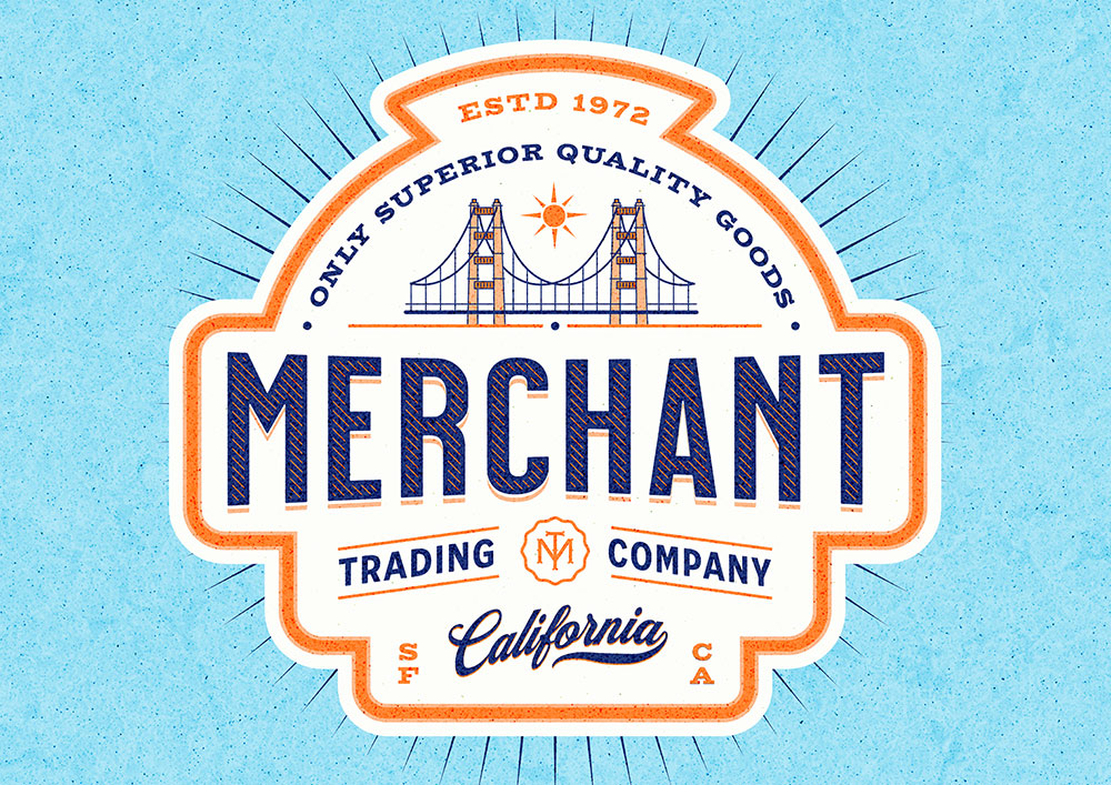
A couple of months ago I showed you how to create vintage designs the easy way using a brilliant new tool called Kittl. Today we’re going to use those powerful tools and features again to easily construct this retro logo design for Merchant Trading Company. It combines a variety of retro-style design aesthetics, such as lettering layouts, engraved line effects and angled text shapes, all of which are easily done in Kittl.

