
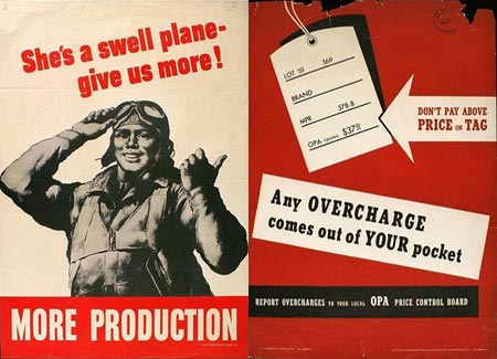
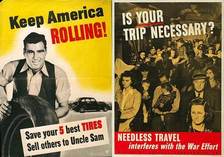
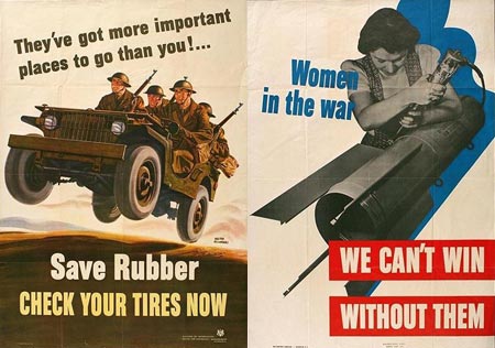
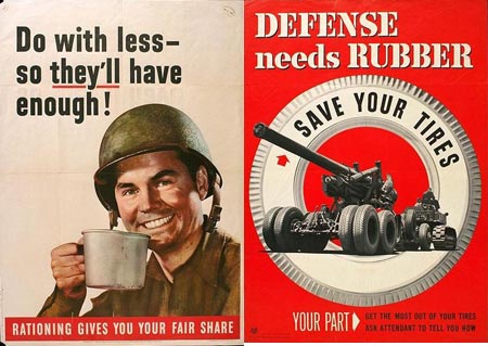
I recently came across a library of US WW2 Posters and pulled out a selection of examples for as a showcase of inspiration. They each rely on the basics of design; composition, typography and colour (be it a limited palette of mostly black and red inks to conform to the available printing technologies) to put across a short and concise message with high visual impact.

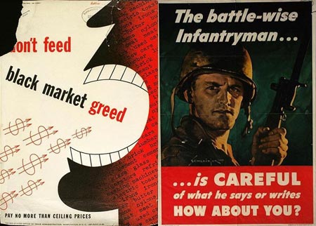
One thing’s for sure – they definitely get the message across!

OMG…there’s a STFU picture in there. You know, have a nice warm cup of STFU.
Where did you find these pictures?
dude thats awesome. So many of these types of post are filled trendy images and bright colors. This is great. I might have do something like this.
hey hey, this is so nice- I like what you did right there, awesome very helpful and it gives me an idea how to create like this one. Thanks good job
hey dude, just to know where can i get hi-res of this posters… anyway, 40’s people really know how to make great ads :P
They are gorgeous ! where did you find them ???
Thanks for sharing this great list! I am definitely going to check out that collection site.
Whoa! They all look far more contemporary than I imagined. I have a hard time believing they were all made in the 40s!
Thanks Chris Great inspiration I luv old posters they make me realize how “modern” vintage design could look, have a look to this great Chinese political propaganda from the 30’s
http://www.iisg.nl/~landsberger/
Here is another place for more posters from World War I and II and in between both wars:
http://digital.lib.umn.edu/warposters/warpost.html
Search for the health and safety posters they are hilarious.
beauty :-)
Wow it’s amazing how blatant their messages were! These day’s they’d be considered brash and inconsiderate. We’re such a panzy nation now. lol. Could you just imagine the sheer terror that would come upon our nation if our government were to tell us now that _they’ve got more important places to go_ HA! That president wouldn’t last long… Anyway, nice post.
Oh, sorry I didn’t realize I was on a British blog, I should clarify that I my comments were as a US citizen and I absolutely love the States! Just poking fun at ourselves a bit, that’s all. :)
Great find!
This is a gold mine. This stuff is awesome!
These are awesome. I also love the older vintage items as you can see by my website. The war ads are some of the more interesting. I seriously doubt Americans would sacrifice the way they did back in the 40’s.
Great site
———————————————————-
Remember when…..
http://www.Vintage-Ads.com
@ Marko, 1st post
LOL… good one!!