Logo Design Process and Walkthrough for BioThemes

It must be well over a year since I created the BioThemes logo, but the BioThemes website has finally launched with a bang so I thought I’d pull out my logo design to share my design process with you guys and girls. The BioThemes logo was pretty different to the majority of logos I’ve worked on in the past, which made it a super interesting project.
John O’Nolan and Gilbert Pellegrom are the guys behind BioThemes. John got in touch back in early 2010 to ask if I’d be interested in designing the logo for their BioThemes project. Being a good friend of John in the design community I jumped at the chance.
In his brief, John was keen to play on the word Bio by linking it with nature and the environment. He gave examples of the Coda logo and the work of Alberto Seveso as examples of the style he’d like to aim for in the logo, so it looked like I’d definitely be throwing out the rulebook in terms of creating a simple or flat logo design and aim at something more detailed and semi-realistic.
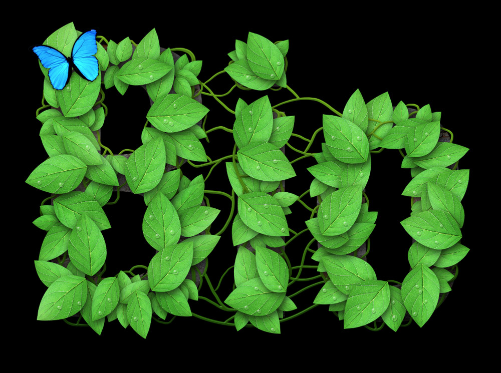
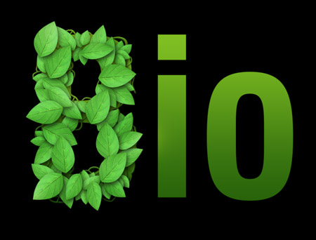
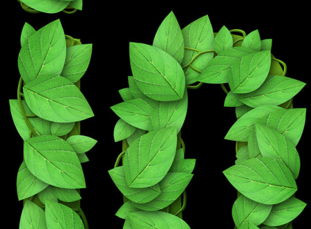
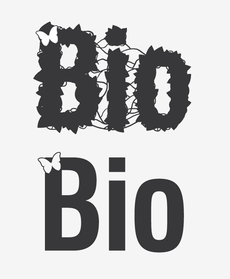
The design I developed for BioThemes features a range of detailed leaves that fill out the entire word. In the background a tree bark texture and intricate vines all add to the theme.
View the BioThemes logo design
The making of the BioThemes logo
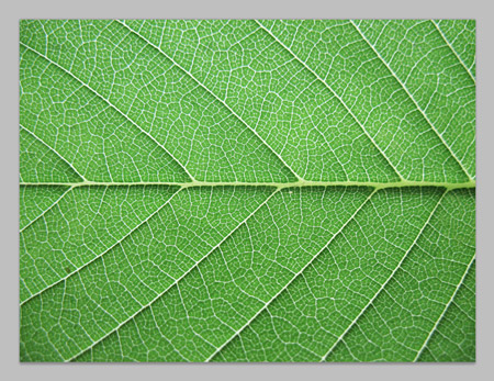
Unlike most of my logo designs, the BioThemes logo was build in Photoshop at super large dimensions. The whole design is based on a leaf texture file sourced from Caleb Kimbrough.
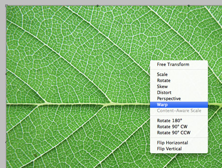
The flat leaf shape was then transformed using the Warp function in Photoshop.
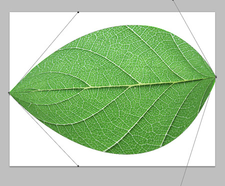
All four corners were moved together and the handles stretched out to form a typical leaf shape.
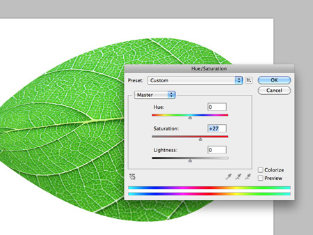
A quick Hue/Saturation adjustment altered the green tones and brought out the vibrant colour of the leaf.

The basic text was then laid out in Photoshop, with a temporary green gradient added as a layer style.
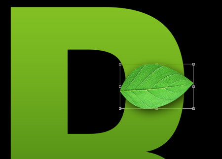
Copies of the leaf were then pasted in, scaled and rotated into position over the first letter. A Drop Shadow effect will help add depth to the leaves once the numbers begin to add up.
Each new leaf was easily created by holding the ALT key while dragging the item to create a duplicate. It was then randomly rotated and re-positioned.
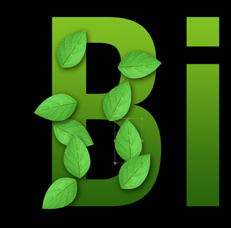
Once a number of large leaves had been placed, another copy was scaled down and squashed into a different shape. This new leaf is then duplicated to fill out the gaps.
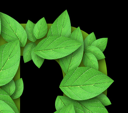
The final series of leaves is a collection of smaller leaves bunched together to fill out any unsightly gaps.

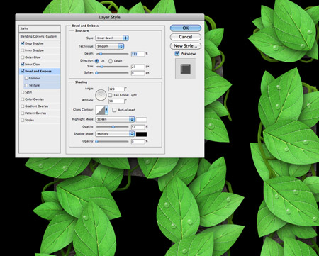
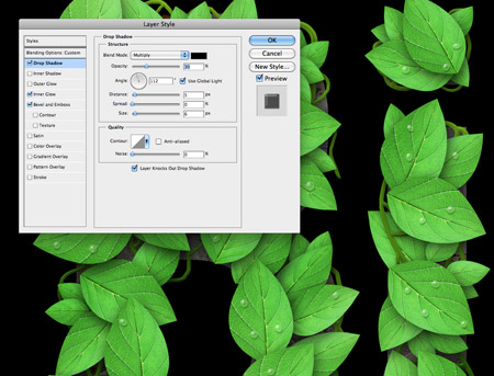
A simple Photoshop brush was then used along with my Wacom tablet to draw a series of vine shapes between the leaves and extending beyond the outline of the letter.
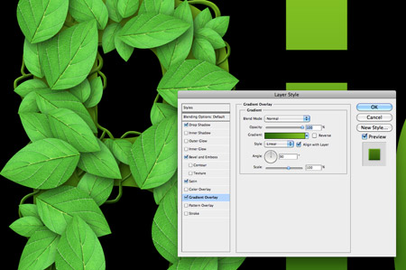
In order to give these white strokes the appearance of vines a Gradient Overlay was first applied.
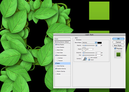
Next, a Satin overlay gave subtle changes in tone across the vines to counter the predictable flow of the gradient.
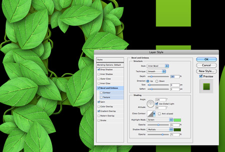
A Bevel and Emboss effect gave the vines a three dimensional appearance with bright green highlights and darker green shadows.
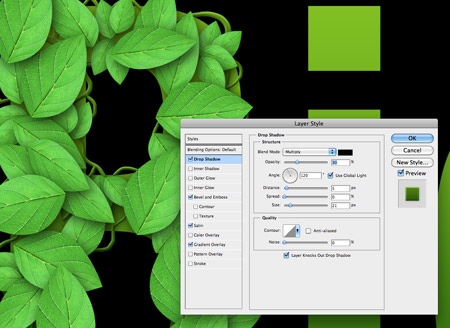
Finally a subtle Drop Shadow lifts the vines where they appear over the text or the leaves.
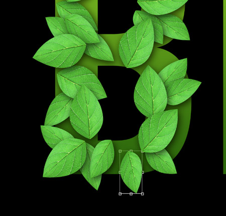
A few splodges of black and white using a large soft brush then added variances in colour and tone to differentiate the leaves from each other. This layer is set to Soft Light at 70%.
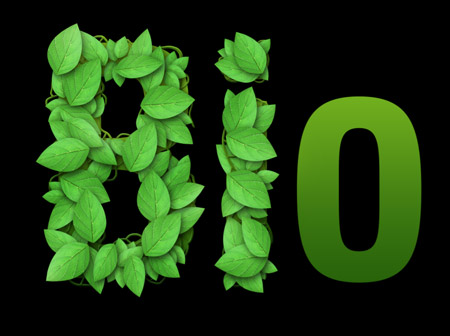
The first letter is now complete. The same process is then repeated on the following two letters to finish off the word.
A new group of layers kept the hundreds of layers for each letter separate to keep the PSD clean and tidy.
The vines layer was added half way down the stack of leaf layers so the vines interweaved above and below the leaves.
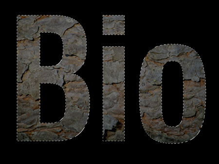
To add a little extra detail to the background, the letter outlines were used as a layer mask with a tree bark texture. This replaces the original green gradient.
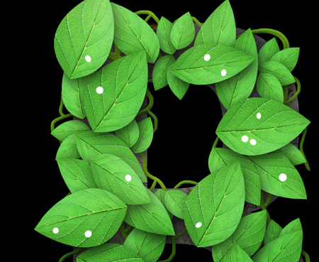
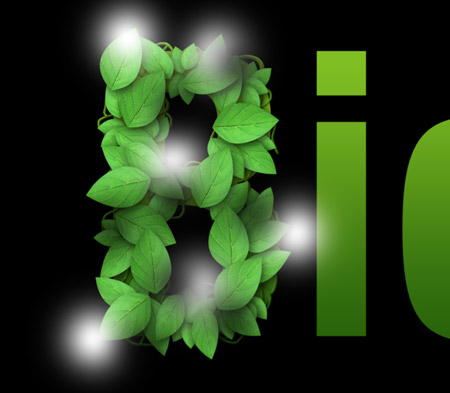
The final touches to the logo were a series of water droplets. The base of these droplets were created with a round Photoshop brush with the scattering settings turned to max.
A series of layer style effects soon created a water drop appearance. First the layer was set to Multiply to render the white transparent, then a Bevel and Emboss effect added.
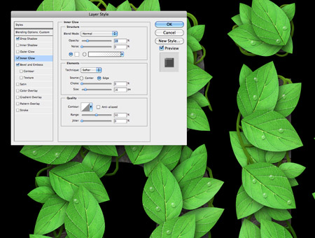
An Inner Glow helped outline the drops with a white glow. The key is to turn the opacity right down low to create a subtle effect.
Finally a soft Drop Shadow gives the droplets a subtle three dimensional appearance.
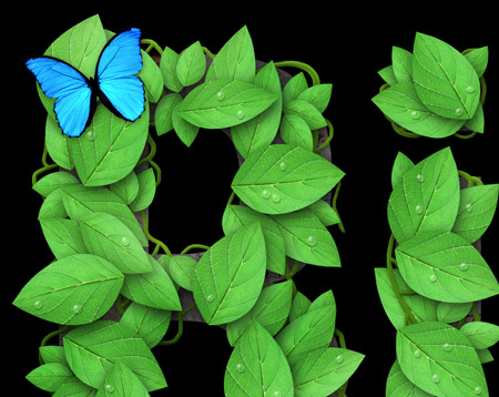
A quick addition of a butterfly links in with the ‘bio’ theme. The colour of the butterfly is used to balance off the word ‘Theme’s on the second half of the logo.
But wait, this won’t work in black and white!
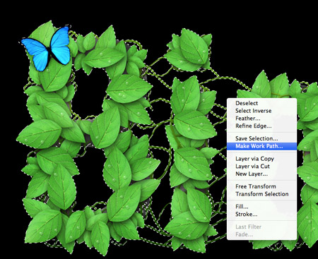
Everyone who creates logo designs knows the core principle that a logo should also work in mono format, or in other words be reproducible in black and white. On first impressions this full-on raster based photomanipulation logo might seem far from versatile, but we can make some tweaks to recreate the logo in file formats that can be used in multiple applications.
A selection is made of the entire logo in Photoshop, which is then converted into a Work Path. This path is then pasted into Illustrator to create a solid vector version of the logo.
A detailed and simple vector version of the logo was also supplied along with the high res raster logo so it can be used on any kind of design; big or small; web or print.
So here’s the final BioThemes logo in all its colour and intricate detail. Head over to BioThemes.com to see it in action. Don’t forget, if you’re an Access All Areas member, you can get yourself 30% off the ShowOff theme!

very nice :) thanks Chris!
Look too busy to me, especially in the black and white version.
At least, I would have removed the central linking vines
Hello Chris this is really nice tutorials , thanks for sharing with us.
Cheers
Its really very nice. Thanks for sharing this.
I absolutely love this. Awesome!
thank you as always no words for your work, and very well explained
Such an amazing piece here Chris, the water droplets really bring this piece to a whole other level. Cheers
Looking at the Bio Themes website, you’ve not considered how the logo will look scaled down. At the size it is on that website you don’t get to see the level of detail and it all kind of melts into one big green blob.
This isn’t a criticism of the design itself, it’s a great on concept, and the execution is slick. But failing to consider sizings, especially when it’s specifically for a website is a little unfortunate. I can see the logo working at a larger scale, but it just doesn’t work at the size it is currently.
I think this is an ideal opportunity to put the ball back in the client’s court and request the logo is a little larger… a designer’s nightmare, but thoroughly justified in this case.
Hi Abbas, John here – or “The Client” if you will. We love the logo, which is why we display it in all its detail and glory at the bottom of product pages and on the about page of the site. We don’t feel the need to have the logo huge on every page – we’re ok with it alluding to the larger version of itself ;)
You should… a good logo needs to be flexible, who knows what the future brings you.
Looking at the Bio Themes website, you’ve not considered how the logo will look scaled down. At the size it is on that website you don’t get to see the level of detail and it all kind of melts into one big green blob.
This isn’t a criticism of the design itself, it’s a great on concept, and the execution is slick. But failing to consider sizings, especially when it’s specifically for a website is a little unfortunate. I can see the logo working at a larger scale, but it just doesn’t work at the size it is currently.
Great design Chris, I don’t think BioThemes do it justice though by using it so small on the site, I’d at least have had a bigger version on the home page to show of some of the details you put it.
Yes, really nice work but all that intricate detail is now missing on the BioThemes website. The word Themes dominates the Bio logo, it should be a lot smaller in relation to the word Bio. Time to redesign the website to make full use of the logo. Great walkthrough as always.
Great job there, although it’s a shame it appears so little on the website. You can’t see the details, especially the butterfly.
Thanks for sharing the process.
B.T.W., what resolution did you use?
Love it! I had a great time going through the steps. Thanks.
Lovely tutorial and really nice and simple techniques. This was actually very good for me right now since I’m about to develop something like this :)
Love the logo and love seeing your process :) Great job!
It’s a great logo Chris and very interesting to read about the process you used to create each different effect. Cheers :-)
Very nice, you are definitely one of the best out there, thanks.
Really nice Chris, Thanks
very, very cool……nice work!
Nice Chris.. Thanks for sharing.
Really like the way you’ve achieved the final effect. Cheers for sharing
Nature is the most inspiring of things; it is great how it could create anything even in the cyber world.
Great tutorial! We hope more people would use this example and create their own nature combinations.
What is the social media sharing plugin you are using?
Looks beautiful…..
I specially liked the way of giving lights to leaves…
gr8 tutorial.
thanks!
I just love that logo! Over the years I’ve made a few logos myself but those have been purely in Illustrator. This has opened my eyes to what can be achieved in PS. Particularly I loved the first part where you warped it into the shape of a leaf – so simple yet effective!
Looks great!!! Awesome workflow!!!! I would just leave a little more space between the “i” to be able to distinguish it a bit more.
To everyone complaining about the size of the logo on the site – you are missing the point a little ;) The website doesn’t exist to show off a logo, it exists to sell products. That is (quite rightly) the focus of the design.
We’re very proud of the logo, which is why it *is* displayed at full size in multiple places throughout the site :)
Chris did an awesome job, we couldn’t be happier!
AMAZING…
@JohnONolan
The ‘logo’ on your site (biotheme) definitely needs a fix.
‘Bio’ is almost unreadable.
‘Themes’ colored in blue on silver bg is hurting more than helping.
( in case you are too lazy to care, just blow it up 2x.)
Nice tutorial! We produced a logo using foliage awhile back and could have saved some time by read this first. Thanks!
Love the green connection and natural spin. Very unique approach really like the end result. Thanks a bunch!
awesome
Hola…!!! Estos son berdaderos trabajos
Another great tutorial! Nicely explained and very helpful. Thanks Chris.
Another great tutorial! Well explained and very helpful. Thanks Chris.
Absolutely love it, nice to see a fresh approach, appreciate the tutorial, cant wait to try this out myself.
Thanks for sharing!
That is great post. It’s very nice. Thanks for shearing your ideas.
Once again a great Tut, many thanks.
I really like this!
great work Chris
I don’t know where you get the time from to do all this design work and then write brilliantly descriptive articles to take us through how you did things. Thumbs up! :o)
my bio:)
http://img31.imageshack.us/img31/7131/bioleaves.png
wow, just amazing
@smike- nice, i liked it, but the background is little odd, but nice work