Retro Text Effects with Adobe Illustrator’s Blend Tool
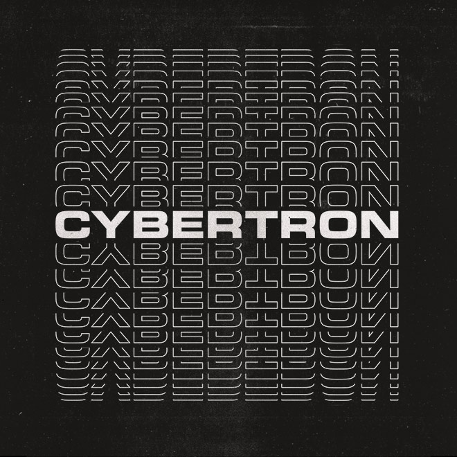
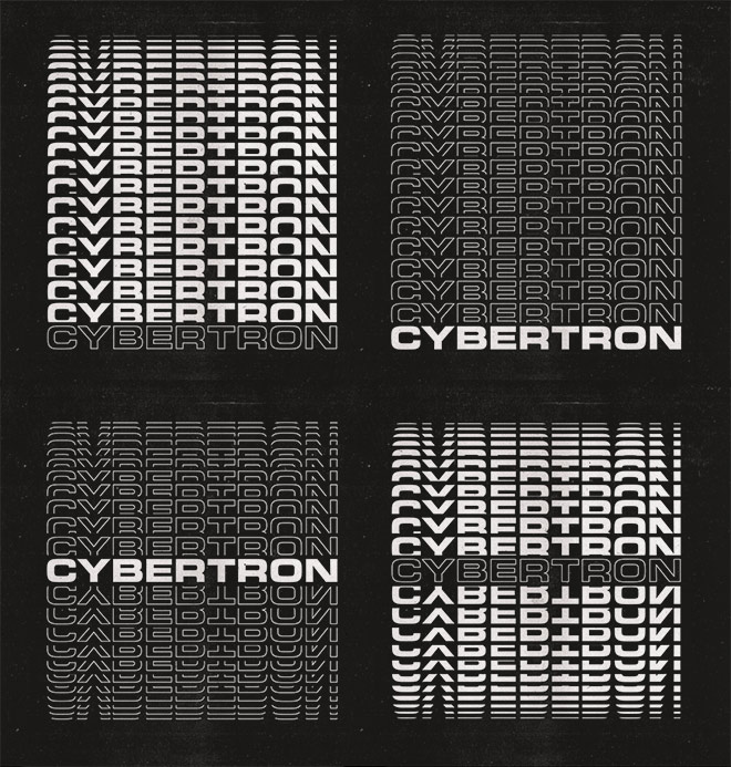
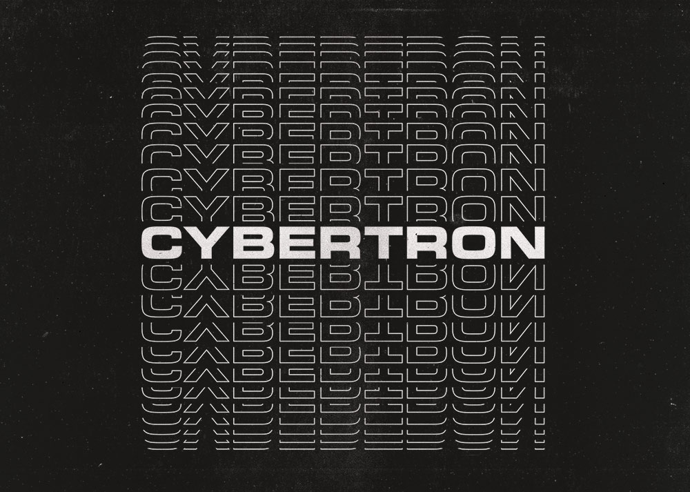
Follow along with today’s Adobe Illustrator tutorial to create a simple but effective text effect with somewhat of a retro vibe, featuring stacks of text elements that are progressively spaced further apart. It reminds me of the kind of design you might see on an old VHS tape box or an ad for an 80s technology brand. Illustrator’s Blend Tool will be used to create the basic effect, but I will also show you a trick to alter the spacing of the text with a cool easing effect and show how variations of the artwork can be created by combining different combinations of solid and outlined text styles.


► Activate the Eurostile font – https://spoon.graphics/3N5zMcq
► Download my FREE Photocopy Textures – http://spoon.graphics/17K117j
Check out Envato Elements for Unlimited Design Asset Downloads and Get 50% off Annual Membership – https://spoon.graphics/envato


Thank you so much for taking time to do these tutorials!
Very goooood as always !!!!! its good to know you are etting better form your injury !!!!!
God bless you chief, sorry about your injury.
Please can you help me? When I get to the blending part at about 3.05, the make option is greyed out and I can’t seem to do anything to get it highlighted (I tried blending with 2 shapes to see if it works and it does but I can’t get it working on my text).Thank you.
I have the same problem, I can merge shapes but the text doesn’t, I don’t know what the problem is or how to solve it, please help,
So simple, but beautiful.
Chris,
I’ve been following you for a long time now and I love how you always make tutorials easy to follow! Even though I’m sure you have many of the shortcuts down by heart, I appreciate that you take the time to create you videos so that almost anyone with a basic understanding of the programs can follow along. I work full time as a graphic designer, but because I specialize in inDesign, my other program knowledge is often limited. I also don’t always take time to catch up on new features either. Seeing that new feature added to illustrator (the text alignment feature) blew my mind.
This tutorial is simple and easy to follow, but yet effective with stunning results. For me, the cherry on top is the integration of photoshop at the end. I really love that you go beyond just using one program. You could easily stop at the illustrator design, but you added the extra bit that elevated the design. The fact you took the time to make a polished final design was great and it’s what makes you a cut above some of your competition. While many tutorials are good starting points, your integration makes them feel more tangible and practical. I loved seeing that texturing really elevate your design a step further. And as always, giving a reason for doing what you do just sells it. Anyone can slap a texture on something for no reason, but if you have a reason as to why (in this case, adding a retro feel), then you can really make any design marketable.
A dose of design learning with a pinch of design thinking.
Thank you!