Letterpress Poster with Overprint Effects
Follow along with today’s how-to guide to create a letterpress style poster design with overprint effects. Authentic poster art of this kind would traditionally be created by hand on a letterpress print machine, where the transfer of ink from roller to paper would naturally create the texturing and overprint appearance. Instead, we’ll be using Adobe Photoshop to mimic the style of vintage prints by using digital fonts, textures and Photoshop effects. Along the way, we’ll go over some useful techniques for creating type layouts, producing effects that realistically replicate the appearance of printed ink, and I’ll show you how layer masks can be used to apply textures that make your clean digital art look like an authentic hand-made print.
⭐️ Create your own website with Wix – https://www.wix.com/go/spoongraphics

► WTR French Clarendon Font – https://spoon.graphics/3D8D9en
► Bee Font – https://spoon.graphics/3DxyfJb
► Casey Font – https://spoon.graphics/3DuG1U2
► Old Vintage Paper Background by Andrius Saz – https://spoon.graphics/2F19jv9
► Download My Free Photocopy Textures – https://spoon.graphics/2qROHf4
► Love this design? Get the T-Shirt! – https://spoon.graphics/2JRODJX
Subscribe to the Spoon Graphics YouTube Channel
Love This Design? Get the T-Shirt!
Want more? Check out these great related products
The following resources cost a little money, but I definitely recommend checking these related products out to complement my letterpress poster tutorial.
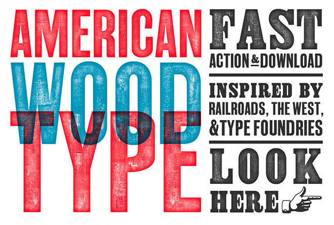
American Wood Type
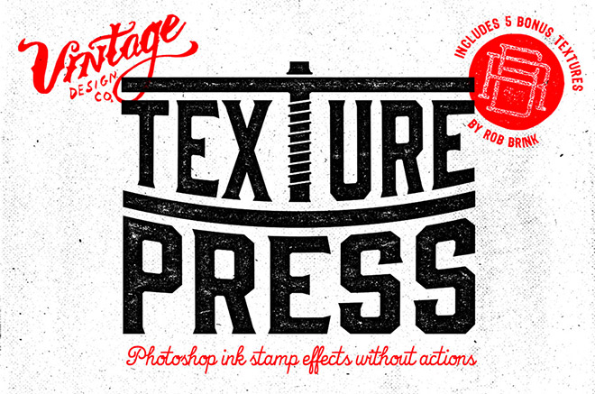
TexturePress – Ink Stamp Effects
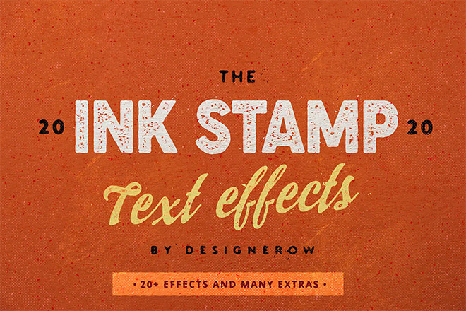
Photoshop Ink Stamp effect
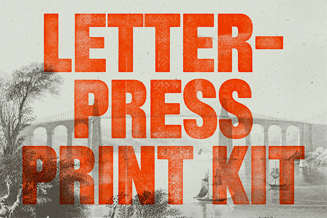
Letterpress Print Kit
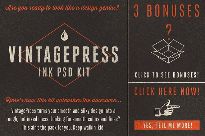
VINTAGEPRESS FOR ADOBE PHOTOSHOP
⭐ Get 20% off at RetroSupply with the code SPOON20
Mock up your poster designs with PlaceIt
Upload your artwork to hundreds of ready-made mockups on PlaceIt to simulate how your design will look on a real poster!







I love your videos. I’ve been using Photoshop for 20 years and I love learning new ways of doing things. I never thought to make a work path of a low res image before. Thanks for sharing!
Thanks for this great tutorial, Chris! I enjoy learning new tricks (which I always do with your tuts.) You rock!
The noise/ripple trick is such an elegantly simple technique. I’m curious as to how you’d suggest the same technique on a dark background with light text.