
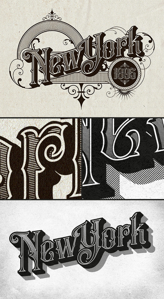
Vintage Text Effect in Adobe Illustrator
I’ve been admiring the lettering work on vintage insurance maps lately. These old documents were originally drawn up by hand by master penmen, who illustrated the title page with ornate lettering and detailed embellishments. Painstakingly illustrating artwork like this by hand is a dying art form that would have taken years of training to become a master of penmanship, but we can create similar text styles with the help of digital fonts and modifications in Adobe Illustrator. Follow along with this Illustrator tutorial to create a vintage text effect with decorative details. We’ll take inspiration from the authentic examples with fine line work, drop shadow effects, and warped text layouts.
Assets used from the Vintage Font Bundle

⭐ Get an extra 10% off with the code: SPOONER

Nice Tutorial! Thank you. For some reason my offset path function isn’t working, when following along. A negative value of any amount makes no difference, whereas a positive one does. Any tips?
love this new tutorial. Thank you for all you contribute and share. Question: when you replace spine, adding lines to a circle shape, it works great with a semi circle, and the lines extend from the center out, but if you use anything more, like 3/4 or a whole circle the lines don’t extend straight out from the center, they end up at an angle. Any way around this? I can send a screen shot but not sure where I can attach an image. Thanks for any feedback.
Also, seeing you are so versed in illustrator, I have been trying to understand the somewhat recently added LAB colors and why/how they take over and sometimes alter PMS color recipes? I have tried to research this but not really finding good answers. Have a great weekend, Judi
I’ve done version of this using just the appearance manager so the text remains editable. The only thing I can’t recreate is the inner shadow – anyone got any ideas?
Loved the tutorial and produced my own masterpiece, thanks to you. I create an internal newsletter where I work and included a colleague’s recipe and technique for making sourdough bread… used the same template to personalise it with his name, change text to sourdough bread, change colours, etc…. looks amazing! Thank you for tutorial and link to font bundle.
So glad to find this amazing tutorial. It’s so helpful for my works. Thank you for sharing and always look forward for another tutorials.