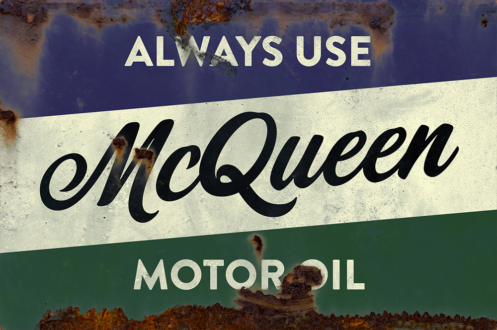
How To Create a Vintage Rusty Metal Sign
Recently I was wandering around the stalls at a classic car show admiring a collection of vintage automotive signs, which featured various lubricant and fluid brands on old rusty metal plates. It has taken over 70s years to slowly decay those tin advertisements into vintage memorabilia, but they gave me the idea to use the aesthetic to create our own rusty sign effect using Illustrator and Photoshop. Follow along with today’s tutorial to produce a simple motor oil brand sign with a 50s inspired design, using type and colours that are based on authentic examples. We’ll use Illustrator to construct the design for its powerful shape and text editing tools, then we’ll transfer the artwork over to Photoshop to distress it using a rusty metal texture. I’ll show you how a simple layer mask trick can instantly take your crisp digital design and give it a realistic weathered patina look.
⭐️ Create your own website with Wix – https://www.wix.com/go/spoongraphics
► Corner Store Font – https://spoon.graphics/3SFj1WK
► Brandon Grotesque Font – https://spoon.graphics/3DxzKag
► 99% Off The Versatile Textures & Patterns Collection – https://spoon.graphics/2S8NwXA


Is there anything you can’t do, Chris? Thank you for another awesome tutorial!! :)
Ditto Taylor’s comment! :)