How To Create a Realistic Chalk Lettering Effect
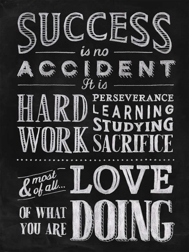
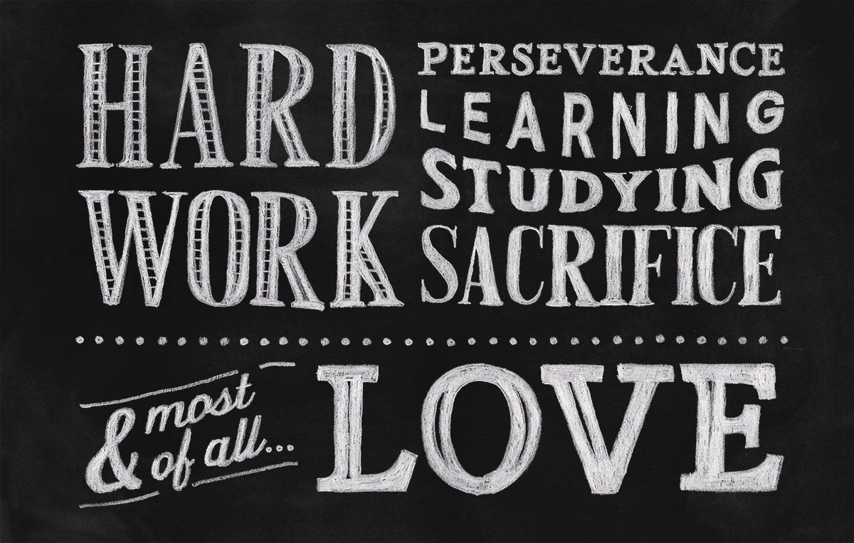
Today we’re going to take a look at creating a chalk lettering effect, just like the trendy menus you see in bars and cafes, or the quote murals all over Pinterest. We’ll use the digital power of Adobe Illustrator to plan out our typographic quote design with fonts, which allows us to experiment and move elements around. This isn’t something you can do with chalk, without rubbing it out and starting again! To achieve the most realistic effect possible, we’ll then make use of some analogue tools to capture the natural irregularities of hand made art.

► Taberna – https://spoon.graphics/2YlrR3m
► American Oak – https://spoon.graphics/3f55Eg7
► Mercenary – https://spoon.graphics/3d1Gmxt
► Fourth – https://spoon.graphics/35hcf2y
► Rail – https://spoon.graphics/2yeiMim
► Chalkboard background – http://spoon.graphics/2lYWxBD
Subscribe to the Spoon Graphics YouTube Channel


Thanks for this kick-ass tutorial!
Glad you like it Marie!
This is brilliant! Thanks a lot.
Thanks Jessica!
Nice tutorial. Thank you
Thank you Alexander!
Most excellent! Really enjoyed this one. :)
Great to hear you enjoyed the tutorial!
Great Tutorial. Thank You
Thanks for your comment Kevin!
Great video. Very instructive and concise.
Thanks for your feedback!
Great stuff Chris. I used this tutorial when you posted it previously and it worked a treat on a poster project I used it on. Thanks.
Glad it worked out for you Pete!
Great tutorial! Thanks Chris!
Thanks Andrea!
amzazing! thanks!!
Thanks!
Wow, Chris, you are the master of surprises. This is an amazing video. Maybe you have to do a bit of hand work, but it comes out so great. Love it.
Thanks for this.
MJ
Thank you very much for your comment! A little bit of extra effort but it makes the end result :)
Nice one. Thank you!
Thanks Maren!
Love this!! Thx!
Great!
Great tutorial man! Love the little segue clips as well.. #Humor100%
Ha, thanks Ricky! I try :)
Great tutorial, though when you said ‘we’ll do this by hand’ I thought ‘been there, done that’. I once made a bar sign by arranging the lettering digitally and then copying it with transfer paper on the blackboard and then drew that with white permanent marker. A day’s work, but very satisfying.
Keep up the good work, I love your tutorials.
Thanks for your comment Johannes! it’s great seeing the end result when you have put the extra effort in!
Thank you so much Chris! I have a project on at the mo that requires this exact look and I’ve struggled to get the a realistic effect digitally! :)
Many thanks, Chris. Great tutorial. As you mention this is quite a manual based approach and can see using it only for really demanding requirements. Was wondering if you can also recommend any good fonts that you would recommend for a similar, if admittedly not quite as good, effect?
A story tut :) Thanks Chris for the way to exhibit it.