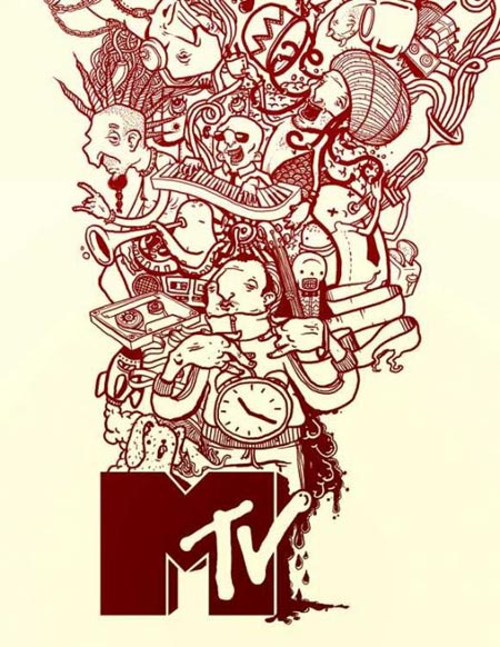
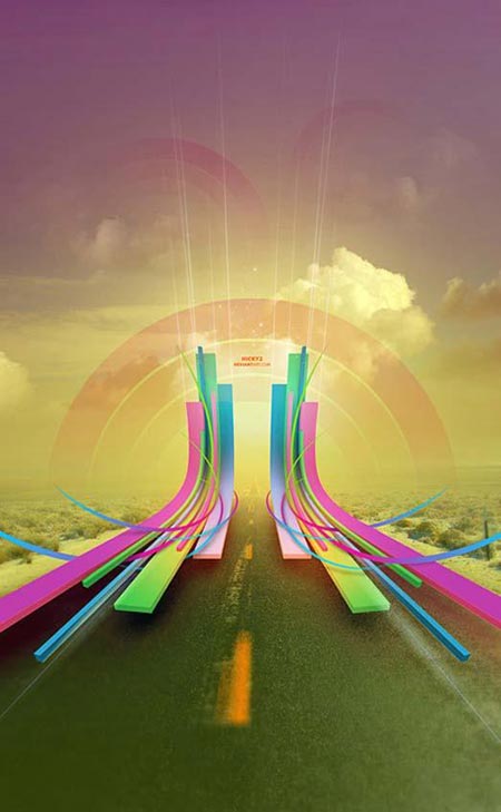
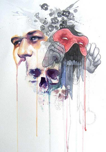
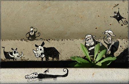
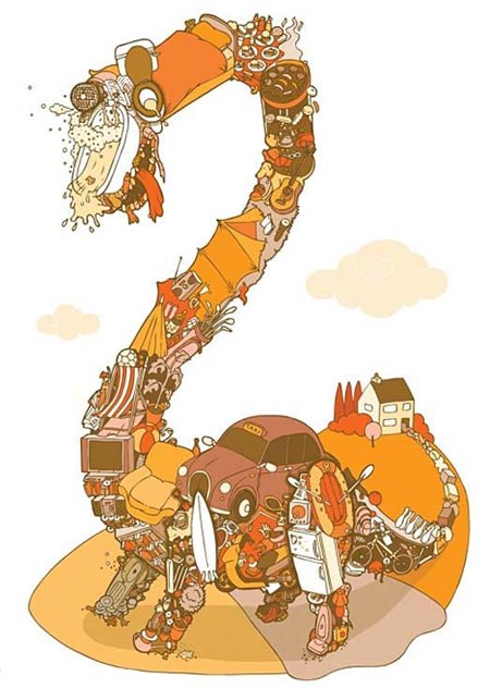
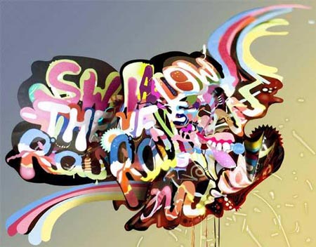
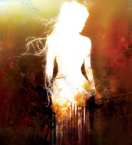
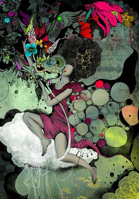
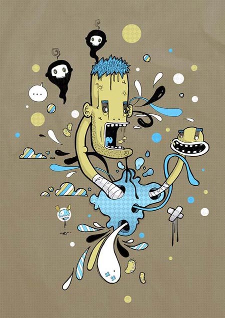
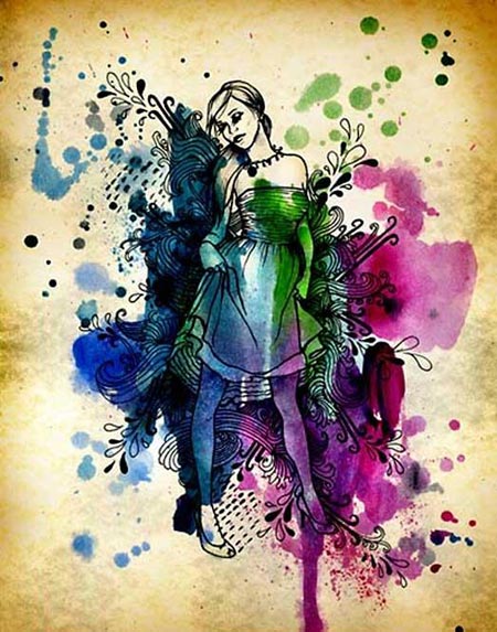
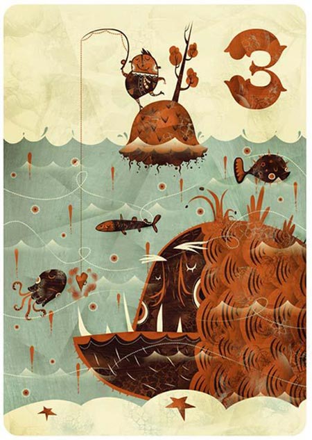
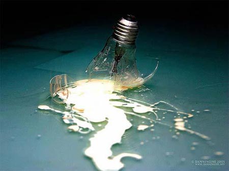
If you didn’t subscribe to the RSS feed over at DesignFlavr after last months post post; 32 Amazing Inspirational Pieces of Graphic Artwork, here are 32 more reasons to head over and check out the huge collection of incredible artistic pieces compiled daily by DesignFlavr!
DesignFlavr is an art and design aggregator that is updated daily with some wonderful pieces of work by designers and artists from a variety of genres including Illustration, Vector Art, Traditional Art and Urban Art
The last post did a great job of stirring up some strong opinions on what should be classed as Graphic Artwork, with many people expressing their hatred towards the examples shown. Art and design in general is very subjective so please feel free to post your comments and opinions – just keep the language clean or the comment will be deleted!









Hello, i’m from belgium and i read every new post; il like them. Sorry for my english, it’s not perfect, but i do my best.
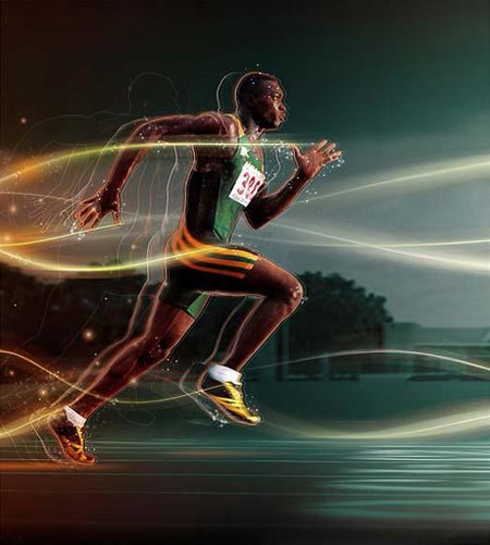
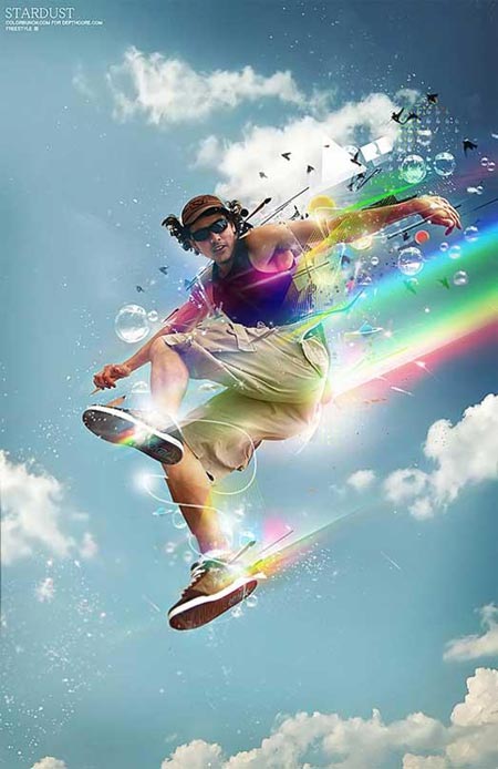
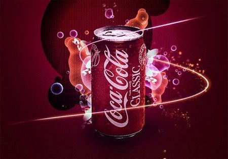
Is it possible to you to make a tutorial which explain how to realise light ligns like in the image of the runner (the ligns are following the man) or the image of the coca cola bottle (the lign around the bottle).
One more time sorry for my english and as we say in belgium “longue vie à vous”
My favorite one is the coke can one with the light around it. D’you think you could make a tutorial on how to achieve that kind of effect, and / or using illustration to make a cool fake coke as, like the “Coke Side Of Life” ads?
fantastic!
i really appreciate when you find really good work for us to look at and learn from.
These light strokes are easily achieved in After Effects with a plug-in called 3D stroke. In fact compositing in After Effects is a good idea in general as it is a far less destructive environment than photoshop. That said, a similar effect can be had in photoshop by making a small while blob and applying a directional blur or wind filter several times. Then use a bezier distort tool to bend the line. finally dupe the result, change the layer transfer mode of the copy to add and add a fast blur to get a glow out of it. You can colorize it with an adjustment layer if you like. Not as nice as a tutorial, but that’s the quick version.
Nice collection! I love the use of color in many of these designs.
I think Maxime doesn’t mean the light “shadows” of the running which indicate his speed. She wants to know how to draw a line in Photoshop.
This can be done easily by selecting the path tool and switching its mode to “path”. Draw a cool and energetic line and create a new layer. Your path should now be only a 2-deminensional line (not a shape). Now select the brush tool and choose 1px sized dot and a color of your choice. Select the path tool again and rightclick on the line-path and select “Fill path shape/outline” and apply the brush. You should know have a 2D-Line. Using the layer-effects or overlaying it with a blur should create the style which is used in the image of the runner.
Some expressions may be different since I am using the german version of Photoshop and don’t know the exact english words for them.
Hope I could help.
Al lott of belgium people out here :)
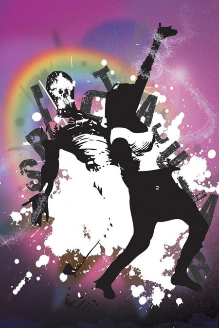
very nice collection and indead the runner and the rainbow guy are the best of it in my opinion.
There’s a handy tutorial on the website of abduzeedo explaining light effects… could come in handy to check it out for yourself…
cheerz
Thanks to all for your response, It’s not easy to understand but i will try to do that at home. But you can also make a tutorial, screen capture would help me a lot.
I hope i’m better in graphism than in english, dont want to lose my job :)
Hey, my piece made the list! :) Thanks for link up.
I love these posts. I always copy a handful that inspire me into folders for future reference. thx.
Thanks for featuring me, very inspiring site!
Amazing, very very very beautiful work.
Some of those are very nice! Thanks!
thank you
Hi, i just wanted to say thank you! i get a lot of hits from your site. also, thanks for putting my work amongst such wonderful artists! Great work yourself, i love the nike retro illustration! anyway i put a link to your blog on my blog
http://www.carpaltunnelmagazine.blogspot.com/
thanks again!
Angel
Very cool stuff, thanx :)
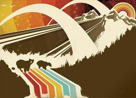
these are cool! my favorite is the mountain with polar bears… ^_^
me inspiro mucho la de la careta
Very cool stuff, thanx add my bookmark