This post was originally published in 2014
The tips and techniques explained may be outdated.
All kinds of cool effects can be created in Illustrator by outlining text into a solid shape then making various permanent alterations, but what if you want to keep your text editable? In today’s Illustrator tutorial we’ll take a look at the Appearance Panel and see how it can be used to build up layers of non-destructive effects that can then be saved as Graphic Styles so the effect can be instantly applied to any elements with just one click.
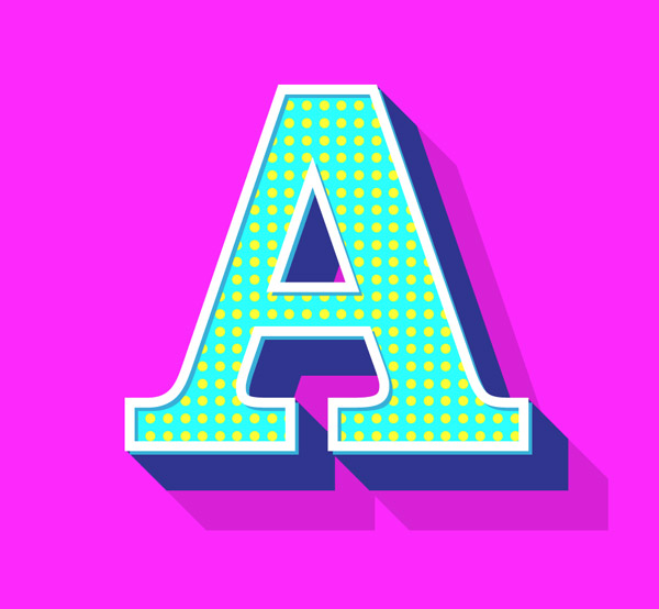
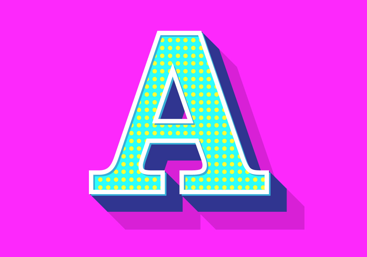
The effect we’ll be creating is this bright and colourful retro style text style. It’s made up from multiple fills and strokes in the Appearance Panel, some with extra modifications thanks to the Effects tools. The result is a cool looking effect that retains the editability of the basic text, allowing you to easily change the wording or apply the effect to other elements.
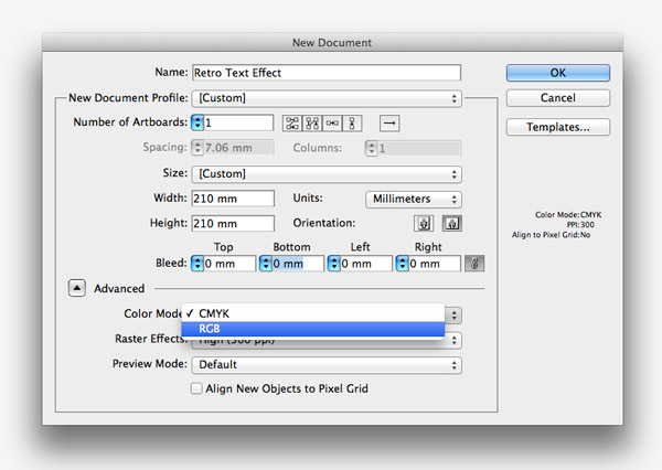
To create this specific effect we’ll need to set up our Illustrator document in RGB mode to make use of the wider spectrum of vibrant colours. Under the Advanced settings alter the Color Mode to RGB.
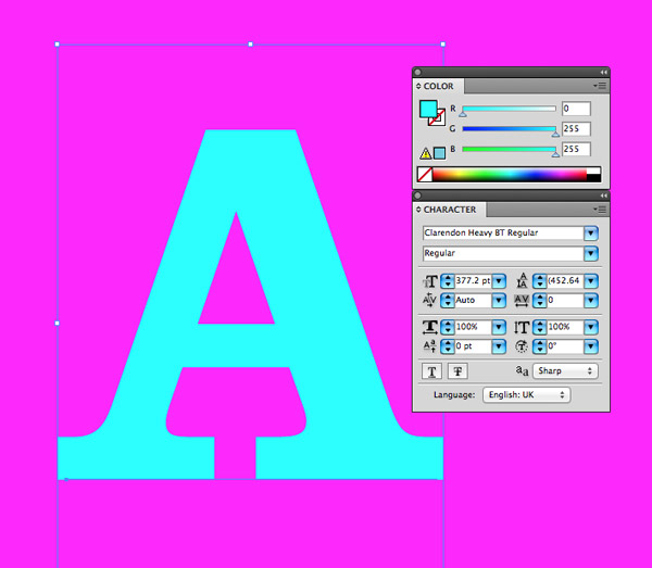
Draw a rectangle across the artboard and fill it with a bright Magenta to provide a background for this retro text effect design. Use the Type tool to add a letter to the artboard. Use any font your prefer, but I’m going with the classic Clarendon Heavy.
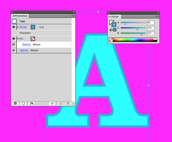
Make sure the Appearance Panel is open, then click the New Stroke icon at the bottom of the palette. This is similar to editing the default stroke settings, but the Appearances Panel allows you to build up multiple fills and strokes. Set the colour to a slightly darker turquoise and the size to 6pt.
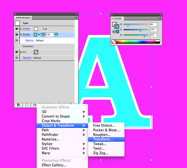
Add another stroke then change the colour to 7pt white. This currently hides the turquoise stroke, but select it from the Appearance panel, click the Effects icon and choose Transform.
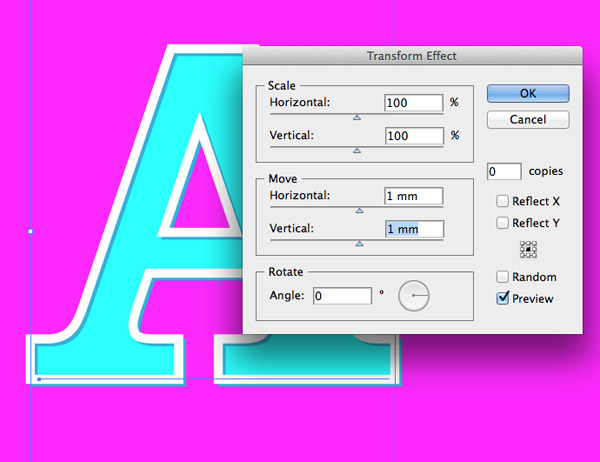
In the Transform Effect options alter the Move settings to 1mm horizontally and vertically to allow the darker stroke peek out from behind the white stroke and create an inset shadow effect.
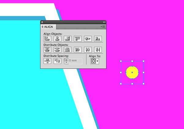
Elsewhere on the artboard draw a small circle filled with yellow. Also draw an empty square around the shape with no fill or stroke. Use the Align palette to line them up centrally along the X and Y axis.
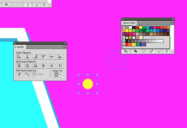
Select the the circle and square together then drag them into the Swatches palette to create a pattern fill. The empty square will pad out the visible space between the circles when this swatch is applied as a pattern.
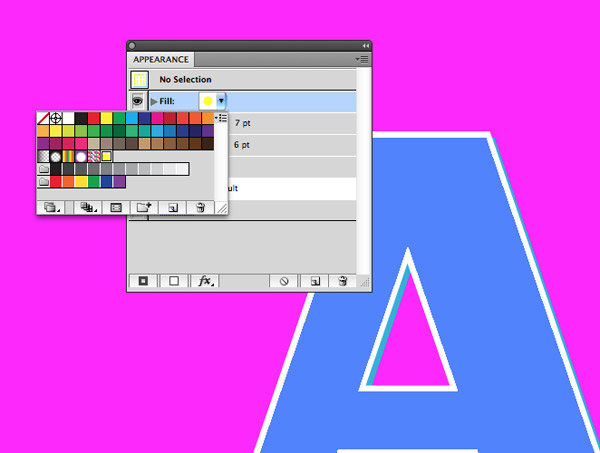
Apply a new fill in the Appearance panel and select this newly created swatch to have the yellow dot repeated across the element.
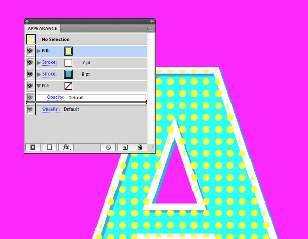
This dotty layer is currently overlapping the white stroke, so click and drag the item to the bottom of the stack in the Appearance panel.
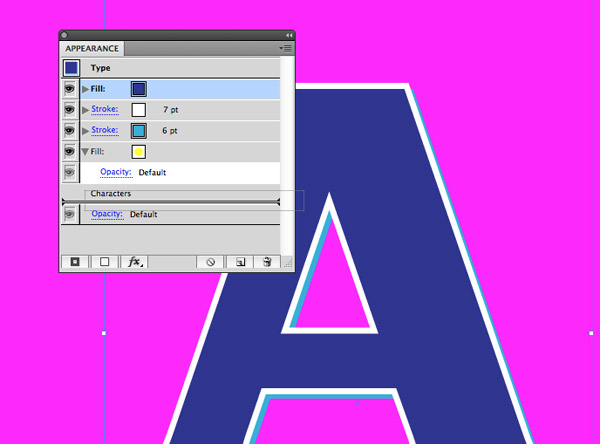
Add yet another fill layer, this time with a dark blue colour. By default this will be added to the top of the stack, so once again drag it to the bottom to make the other effects visible again.
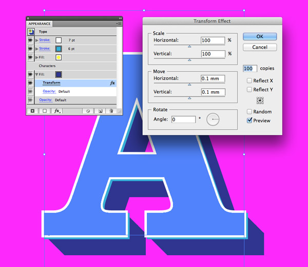
Go to Distort & Transform > Transform under the Effects menu and enter 0.1mm in both the horizontal and vertical move options, as well as 100 in the copies box on the right. Preview this to see how it creates a retro style 3D effect.
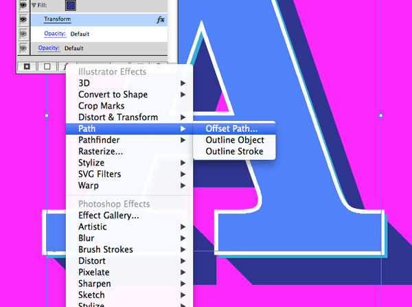
Due to the way the stroke enlarges the overall size of the text the 3D effect doesn’t line up properly. We can fix this by also applying an Offset Path effect to the blue fill.
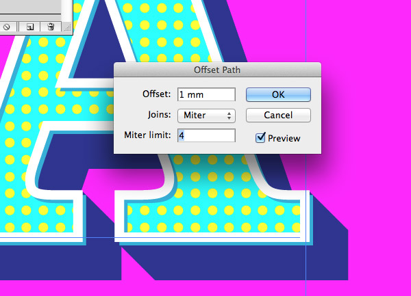
Enter 1mm in the options to add some extra padding around this layer, or the required amount to allow the edges to line up in your own document.
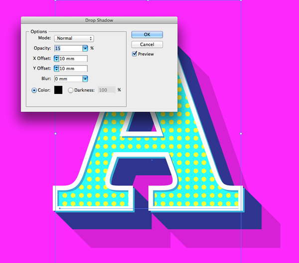
Go back to the Effects menu and select Stylize > Drop Shadow. Adjust the settings to Normal, 15% opacity, 10mm X & Y Offset and 0mm blur. This will create another solid colour offset, but this time the reduced opacity is a cool long shadow effect.
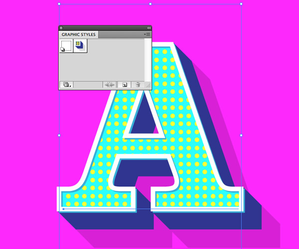
The great thing about all these Appearance tweaks is they can be saved as a Graphic Style. Select the element and click the New icon in the Graphic Styles panel. This style can now be instantly applied to any element to recreate this exact effect.

The final text effect is full retro awesomeness, but the coolest thing is the text can be double clicked and easily edited. I quite fancy building a full alphabet of various text styles now. Maybe I’ll share them as a set of Illustrator Graphic Styles!
Want more? Check out these great related products
The following resources cost a little money, but I definitely recommend checking these related products out to complement my Retro Text Effect tutorial.


nice share, i’ll follow your tutorial as soon as i get home :D
WoW! Thank You I am trying it out now.. Keep Sharing sir!
Nice Tutorial, thanks for sharing it.
Thanks for another nice tutorial!
Awesome… Just learned a new trick in Illustrator. Appearence and Graphic Styles are time saviors! Thank you for sharing :)
Illustrator’s appearance panel is really such a hidden gem, I design as a hobby/passion but my day job is as a commercial graphic artist in the print and packaging arena and we use appearances for all our grips and traps, it’s really quite excellent. As always Chris, quality work mate.
Very cool, very useful, and very well-explained. As usual. Have already breezed through this and added it to my collection. Thanks Chris!
Wow!!! Really great tutorial. You gave a very nice look on text (A). Its really cool.
yes yes yes! this is something really nice!
I allways forget about using apearence panel and it’s so usefull. Thanks.
Very Well explained tutorial, Thanks for sharing!
You can make a similar text effect with a new CSS generator EnjoyCSS in in a twinkling http://enjoycss.com/Fo/2#textShadow
Will try to implement the retro text effects in my next suitable project. Thanks for the detailed explanation!
Great tutorial, really cool ;)
Really great tutorial, very quick and easy to follow. Looking forward to experimenting with this window to see what other great effects I can come up with. If anyone comes up with anything, fancy sharing?
AI really is fully of hidden gems like this.
Thanks again, Chris. Keep up the brilliant work.
nice one!!!!