This post was originally published in 2015
The tips and techniques explained may be outdated.
Last week I posted a showcase of stunning chalk lettering designs, which gave me the inspiration to create some chalk typography myself. Unfortunately I neither have the talent or a chalkboard to produce authentic hand made chalk typography murals, but I’ve come up with a technique that designers can use to achieve realistic chalk lettering effects with their artwork. We’ll use the power of Illustrator to design a concept, then we’ll use some analogue tools to help capture the character of hand lettered art.
In this tutorial I’ll show you how to create a typography design with a realistic chalk lettered appearance. In my opinion, digital-only chalk effects just don’t cut it, but with this method we’re combining digital design with traditional analogue techniques. This means we have the best of both worlds; the ability to compose a design with the power of Edit > Undo, and authentic artistic effects that are only achievable with hand held tools.
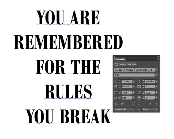
Boot up Adobe Illustrator to begin our design concept. The great thing about digital design is you can undo any mistakes and easily move items around to compose your design, unlike traditional art where every move you make is permanent. Type out a quote and style it up with your favourite font.
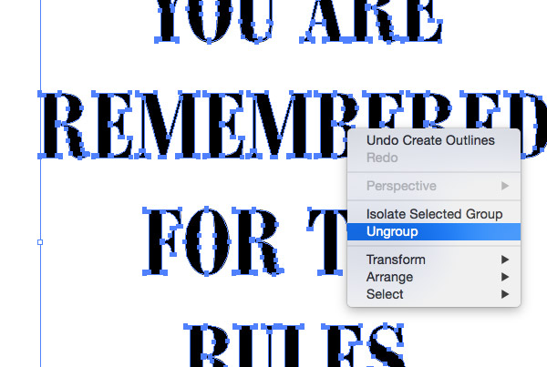
Create outlines from the type using the shortcut CMD+Shift+O, then right click and select Ungroup to break the letters apart.
Draw selections around each word, or group of words, and use the shortcut CMD+G to group the letters back together.
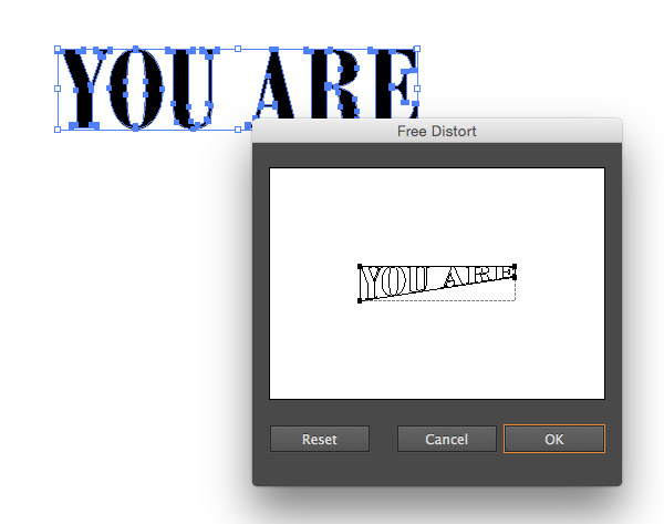
Select the first group of words and head to Effect > Distort & Transform > Free Distort. Move the lower-right point upwards to squash the text into a wedge shape.
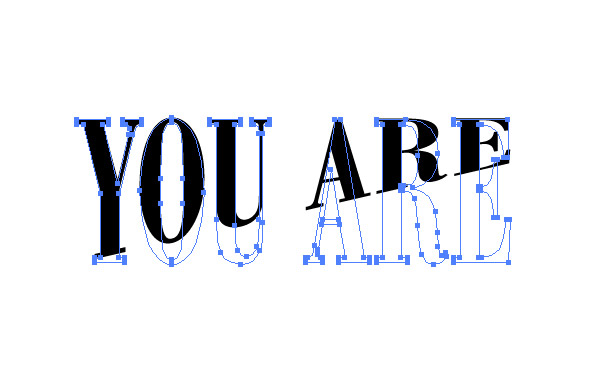
Usually, squashing and stretching fonts is a big design faux pas, but since this design is ultimately in the style of hand lettering we can get away with it. Scale the text vertically to stretch it out a little.
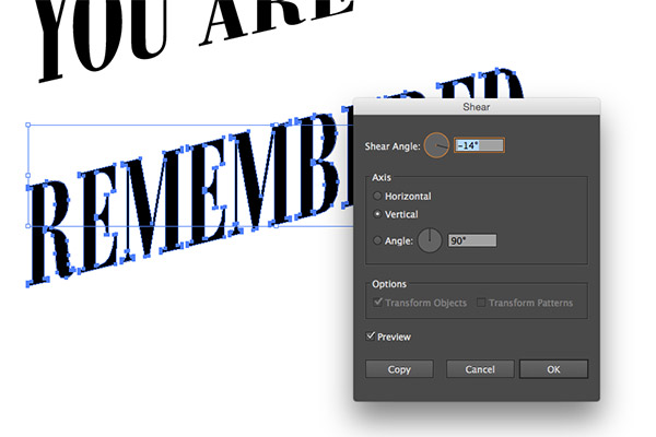
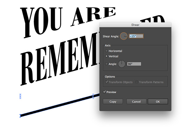
Bring the next word from your quote onto the artboard and Shear (Object > Transform > Shear) the text vertically until the angle matches up with the shape of the previous words.
Draw a thin rectangle across the artboard, then apply a Shear transformation to align it with the angles of the text. Duplicate this shape and position them to decorate the quote. Use the Pen tool to draw triangles to fill any other white space within the layout.
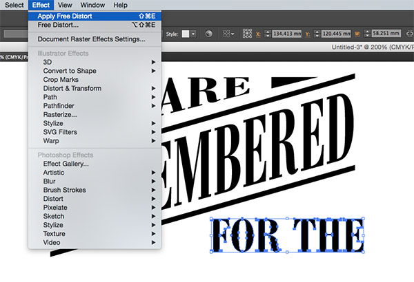
For the next word group, go to Effect > Apply Free Distort to apply the same wedge transformation we recently used.
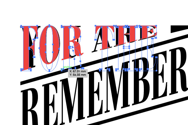
Temporarily change the colour of the text to allow you to scale it to the same size as the first set of words.
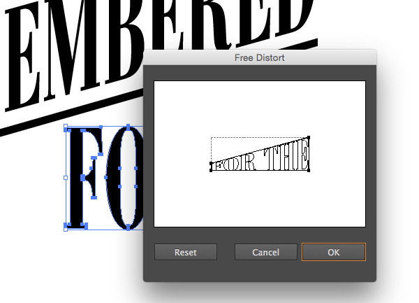
Bring up the Appearance panel and click the Free Distort effect to edit its settings. Move the upper-left point until the two diagonal lines run parallel, then move the lower-right point back to its original position.
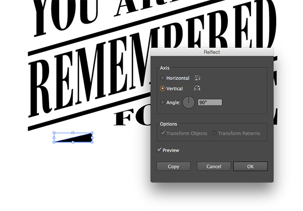
Any additional shapes that were drawn for the first layer of the layout can be duplicated and reflected across both the horizontal & vertical axis so they fit symmetrically into the design.
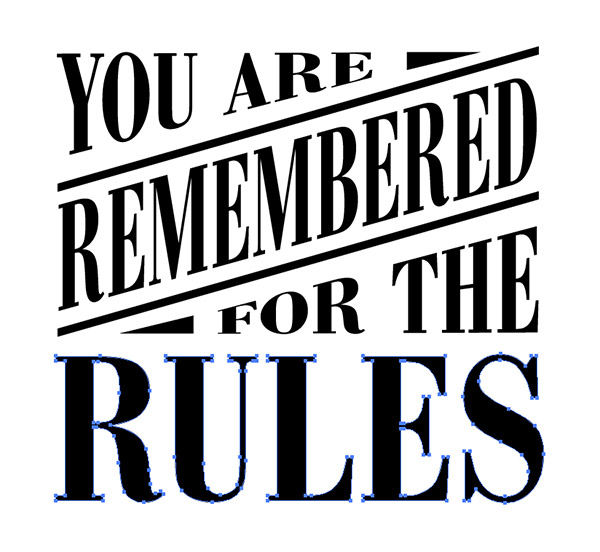
Scale up the next word of the quote to fit the width of the layout, positioning the text to maintain equal spacing between the elements.

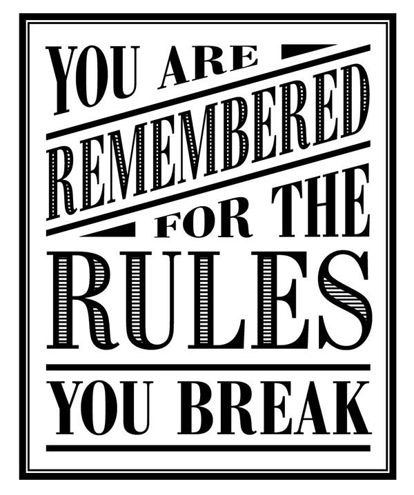
Finish off the typography quote by placing the last few words into the layout. Including simple rectangle lines is an easy way to add visual interest to the design.
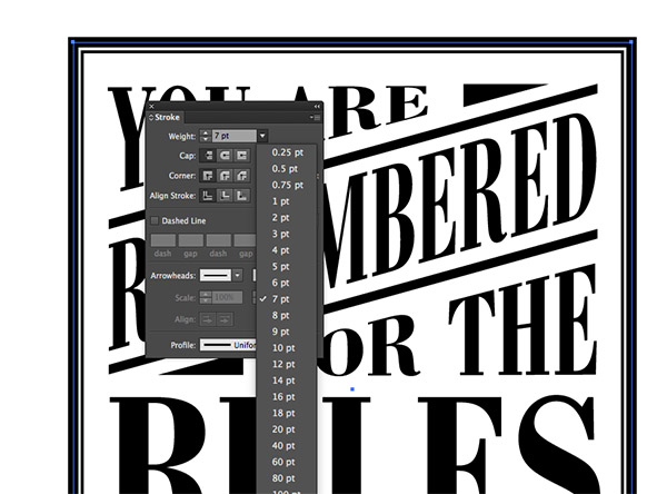
Draw a rectangle surrounding the entire quote. Clear out its fill colour but give it a thick 7pt stroke. Copy (CMD+C) then Paste in Front (CMD+F) a duplicate and hold the ALT key while scaling it down to form a second outline. Reduce the stroke weight to around 2pt.
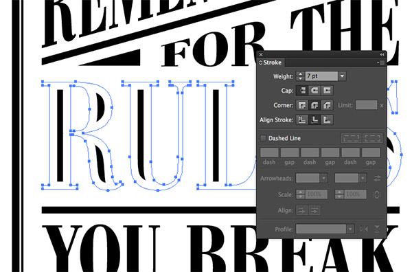
Select one of the larger words from the layout and copy it to the clipboard using CMD+C, then add a thick white stroke with round corners aligned to the inside.
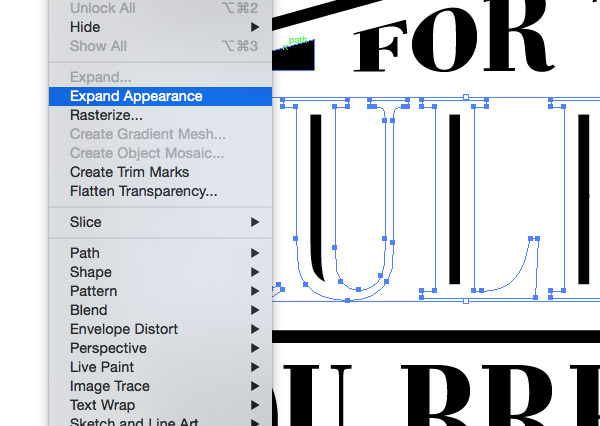
Go to Object > Expand Appearance to convert this stroke into sold shapes, then right click and select Ungroup to break the word up into individual letters.
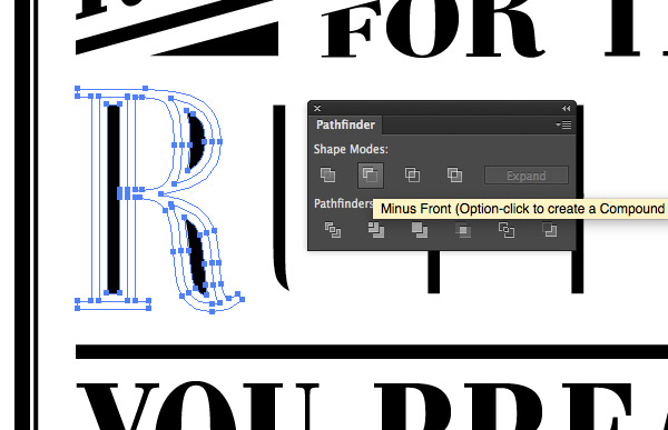
One by one, select each letter then click the Minus Front option from the Pathfinder panel to clip the shape down in size to the new inner shapes.
Group all the new inner shapes together and change the fill colour to white, then press CMD+B to ‘paste behind’ the original text that we copied to the clipboard earlier.
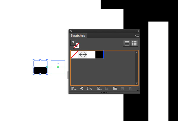
Elsewhere on the document draw a tiny black square. Press CMD+C and CMD+F to create a duplicate, then scale it down to half its size (turning on Smart Guides will help with the alignment). Change the smaller half to white, then drag both shapes into the Swatches panel.
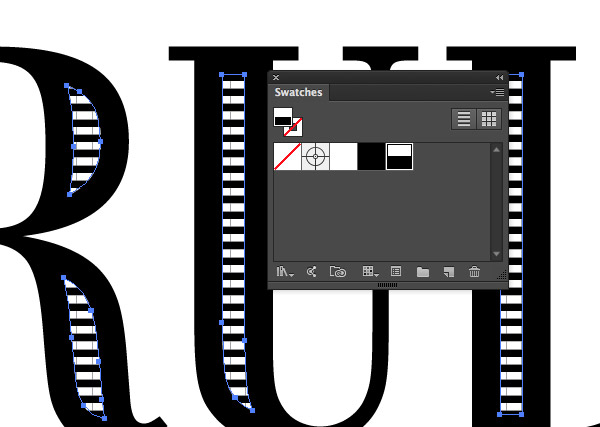
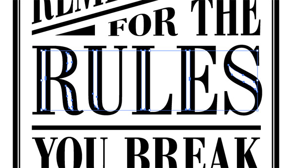
Apply this new swatch to the new inner shapes to give them a cool, vintage style striped appearance.
Use this opportunity to make any finishing touches to the concept by tweaking the position of elements or editing the layout.
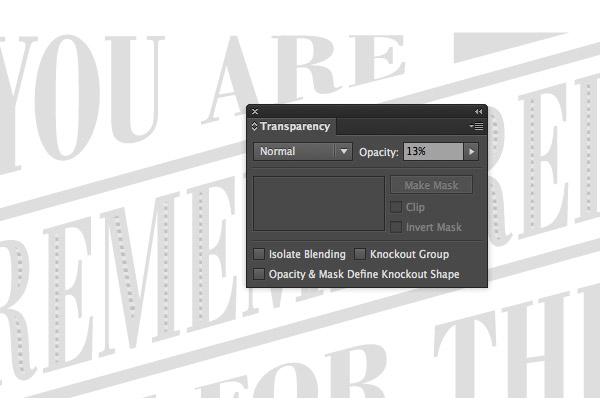
Select all the elements that make up the typography quote and group them together, then reduce the opacity to around 15%.
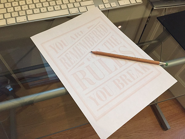
Print your artwork, which should appear very faintly on the paper thanks to the reduced opacity. Now, find one of those old fashioned tools known as a pencil.
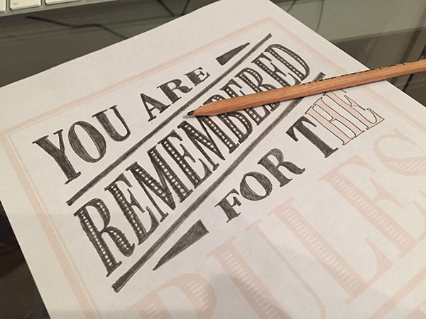
Begin tracing the design with your pencil, carefully colouring between the lines. This technique bridges the gap between freehand lettering and pure digital design.
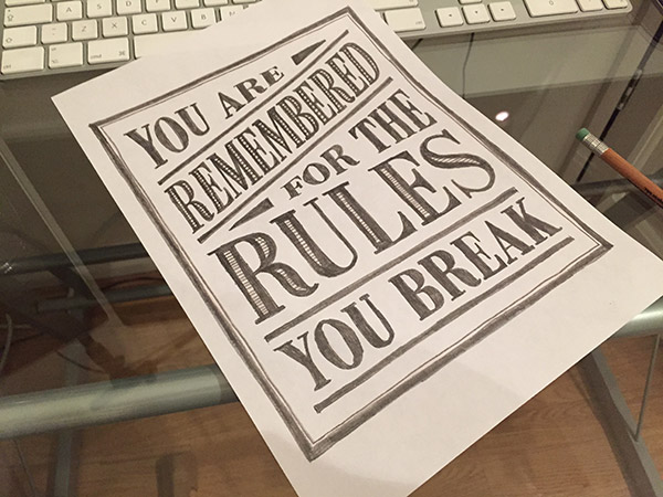
Once the design is completely traced, it’s ready to be scanned. The design obviously looks identical to the original concept, but it now has the irregularities of hand crafted art. Who’s to know you didn’t freehand it? Your secret is safe with me!
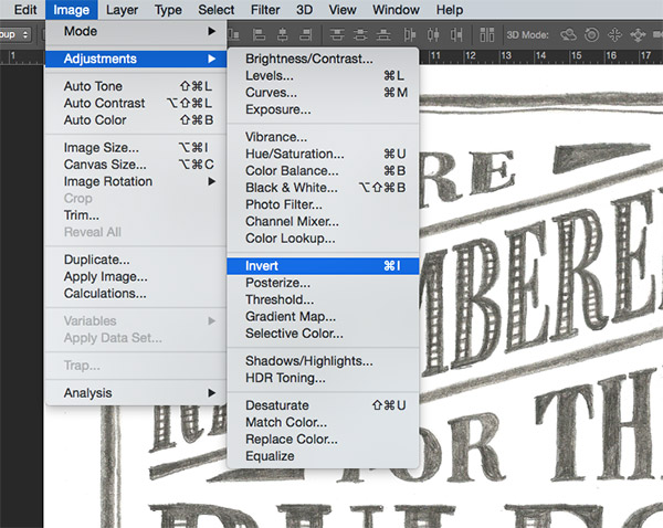
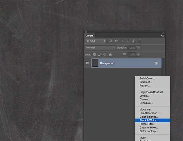
Open the scanned design in Adobe Photoshop, then go to Image > Adjustments > Invert. Follow this up with Image > Adjustments > Desaturate to remove any colour casts from the scan, resulting in a black and white image.
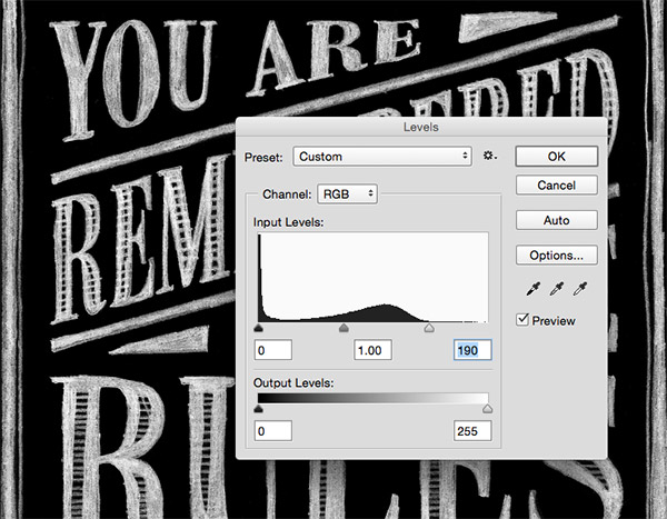
Go to Image > Adjustments > Levels and bring the highlights slider inwards until it matches the Levels histogram.
Download a chalkboard background texture, then follow my tips for better textures post to flatten the tones. Apply a Black and White adjustment layer to remove the colour from the texture.
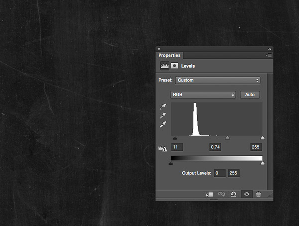
Add a Levels adjustment layer and move the shadows and midtones sliders to produce a darker chalkboard texture.
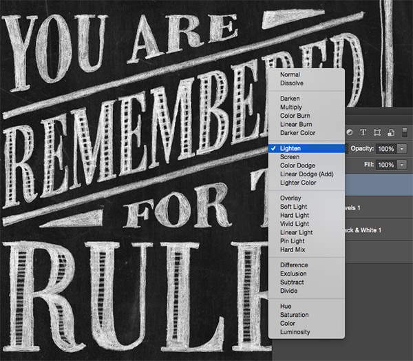
Paste in the processed scan image over the chalkboard texture and change the blending mode to Lighten to render the black background of the scan transparent.
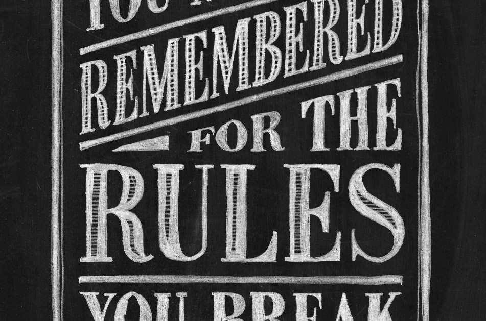
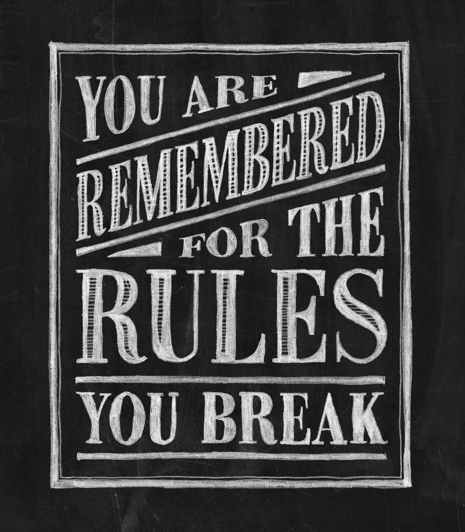
The final result is an extremely realistic chalk lettered effect. The time spent tracing the design with pencil and paper is what helps achieve that authentic hand crafted appearance, which just isn’t possible with purely digital techniques. When the design is applied to a chalkboard texture it’s difficult to tell the design apart from real hand lettered chalk typography.
Very clever!
Had a hard time finding the ancient tool you call a “pencil”. Luckily I found a bunch at a nearby IKEA.
I’m definitely going to use this method for designs like this!
I’m glad you like the method, you’ll have an abundance of pencils soon!
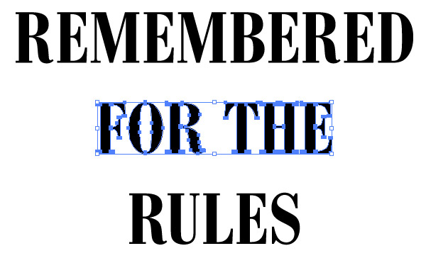
Ah, the famous ‘rembered’ (sic) rules . . . Thanks for your expertise and patient, comprehensible instructions.
Thank you Joan! :D
Seriously, I can’t handle you! You are the TOO much! Thank you SO, SO, SO much for this Chris!
HAHA thanks Michelle, I’m glad you enjoyed the post.
Oops! Sorry, I meant to type *You are TOO much!
It’s so awesome it’s almost evil!
Most definitely!
Great post, wonderful how you brought back the hand draw elements. I use this workflow frequently. But as a suggestion, try scanning by using your phone, adds extra artifacts and slight distortions.
Only learned this because I had to work with out a scanner for so long.
Great tip Dan, it’s just another way of utilising what you have!
I love that technique! So direct and easy plus it looks wonderful. Thank you!!
No problem Jenny. :D
Chris,
This is a great post. Well done, again.
Thank you, I’m really happy you like it!
That is so amazing! Thank you!
Thank you for your comment, so happy you like the post.
Thank you! Now to find this “Pencil” thing ;)
Good luck! :D
I like to take the designs into Photoshop and hit them with a grunge brush on a layer mask to make them look like chalk.
What an idea! Thanks for your tip Liz. :)
Chris, I find your blog posts getting better and better! This was an awesome post!!! Great idea- I can’t wait to try something like this.
Thank you so much Sara, that’s really appreciated. I hope you enjoy my future posts too. :D
Okay, Chris,
I am not a “joiner” of many things, but one of these days soon, I’m going to become a Premium Member. If you’re GIVING AWAY this kind of stuff, the ‘paid for’ stuff has to be something!
That’s a compliment and a half Greg, thanks!
My sentiments exactly, Greg! I, too, will be upgrading my membership in the near future, if for no other reason than to support this graphics angel!
OMG it’s a bird, it’s a plane, it’s a…PENCIL! I actually do a lot of scanning, editing, printing and drawing over my work so I really appreciated this post combining hand art with digital. great post. Thank you for all of your tutorials. I always learn something new. :)
It’s always good working with different techniques!
Thank you for your comment Jacquelyn.
This is fucking genious. I’m trying this right now. Thank you!
Hope it goes well, thanks Josie!
(I want to have your babies LOL)
THANK you for such kickass lessons – they are one of the reasons I make time to practice!
Why thank you! I’m glad you like the post. :D
Very nice! I like the type layout. Thanks for the inspiration.
No problem Silas, thanks for your comment!
This looks SO cool! I can hardly wait to try it out. Thanks, Chris!!! I LOVE your blog.
I hope it goes well, thanks for checking it out. :)
Super! It will be nice as long as there is no corrections in content :)
Take a look what I have produced with this tutorial!
http://2.bp.blogspot.com/-baI32tutN7Y/VOMstfM45hI/AAAAAAAABhY/SDLZhkKECrg/s1600/12-X-10-AD.png
Awesome job!
That’s impressive Arul! I love the drawings with the lettering, great job. :)
Chris, Thank you so much! Your talent and generosity are greatly appreciated.
Thank you so much Mindy, your comment means a lot! :D
Super post Chris! Thanks for sharing!
No problem Sasha-Shae, thank you for your comment. :)
Chris you are the best !!!
Your talent is very impressive, many thanks for sharing with us your art work.
Marvellous!!! thank you so much
Pensil is the best toolever (0=
Thanks Chris! So simple. So genius!
Had a fun time trying out the tutorial!
https://dl.dropboxusercontent.com/u/6823993/chalk-lettering.jpg
That’s amazing!
Awesome…
That was really clever. Thanks, Chris. I’ve been following your tutorials for quite a while now, but this one compelled me to comment. It’s so simple, yet effective. Nice!
طريقك للمعرفة
What a great idea and stunning result. I can’t wait to try it out.
Conceving this method: genius.
Sharing with us: boss!
thanks Chris!
Awesome Tutorial Chris. I will definitely share it on my blog
Great in-depth tutorial. Thank you!
I love the idea of putting pencil to paper more – it connects the soul to the work.
Thanks for the great tips – always.
This is what I did with this tutorial, a long with using free downloads that Chris has provided.
https://www.dropbox.com/s/lz8qhbr09jyj7zw/lantern.jpg?dl=0
Yet another deceptively simple tutorial with a very effective and useful end result. I just wanted to thank you for what you do with the site. I enjoy that your tutorials lack all of the overly detailed instructions so many other sites try to throw out. I’m not sure if it’s by design, or laziness, but certain steps are just murky enough that they don’t always work on the first try. After the initial frustration wears off and I spend some time really working with the program to fix whatever mistakes I’ve made, I come away with a much better understanding of not only ‘What’ I’m doing but also ‘Why’ I’m doing it. I hope the site stays popular and good things come your way bud!
Very deeply explained tutorial! This shows your work quality and interest in your field.. Keep it up!!
Very smart idea !
بلادي أنا
Brilliant, thanks very much.
Thanks also for the free resources bundle.
I’ve added this tutorial and other chalkboard typography featured here to my Pinterest page: https://www.pinterest.com/MadeleineS22/graphic-design-typography/