This post was originally published in 2014
The tips and techniques explained may be outdated.
Last week I shared a free set of rusty logo mockup textures that I collected from an old WW2 era aerodrome. The files included a Smart Object layer which allowed you to paste in your own artwork and have it applied to the surface, with all the fine details of the decay and corrosion also affecting your design to create a realistic mock up. I discovered a few interesting techniques when creating those textures, so in today’s tutorial I’ll explain the whole process of creating an aged weathered logo mockup of your own.
![]()
In this tutorial I’ll show you some handy techniques to realistically mock up a logo onto a textured surface. We’ll be making use of the Channels and Displacement Map features in Photoshop to manipulate the flat digital artwork and seamlessly apply it onto the rough surface for maximum realism.
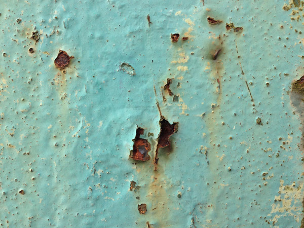
The whole process begins with a texture photo. I’m using my collection of rusty metal textures as an example, but this technique also works great with grainy wood and other detailed surfaces.
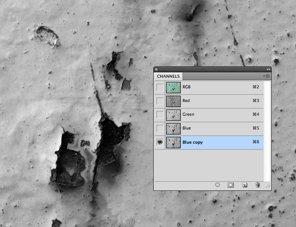
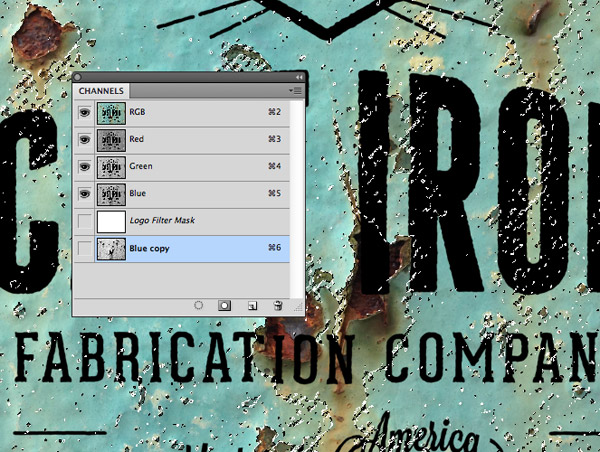
In order to capture all those fine details we can use the Channels to create a selection from the actual image. Toggle the visibility of the Red, Green and Blue channels to find the one with the highest contrast, then drag it onto the ‘New Channel’ icon to make a duplicate.
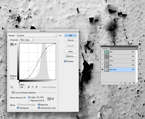
Press the shortcut CMD+M to bring up the Curves adjustments and increase the contrast by darkening the shadows and brightening the highlights.
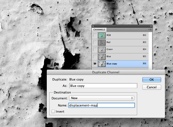
Right click on the new channel and select ‘Duplicate Channel’. Under the Destination options change the Document setting to ‘New’ and enter the filename ‘displacement-map’. A new Photoshop document will be created with just the image from this channel.
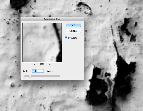
Go to Filter > Blur > Gaussian Blur and add a 3px blur to soften the details, this will displace our logo more smoothly to increase the realism when it’s applied to the texture.
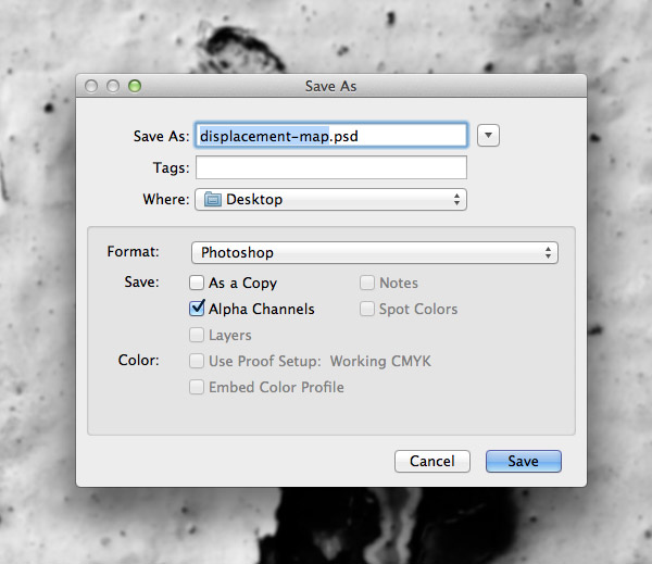
Save the file in a convenient place as a Photoshop (.psd) document. It will already contain the ‘displacement map’ name from when the file was created using the channel duplication.
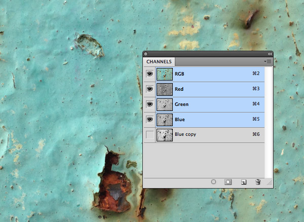
Switch back to the working document and restore the original colours and tones of the image by turning on the RGB channels.
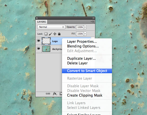
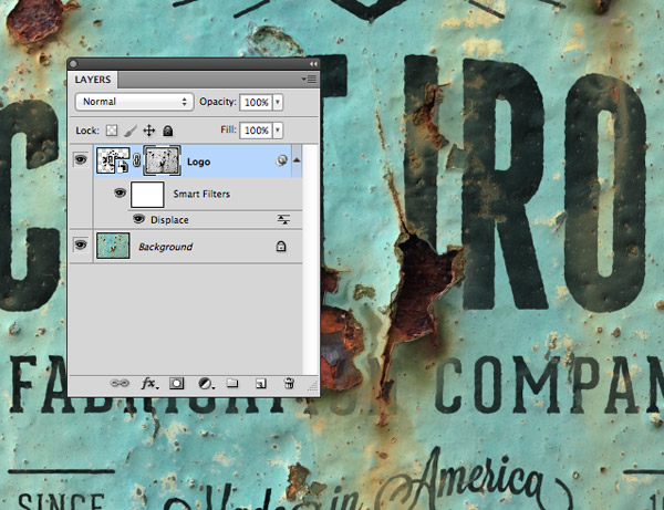
Create a new layer in the Layers panel and give it the name ‘Logo’. Right click and select Convert to Smart Object. This will allow the logo file to be edited and customised later, so you can paste in any artwork and it will be instantly applied to the same texture.
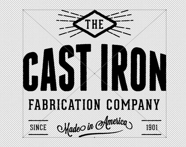
Double click the thumbnail of the Smart Object to edit its contents. Paste in your logo artwork, scale it to an appropriate size to fill the canvas then save and close the file.
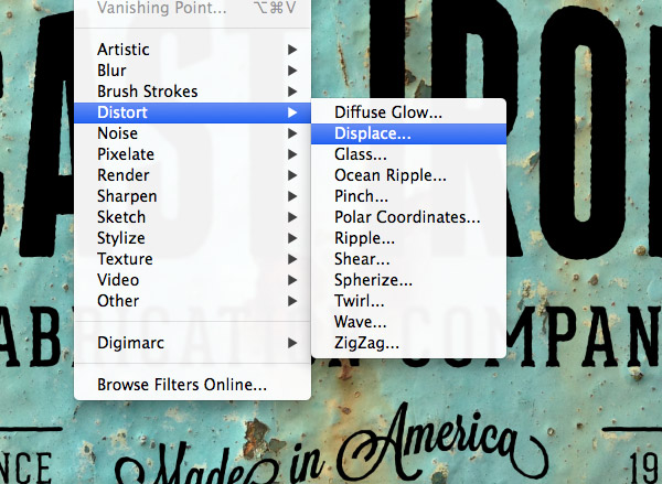
Back in the main document with the Smart Layer selected, go to Filter > Distort > Displace. This step will use the displacement map to warp the logo around the contours of the texture.
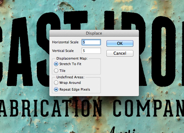
I found the number 5 for the horizontal and vertical scale settings gave good results, but these figures can be adjusted to apply more or less distortion to the logo. Click OK then navigate to the ‘displacement-map.psd’ file we saved earlier.
To really distress the logo so it blends in we need to apply all the fine details of the texture. Go back to the Channels and CMD+Click the thumbnail of the duplicated channel to load its selection.
Switch back to the Layers panel and apply a Layer Mask to the Smart Layer while the selection is still active. All the dark rusty areas of the texture will be erased from the logo using the layer mask to realistically apply every little detail.
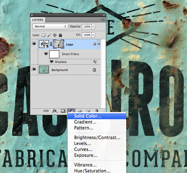
Add a Solid Color adjustment layer to the top of the layer stack. We’ll use this to non-destructively adjust the colour of the logo as a finishing touch.
ALT+Click between the colour fill and smart object layers to clip the adjustment layer to the logo, or right click and select Create Clipping Mask.
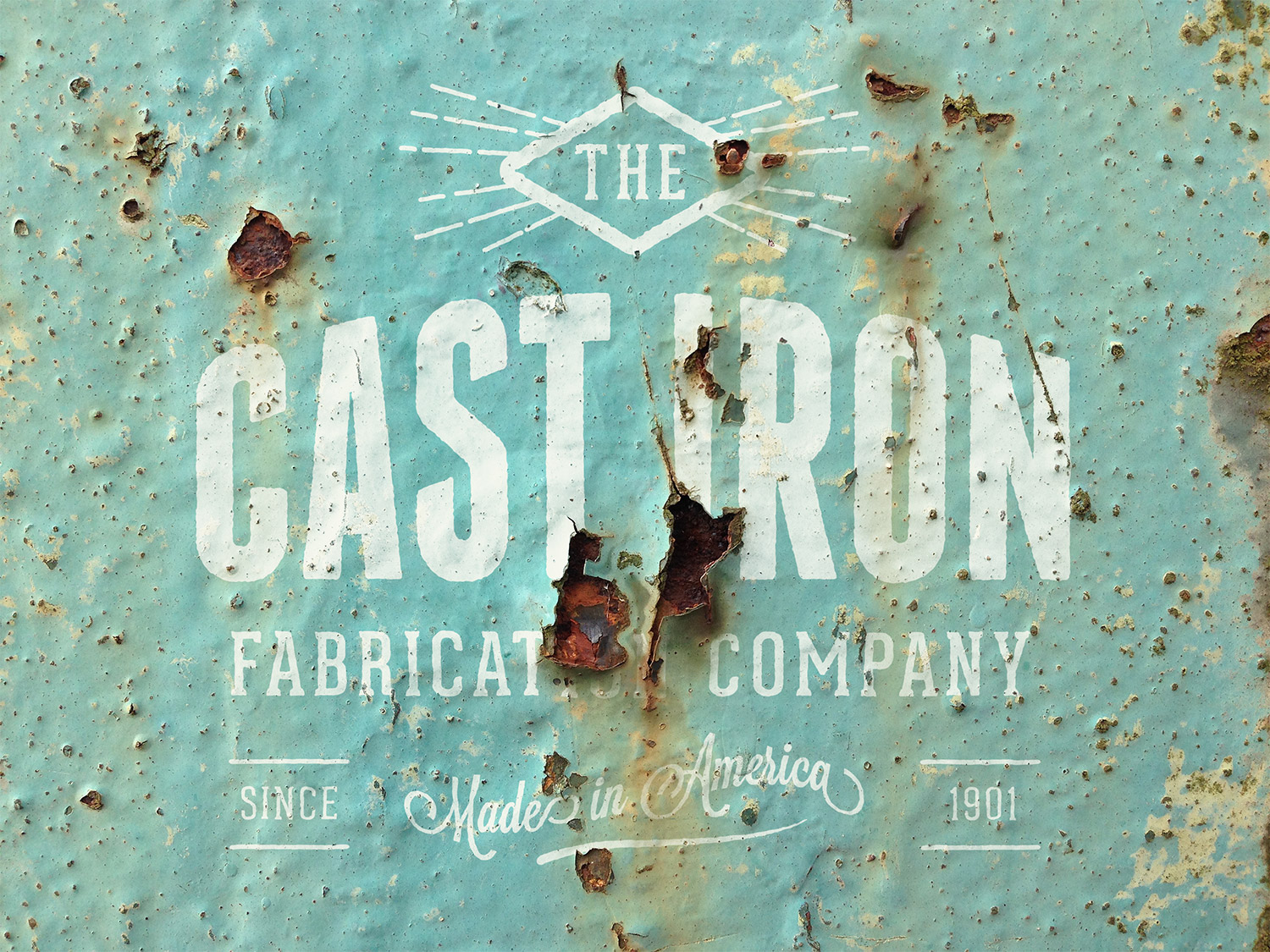
![]()
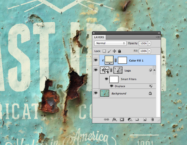
The result is a highly realistic logo mockup that simulates a painted sign that has been aged and weathered over many years! The combination of the displacment map and the masking from the channels layer really boosts the realism by warping the artwork to the contours of the texture and erasing away all the areas of decay from the logo art to seamlessly blend it into the background.
hey…I feel so awful/odd – I had 2 subscriptions somehow and just unsubscribed from one as it seemed silly to keep getting 2 emails each time.
DON’T HATE ME!!!!! I still luv you Spoonster
Haha no worries Fran, you can have as many email subscriptions as you like!
Absolutely loved the presets with the smart object layer and it’s great to see a full explanation of how you created them.
I’ve had mixed results with the displace filter and I’m looking forward to following this tutorial and experimenting.
Thanks!
The revelation for me was to blur the displacement map slightly. Without the blurring it appears all jaggy and unrealistic
Great tutorial as always Chris!
I’m considering going premium on your site if i do are there more tutorials like this one ?
Thanks
There’s no extra tutorials, but you can download source files for tutorials as part of the membership. Check out the Access All Areas overview page for a look at what you can get your hands on. You can browse all the content to make sure there’s something you fancy before signing up.
you are the best man!!
Is there any way to save this tutorial file as I would like to do it at a later date when I have some time. And I’m pretty sure my premium account finishes very soon.
This page will be here to stay, so come back to this page when you’re ready.
Don’t worry if you decide not to continue your premium membership, you can still enjoy the free content like this.
I don’t know if I’m violating some copyright law… but this is how I do when finding something worth saving.
In Safari I click the reader button, then print but instead of clicking the print button I choose save as pdf.
I more than likely will still subscribe, as all the content and resources here at Spoon Graphics are awesome.
wonderful tutorial by Chris, thank you so much for sharing this blog, i enjoyed this too much…
Chris – thank you! So fun to follow along. I chose a wood texture that faded my logo out almost too much. Any quick thoughts on what I can do to adjust?
Hello Your blog giving great information and we are given My Brushes is the only digital paint tool to work on UNLIMITED size canvas and PLAYBACK every drawing stroke on Mac OS X .know more please click here..
http://mybrushes-app.com/MyBrushes-MAC.html
This is absolutely awesome Chris! Post a tutorial every day, you rock :) Thanks for sharing!
nice tut man! after checking your mock up! I was wondering how do you made this and now I found it! You are mind reader..:)
Awesome Tutorial….!
great work Chris..!! outstanding tutorial
Great work Chris!
Excellent tutorial! I like the final effect.
I have always been interested in photo shopping and it’s techniques. And I found this post very intriguing. I’m sure I got pulled in initially because I wanted to change personal pics so I looked way better than in real life, ha. But I have grown since than, I think;).
Thanks for this tutorial, this is a really nice effect.
Everything goes well, till I want to apply the displacement map… I saved it (in .psb), but when I want to choose it, I simply cant… PS dont even sees it in the folder… (Its there, I checked!)
Anyone knows why?
Yours tutorials grow me up everyday! Thanks for sharing!
Thumbs up for this technique, the resulting image seems so natural. Thanks for sharing!
Very realistic result indeed ! thank you for this great tutorial, I’ve learned a lot from it :)
Beautiful, Thanks.
Just wanted to say thanks! Used these steps here: https://newevolutiondesigns.com/create-a-distortion-wallpaper-in-photoshop
Thanks a lot Chris!