This post was originally published in 2014
The tips and techniques explained may be outdated.
Traditionally the double exposure effect is produced by photographers using nothing but their camera to combine two separate photographs to create an abstract and surreal image. However, we can also mimic the effect in Photoshop, which actually gives us more control over the final output with the ability to adjust and preview the effect as we go. Follow this step by step tutorial to create a double exposure effect yourself, we’ll blend two existing photographs together with the help of some simple clipping and masking techniques.
The double exposure effect isn’t just popular with photographers, it’s a technique that artists and designers can use to create cool abstract artwork. You can see this effect used in the real world on album covers and even during opening titles of popular TV series. Today we’re going to focus on mimicking the traditional effect in Photoshop. It’s a relatively simple process but the final result mostly depends on a good match of two complementing photographs. For some inspiration, browse some great examples of double exposure images on Pinterest.
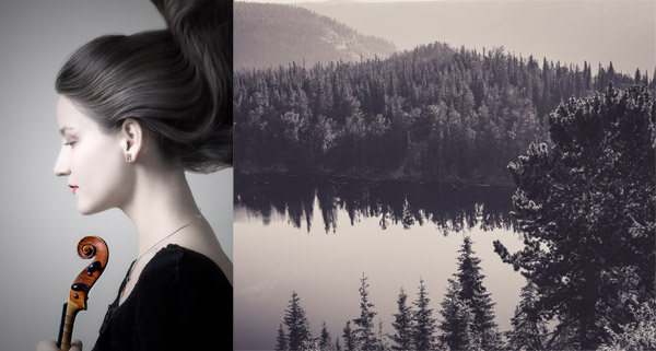
A popular combination of photographs is a portrait with a scene of nature, so I’ve picked out some cool images from free stock photo websites. First, we have a female side profile from Stockvault.net. Aim to find a portrait with a clean background, otherwise it will be difficult to clip out the subject. The second image I’ve chosen is a beautiful landscape scene from Unsplash. One of the benefits of creating this effect in Photoshop is you can test out multiple images to find the best match, so download a few contenders to see which one looks the best!
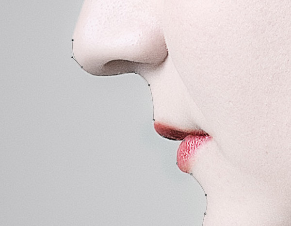
Begin by clipping out the subject from the portrait photograph. Use the Pen too and closely follow the outline of the person’s profile.
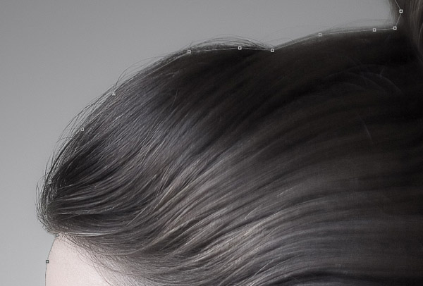
Roughly follow the outline of the hair, cutting into the portrait by a few pixels to avoid capturing the background between the loose hair strands.
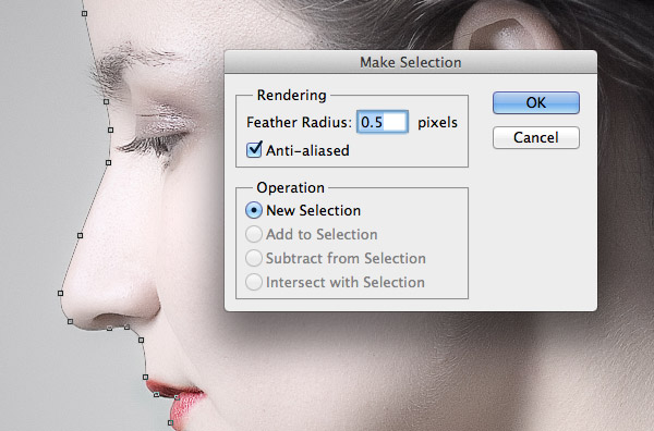
Follow the path all the way around the image, making rough clicks outside of the canvas until you reach the start, then complete the path. Right click and select Make Selection from the menu then enter 0.5px in the Feather Radius option.
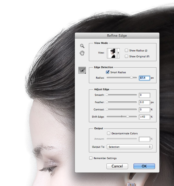
Now let’s work on that rough hair line. Go to Select > Refine Edge and begin altering the Edge Detection Radius and Shift Edge options to bring the hair line into the selection.
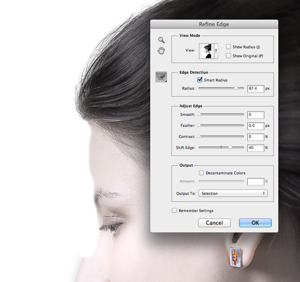
Extending the edge selection will also bring in areas of the background around the face. Select the Erase Refinements Tool from the Brush icon in the Refine Edge panel and paint over any areas of unwanted background.
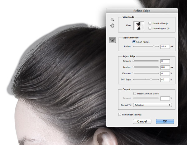
Change the brush to the Refine Radius tool then paint around the hair line to capture any stray hairs that aren’t yet in the selection.
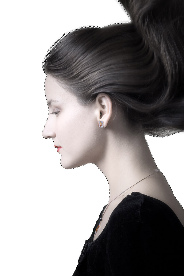
Copy this new selection from the Background and paste it onto a new layer. Add a layer with a white fill below it to isolate the portrait.
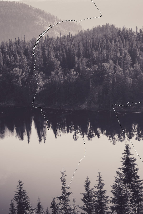
Open up the landscape image and paste it into the working document. CMD+Click the thumbnail of the portrait in the Layers panel to load its selection then click the Add Layer Mask icon to clip the background to the outline of the portrait.
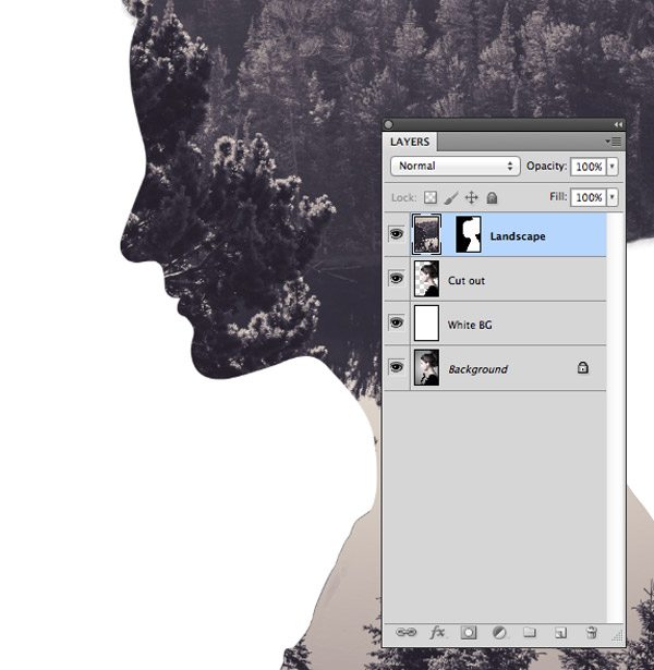
Unlink the image from its mask by clicking the chain icon between the thumbnails in the Layers panel. This will allow you to move and scale the image independently from its mask, so the mask will stay in place while you find the best composition.
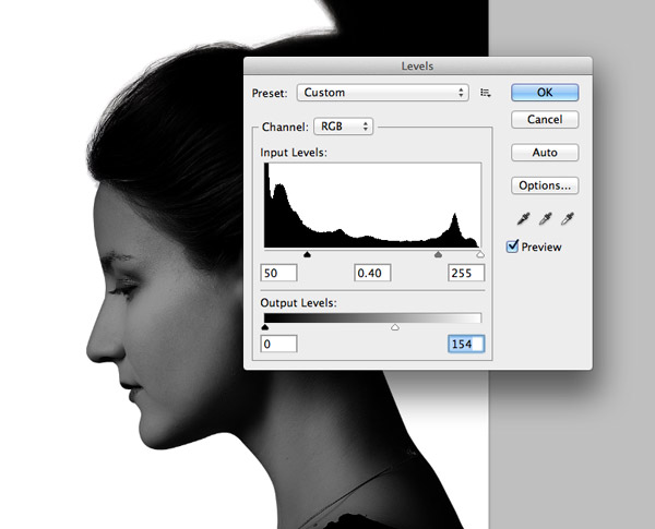
Duplicate the portrait cut out layer and drag it to the top of the stack. Open up the Levels adjustment (Image > Adjustments > Levels) and begin darkening the image by moving the Input and Output level sliders.
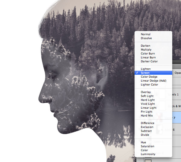
Change the blending mode of this new portrait layer to Screen to render all the dark areas transparent. The darkening of the image with the Levels will leave just a faint ghostly image, which can be tweaked with extra layer opacity adjustment.
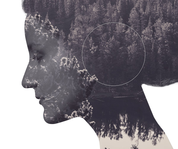
Add a Layer Mask to this ghostly portrait layer and use a large soft brush to erase away some areas to blend it in. Painting black onto a layer mask will erase areas while painting white will bring them back.
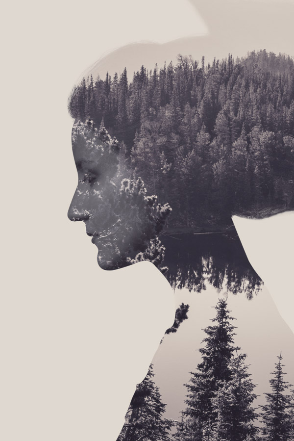
Sample a light colour from the image and replace the fill colour of the white background layer.
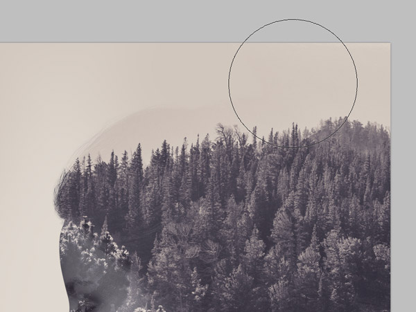
This particular image silhouette has a strange shape on top of the head where the hair was lifted, but it can be blended in by painting a sampled background colour on a new layer with a soft brush.
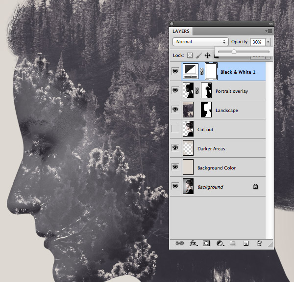
Add a Black & White Adjustment Layer then reduce its opacity to around 30% to wash out the colour of the image.
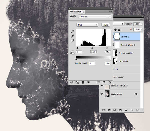
Next, add a Levels adjustment layer and fine tune the contrast of the image by clipping the highlights and shadows.
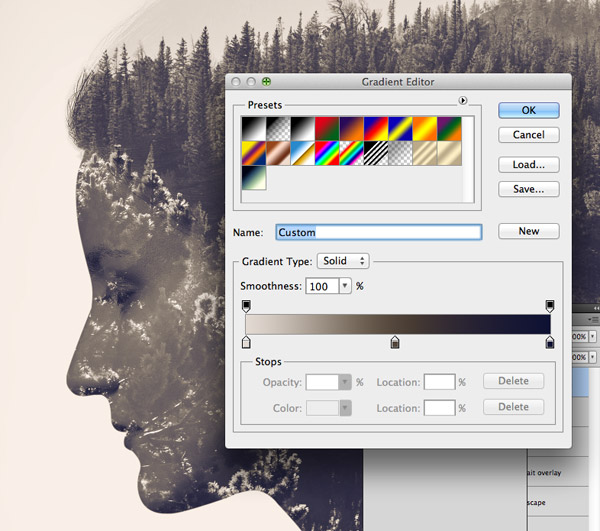
Finally, add a Gradient Map and create a split toned style colour scheme. I’ve gone for a light beige highlight (#e2d9d1), a dull brown midtone (#52463b) and a dark blue shadow (#0e1133). Change the blending mode of the Gradient Map layer to Color.
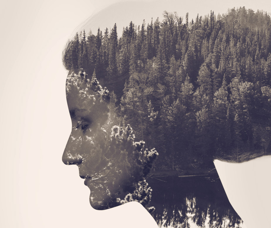
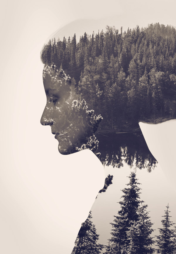
The completed image boasts the full double exposure effect and looks great with the extra colour filters. The sharp lines of the silhouette really stand out from the background while the addition of the subtle ghostly portrait layer being back some facial details. Unlike the traditional camera method though, this artwork can be changed and altered, allowing you to test out different backgrounds combinations and see the result as you work.
Want more? Check out these great related products
The following resources cost a little money, but I definitely recommend checking these products related to the Double Exposure effect.


Amazing Tutorial. I will try this technique with my girlfriend. She have very nice profile :)
I hope she likes it!
Thanks for posting this!! I have always been enthralled with the movie poster / dvd sleeve for the newest Jane Eyre film that came out a few years ago. I will be trying this ASAP.
Just Googled it to check it out. It looks like a nice subtle effect on that design
Excelent tutorial, thanks for posting this
Thanks Gustavo!
Chris!
downloaded your bundle after registering but no! it wouldnt work, is there a version for mac and window?
I am a photographer btw, advertising and Industry
There’s a link in the welcome email to an alternative .RAR file, does that one work for you?
AWESOME!!! Thanks for for posting this!!!
No problem Monica, I’m glad to hear you enjoyed it.
My favorite kind of photography. You have a few more refining steps that I’ll definitely add to my own work flow. Thanks!
Thanks Bryan! I think those last couple if filters really finish it off.
Just beautiful! Thanks for the tips
Thanks Cate, I hope the tips come in handy one day.
This is amazing man! seriously I am trying it out now.
I’d love to see your result!
This method is very simple, i find it very usefull this tutorial, thank you. :) Hope i see more of this kind of tutorials :D
Simple but effective! I’ll certainly look into creating similar photo based tutorials in the future.
Chris,
Just the tutorial I needed for this week!!! Thank you sooooo much!!!! The way you explain things & approach a tutorial is hard to find these days!
Thanks again!
… yhn
Thanks so much for the kind words yhn. It’s always nice to hear when these tuts help people out.
Hey Chris, great tutorial! I was wondering if you could do a tutorial on doing paper cut illustrations in photoshop, kind of similar to the effect here (http://www.youthedesigner.com/2014/05/13/pseudo-papercut-illustrations-of-eiko-ojala/) . I already do paper cuts by hand (https://www.behance.net/ameliathompson) but it would be great to know how to do them in photoshop too.
That’s a really cool effect, I’ll see what I can do.
Your real paper cuts look awesome, I especially like to ‘Beary’ one based on my old tutorial, it’s great to see how you’ve transferred the Illustrator tips into paper crafts!
This is awesome! I will totally trying this tutorial! Thank you :)
Nicely done. Thanks for a new inspiration :)
Nice tutorial Chris. I tried it and it works great. Love the way you explain.
Truly a stunning effect, you need a lot of creativity to be able to get a result like this, excelent tutorial I will try to do here in my online Photoshop
Great tutorial!
Thanks for this work, I’m impatient to try this :)
Thanks for this tutorial and all the freebies on your blog. I’m so glad I found your site :)
Thank you so much from Argentina!
I find your tutorials very useful and well explained. Hope to send you my results.
Thank You!
Needed something like this for my final year project of University, Again thank you :)
Hi Chris! Thanks for this, mainly how to use the refine selection tool. I’d like to see a more detailed tutorial on just that. Thanks a ton for everything!
We’re all in Carcosa now.
Wow, this is an awesome tutorial. I will probably use this technique for the album art for my upcoming music project.
Thanks!
Awesome tutorial man !!!!
Keep it up !!!